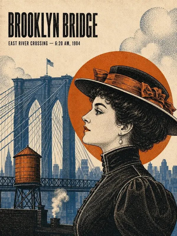
Layered New York Travel Poster
Prompt
Create a premium 4:5 vertical travel-art poster for [CITY NAME], inspired by the reference images. Use a refined handcrafted paper-cut / layered 3D architectural illustration style with clean editorial composition and subtle dimensional depth. CORE CONCEPT: Create a stylized miniature world of [CITY NAME] using its most recognizable real landmarks, architecture, monuments, streets, bridges, waterways, and cultural details. Keep landmarks recognizable while translating them into elegant layered paper sculptures. CITY NAME INTEGRATION: Embed the exact text “[CITY NAME]” naturally into the artwork as a major graphic element. Make the typography physically integrated into the paper-cut environment rather than a separate caption. Use elegant architectural typography that complements the landmarks. Keep it clearly readable, correctly spelled, and balanced within the composition. VISUAL STYLE: • Handcrafted paper-cut illustration • Layered cardstock / sculpted paper • Subtle 3D depth • Clean geometric silhouettes • Soft bevels and realistic paper edges • Delicate cast shadows • Sophisticated editorial travel-poster aesthetic • Stylized yet architecturally accurate landmarks • No photorealistic rendering COMPOSITION: Create a spacious vertical composition with generous upper negative space. Feature 2–4 iconic landmarks of [CITY NAME] as the main focus, arranged at different depths and scales. Add atmospheric paper-cut elements where appropriate: • Circular sun/moon • Minimal sculpted clouds • Layered trees and foliage • Bridges, streets, plazas, or waterfronts • A recognizable local vehicle or boat • Subtle distant city silhouettes Use layered geometric ground surfaces, roads, plaza patterns, or flowing paper-cut water shapes in the foreground to create depth and visual rhythm. COLOR PALETTE: Use a restrained palette inspired by the references: warm ivory/off-white, dusty blue, deep navy, soft teal, terracotta, warm beige, muted gold, plus subtle accents reflecting [CITY NAME]. Keep colors cohesive and slightly desaturated. LIGHTING & DEPTH: Soft studio illumination from the upper left with delicate shadows beneath each paper layer. Add subtle ambient occlusion, dimensional edges, gentle highlights, and tactile cardstock texture. Make it feel like a professionally crafted miniature paper diorama photographed against a clean studio background. ARCHITECTURAL ACCURACY: Use real, recognizable landmarks from [CITY NAME]. Preserve their distinctive silhouettes, domes, towers, columns, façades, statues, bridges, and architectural proportions while translating them into the simplified paper-cut style. IMPORTANT: The artwork must immediately communicate “[CITY NAME]” through both its architecture and integrated typography. The city name should feel like a natural part of the physical poster design. OUTPUT: Premium 4:5 vertical travel poster, balanced composition, elegant negative space, tactile layered-paper construction, integrated typography, crisp details, polished editorial design, high-end collectible travel-art aesthetic. AVOID: Photorealism, generic or inaccurate landmarks, clutter, oversaturation, flat vector graphics, cartoon/anime styling, plastic 3D, distorted architecture, misspelled or illegible text, duplicate elements, excessive text, watermarks, logos, and AI artifacts.