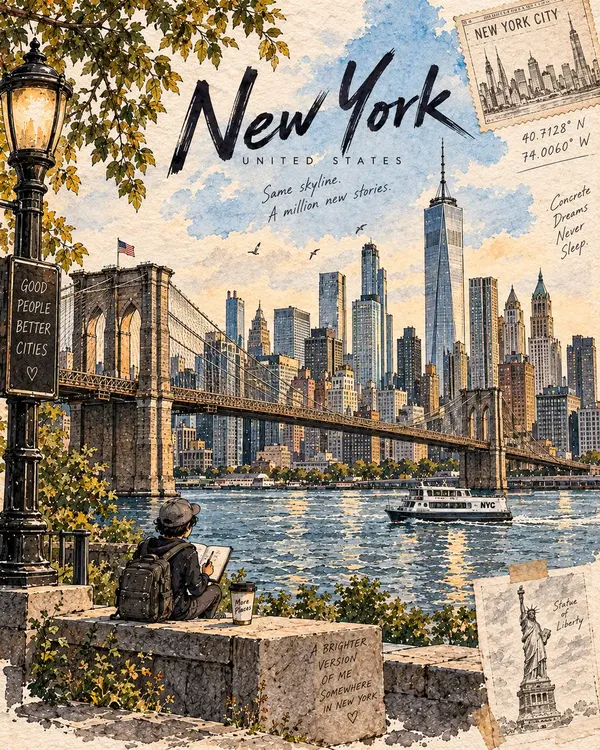
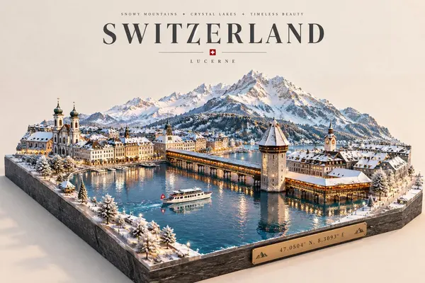
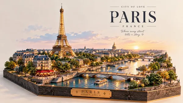
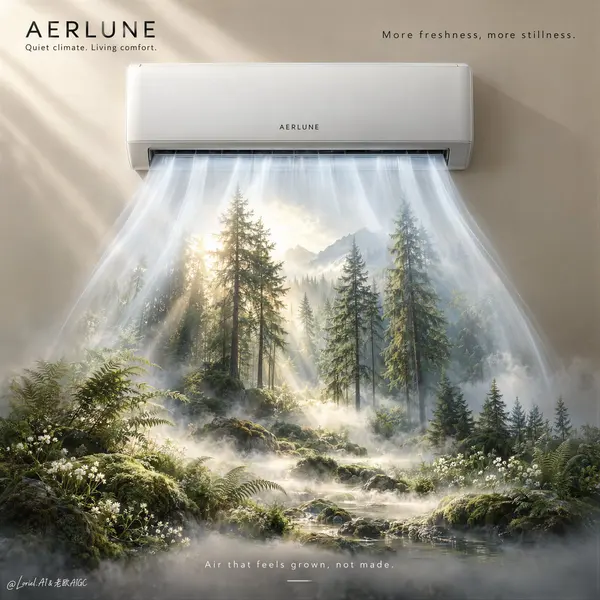
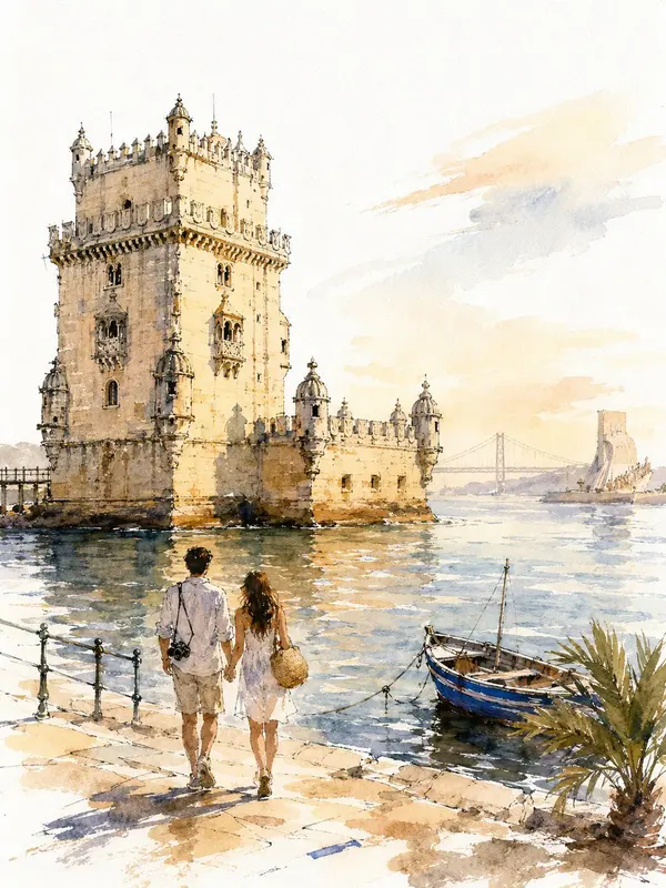
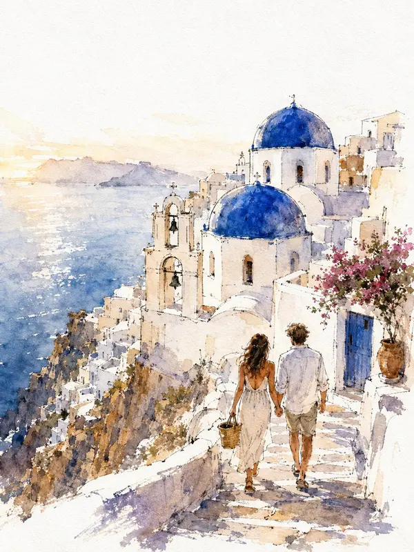
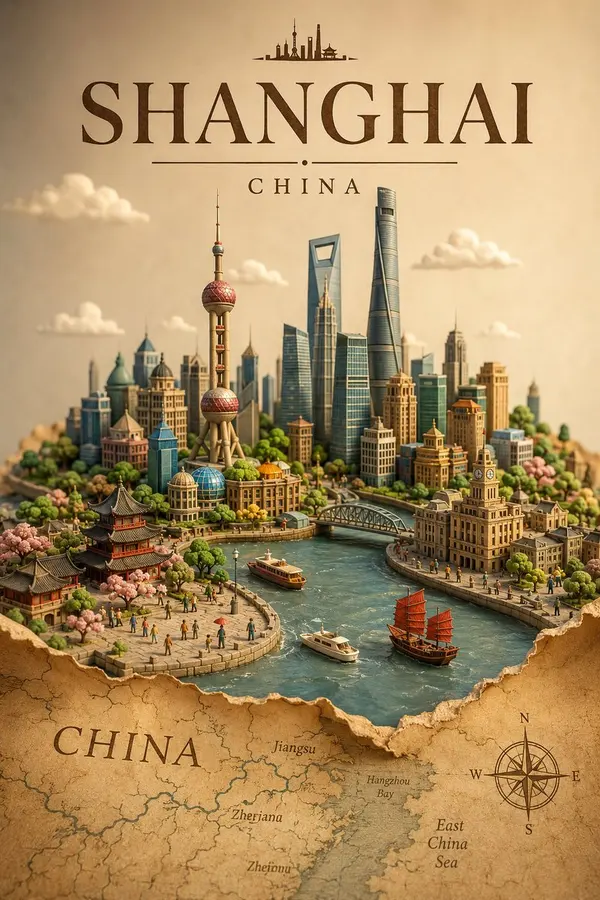
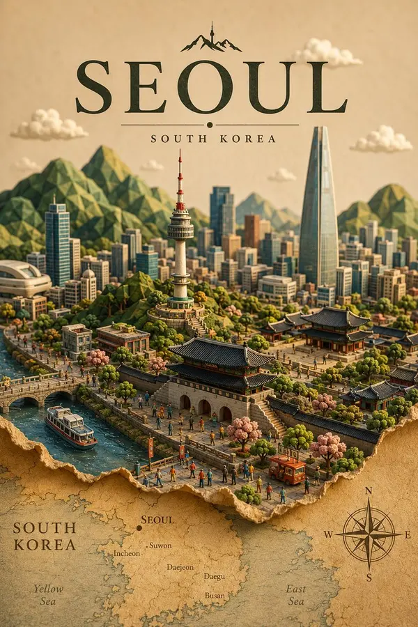
This collection includes prompts and examples from GPT Image 2 and GPT Image 2.5, including Flare and Sunburst. Examples retain their original source; trying a prompt with another model may produce different results.
How are the prompts collected?
The gallery is hand-picked by our team from creators sharing their work in public communities. If a prompt of yours is featured and you'd prefer it taken down, just reach out and we'll remove it right away.
How do I try a prompt?
Hit the Try button on any card and you'll be taken to the prompt editor. Image 2.5 is selected automatically. Customize the prompt, then select Generate to create it in Playyy.
Can I submit my own prompts?
Submissions are coming soon. In the meantime, share standout prompts with us on X or Discord and we'll review them for inclusion.
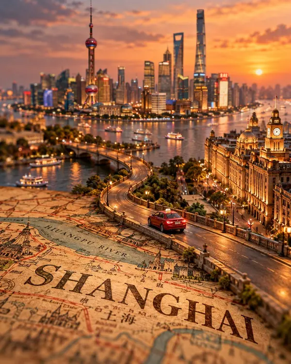
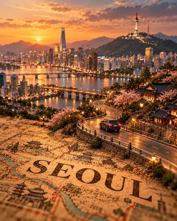
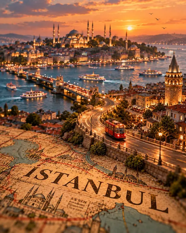
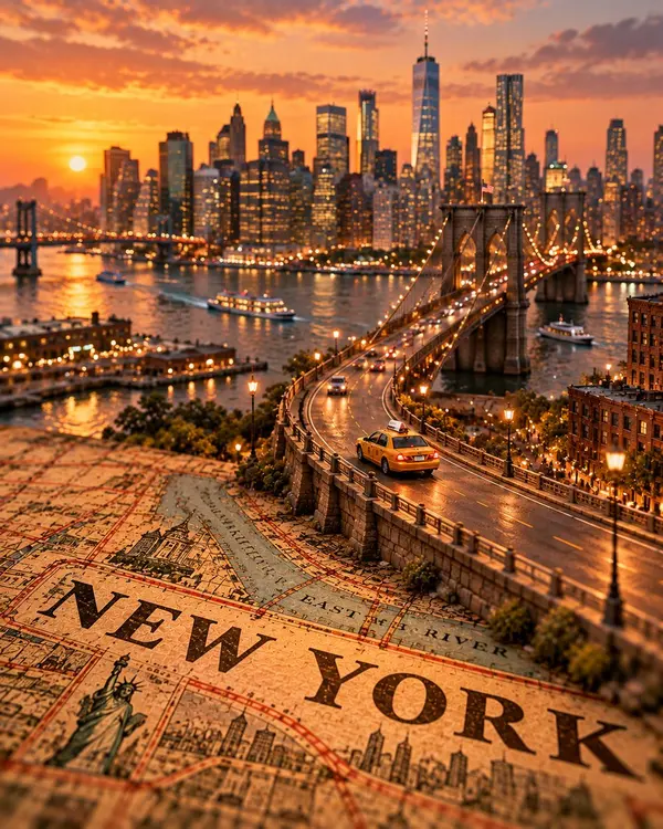
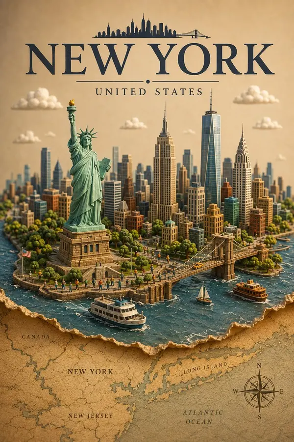
Create a premium FULL-FRAME 4:5 vertical miniature tilt-shift travel poster for [CITY / LOCATION].
TEXT-TO-IMAGE ONLY — generate the entire scene from the destination name alone. No reference image required.
CORE CONCEPT:
A vintage printed city map transforms into a winding elevated road leading toward the destination’s iconic skyline. One realistic local vehicle drives along the curved road, becoming the main focal point.
COMPOSITION:
Foreground: detailed vintage map with “[CITY NAME]” printed boldly across it. Middle ground: a winding road emerging naturally from the map. Background: recognizable landmarks, authentic architecture, and local scenery arranged in atmospheric depth.
STYLE:
Photorealistic miniature diorama, tilt-shift photography, intricate cartographic textures, realistic vehicle details, shallow depth of field, warm golden-hour lighting, and cinematic shadows.
FINAL AESTHETIC:
A premium collectible travel poster blending vintage cartography with a realistic miniature world. Strong visual depth, authentic local atmosphere, and clean, uncluttered composition.
AVOID:
Unrelated landmarks, distorted roads, oversized vehicles, excessive labels, incorrect text, logos, watermarks, and borders.
FORMAT: Full-bleed 4:5 vertical composition.
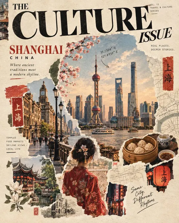
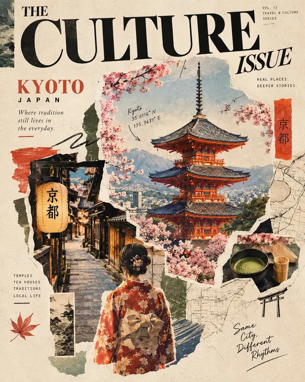
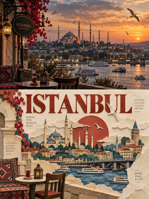
Create a stunning editorial travel and culture magazine cover featuring [CITY / COUNTRY / LANDMARK], designed as a sophisticated vintage scrapbook collage that celebrates the destination’s authentic identity, heritage, architecture, and everyday life.
Overall aesthetic: A luxurious vintage travel magazine cover blending documentary photography, torn-paper collage, retro editorial design, travel journaling, and artistic mixed-media textures. The composition should feel handcrafted, culturally rich, nostalgic, and visually captivating.
Main composition:
Hero image: A large, beautifully detailed, photorealistic view of the destination’s most iconic and architecturally accurate landmark, surrounded by its authentic natural scenery and recognizable local environment.
Cultural photography: Smaller photographic cutouts showing traditional streets, local markets, historic buildings, traditional clothing, regional food, crafts, festivals, or everyday moments that genuinely represent the destination.
Human element: Include a person wearing authentic regional attire, viewed from behind or naturally integrated into the scene, creating an emotional connection with the place.
Local details: Incorporate recognizable cultural objects, traditional patterns, native flowers, regional ingredients, handwritten travel notes, map fragments, botanical illustrations, and subtle geographical coordinates.
Collage composition: Arrange the photographs in overlapping, irregular torn-paper shapes, layered with painted brushstrokes, rough paper edges, subtle ink marks, and fragments of vintage maps. Allow certain elements to overlap naturally, creating depth without making the layout feel cluttered.
Magazine typography and layout:
At the top, feature an oversized, bold, elegant serif masthead reading “THE CULTURE ISSUE.” The typography should dominate the composition like a premium independent travel magazine.
Include the destination’s name in large, distinctive lettering, followed by its country or region. Add smaller editorial details such as:
Travel & Culture Series
Real Places. Deeper Stories.
A short poetic description of the destination.
Geographical coordinates in handwritten script.
A few small cultural section labels.
A handwritten phrase capturing the spirit of the place.
Typography should feel editorial, sophisticated, and thoughtfully arranged around the imagery, with clear visual hierarchy and generous negative space.
Color palette and materials:
Use warm ivory and aged cream paper as the background, complemented by muted earthy tones, faded terracotta, deep olive green, dusty blue, charcoal black, and colors naturally associated with the destination. Add subtle paper grain, vintage print imperfections, faded ink, watercolor washes, pencil marks, and authentic analog photography textures.
Cultural authenticity — essential:
The destination must remain geographically, architecturally, and culturally recognizable. Accurately represent its famous landmarks, traditional clothing, local cuisine, cultural objects, and regional environment. Use genuine cultural references rather than generic or invented symbols. Every collage element should feel connected to the actual place.
Final result: A breathtaking, premium-quality editorial magazine cover that feels like a carefully curated collection of travel photographs, cultural memories, handwritten observations, and vintage paper ephemera. Artistic yet believable, richly detailed yet balanced, nostalgic yet contemporary.
Format: Vertical 4:5 composition, high resolution, professional magazine art direction, realistic photography blended with handcrafted collage, elegant typography, layered textures, and visually striking storytelling.
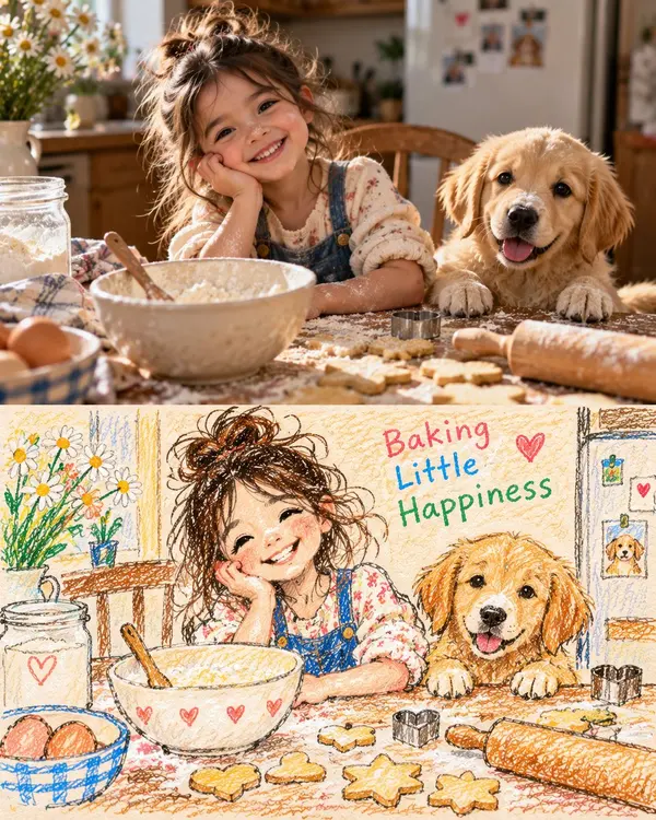
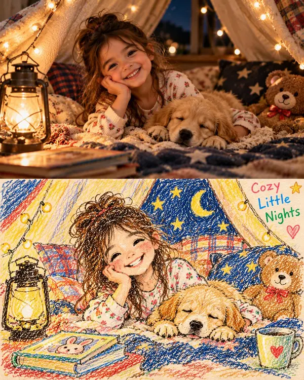
Create a charming, heartwarming two-panel vertical collage inspired by nostalgic childhood photography and handmade children’s crayon drawings. Portrait 4:5 aspect ratio.
TOP PANEL — ULTRA-REALISTIC PHOTOGRAPH
Capture a cozy nighttime moment inside a magical homemade blanket fort. A happy young girl with naturally tousled brown hair, wearing cream-colored floral pajamas, lies comfortably on soft layered blankets, resting her cheek on one hand while smiling warmly at the camera. Beside her, a fluffy golden retriever puppy sleeps peacefully with its head resting on the blanket. A vintage glowing lantern sits on the left, casting a warm amber light across the scene. Tiny warm-white fairy lights decorate the draped cream blankets overhead. Include navy-blue star-patterned cushions, a cute brown teddy bear with a red bow, and a few children’s storybooks in the foreground. The background feels intimate, safe, and dreamy, like a treasured childhood memory captured at bedtime.
Use realistic skin texture, individual hair strands, natural facial expressions, authentic puppy fur, physically accurate fabric folds, soft shadows, shallow depth of field, subtle cinematic grain, warm tungsten lighting, and professional family-photography quality. The image must look like a genuine photograph, not AI-generated artwork.
BOTTOM PANEL — MATCHING HANDMADE CRAYON DRAWING
Directly beneath the photograph, recreate the exact same scene as a child’s handmade illustration. Depict the same girl with the same hairstyle, floral pajamas, smiling expression, resting pose, and the same sleeping golden puppy. Preserve the recognizable arrangement of the lantern on the left, glowing fairy lights, draped blanket fort, navy starry cushions, teddy bear, and storybooks.
Use visible wax-crayon strokes, colored-pencil scribbles, uneven hand-drawn outlines, imperfect childlike proportions, overlapping colors, and richly textured warm ivory drawing paper. Use dark blue, golden yellow, cream, orange, brown, and red crayons. Draw the fairy lights as glowing yellow dots, add hand-drawn stars and a crescent moon to the navy blanket, and include small hearts and playful doodles around the edges.
Write the words “Cozy Little Nights” in colorful, imperfect childlike handwritten lettering near the upper-right corner of the illustrated panel. Ensure the words are spelled correctly and remain clearly legible.
COMPOSITION AND QUALITY
Stack the two panels vertically with a clean, straight horizontal division. The top photograph occupies approximately 55–60% of the canvas, while the bottom illustration occupies the remaining 40–45%. Keep both panels visually aligned so the drawing feels like a child’s interpretation of the exact photograph above it.
The upper panel must remain completely photorealistic, while the lower panel must look genuinely handmade using crayons and colored pencils. Maintain a warm, nostalgic family-album atmosphere, gentle bedtime storytelling, and a consistent composition across both panels.
AVOID: 3D cartoon rendering, digital vector art, glossy illustrations, painterly photographic effects, artificial skin, distorted hands, extra fingers, duplicate puppies, inconsistent character appearances, mismatched poses, blended panel boundaries, excessive decorations, illegible text, watermarks, and logos.
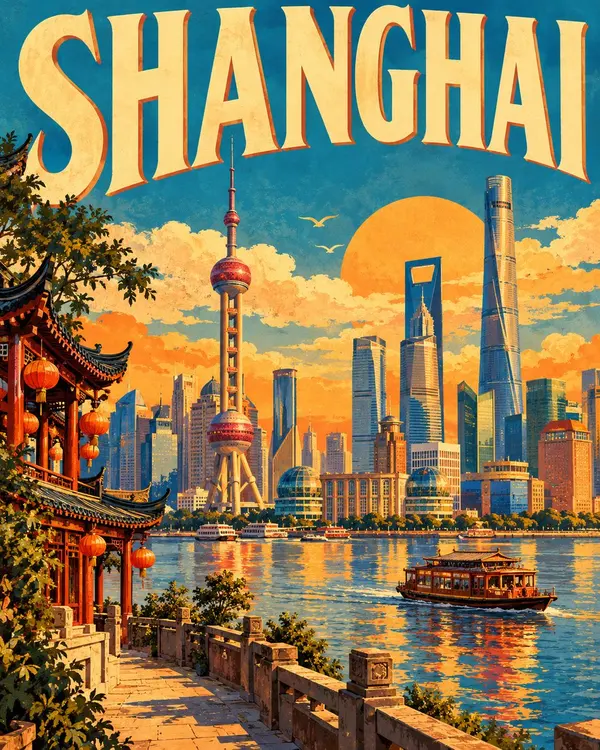
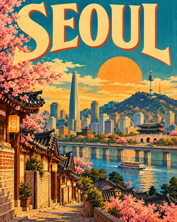
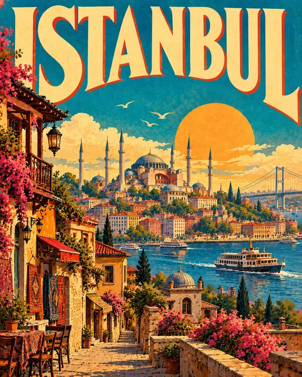
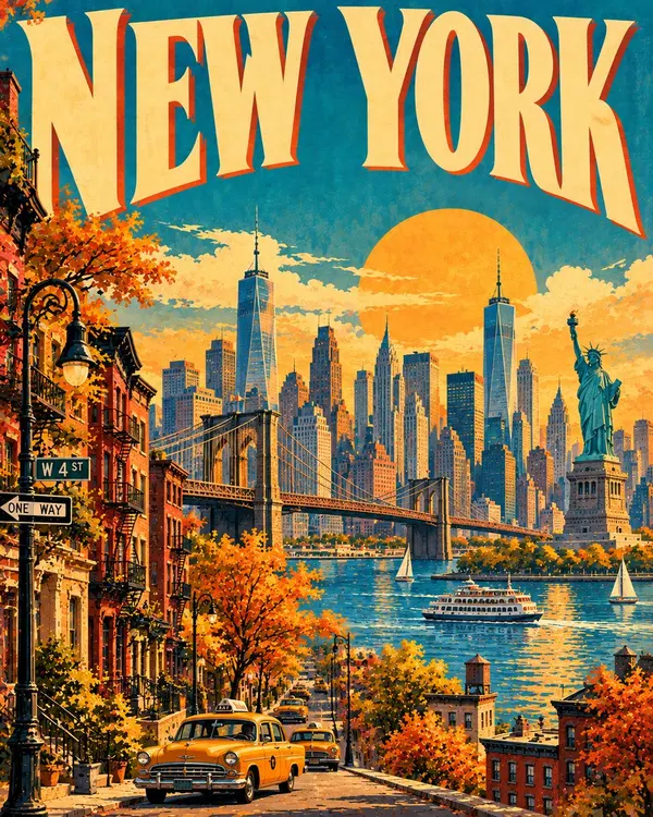
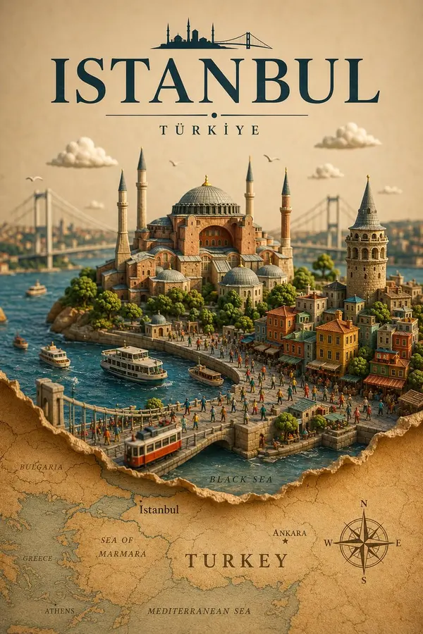
Create a premium FULL-FRAME 4:5 vertical vintage travel poster for [COUNTRY / CITY / LOCATION].
TEXT-TO-IMAGE ONLY — generate the entire artwork from the destination name alone. No reference image required.
CORE CONCEPT:
Transform the destination into a colorful 1950s–60s mid-century travel poster inspired by hand-painted Nubian village architecture. Feature iconic local landmarks, distinctive buildings, and a beautiful coastal, riverside, or natural landscape appropriate to the location.
COMPOSITION:
Place “[CITY NAME]” in large, bold retro typography across the top. Fill the central scene with simplified architectural forms, geometric wall patterns, local vegetation, and a few authentic transport or cultural details. Add a warm sun and a spacious, atmospheric background. Keep the composition balanced and uncluttered.
STYLE & COLORS:
Flat geometric shapes, hand-painted wall textures, sun-faded colors, and subtle vintage print character. Use turquoise, cobalt blue, terracotta, orange, butter yellow, and warm ivory, adapting the palette to the destination.
FINAL AESTHETIC:
Bright, optimistic, nostalgic, and collectible—classic mid-century tourism art with distinctive local identity.
AVOID:
Photorealism, 3D rendering, excessive detail, unrelated landmarks, crowded layouts, incorrect text, logos, watermarks, and mockup framing.
FORMAT:
Full-bleed 4:5 vertical poster. Artwork fills the entire canvas with no external borders or margins.
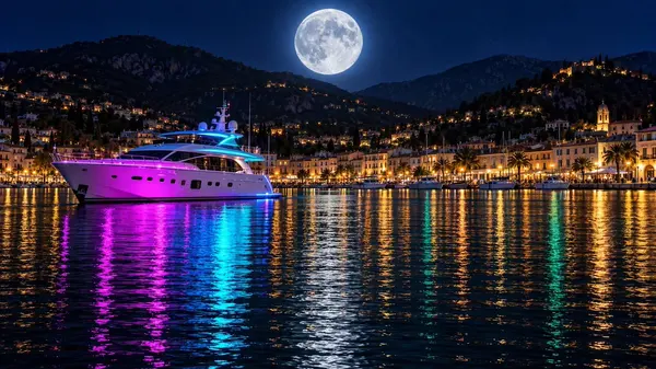
Photorealistic night harbour scene, wide 16:9 panoramic composition, cinematic, ultra-detailed. Edge to edge, no frame, no border.
HARBOUR: the lower half is calm black water rippling in fine horizontal chop, carrying long smeared vertical reflections that stretch down the frame.
MOON: high in the upper middle of the deep navy night sky hangs one enormous, sharply detailed full moon, its craters crisp, ringed by a soft cool blue-white halo. The sky is darkest at the top corners, paling slightly toward the horizon.
BOAT: just left of centre sits a sleek modern white motor yacht at rest, seen broadside from the front-left. Its flanks are washed in vivid neon ultraviolet magenta along the hull and glowing electric cyan along the upper deck and railings, with a dark tinted glass bridge, a radar mast, a blue-lit stern platform and a line of small dark portholes.
HILLS: behind, layered dark ridgelines rise across the full width, their slopes dotted with scattered warm gold lights of hillside villas and small windows.
TOWN: along the water's edge runs a continuous waterfront promenade of low pale buildings with warm golden lit façades, arcades, windows and streetlamps. A row of moored white boats and small yachts lines the quay in dark silhouette.
REFLECTIONS: the water is split into ribbons of colour. Directly beneath the yacht run two bold vertical bands — bright magenta and electric cyan — vivid and saturated, broken into short ripples. Across the rest of the surface, the town lights throw long warm amber and orange columns, with cooler teal and deep green streaks threading between them in the lower right.
PALETTE: deep navy, near-black water, brilliant magenta, electric cyan, warm amber gold, teal green, silver-white moon. Sharp focus, high dynamic range, glossy wet highlights, clean and unmarked.
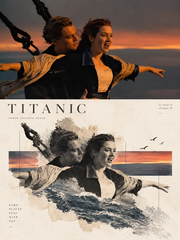
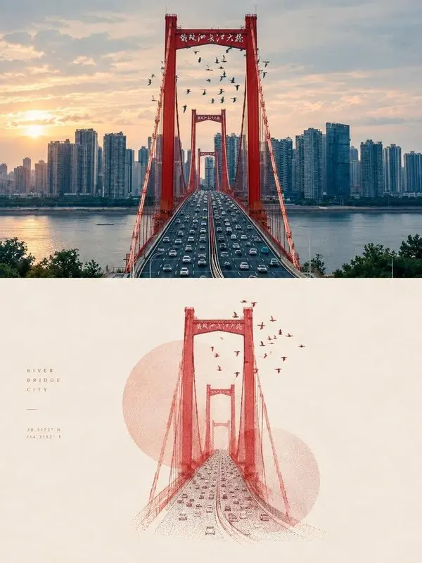
Create a sophisticated contemporary travel-art poster from the uploaded londscape photograph.
Strict 3:4 vertical format.
The upper half must remain the original landscape photogroph. Preserve all important environmental structures, natural textures, lighting, shadows, horizon, architecture, people and perspective. Do not regenerate the scene.
The lower half reconstructs the landscape's strongest narrative element using delicate photographic fragments, halftone printing, subtle paper fibers and fading edges.
Use a single horizontal geometric color field sampled from the landscape. Let the reconstructed subject or horizon physically intersect this field.
Keep the background most white with muted tones derived from the original image. Avoid saturated colors.
The result should resemble a limited-edition museum travel poster rather than a conventional photo collage.
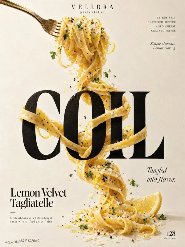
Create a Cannes-grade vertical poster ad for an original premium pasta brand, VELLORA, merging the warmth of a plated dish, the tactile authority of luxury food photography, and the restraint of a curator-led graphic poster. The core idea is a single continuous ribbon of lemon-butter tagliatelle physically twisting around typography, making pasta and letters structurally inseparable. The pasta remains the true visual hero, while the letter interaction delivers the conceptual impact.
Use a tall minimalist composition on a warm ivory paper-plaster background with subtle tactile grain and generous negative space. From the upper-left, a polished vintage-gold fork enters diagonally, holding a compact nest of glossy tagliatelle near the top center. From this lifted forkful, one continuous strand descends vertically through the poster, tightening, looping, crossing, and relaxing with believable weight and gravity. At the center, place one monumental ultra-bold black serif display word: "COIL". The pasta wraps around the letter stems, passes behind counters, crosses in front of key edges, and re-emerges with precise occlusion, natural contact shadows, and elegant tension. The strand continues below and resolves near the lower-right with a fresh lemon wedge accent, keeping the movement vertically unified.
Render the pasta with exceptional realism: silky ribbons with slight width variation, rich butter emulsion, subtle lemon zest, cracked black pepper, delicate grated aged cheese, and restrained parsley flecks. The noodles should feel freshly tossed, elastic, heavy, and luxurious, with visible drag, torsion, overlap, and sauce cling. Add only a few curated crumbs, pepper granules, zest curls, and tiny herb leaves close to the strand so the image feels alive without clutter. The fork must feel premium and tactile, with brushed metallic highlights, slight edge wear, and refined reflection control.
Typography must be entirely original and treated as graphic architecture. At the top center, place a small premium brand lockup reading "VELLORA" with the micro-line "pasta atelier". Top-right: "CITRUS ZEST / CULTURED BUTTER / AGED CHEESE / CRACKED PEPPER", with a small italic line beneath: "Simple elements. Lasting craving." The main central word is "COIL". In the lower-left, place "Lemon Velvet Tagliatelle", with the line "fresh ribbons in a butter-bright sauce with a lifted citrus finish". Mid-right: "Tangled into flavor." Bottom-right: a restrained numeric marker "128" with the tiny line "single serve". All lettering must feel custom-designed, beautifully kerned, spatially embedded, and tonally harmonized with the food, never crude, generic, or blocking the key pasta interaction.
Use soft directional daylight from the upper-left with refined studio discipline. The forkful catches creamy highlights, the black display word feels dense and premium without dead flat black, and the pasta carries luminous buttery reflections with layered shadows where it crosses the letters. Build a strong tonal step between the pale background, the dark central word, and the golden pasta so the concept reads instantly from a distance. Color hierarchy: 60% warm ivory and cream paper tones, 25% golden pasta and butter hues, 10% deep black typography, 5% lemon yellow and herb green accents. The overall mood is bright, tactile, elegant, modern, and quietly indulgent.
Materials must feel physically coherent and expensive: matte-ink or painted letter surface with subtle paper response, glossy butter-coated pasta with fine semolina texture, irregular grated cheese, crisp pepper granules, moist lemon flesh, and softly reflective metal. Hyper-real food photography merged with high-end editorial poster design, luxury print-ad finish, crisp readable text, believable gravity, clean background, strong product-first hierarchy, no clutter.
Avoid floating noodles without support logic, broken or melted strands, warped fork structure, unreadable text, generic menu-board styling, garnish overload, muddy shadows, dirty paper stains, dead black slabs, plastic-looking sauce, stiff pasta geometry, cheap glow, random particles, compositing artifacts, distorted letters, style drift, accidental resemblance to any real brand, or extra props that weaken the central noodle-and-typography interaction.
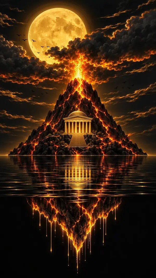
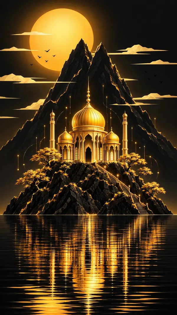
Smooth transformation from peaceful golden palace to dramatic volcanic mountain. Golden domes morph into ancient Greek columns, calm water begins to bubble and reflect lava, serene sky fills with fiery storm clouds, golden light turns into flowing lava, peaceful atmosphere transforms into epic volcanic drama. Cinematic morphing,
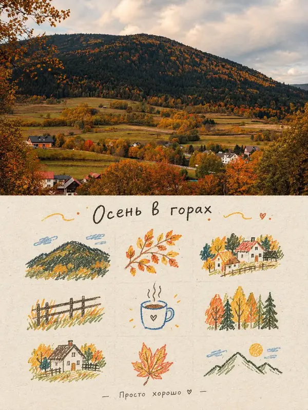
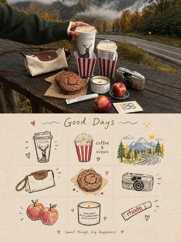
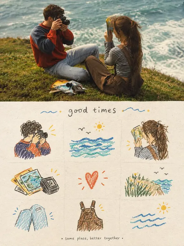
Create a nostalgic editorial scrapbook-style image combining one main photorealistic lifestyle photograph with a hand-drawn illustrated section underneath.
The top 50–55% should be a cinematic, highly realistic photograph of [SUBJECT / SCENE], captured like an authentic film photograph. Natural candid composition, warm nostalgic atmosphere, soft diffused light, subtle film grain, realistic textures, slightly muted vintage colors, autumnal/warm earthy tones, shallow depth of field where appropriate, beautifully composed but not overly polished.
The bottom 45–50% should look like a vintage handmade scrapbook / travel journal page, printed on warm cream textured paper. Recreate small elements from the photograph as loose colored-pencil and watercolor doodle illustrations arranged in a clean 3×3 or balanced grid. Include simple hand-drawn objects related to the scene such as [OBJECT 1], [OBJECT 2], [OBJECT 3], [OBJECT 4]. Use imperfect sketch lines, subtle pencil strokes, watercolor bleed, slightly uneven coloring and authentic handmade imperfections.
Add a short handwritten title at the top of the illustrated section: “[TITLE]”, in casual imperfect black/gray handwritten lettering. Add tiny decorative elements such as hearts, dots, clouds, leaves, stars, waves or small doodles around the illustrations.
At the very bottom, add a small handwritten caption: “[SHORT CAPTION]”.
Overall aesthetic: cozy Pinterest editorial, nostalgic travel diary, vintage film photography + children’s sketchbook illustration, warm analog memories, premium lifestyle magazine composition, tactile paper texture, understated and elegant, emotionally warm, authentic rather than overly digital.
Composition: vertical 4:5, clean separation between photograph and illustration, balanced negative space, consistent visual storytelling between the photo and drawings.
Important: preserve realistic photography in the top section; do not turn the photograph into an illustration. The lower section should clearly look hand-drawn. Avoid excessive text, distorted lettering, photorealistic doodles, CGI appearance, oversaturation, clutter, or overly perfect vector graphics.
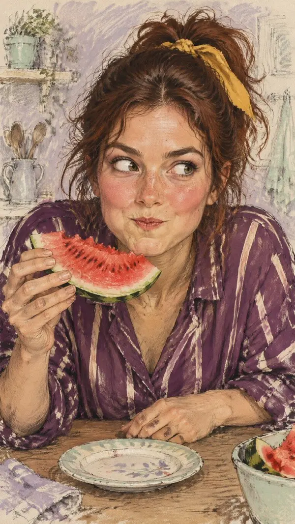
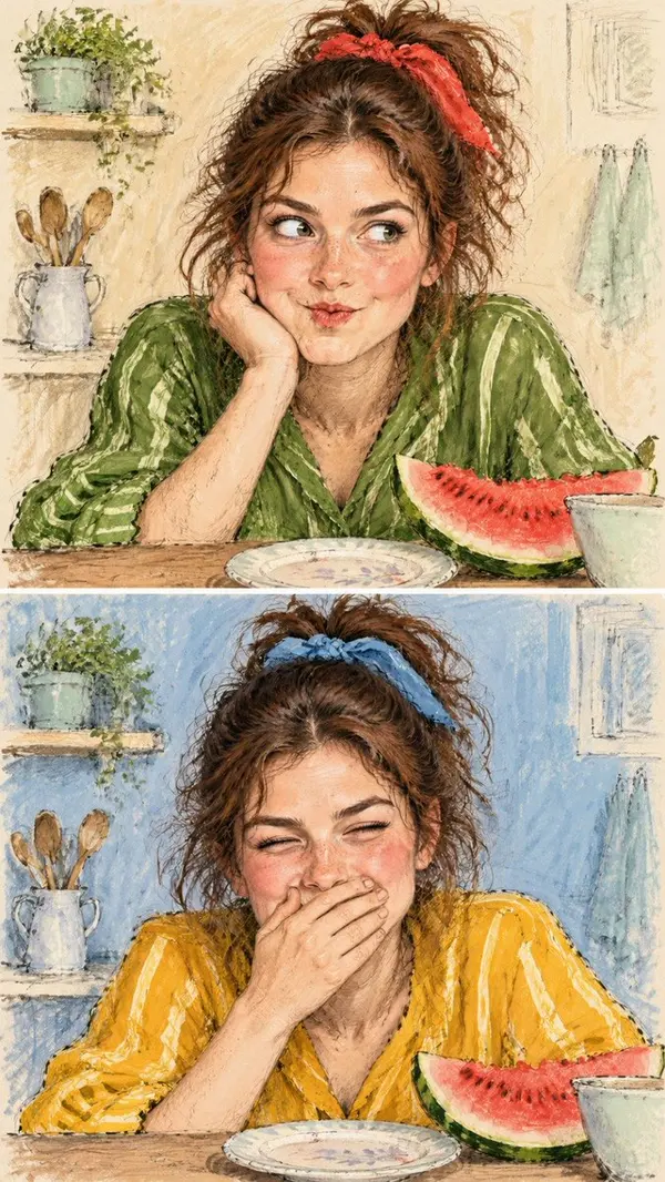
Create an original vertical 9:16 semi-realistic hand-drawn editorial illustration of a quirky young adult woman caught in a funny, spontaneous moment while eating a slice of watermelon. She has realistic human facial anatomy, naturally flushed cheeks, detailed expressive hazel eyes, a few freckles, and messy dark auburn hair loosely tied in a high ponytail with a mustard-yellow ribbon. She wears a vivid plum-purple blouse with loose cream-colored stripes. Her body leans forward over a kitchen table, her head tilted slightly to one side, eyes glancing sideways with a comically suspicious expression, cheeks slightly puffed, and lips pressed together as she tries not to laugh. One hand holds a juicy watermelon slice close to her mouth while the other rests casually on the table beside a small ceramic plate.
The image must look like a traditional artist's expressive sketchbook illustration, with loose charcoal and graphite strokes, rough ink outlines, visible construction marks, scratchy cross-hatching, textured watercolor washes and opaque gouache brushwork. Realistic skin shading and believable human hands, painterly facial details, imperfect sketch lines extending beyond the figure, lively spontaneous brush marks. Background: a loosely sketched muted dusty-lavender kitchen wall with pale mint and warm ivory brush strokes, faint illegible handwritten-style artistic scribbles, and unfinished pencil marks.
Use a fresh, vibrant color palette of plum purple, watermelon red, mustard yellow, dusty lavender, pale mint, and warm peach skin tones. Medium close-up composition, face large and sharply readable, natural human proportions, expressive eyes and mouth, visible paper texture, sophisticated hand-illustrated magazine art aesthetic. Keep the character visually dominant and the background loose and sketchy.
IMPORTANT STYLE: semi-realistic human illustration, NOT cartoon, NOT anime, NOT 3D, NOT glossy digital art, NOT a photograph. Preserve the raw, loose, textured, imperfect hand-drawn quality of traditional editorial sketch art. Original character, original pose, original outfit, original composition.
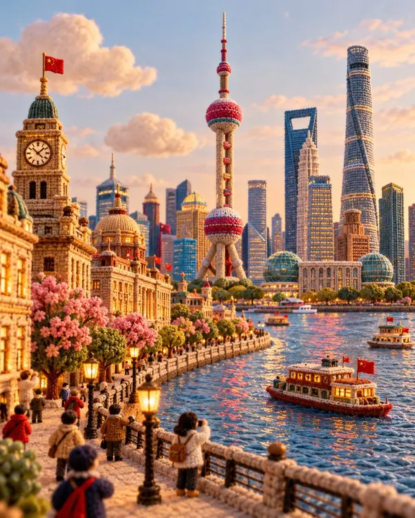
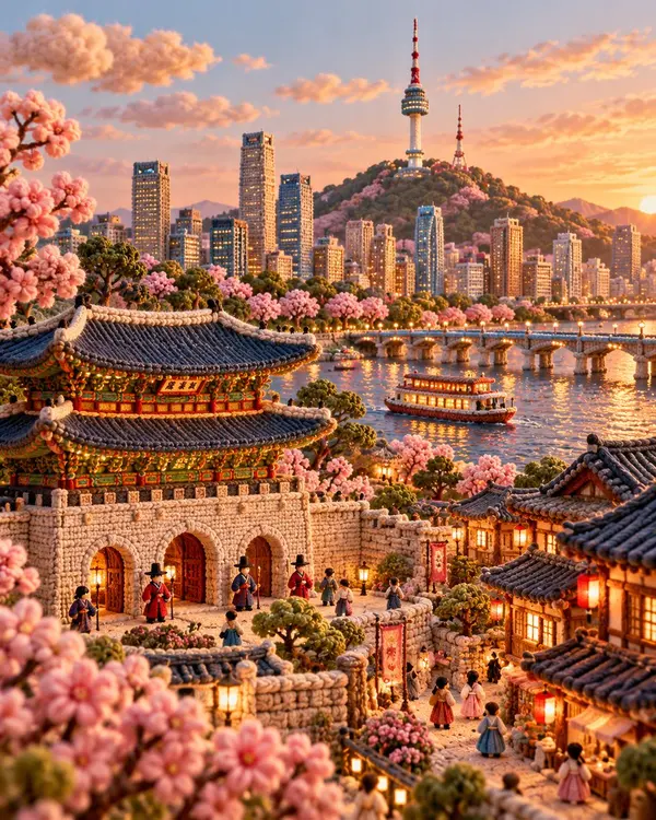
Create a premium 4:5 vertical architectural travel artwork for [COUNTRY / CITY / LOCATION / LANDMARK].
TEXT-TO-IMAGE ONLY — generate the entire scene creatively from [COUNTRY / CITY / LOCATION / LANDMARK] alone. No reference image required.
CORE CONCEPT
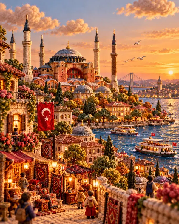
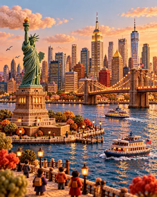
Transform the destination into a charming handcrafted miniature world made entirely from knitted yarn, soft felt, embroidery, and plush textile materials. Reimagine its architecture, streets, nature, transportation, and local atmosphere as a sophisticated collectible textile diorama.
LANDMARK & COMPOSITION
Automatically select ONE unmistakable landmark representing [COUNTRY / CITY / LOCATION / LANDMARK] and make it the central hero.
Build a complete miniature environment around it using authentic local architecture, streets, gardens, trees, shops, landscape, and a few tiny generic yarn characters. Keep the landmark’s recognizable silhouette and defining architectural features while translating everything into rounded handmade textile forms.
MATERIAL LANGUAGE
Every element should visibly feel handmade:
- chunky knitted yarn
- soft felt
- embroidered details
- woven fabric
- stitched edges
- wool fibers
- plush textile surfaces
- tiny handcrafted imperfections
Architecture should look carefully constructed from layered fabric and yarn rather than plastic, clay, or CGI.
ATMOSPHERE
Create a warm, playful, cozy travel atmosphere with soft natural lighting, gentle shadows, tactile fibers, rounded forms, and subtle depth. Add small destination-specific details such as local food, transportation, plants, signs, or cultural objects where they naturally enhance the scene.
Keep the background simple and softly colored so the miniature world remains the focus.
STYLE
Architectural travel poster × knitted miniature diorama × handmade textile art × plush yarn world × sophisticated editorial illustration.
The result should feel like an elaborate handcrafted collectible discovered in a miniature museum — whimsical but visually refined and architecturally recognizable.
COLOR
Use a harmonious palette inspired by the destination itself, combining warm neutrals with a few distinctive local accent colors. Keep the colors soft, rich, and tactile rather than overly bright.
Avoid photorealism, plastic materials, smooth CGI, generic architecture, unrelated landmarks, hard geometric edges, excessive clutter, realistic humans, logos, watermarks, and flat vector illustration.
FORMAT
4:5 vertical, one cohesive miniature world, central landmark, rich textile detail, soft depth of field, premium handcrafted finish, highly detailed yarn and felt textures.
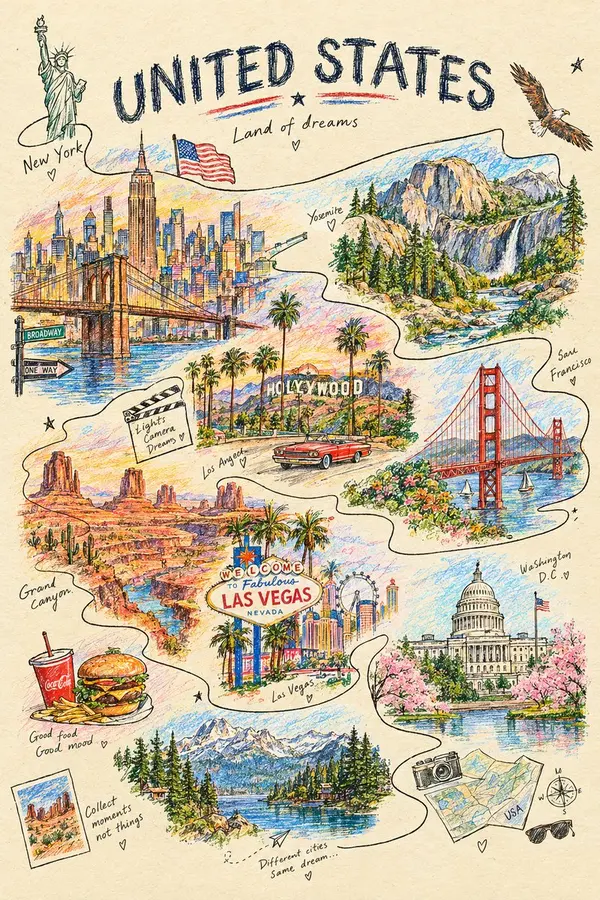
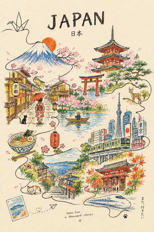
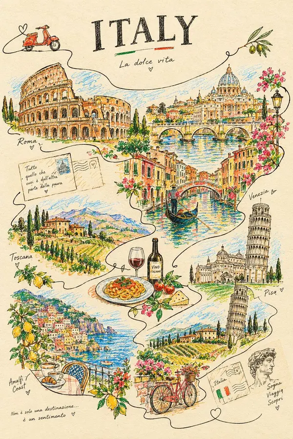
Create a visually stunning minimalist colored-pencil and wax-crayon artwork of [CITY], where the entire city is constructed from one single continuous hand-drawn line. The line begins as a tiny cultural symbol, travels through famous architecture, streets, vehicles, trees, mountains, and everyday life, gradually forming an intricate panoramic cityscape. Add unexpected pops of bright wax-crayon color between the graphite lines, visible paper texture, imperfect handmade strokes, subtle smudges, playful scale changes, and tiny hidden details that reward zooming in. Clean ivory background, sophisticated editorial poster composition, artistic but recognizable, highly detailed, contemporary viral design aesthetic. Add “[CITY]” in bold refined typography at the top.
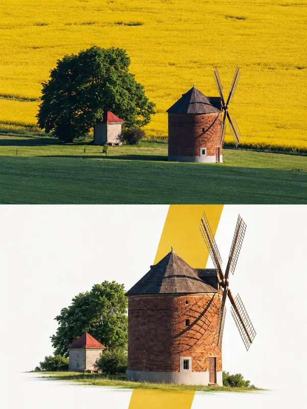
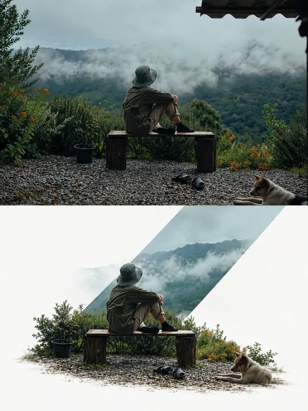
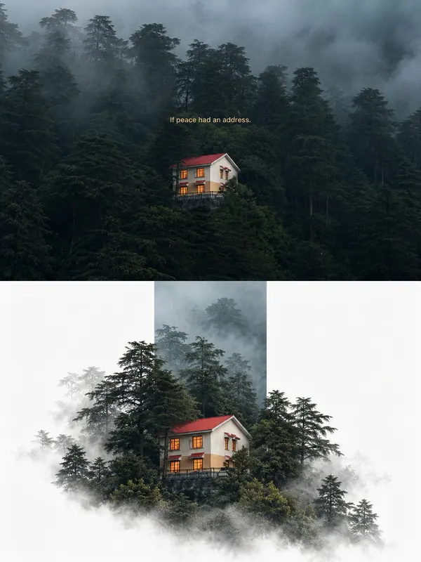
Each uploaded photo must be made into a separate, independent, premium editorial poster, and multiple photos must not be combined. Use a strict 3:4 vertical canvas. Split the canvas horizontally in the exact center: the upper half and the lower half each occupy 50% of the height, are equally wide, and equally high, with no alteration of proportion.
The upper half uses the original photo directly and must not be regenerated. Preserve the identity of the main subject, the human body or architectural structure, proportions, perspective, spatial relationships, texture, natural light and shadow, color, and environment in their entirety. Only slight cropping and restrained premium color grading are permitted; re-drawing the main subject, fictional light, HDR, excessive saturation, plastic texture, and fictional content are prohibited. When needing to adapt to the frame, only environmental areas such as sky, water surface, ground, walls, plants, or background can be extended.
The lower half extracts and reconstructs the "narrative core" of the photo: it can be a single primary subject, or a group of related elements that together embody the photo's identity, scale, action, o story relationship. Maintain its realistic, recognizable appearance, proportion, internal structure, texture, and relative position. Do not remove important related elements, and do not directly use rectangular photo cutouts. The reconstructed subject typically occupies 55%-80% of the width of the lower area. It should naturally extend based on the photo's primary direction and retain plausible ground, water lines, shadows, or softly dissipated edges to integrate into the background, avoiding a sticker-like or floating appearance.
Incorporate a narrow, low-saturation geometric color field behind or through the center of the subject, serving as a "critical window" between reality and editorial abstraction. The color of the window must be extracted from the original photo, and its orientation (horizontal, vertical, or diagonal) chosen based on the overall narrative direction.
The subject must actively pass through the window: part of it is within the color field, and part enters the open negative space, naturally crossing the window's boundary to create occlusion, penetration, and spatial depth. The window is not a frame or a card; it must not fully enclose the subject. Only one primary window is allowed; multiple color blocks, thick borders, rounded corners, strong gradients, and drop shadows are prohibited.
Use a white, cool white, very light gray, or near-white background for the lower half, coordinated with the photo. Employ a restrained asymmetrical composition and abundant negative space to establish a three-tier hierarchy:
Reconstructed subject or narrative composition
Low-saturation geometric window
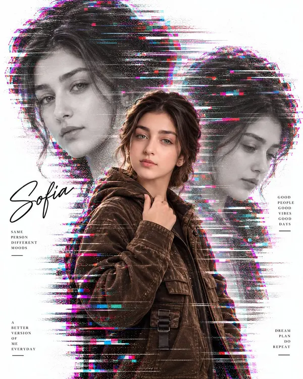
Use the uploaded TARGET IMAGE as the master reference for the poster design.
Create the same premium cinematic glitch-style identity poster, but transform the main subject into a female character named:
SOFIA
REFERENCE IMAGE:
Use the uploaded female reference image as the identity and physical-character reference.
IMPORTANT — FEMALE CHARACTER:
The final subject must be fully female.
Use the reference image for:
- Female face and facial identity
- Facial structure
- Eyes, nose, lips and jawline
- Skin tone
- Hair, hairline and hairstyle
- Body shape and feminine proportions
- Overall feminine physical appearance
Do NOT keep the original male body, masculine shoulders, masculine torso, masculine arms or masculine proportions.
MAIN PORTRAIT:
Replace the original male subject with Sofia.
Create a realistic female body with natural feminine proportions while keeping the target image's overall pose, framing, hand placement and cinematic posture.
CLOTHING:
Adapt the target's clothing naturally to the female body while preserving the same overall outfit style, color, material, folds, texture and cinematic appearance.
BACKGROUND PORTRAITS:
Create two large faded monochrome portraits of the SAME FEMALE PERSON, Sofia:
- Large portrait on the left
- Large portrait on the right
- Different natural facial expressions/angles
- Same face, hair and female identity
- Grayscale/faded treatment
- Integrated with the glitch effect
GLITCH STYLE:
Keep the target's exact visual aesthetic:
- White background
- Cyan, magenta, pink and red RGB separation
- Horizontal digital glitch streaks
- Scanlines
- Pixel displacement
- Digital distortion
- Subtle grain
- Premium editorial photography
- High-resolution cinematic finish
TEXT:
Replace the existing person's name with exactly:
SOFIA
Use “SOFIA” as the elegant handwritten signature in the same approximate position as the original name.
Keep supporting typography such as:
SAME
PERSON
DIFFERENT
MOODS
GOOD
PEOPLE
GOOD
VIBES
GOOD
DAYS
A
BETTER
VERSION
OF
ME
EVERYDAY
DREAM
PLAN
DO
REPEAT
FINAL RULE:
REFERENCE IMAGE = Sofia's face, hair, body shape and feminine identity.
TARGET IMAGE = poster composition, pose, clothing style, lighting, background, glitch effects and typography layout.
The final result must clearly look like the SAME FEMALE PERSON, Sofia, appearing consistently in the main portrait and both background portraits.
Do not retain any male facial features or male body proportions.
Do not add any celebrity identity or unrelated person.
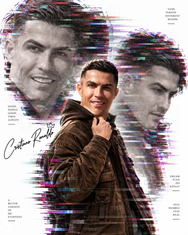
Create a premium cinematic identity poster using:
1. TARGET STYLE / POSTER REFERENCE
2. USER'S REFERENCE IMAGE
3. USER-PROVIDED NAME
IMPORTANT:
Use the TARGET STYLE as the master for the entire composition, layout, pose, clothing style, visual effects, typography placement, and overall design.
Use the USER'S REFERENCE IMAGE only for the person's identity.
IDENTITY:
Transfer the reference person's:
- Face
- Facial structure
- Eyes
- Nose
- Lips
- Jawline
- Skin tone
- Hair
- Hairline
- Hairstyle
- Facial hair/beard, if present
Keep the person's identity highly consistent and recognizable in every appearance.
MAIN PORTRAIT:
Create one sharp, photorealistic full/medium portrait of the reference person in the center.
Preserve the target poster's exact pose, body position, clothing style, hand position, camera angle and composition.
BACKGROUND PORTRAITS:
Create two large faded monochrome portraits of the SAME PERSON behind the main portrait:
- One enlarged portrait on the left
- One enlarged portrait on the right
- Different natural facial expressions/angles
- Soft grayscale treatment
- Subtle transparency
- Integrated with the glitch effects
GLITCH / VISUAL STYLE:
Use the same premium digital-glitch aesthetic:
- RGB color separation
- Cyan, magenta, red and blue digital streaks
- Horizontal glitch fragments
- Scanlines
- Pixel displacement
- Digital distortion
- Subtle film grain
- High-end editorial photography
- Clean white background
- Strong contrast
- Professional cinematic lighting
TEXT:
Replace the existing person's name with the exact name provided by the user:
[USER NAME]
Do NOT invent or change the name.
Keep the supporting typography in the same style and approximate positions:
Top right:
“SAME
PERSON
DIFFERENT
MOODS”
Left:
“GOOD
PEOPLE
GOOD
VIBES
ALWAYS”
Bottom left:
“A
BETTER
VERSION
OF
ME
EVERYDAY”
Right middle:
“DREAM
PLAN
DO
REPEAT”
Bottom right:
“STAY
HUMBLE
STAY
REAL”
Add the user's exact name as an elegant handwritten signature near the lower-left area.
DESIGN RULES:
- Keep the target composition and layout intact.
- Keep the same visual hierarchy.
- Keep the same poster proportions.
- Keep the same glitch treatment.
- Do not copy identity from the target.
- Do not use any celebrity name or celebrity identity.
- Do not invent age, profession, height or other personal information.
- Do not add watermarks, social-media handles or extra promotional text.
FINAL PRIORITY:
REFERENCE IMAGE = person's identity, face, hair and facial hair only.
TARGET STYLE = composition, pose, clothing, background, effects, typography and overall design.
USER INPUT = exact name.
Create a polished, realistic, high-resolution cinematic poster with seamless identity integration.
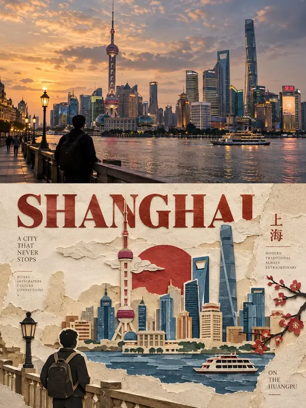
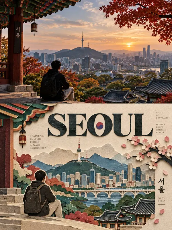
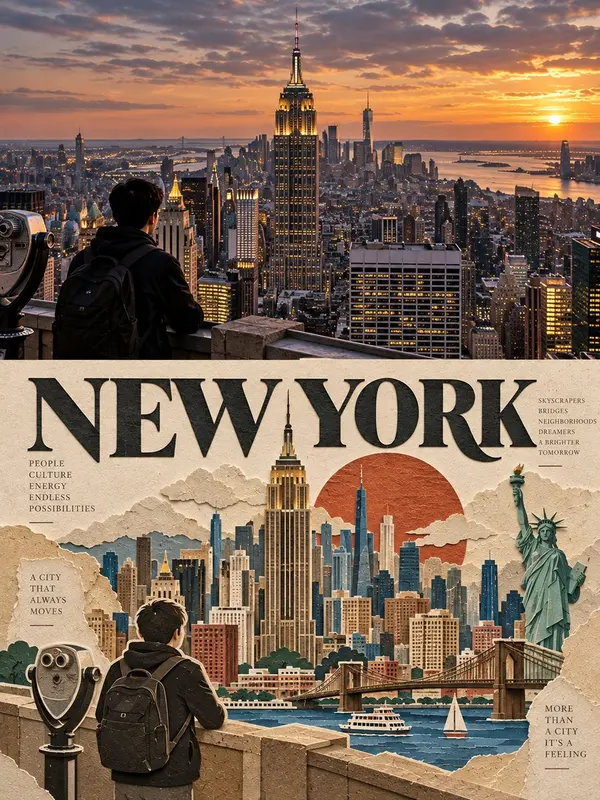
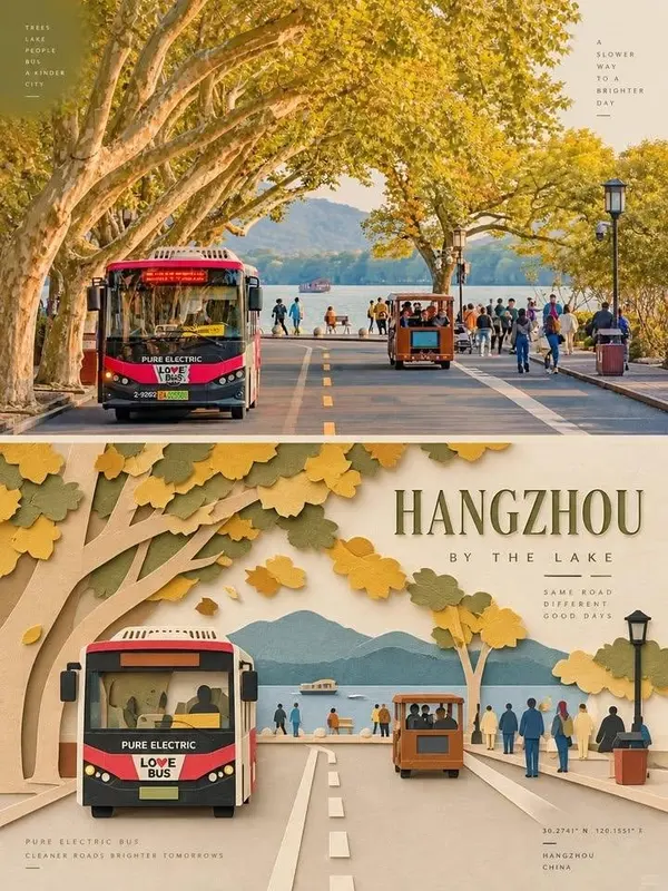
Create one premium 3:4 vertical editorial poster for [COUNTRY / LOCATION / SUBJECT], divided into two exactly equal 50% sections.
TEXT-TO-IMAGE GENERATION ONLY. Generate the complete artwork from [COUNTRY / LOCATION / SUBJECT] alone. No reference image or additional visual input is required.
TOP 50% -PHOTOGRAPHIC SCENE
Create a highly realistic, cinematic photograph representing [COUNTRY / LOCATION / SUBJECT].
Automatically determine the most recognizable subject, pose, architecture, environment, colors, lighting, textures, atmosphere, and composition.
Give the scene a subtle high-end editorial color grade, similar to an art magazine, independent publication, or exhibition photograph. Preserve natural lighting, realistic textures, authentic colors, and believable depth.
The environment may be naturally extended where appropriate, but keep the main subject realistic, correctly proportioned, and undistorted.
BOTTOM 50% - LAYERED PAPER-CUT ART
Reinterpret the key subject from the upper scene as a refined layered paper-cut / handcrafted paper-art composition.
Preserve its most recognizable silhouette, proportions, pose, structure, and spatial relationships, while simplifying unnecessary details.
Build the subject using carefully cut and folded paper layers with clear foreground, midground, and background separation. Use scale contrast, clean alignment, overlapping layers, and controlled negative space to create a sophisticated editorial composition.
Keep one primary subject as the visual anchor and use only a few supporting environmental elements.
COLOR & MATERIAL
Automatically extract the most distinctive colors associated with [COUNTRY / LOCATION / SUBJECT] and reduce them into a limited, harmonious paper-art palette.
Use warm ivory or light paper as the base, combined with a few stronger accent colors, darker structural tones, and subtle transitional shades.
Make the material resemble premium matte cardstock, with fine paper fibers, crisp cut edges, layered thickness, and soft natural contact shadows.
Avoid glossy plastic, excessive 3D effects, neon colors, muddy tones, and complex gradients.
EDITORIAL TYPOGRAPHY
Create one short main English title inspired by the subject's identity, location, action, emotion, or symbolism.
Add 2–4 small groups of supporting English text, such as location details, object names, directional words, numbers, classification labels, material descriptions, or a short poetic phrase.
Do not use any year or date.
Use refined modern typography with a strong hierarchy. Integrate the text into the artwork by aligning it with paper edges, subject contours, geometric axes, or negative space.
Use a mixture of horizontal, vertical, rotated, edge-aligned, and subtly overlapping typography where appropriate.
The main title may have a subtle paper-cut character, while supporting text should remain thin, precise, minimal, and editorial.
FINAL AESTHETIC
Create a seamless combination of:
realistic photography × handcrafted layered paper art × sophisticated editorial typography × premium material design.
The final poster should feel tactile, elegant, contemporary, balanced, refined, and art-directed, like a limited-edition piece from a high-end design magazine or gallery.
STRICT 3:4 VERTICAL | EXACT 50/50 SPLIT | TEXT-ONLY GENERATION | PREMIUM EDITORIAL DESIGN | NO REFERENCE IMAGE REQUIRED.
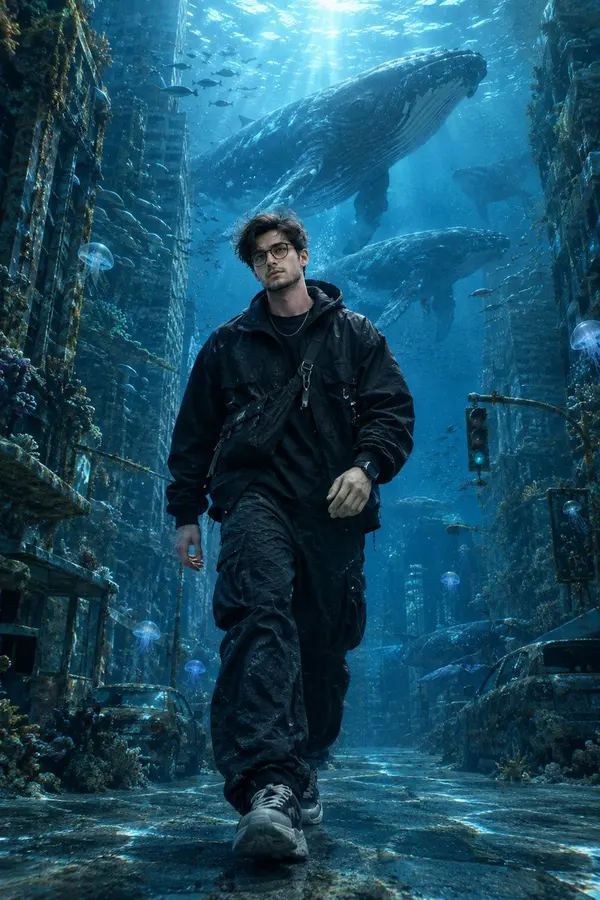
Create an ultra-realistic cinematic photograph of a young handsome man calmly walking through a completely submerged modern city street deep beneath the ocean.
The character is a realistic South Asian young man in his mid-20s, with thick slightly messy wavy black hair, neatly trimmed beard and mustache, expressive deep-brown eyes, natural warm-brown skin, and sharp but realistic facial features. He wears a black oversized waterproof technical jacket, dark cargo trousers, futuristic sneakers, a silver chain, black smartwatch and a small crossbody utility bag. His clothes and hair move naturally underwater.
He is walking slowly along a completely flooded urban street, with realistic skyscrapers rising on both sides, partially covered in algae, coral and marine growth. Traffic lights, abandoned cars, street signs, storefronts and scattered debris are visible beneath the water.
Behind him, several enormous humpback whales gracefully swim between the skyscrapers, creating an incredible sense of scale. Smaller schools of fish move around the buildings, while jellyfish and tiny glowing marine organisms drift through the water.
Sunlight penetrates from the distant ocean surface above, creating beautiful volumetric god rays, caustic light patterns and floating particles throughout the scene. The deeper parts of the city gradually disappear into dark blue ocean haze.
The man's face remains perfectly recognizable and photorealistic, with realistic skin pores, individual hair strands, subtle facial imperfections and natural expression. No cartoon appearance, no plastic skin.
Cinematic composition: full-body character in the center foreground, low-angle perspective, skyscrapers creating strong depth, gigantic whales positioned in the background, atmospheric underwater perspective, dramatic scale contrast.
Photography: professional cinema camera, 35mm lens, f/2.8, shallow depth of field while maintaining the environment, realistic underwater refraction, HDR, natural blue tones, cinematic lighting, high dynamic range, subtle film grain, physically accurate reflections and light scattering.
Style: ultra-photorealistic, cinematic blockbuster frame, realistic human anatomy, realistic underwater physics, highly detailed environment, natural colors, 8K UHD, immersive scale, no text, no watermark, no logos, no cartoon, no CGI-looking character.
A minimalist artistic graphic illustration based on the provided photograph, split or standalone style, featuring a muted cream and off-white textured paper background. The primary subject from the source image is redrawn in a refined, minimalist line-art and stippled dot-work etching style using a rich brick-red and burnt-orange color palette. Soft, semi-transparent overlapping geometric circles create a gentle layered backdrop behind the subject. Elegant minimalist typography blocks are placed neatly on the left side with clean sans-serif layout (including placeholder location coordinates and descriptive text labels). Clean composition, high editorial design aesthetic, vector illustration blend with delicate halftone texture, professional graphic arts poster style.
Create a premium editorial art poster from the uploaded photograph in a strict 3:4 vertical format. Keep the subject, identity, pose, outfit, background, composition, lighting, and mood recognizable and faithful to the original. Apply a subtle sophisticated editorial color grade with a muted palette based on the photo’s natural colors. Add delicate ink sketches, soft gouache textures, paper fibers, and handmade artistic details without overpowering the original image. Use minimal elegant typography only if it enhances the design. The final result should feel like a collectible, modern, poetic, tactile art print.
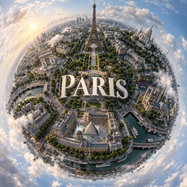
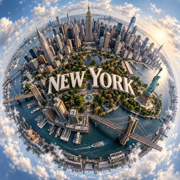
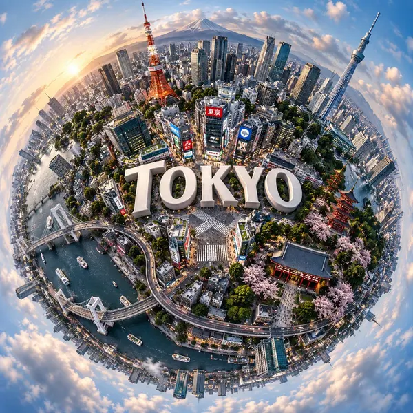
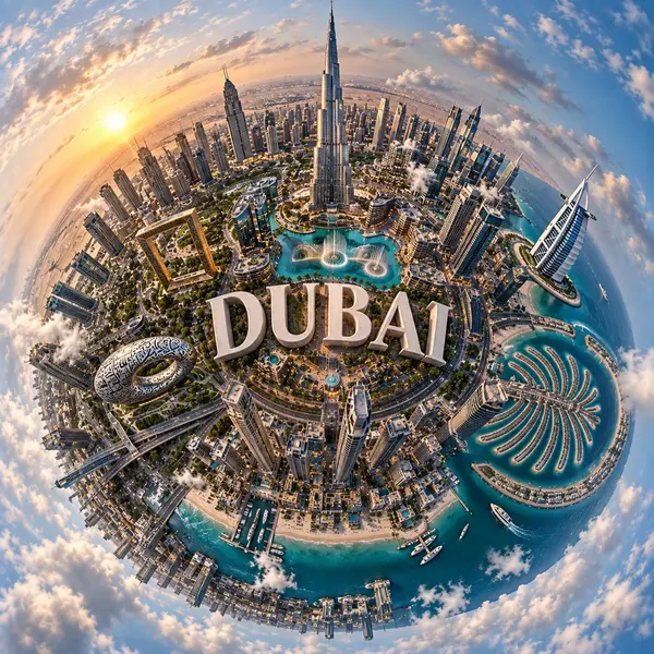
Create a hyper-realistic surreal spherical panorama of a charming [CITY NAME], featuring its most famous landmarks seamlessly curving around a tiny planet-like surface. The entire city should wrap naturally around the spherical landscape, creating a stunning miniature planet effect.
Place the text "[CITY NAME]" prominently at the exact center of the composition, using sleek, elegant white 3D typography seamlessly integrated into the urban landscape. The city name should be clearly readable and visually balanced.
The scene is viewed from a top-down, orbiting perspective that strongly emphasizes the spherical planet effect. Soft, natural daylight filters through a slightly cloudy sky, creating realistic lighting, subtle shadows, atmospheric depth, and a cinematic photorealistic finish.
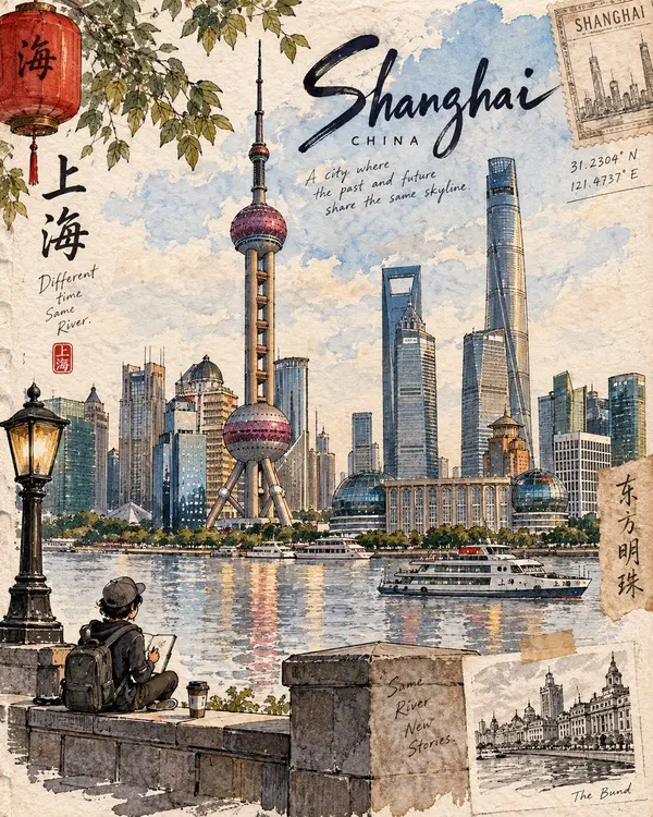
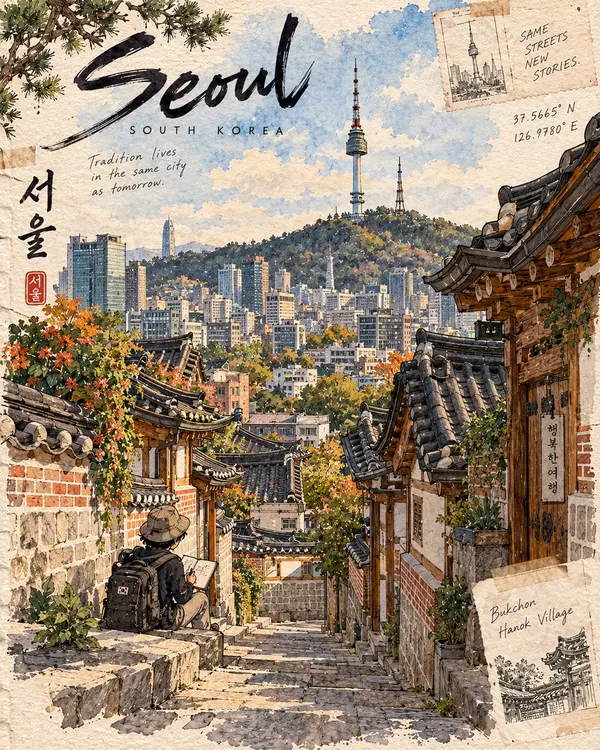
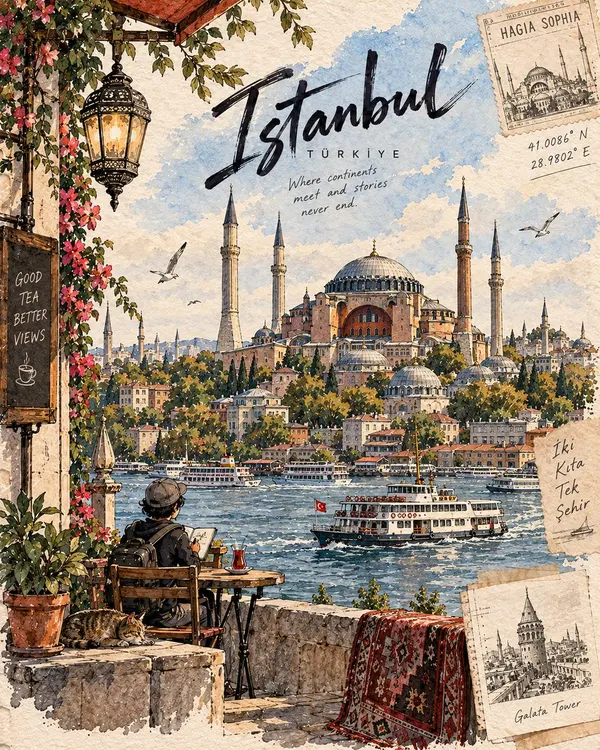
Create a premium 4:5 vertical illustration for the “Destination Sketchbook” series. Use the Matterhorn artwork as the series DNA, not as a literal template.
For [DESTINATION], identify its most distinctive and authentic landmark or place and build the entire scene around it. Prioritize geographic accuracy: landmark, architecture, terrain, vegetation, water, geology, culture, and viewpoint must naturally belong together and be realistically observable from one location. Never create composite landmarks or mix attractions from different places.
COMPOSITION: One dominant hero landmark with 60–70% visual emphasis, strong foreground–middle–background depth, generous negative space, and exactly ONE tiny cute chibi traveler occupying 8–12% of the frame. The traveler should naturally explore, sketch, sit, walk, or observe—not pose for the viewer. Use destination-specific foreground details.
STYLE: Hand-painted travel-journal artwork with expressive dark ink lines, varied line weight, loose watercolor/gouache washes, warm off-white paper, visible grain, subtle pencil marks, imperfect brush edges, natural paint bleeds, and restrained imperfections. It should feel personally observed, tactile, intimate, and handmade—not photorealistic, glossy, vector-like, or generically AI-watercolored.
Make each destination visually unique through its architecture, vegetation, geology, materials, weather, light, culture, textures, and viewpoint, while preserving the same artist identity. Avoid generic tourism clichés and decorative elements unless genuinely relevant.
TEXT: Minimal handwritten editorial lettering:
[LANDMARK NAME]
[LOCATION, COUNTRY]
Optionally add 1–2 short, location-specific observations.
COLOR: Naturally derived from the destination and season. Restrained watercolor palette, subtle accents, visible paper, no neon, excessive contrast, glossy gradients, or artificial cinematic grading.
FINAL: The destination must be immediately recognizable, geographically coherent, landmark-dominant, authentically detailed, and unmistakably part of the Destination Sketchbook series.
OUTPUT: 4:5 vertical premium hand-drawn travel-journal illustration.
Premium luxury 3D miniature travel poster for [CITY_NAME], 3:4 vertical format.
Create an original, sophisticated destination poster combining a raised architectural diorama, elegant vintage travel typography, realistic miniature details, and a beautiful cityscape viewed from a wide three-quarter angle.
CITY IDENTITY
Build the scene specifically around [CITY_NAME], featuring:
One iconic landmark as the main focal point.
The city's recognizable river, lake, coastline, or natural landscape where appropriate.
Local architecture, bridges, streets, and waterfront areas.
One or two authentic transportation elements such as boats, trains, or trams.
Small pedestrians and subtle everyday city activity.
The entire destination should look like a carefully crafted miniature city model sitting on a thick dark stone base.
MAIN DIORAMA
Create a highly detailed raised 3D cityscape with:
miniature buildings
iconic landmark
bridges
waterways
boats or local transport
trees and landscaped areas
tiny streetlights
small pedestrians
warm architectural lighting
realistic water reflections
Use a wide elevated perspective so the city feels expansive while the stone base clearly shows the three-dimensional construction.
SEASON & ATMOSPHERE
Choose the season that best represents [CITY_NAME].
For winter destinations, use elegant snow-covered rooftops, snowy trees, cool blue water, and warm glowing windows.
For warmer destinations, use lush green trees, golden-hour sunlight, warm architecture, and calm reflective water.
Keep the atmosphere premium, peaceful, and visually clean.
TYPOGRAPHY
Place a small elegant tagline at the top, followed by:
[CITY_NAME]
in large sophisticated serif typography.
Below:
[COUNTRY]
Add one short destination-inspired phrase.
Include a small elegant brass or metallic plaque on the front of the stone base containing:
[CITY_NAME]
[COORDINATES]
Typography should be crisp, luxurious, editorial, and correctly spelled.
ART DIRECTION
Luxury miniature architectural model, premium European travel poster, high-end tourism branding, realistic 3D diorama, elegant editorial design, detailed miniature city, refined architectural modeling, soft natural lighting, sophisticated postcard aesthetic.
COLOR SYSTEM
Use warm ivory and cream for the background, balanced with architectural neutrals, deep navy, soft blue, natural greens, muted gray, and subtle warm golden lighting.
Keep the palette elegant, slightly desaturated, cohesive, and luxurious.
MOOD
Timeless, peaceful, luxurious, refined, romantic, sophisticated, and atmospheric.
IMPORTANT QUALITY RULES
Make the composition unique to [CITY_NAME].
Adapt the landmark, architecture, geography, transportation, season, viewpoint, and city layout specifically to the destination.
The raised stone base must remain clearly visible and convincingly three-dimensional.
Keep the city detailed but uncluttered. The landmark should be recognizable without overwhelming the entire composition.
NEGATIVE PROMPT
No generic city. No copied template. No random landmarks. No landmark collage. No flat illustration. No watercolor. No painterly brushwork. No messy composition. No excessive snow. No oversized people. No crowded streets. No distorted buildings. No malformed boats or vehicles. No floating architecture. No flat base. No weak 3D depth. No neon colors. No excessive gradients. No cluttered typography. No misspelled text. No watermark. No blurry details. No low-resolution architecture.
A hyper-real premium air-conditioning poster advertisement for a fictional luxury climate brand called AERLUNE, refined in an Orbit-plus-Transit direction with a more curated, gallery-grade visual language. The composition is built around one sleek wall-mounted split air conditioner, centered high on a warm mineral-beige wall, treated as the absolute hero object. From the lower vent opening, the airflow descends in broad, soft, semi-transparent ribbons of cool mist and light, and within this controlled air stream a distilled natural landscape gradually materializes below: a serene alpine forest micro-world with tall conifer silhouettes, mossy ground, low white wildflowers, layered fern textures, shallow morning fog, and filtered sun shafts. The image must feel as if the machine is releasing an atmosphere of purified nature rather than simply blowing cold air.
Framing and composition: vertical poster layout, strict central alignment, generous negative space, clean premium wall plane, air conditioner positioned in the upper third, and the environmental transformation occupying the lower two-thirds. Preserve the core logic of minimal appliance above and nature emerging below, but make the entire frame more curated and refined: fewer visual elements, cleaner spacing, more sculptural airflow, and stronger hierarchy. The forest must clearly remain inside and beneath the descending air column, never reading as a separate pasted landscape. The lower environment should feel like a controlled living installation or spatial reveal, not a wild outdoor scene.
Product design: create a premium wall-mounted air conditioner in matte off-white with elegant edges, subtle seam lines, precise proportions, minimal central branding reading exactly: "AERLUNE", and a discreet engineered vent. The product should look globally premium and contemporary, with soft reflections, flawless casing, and no noisy buttons, no cheap appliance detailing, no distracting LED clutter. The airflow must feel engineered and luxurious, expressed as smooth cool-white vapor ribbons with layered translucency, soft diffusion, and believable directional fall from the vent.
Environmental reveal: inside the airflow field, create a refined forest atmosphere with slender pine trunks, patches of moss, soft undergrowth, delicate white wildflowers, a few airy fern silhouettes, and low drifting fog hugging the ground. Use filtered early-morning light entering from behind and above the forest zone, creating a luminous freshness. Keep the forest slightly simplified and compositionally restrained so the image feels more editorial and curatorial than illustrative. The mood should suggest silence, purity, oxygen, and temperature control. No dense jungle clutter, no excessive wildlife, no fantasy glow overload.
Lighting and color: soft premium commercial key light from upper left across the appliance, with a secondary luminous internal glow emerging from within the forest field. Palette balance: 60% warm mineral beige wall, soft off-white appliance body, and cool mist whites; 30% pine green, moss green, and pale yellow-green filtered foliage; 10% soft sunlight gold and tiny white floral accents. Build a stronger warm-cool contrast than a standard appliance ad so the air stream reads clearly, the forest feels fresh and dimensional, and the overall image feels luxurious without becoming noisy or theatrical.
Materials and finish: hyper-real product photography fused with atmospheric environmental compositing. Show smooth matte casing, realistic vent depth, delicate fog diffusion, soft plant textures, filtered sunlight, fine ground moisture, and premium print-level clarity. The final result should feel like a Cannes-level appliance flagship campaign: elegant, conceptual, tactile, and high-end, with a distinctly curated visual restraint.
Typography: all visible text in English only, minimal and premium. In the upper-left corner place the brand mark exactly: "AERLUNE". Beneath it add exactly: "Quiet climate. Living comfort." Add one refined support line near the upper area exactly: "More freshness, more stillness." Near the lower area add one understated product statement exactly: "Air that feels grown, not made." Typography should be small, spacious, and restrained, never competing with the appliance silhouette or the forest-air transition.
Output and constraints: polished premium appliance poster, product-first hierarchy, no copied source text, no real brand names, no people, no interior furniture, no extra props, no clutter. Keep the appliance geometry correct, airflow physically plausible, forest detail clearly integrated into the descending air, light coherent, and typography crisp. Avoid warped proportions, noisy controls, muddy fog, chaotic vegetation, unreadable text, heavy fantasy effects, dirty greens, black blotches, or drift away from high-end commercial realism.
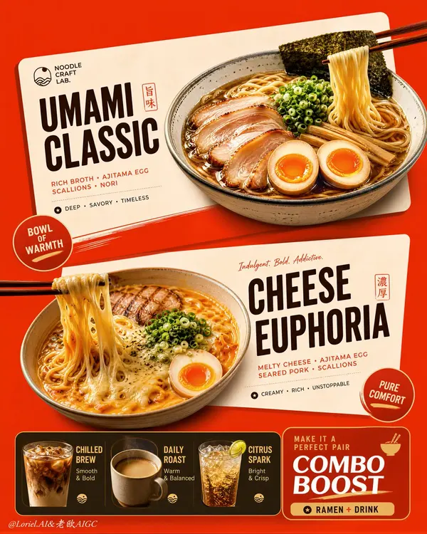
Create an ultra-premium vertical restaurant advertising poster that merges Orbit-style compositional force with Transit-style international polish, preserving the exact logic of a bold ramen combo menu while refining it into a cleaner, sharper, more globally premium flagship campaign. Use one dominant saturated orange-red background field and build the poster around two large cream-toned angled menu-card blocks floating through the center, each framing one ramen hero dish, with a compact drink-combo strip anchored along the bottom. The final image must feel graphic, hot, craveable, modern, and commercially irresistible, with the food and color-block geometry fused into one exact system. Do not copy any original text, logo, price, or wording.
Core composition:
Use a strict vertical poster architecture with three main beats:
1. a bold upper hero card featuring one ramen bowl,
2. a second slightly offset lower hero card featuring another ramen bowl,
3. a compact bottom combo strip featuring three drinks and one combo-offer zone.
The orange-red field must act as the dominant visual stage, while the cream menu-card blocks slice across it with more deliberate angled placement. The whole poster must read instantly as a strong graphic food composition.
Orbit enhancement:
Push the card geometry harder. The two large cream cards should feel more decisively slanted and more dynamically offset, as if they are thrusting the food forward through the page. The bowls, price badges, and chopstick directions should align with these card angles so the entire poster feels driven by one aggressive compositional motion. The upper and lower ramen heroes should feel like two strong visual hits in a diagonal rhythm.
Transit enhancement:
Refine the whole image into a more international flagship restaurant-advertising language. Make the orange-red field cleaner and more premium, the cream cards softer and more elegant, the typography more disciplined, and the supporting elements more restrained. Reduce unnecessary icon clutter and decorative noise. The result should feel like a global fast-casual or modern Asian dining brand campaign with polished international art direction.
Upper ramen hero:
Show one premium ajitsuke tamago-style ramen bowl with rich glossy broth, springy noodles, a halved jammy egg, chopped scallions, and dark nori. The bowl should feel warm, comforting, and immediately craveable. Place it confidently within the upper cream card so the bowl, title zone, and price badge feel locked together.
Lower ramen hero:
Show one indulgent cheese-and-egg ramen variation with melted cheese stretching from lifted noodles, glossy broth, sliced meat or chashu, chopped scallions, and halved egg. The cheese pull should be clean, appetizing, and visually dramatic. Place the bowl so it balances the lower card while still feeling contained by its geometry.
Drink combo strip:
At the bottom, include a narrow premium combo strip with three compact drink modules:
- iced coffee,
- hot coffee,
- cold soda or sparkling drink.
These should feel like clean supporting products, each inside simple rounded or capsule-like graphic areas. Add one strong combo-value block to anchor the strip, but keep the entire bottom section tight, clean, and secondary to the two ramen heroes.
Typography system:
Use bold modern display typography with strong hierarchy and clean scanning logic. Dish names should be large and high-contrast. Price elements should sit in compact circular or capsule badges. Supporting lines should be short and minimal. All wording must be fully original and fictional. The typography must align tightly with the cream card structures and feel globally polished.
Color-block integration:
This is the most important feature. The food must feel inseparable from the color blocks. The orange-red background and cream cards must not behave like passive backgrounds; they must actively shape the poster, frame the dishes, direct the eye, and create rhythm. Bowls, chopsticks, price tags, and text must all appear intentionally positioned according to the card angles and color boundaries.
Lighting:
Use bright premium food-commercial lighting with warm directional clarity. Broths must glow with rich sheen, noodles must feel elastic, eggs must show soft yolk richness, and cheese must feel molten and luxurious. The drinks should show clean reflections and believable temperature cues. Keep lighting appetizing but controlled so the graphic structure remains dominant.
Material rendering:
Render ceramic bowls with subtle glaze reflections, broths with translucent depth, noodles with moist sheen, meats with caramelized texture, cheese with smooth melt physics, eggs with creamy yolks, and drinks with realistic ice, crema, or bubbles. The cream cards should feel matte and graphic, contrasting with the realism of the food.
Background and cleanliness:
Keep the poster tightly controlled and free of clutter. If any subtle texture appears in the orange-red field, keep it minimal and premium. Avoid unnecessary environmental storytelling. This must remain a graphic menu-poster composition first.
Color system:
Use a disciplined premium restaurant palette of orange-red, cream, warm beige, deep brown, black, noodle gold, broth mahogany, egg orange, scallion green, and coffee tones. The overall effect should be vivid, hot, and globally polished.
Image finish:
The final poster must feel like a world-class flagship ramen combo campaign: bold, graphic, product-led, appetizing, and commercially exact. Preserve sharp food detail, strong card geometry, clear typographic hierarchy, and immaculate commercial retouching. 8k, premium restaurant advertising quality.
Negative prompt:
copied brand names, copied pricing, copied slogan, cluttered menu text, weak card angles, weak color-block structure, muddy broth, limp noodles, fake cheese pull, greasy mess, random props, poor hierarchy, dirty background, black blotches, low-resolution food detail
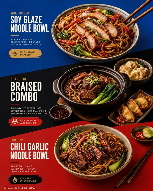
Create an ultra-premium restaurant advertising poster that merges Orbit-style compositional force with Transit-style international polish, preserving the exact structural logic of a bold color-block menu poster while refining it into a cleaner, sharper, more globally premium flagship campaign. Use a tall vertical layout divided into three large graphic color fields with strong angled transitions, where each color block acts as a compositional stage for a specific hero dish or combo. The final artwork must feel bold, graphic, craveable, modern, and Cannes-level commercial, with the food and color planes fused into one precise design system. Do not copy any original text, logo, pricing, or wording.
Core composition:
Use a vertical poster layout with three major stacked sections connected by strong diagonal or slanted color-block cuts.
Top section: a premium blue field featuring one hero stir-fried rice noodle bowl.
Middle section: a deep black-charcoal field featuring one larger family combo or shared meal composition.
Bottom section: a rich red or terracotta-red field featuring a second hero noodle bowl.
The transitions between color fields must feel sharper, more directional, and more deliberate, so the eye travels through the poster in one continuous graphic rhythm.
Orbit enhancement:
Push the structural energy of the color blocks much harder. The diagonal cuts between blue, black, and red should feel more assertive, almost slicing through the page and directing the viewer’s attention from top hero bowl, through the middle combo, into the lower bowl. The placement of bowls, chopsticks, and side dishes should echo these diagonal vectors, so the food itself appears orchestrated by the color geometry. The poster should feel more immediate and more visually aggressive from a distance.
Transit enhancement:
Refine the entire poster into an international flagship restaurant-advertising language. Use purer, more controlled color fields, cleaner typography spacing, calmer negative space, and more elegant hierarchy. The blue should feel fresher and more premium, the black deeper and more sophisticated, and the red more refined and less noisy. The result should feel like a global fast-casual or modern Asian dining brand campaign rather than a crowded local promo poster.
Food and color-block integration:
This is the most important feature. The dishes must feel inseparable from the color fields. Each bowl must sit in its section with exact compositional intention, using plate placement, garnish direction, chopstick angle, and nearby side elements to reinforce the graphic planes. The color blocks should not be passive backgrounds; they must actively frame, support, and sharpen the food presentation.
Top hero bowl:
Show a premium soy-glazed or stir-fried rice noodle bowl with glossy noodles, sliced roasted pork or chicken, red pepper strips, broccoli, scallions, and rich dark sauce sheen. The bowl should feel fresh, balanced, and immediately appetizing against the vivid blue field.
Middle combo section:
Show a richer, more abundant combo arrangement in the black-charcoal section: one deep bowl or clay pot with braised meat and noodles, plus one or two supporting side dishes such as soup, dipping bowl, or appetizer plate. The composition should feel generous but controlled, like a hero combo set for sharing. The darker section should make the warm food highlights glow more dramatically.
Bottom hero bowl:
Show a second noodle variation with deeper glaze, richer meat topping, greens, scallions, and carefully layered garnish. This lower bowl should feel slightly heavier and more indulgent, anchored powerfully against the red field.
Typography system:
Use bold, modern, highly legible menu typography integrated precisely into each section. Main dish names should be large, confident, and clean. Price blocks should sit inside compact contrasting graphic capsules or bold painted labels. Supporting copy must be short, sharp, and minimal. All wording must be fully original and fictional. Typography must align with the color-block structure and never float loosely.
Lighting:
Use bright premium food-commercial lighting with warm directional clarity and controlled highlights. The noodles must show moist elasticity, the meat should catch caramelized gloss, and vegetables should remain fresh and crisp. Keep the lighting polished and appetizing, but clean enough that the graphic composition remains dominant.
Material rendering:
Render noodles with springy tension and sauce sheen, meats with rich caramelized texture, vegetables with natural freshness, eggs or tofu if included with convincing surface detail, ceramic bowls with subtle glaze reflections, and chopsticks with elegant wood texture. The color fields should feel matte, flat, and graphically strong, contrasting with the realism of the food.
Background and cleanliness:
Keep the entire poster highly controlled and clean. No unnecessary pattern overload, no cluttered prop styling, no random elements outside the color-block logic. The graphic planes and food should carry the entire story.
Color system:
Use a disciplined premium palette of saturated but controlled blue, deep black-charcoal, refined terracotta-red, noodle gold, roast mahogany, scallion green, citrus green accents, and small off-white typography. The color blocks must feel bolder and more premium, while the warm food tones unify the poster.
Image finish:
The final poster must feel like a world-class flagship restaurant campaign: bold, directional, graphic, product-led, internationally polished, and instantly memorable. Preserve sharp food detail, precise color-block edges, elegant typography hierarchy, and immaculate commercial retouching. 8k, premium restaurant advertising quality.
Negative prompt:
copied text, copied pricing, copied logo, cluttered layout, weak color blocks, muddy food texture, limp noodles, greasy mess, random props, poor typography hierarchy, dirty background, black blotches, low-resolution food detail
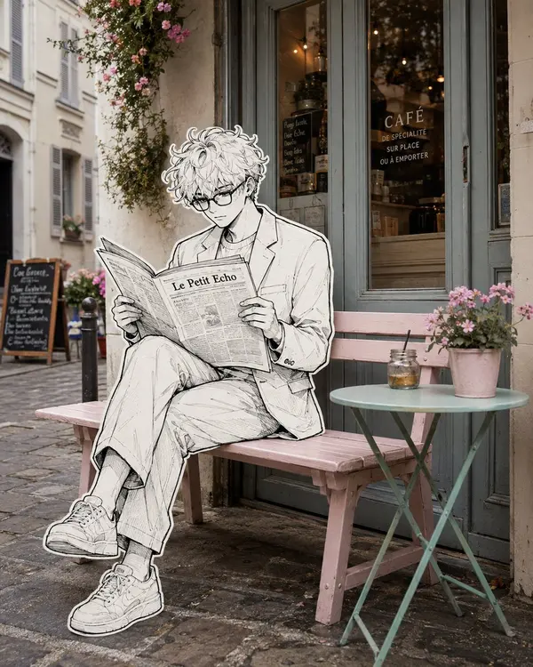
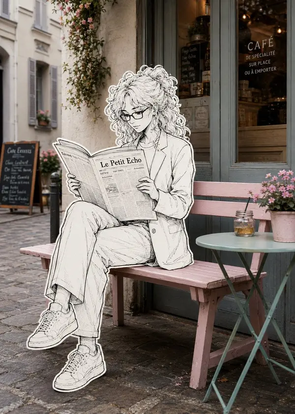
Create a surreal editorial street photograph that seamlessly blends a real-life Parisian café exterior with a hand-drawn black-and-white illustrated character. A stylish young woman with long wavy hair, rectangular glasses, a tailored light blazer and wide-leg trousers sits naturally on a pastel pink wooden bench outside a charming French café, legs crossed, calmly reading a large newspaper. Render the entire woman, her clothing, shoes, hands and newspaper as a detailed monochrome ink illustration with expressive fine linework, delicate cross-hatching, subtle sketch texture and a clean thick white sticker-like outline around her entire silhouette. Keep the café environment completely photorealistic and softly colored: weathered French architecture, muted blue-gray café doors and windows, warm interior lights, cobblestone pavement, climbing flowers, a small mint-green round café table, pink flower pot and glass jar. The illustrated character must physically interact with the real bench and environment with accurate perspective, scale, contact shadows and natural placement. Elegant whimsical mixed-media photography, 2D hand-drawn illustration merged into reality, sophisticated European street aesthetic, subtle film grain, soft natural daylight, realistic depth of field, highly detailed, cinematic composition, photorealistic background, vertical 4:5.
A loose, unfinished watercolor-and-ink travel sketch of New York: fast broken
line, uneven washes, generous bare paper, golden-hour light.
SUBJECT
Hero: the Empire State Building from street level, frontal and slightly
upward-tilted, full height inside the frame, 68–75% of poster height, anchored
on the right third, base in the lower-middle third.
Behind it: the Chrysler crown, small and low left, plus 2–3 soft masses standing
in for Midtown. Nothing else — no Liberty, no Brooklyn Bridge, no Times Square.
Bright white cold-press paper, no cream or sepia cast.
IDENTITY LOCK — the only sustained drawing in the image
(a) stepped Art Deco setbacks narrowing in stages toward the top
(b) continuous vertical piers with recessed window bands — long strokes, never
individual windows
(c) the tiered crown lantern with mooring mast and antenna
These carry the strongest contrast, are never cropped, never fade to blank paper.
COUPLE
A young couple seen from behind, arms linked, walking up the avenue, one
glancing up at the tower. 14–18% of poster height, in the bottom 22–25% band.
Mid-century-cut travel coats; a small handbag, a compact suitcase.
10–15 strokes each — silhouette, hair mass, coat line, legs. No faces, no
fingers, no folds, no third figure. The most resolved human element in the image.
LINE
Contours break, skip, overshoot corners, and stop before meeting; weight varies
within a single edge. Background architecture is gestural only — a roofline, a
corner, an implied vertical. If a building reads in 5–8 strokes, stop at 8.
Never window-by-window, never brick. Some forms exist as wash alone, no line.
WATERCOLOR
Never fill evenly. Within one surface the wash swings from deep pooled pigment
on one side to bare paper on the other. Blooms and backruns with cauliflower
edges, wet-in-wet bleed, hard pooled edges beside dissolved ones, dry-brush
skips, granulation in the grain. Washes overshoot the ink by 5–10% in places and
fall short elsewhere. No object is uniformly colored.
Coverage 55–65%: leave bare paper across most of the sky, the distant city,
sunlit faces, the outer 10–15% of the frame, and gaps in the pavement. Bare
shapes are brush-formed and irregular, never rectangular.
VALUE
6–10 fingernail-sized darks in burnt umber or dark indigo — setback shadows,
window bands, under the awning, beneath the taxi and the couple, tower base.
Drop them into damp wash so they bloom. Without these the image is a flat
pastel smear.
DEPTH
Foreground strongest pigment and clearest line; distance at 15–25% pigment in
dusty blue-gray and hazy peach with almost no line, grouped into 2–3 masses.
LIGHT & COLOR
Golden hour, light raking from the left so the tower has a lit face and a shaded
face. Sky: 3–5 broad strokes, the rest bare paper, no detailed clouds.
Warm limestone cream, pale apricot, warm gray, dusty steel blue, soft graphite.
One saturated accent: taxi yellow. Props, 3 only — a yellow cab from behind, a
lamp post, a striped awning edge.
TEXT
None anywhere: no title, caption, signage, storefront name, street sign, number,
logo, or pseudo-lettering. Signs become abstract shapes. The top 15–18% stays
clean and empty for titling added later.
AVOID
Photorealism, CGI, 3D render, generic AI architecture, hybrid or duplicated
towers, extra setbacks, warped façade, repeating-window artifacts, mechanically
even line weight, floating objects, roads into walls, inconsistent scale,
visible faces, extra figures, flat even fills, uniform contrast at all
distances, edge-to-edge painting, neon color, garbled text.
Bare paper beats invented detail — everywhere except the identity features.
RECOGNITION FIRST, VALUE SECOND, ATMOSPHERE THIRD, DETAIL LAST.
Location: "[LOCATION]"
Create a premium vertical travel-poster illustration of [LOCATION] in a distinctive mixed-media low-poly 3D + handcrafted plasticine/clay diorama style.
Main Scene
Transform [LOCATION] into a highly detailed miniature world emerging from a torn antique geographical map. Make the destination instantly recognizable and geographically accurate.
Include the most iconic features of [LOCATION], such as:
Primary landmark or natural attraction
Characteristic mountains, cliffs, valleys, forests, rivers, waterfalls, coastline, architecture, or terrain
Local vegetation and environmental details
Scale-appropriate visitors, hikers, boats, animals, or vehicles
Authentic local architectural elements where relevant
Visual Style
Combine low-poly 3D geometry for terrain, mountains, rocks, cliffs, buildings, and structures with hand-sculpted plasticine/clay for vegetation, clouds, people, animals, flowers, and smaller details.
Show subtle fingerprints, rounded clay forms, handcrafted imperfections, polygonal facets, realistic physical materials, cinematic depth, atmospheric perspective, and the premium feel of a collectible stop-motion miniature diorama.
Poster Composition
Use a clean, elegant travel-poster layout:
[LOCATION]
"[REGION / COUNTRY]"
Place the title prominently at the top in sophisticated serif typography, with a small minimalist mountain or destination icon above it and a thin decorative line below.
Keep the miniature landscape as the main visual focus across the center and lower portion.
At the bottom, integrate a torn piece of antique map paper featuring:
Country name
Nearby geographic locations
Relevant seas, oceans, rivers, mountains, or regions
Small compass rose
Subtle authentic cartographic markings
The torn map should naturally curl upward around the miniature landscape, creating the illusion that [LOCATION] is physically emerging from the map.
Color & Lighting
Use a sophisticated natural palette appropriate to [LOCATION], with rich greens, earthy stone tones, natural water colors, atmospheric blues, and warm parchment.
Use soft cinematic golden-hour lighting, gentle shadows, realistic ambient occlusion, subtle volumetric atmosphere, and warm highlights across the miniature surfaces.
Important Requirements
Keep the landmark recognizable, geographically believable, and specific to [LOCATION]. Avoid generic scenery, excessive fantasy, incorrect geography, random architecture, or unrelated tourist attractions.
Maintain a clean, premium editorial composition with clearly readable typography and the landscape as the dominant visual focus.
Aspect Ratio: 2:3 vertical
Style: Premium handcrafted travel poster, low-poly 3D, plasticine clay miniature, cinematic diorama, highly detailed, photorealistic miniature photography, elegant editorial design.
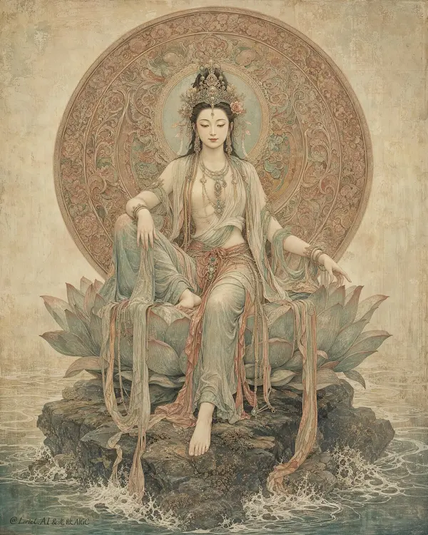
Create an ultra-premium East Asian sacred art poster that merges Orbit-style symbolic monumentality with Transit-style museum-grade elegance, while adding an appropriate faded watercolor-like antique patina across the entire image. Show one serene celestial goddess seated front-facing on a large layered lotus throne rising from dark weathered rocks above shallow swirling water, centered in a tall vertical frame. Behind her head, place one large circular ornamental halo-disc filled with intricate floral and sacred relief patterns, perfectly framing her upper body like a ceremonial mandala. The final artwork must feel sacred, elegant, antique, softly aged, painterly, and collectible, like a rare devotional mural-painting artifact. No title, no logo, no readable text, no real person identity.
Core composition:
Use a strict centered vertical composition with the goddess occupying the full central axis from halo to lotus base. Her seated body must feel calm, monumental, and balanced. One leg lowers naturally toward the rock base while the other rests higher in a graceful asymmetrical pose. The lotus throne and rock base must anchor the composition with strong sacred weight. The circular halo-disc behind her should be large, full, and nearly iconic in scale, creating a powerful devotional silhouette.
Orbit enhancement:
Increase the monumentality of the sacred icon structure. The halo-disc should feel larger and more complete behind the figure, almost pressing the full spiritual force of the image forward. The lotus throne and rock base should feel more substantial and sculptural, giving the figure stronger divine presence. The whole composition should read immediately as a powerful three-part symbol: centered goddess, circular halo, lotus-rock throne.
Transit enhancement:
Refine the image into a more international museum-art language. The palette should feel quieter, more mineral, more elegant, and more globally collectible. Reduce any overly warm or decorative saturation. Keep the lighting restrained, the materials sophisticated, and the overall impression like a high-end exhibition poster for an ancient sacred masterpiece.
Aged light-color patina:
This is the key addition. Apply an appropriate light faded antique wash across the entire image, as if the artwork has lived on silk, fresco plaster, or mineral paper for centuries. The patina should be subtle and beautiful: soft desaturation, slight powdery pigment bloom, gentle worn edges, faint watercolor-like tonal diffusion, and delicate aged surface calm. It must not look dirty or damaged. The result should feel like elegant time-softened color, not decay.
Figure design:
Design an original adult divine feminine figure inspired by classical East Asian sacred sculpture and devotional painting. She must feel compassionate, serene, and spiritually elevated. Her face should be delicate and calm, with lowered eyes, soft brows, subtle lips, and a peaceful meditative expression. Her anatomy must be elegant and natural, with correct shoulders, arms, hands, torso, and posture. She wears layered flowing robes with long trailing sashes and softly revealed upper chest in a sacred historical-art way, always dignified and ceremonial.
Costume and ornament:
Dress her in layered mineral-toned robes of celadon gray-green, faded terracotta, dusty coral, pale parchment, and aged ivory. Add refined antique jewelry, pendant chains, earrings, and a balanced floral-jewel headpiece. The fabrics and ornaments must feel softened by time, as if painted with diluted pigments over an aged surface.
Halo-disc design:
Render the halo as a richly ornamented circular disc with dense floral and sacred scroll relief in muted reddish-brown, aged copper, faded russet, and antique mineral tones. It should feel historical, intricately crafted, and devotional, with slightly softened edges from age.
Lotus and base:
Render the lotus throne as layered and sculptural with desaturated blue-green, gray-teal, and stone-lotus tones. The rock base beneath should feel dark, mineral, and weathered. Add shallow sacred water with gentle pale foam and flowing pattern logic. Everything below the figure must support stillness and icon gravity.
Lighting:
Use soft diffused sacred lighting from upper front-left with very gentle frontal fill. The figure, halo, lotus, and drapery should glow softly through muted tonal transitions. No harsh drama. The light must feel calm, spiritual, and respectful to the antique surface quality.
Material rendering:
Render skin like painted sacred sculpture with matte softness and delicate age integration. Render robes as faded silk-like mineral pigment drapery. Render jewelry with restrained antique-metal detail. Render halo and lotus with painted-relief texture and worn ceremonial richness. Render the full surface with subtle fresco grain, paper tooth, faint crackle, and collector-grade patina.
Background:
Keep the background pale, atmospheric, and minimal, built from parchment beige, faded mineral wash, cloudy plaster texture, and faint devotional atmosphere. No clutter, no crowded architecture, no unrelated objects.
Color system:
Use a restrained sacred palette of celadon gray-green, dusty terracotta, faded coral, aged ivory, parchment beige, muted russet, stone gray, desaturated blue-green, and dark mineral accents. The entire image should feel softened by time and unified by elegant antique color restraint.
Image finish:
The final artwork must feel like a world-class sacred art poster: serene, monumental, collectible, and gently time-worn. Preserve strong detail in the face, crown, halo ornament, robe folds, lotus petals, and rock textures, while bathing the whole piece in a refined aged light-color patina. 8k, museum-grade sacred visual quality.
Negative prompt:
readable text, logo, neon colors, glossy fantasy styling, modern fashion, vulgar exposure, cartoon face, broken hands, extra fingers, missing fingers, distorted anatomy, plastic skin, cluttered background, cheap gold effects, dirty decay, heavy stains, muddy shadows, black blotches, low-detail halo, low-resolution texture
Create an ultra-premium jewelry archive poster that merges a world-class luxury brand design sheet with an East Asian heritage artifact study board. Keep the original structural logic but refine it toward a more international flagship presentation: one pair of exquisite hanging earrings placed at the visual center on a spacious warm-white aged paper ground, surrounded by only a small number of highly disciplined technical sketches, miniature variant studies, elegant manuscript note columns, and one sharpened wooden pencil entering from the lower right corner. The composition must feel calm, expensive, intelligent, and collectible, like a museum-grade design archive reinterpreted as a luxury campaign visual.
Design a new pair of statement earrings inspired by traditional jade, archaic cloud-scroll language, and refined enamel ornament, without copying any existing shape. Each earring should feature a slim polished gold hook, a tiny turquoise connector stone, an elongated white-jade main body with graceful asymmetrical cloud curvature, a compact lower section enriched with deep cobalt-blue enamel floral or wave motifs, delicate gold contour filigree, and one long pale celadon translucent teardrop pendant suspended below. The pair should feel handcrafted and subtly varied, not mechanically mirrored, while still reading as a coherent luxury set. Make the earrings occupy roughly 60 percent of the visual attention and remain the absolute hero.
Push the Transit direction strongly: the page should be cleaner, more spacious, and more elevated, with more controlled negative space, more disciplined object placement, fewer sketch fragments, and a stronger sense of premium restraint. The jewelry should look like it belongs to an international high-jewelry maison presenting a heritage capsule collection. Push the Port direction strongly: compress the image memory into three dominant symbols only, the central earring pair, the surrounding pale technical sketch aura, and the lower-right pencil. Remove unnecessary tiny distractions so the visual identity becomes sharper and more iconic.
Lighting should be soft, refined, and highly controlled from the upper left, creating elegant shallow shadows on the paper, restrained luminous reflections on gold edges, subtle glow through semi-translucent jade, and delicate enamel sheen. Contrast should be gentle but precise, with enough dimensionality to make the jewelry feel tactile and precious while preserving the calm archival atmosphere. The paper background must be matte ivory-white with slight aging, faint fibers, tiny foxing marks, erased graphite residue, and subtle workshop traces, but remain pristine, rarefied, and premium.
Supporting elements must be sparse and intentional: faint graphite contour studies, one or two orthographic geometry diagrams, a few miniature alternate earring thumbnails, one or two proportion grids, and several short vertical columns of newly invented decorative manuscript text with tiny seal-like red accents. These note elements must feel like antique jewelry research annotations, not modern readable branding, and they should remain light and secondary. No copied text, no dominant typography, no loud layout blocks.
Material rendering must be extremely refined: creamy nephrite-like white jade with soft inner translucency, pale celadon pendants with smooth light transmission, polished gold with warm restrained reflections, cobalt enamel with slight depth and handcrafted surface precision, tiny gemstone bezels, elegant hook curvature, and believable jewelry engineering. The pencil should be natural cedar wood with a sharp graphite tip, rendered realistically but kept subordinate.
Style: luxury jewelry campaign, museum archive sheet, heritage object study board, premium product photography fused with technical drawing aesthetics. Color palette: warm ivory paper, white jade, pale celadon, turquoise, cobalt blue, muted antique gold, graphite gray, tiny cinnabar-red seal accents. The overall mood should be noble, scholarly, modernized, and globally premium.
No clutter, no extra jewelry piles, no excessive diagrams, no cheap craft feeling, no plastic texture, no oversaturated color, no loud branding, no modern graphic blocks, no messy stains, no dark dirty patches, no distorted metal hooks, no malformed symmetry, no chaotic text, no watermark, no logo.