Never start from a blank prompt
Find free, ready-to-use prompts for the image you have in mind—no sign-up required.
 Playyy
Find free, ready-to-use prompts for the image you have in mind—no sign-up required.
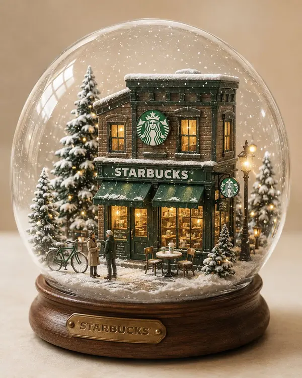
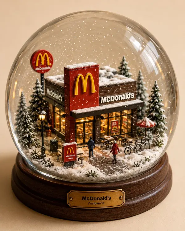
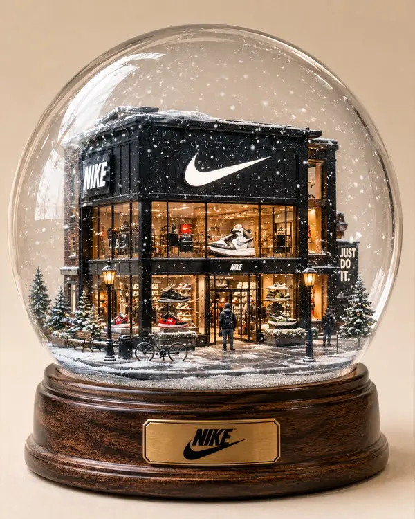
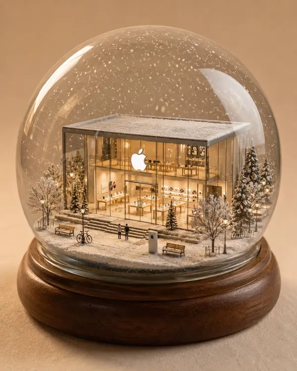
A highly detailed miniature [STORE / BRAND] store inside a beautiful glass snow globe. Signature architecture + logo preserved. Cozy winter street scene with snow-covered trees, tiny street lamps, benches, bicycles and miniature brand props. Warm glowing windows contrasting with the cool snowy environment, 1–2 tiny people for scale. Realistic glass reflections, delicate falling snow, handcrafted miniature details, wooden base, cinematic product photography, soft studio lighting, cream background, whimsical yet premium, 4:5.
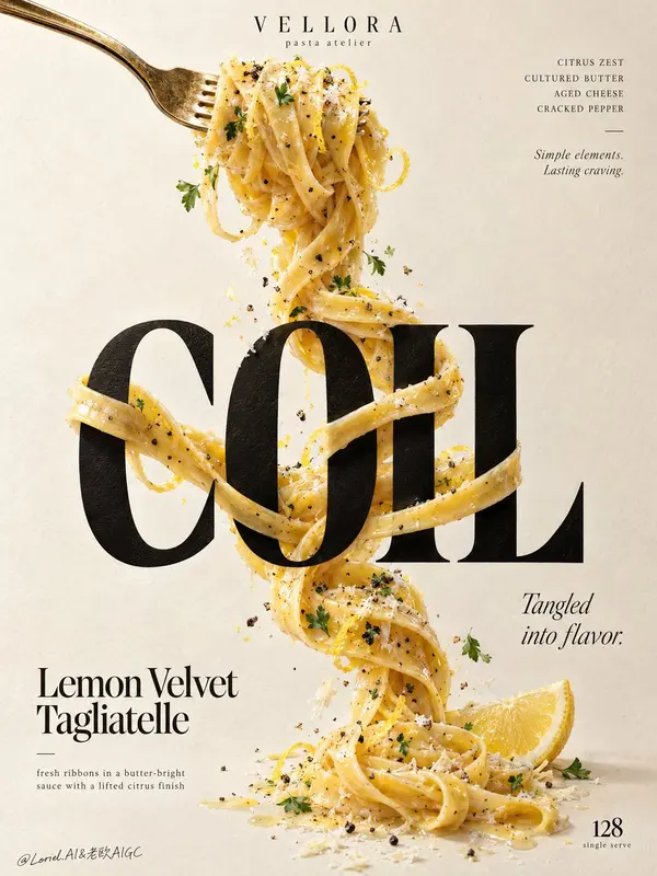
Create a Cannes-grade vertical poster ad for an original premium pasta brand, VELLORA, merging the warmth of a plated dish, the tactile authority of luxury food photography, and the restraint of a curator-led graphic poster. The core idea is a single continuous ribbon of lemon-butter tagliatelle physically twisting around typography, making pasta and letters structurally inseparable. The pasta remains the true visual hero, while the letter interaction delivers the conceptual impact. Use a tall minimalist composition on a warm ivory paper-plaster background with subtle tactile grain and generous negative space. From the upper-left, a polished vintage-gold fork enters diagonally, holding a compact nest of glossy tagliatelle near the top center. From this lifted forkful, one continuous strand descends vertically through the poster, tightening, looping, crossing, and relaxing with believable weight and gravity. At the center, place one monumental ultra-bold black serif display word: "COIL". The pasta wraps around the letter stems, passes behind counters, crosses in front of key edges, and re-emerges with precise occlusion, natural contact shadows, and elegant tension. The strand continues below and resolves near the lower-right with a fresh lemon wedge accent, keeping the movement vertically unified. Render the pasta with exceptional realism: silky ribbons with slight width variation, rich butter emulsion, subtle lemon zest, cracked black pepper, delicate grated aged cheese, and restrained parsley flecks. The noodles should feel freshly tossed, elastic, heavy, and luxurious, with visible drag, torsion, overlap, and sauce cling. Add only a few curated crumbs, pepper granules, zest curls, and tiny herb leaves close to the strand so the image feels alive without clutter. The fork must feel premium and tactile, with brushed metallic highlights, slight edge wear, and refined reflection control. Typography must be entirely original and treated as graphic architecture. At the top center, place a small premium brand lockup reading "VELLORA" with the micro-line "pasta atelier". Top-right: "CITRUS ZEST / CULTURED BUTTER / AGED CHEESE / CRACKED PEPPER", with a small italic line beneath: "Simple elements. Lasting craving." The main central word is "COIL". In the lower-left, place "Lemon Velvet Tagliatelle", with the line "fresh ribbons in a butter-bright sauce with a lifted citrus finish". Mid-right: "Tangled into flavor." Bottom-right: a restrained numeric marker "128" with the tiny line "single serve". All lettering must feel custom-designed, beautifully kerned, spatially embedded, and tonally harmonized with the food, never crude, generic, or blocking the key pasta interaction. Use soft directional daylight from the upper-left with refined studio discipline. The forkful catches creamy highlights, the black display word feels dense and premium without dead flat black, and the pasta carries luminous buttery reflections with layered shadows where it crosses the letters. Build a strong tonal step between the pale background, the dark central word, and the golden pasta so the concept reads instantly from a distance. Color hierarchy: 60% warm ivory and cream paper tones, 25% golden pasta and butter hues, 10% deep black typography, 5% lemon yellow and herb green accents. The overall mood is bright, tactile, elegant, modern, and quietly indulgent. Materials must feel physically coherent and expensive: matte-ink or painted letter surface with subtle paper response, glossy butter-coated pasta with fine semolina texture, irregular grated cheese, crisp pepper granules, moist lemon flesh, and softly reflective metal. Hyper-real food photography merged with high-end editorial poster design, luxury print-ad finish, crisp readable text, believable gravity, clean background, strong product-first hierarchy, no clutter. Avoid floating noodles without support logic, broken or melted strands, warped fork structure, unreadable text, generic menu-board styling, garnish overload, muddy shadows, dirty paper stains, dead black slabs, plastic-looking sauce, stiff pasta geometry, cheap glow, random particles, compositing artifacts, distorted letters, style drift, accidental resemblance to any real brand, or extra props that weaken the central noodle-and-typography interaction.
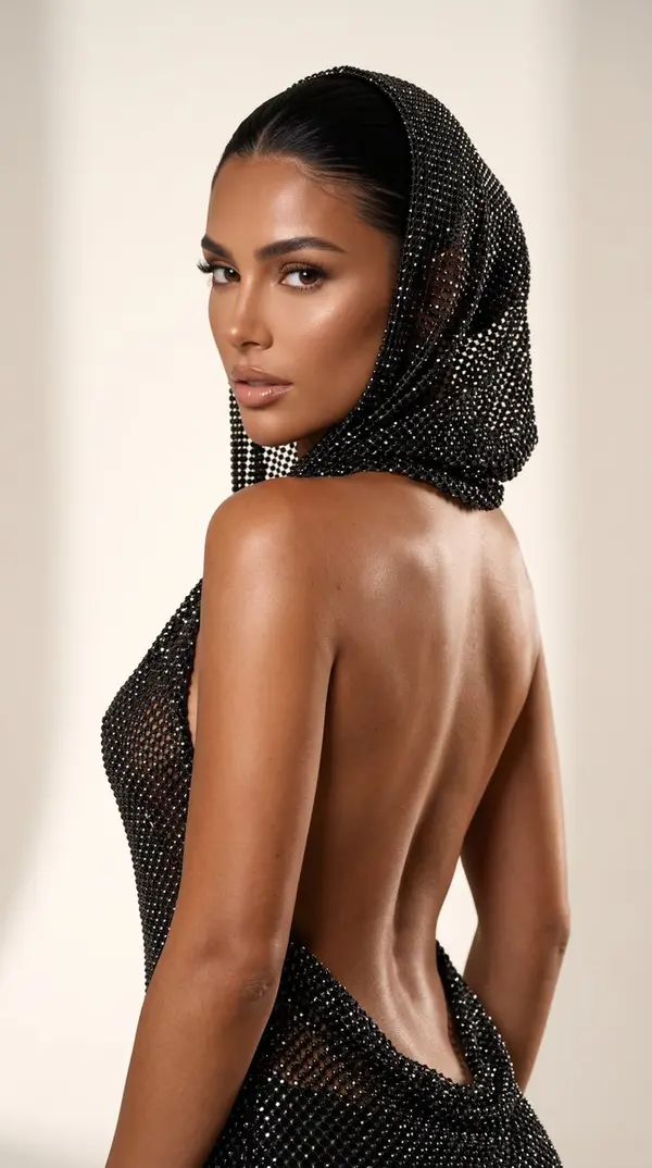
A photorealistic image, A photorealistic image, Ultra-realistic luxury beauty editorial. High-fashion campaign photography. Captured on a Hasselblad X2D 100C with an XCD 90mm f/2.5 V lens. Medium format RAW. Ultra-high dynamic range, exceptional micro-contrast, natural color science, 16-bit color depth, razor-sharp details, 8K realism. A glamorous brunette with an ultra-feminine hourglass figure, tiny waist, naturally full large breasts and curvy hips. Long jet-black hair pulled into a sleek sculpted bun completely hidden beneath the hood. She wears an extraordinary couture hooded mini dress handcrafted from thousands of individually set black hematite crystals and jet-black micro rhinestones. The dress is backless with dramatic open sides, sculpting the body perfectly. The hood drapes elegantly over the head and shoulders. The crystal fabric behaves like liquid metal, creating luxurious reflections while preserving realistic textile weight and movement. Every crystal is individually visible. Skin: Extremely deep Mediterranean bronze tan with rich caramel, honey and mocha undertones, as if naturally sun-kissed for months. Completely even tan with no tan lines. Ultra-realistic skin with visible pores, subtle peach fuzz, tiny natural imperfections and authentic skin texture. The body has a luxurious satin finish, not oily or greasy. Powerful champagne-colored specular highlights illuminate the forehead, temples, cheekbones, nose bridge, shoulders, collarbones, chest, arms, waist, hips and legs. The skin reflects warm golden light like polished bronze while maintaining completely realistic human texture. The body appears velvety smooth, healthy and naturally radiant, with thousands of tiny champagne reflections dancing across the skin under the studio lighting. Editorial luxury beauty campaign aesthetic. Face: Deep bronze complexion with naturally sculpted features, luminous cheekbones, glossy nude lips with a perfectly defined Cupid's bow, feathered brows, ultra-long wispy lashes and highly detailed hazel-green eyes. Bright reflective highlights on the cheekbones, eyelids, nose bridge and lips create an expensive beauty campaign look. Expression: Confident, seductive and powerful. Head slightly turned toward the camera over the shoulder. Direct eye contact. Lips softly parted. Lighting: Luxury beauty campaign lighting. Powerful direct studio flash combined with a large diffused key light and subtle rim lighting. High contrast with clean shadows. Strong champagne and golden highlights across the skin. Inspired by Tom Ford Beauty, Dolce & Gabbana Beauty, Mugler and Balmain campaigns. Background: Minimal warm ivory studio backdrop with soft shadows. Clean luxury editorial environment. No distractions. Camera settings: Hasselblad X2D 100C, XCD 90mm f/2.5 V, f/4, ISO 64, 1/200s, medium-format RAW, extremely high detail, perfect focus on the eyes. Ultra-realistic luxury editorial photography, hyper-realistic skin, visible pores, premium crystal textures, cinematic composition, luxury fashion campaign, expensive goddess aesthetic, museum-quality image, no AI look.
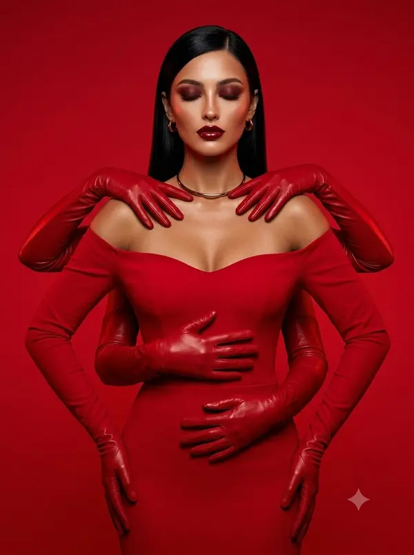
Create an ultra-realistic high-fashion editorial portrait based closely on the reference image. A glamorous woman stands centered against a seamless vivid crimson-red studio background. She wears a luxurious fitted, floor-length red off-the-shoulder gown with long sleeves, a sculpted neckline, and matching glossy red opera gloves. Create a surreal artistic illusion of multiple red-gloved hands surrounding and touching different areas of her body: two gloved hands resting elegantly across her shoulders near her neck, another gloved hand placed across her upper waist/abdomen, and another hand positioned across her lower waist. Additional gloved arms extend naturally from behind her body, creating the illusion of a mysterious multi-armed fashion figure. The hands must look anatomically realistic with five fingers each, natural joints, realistic skin/glove folds, and believable positioning. The woman has sleek, straight, jet-black hair, neatly parted to one side and falling smoothly behind her shoulders. She wears dramatic luxury makeup: deep burgundy-red smoky eyeshadow, softly closed eyes, long defined lashes, sculpted eyebrows, luminous highlighted cheekbones, warm bronzed skin, and glossy deep-red lipstick. Add small elegant gold hoop earrings and a minimal metallic gold choker necklace. Pose her with a calm, confident, mysterious expression and elegant posture. Keep the composition highly symmetrical and visually balanced. The entire scene follows a monochromatic red aesthetic, with rich crimson tones throughout the dress, gloves, and background. Lighting: dramatic professional studio lighting, strong directional red light, soft highlights on the face and shoulders, deep cinematic shadows, subtle rim lighting, glossy reflections on the satin fabric and gloves, realistic skin texture. Photography style: luxury fashion magazine editorial, haute couture campaign, sophisticated beauty photography, cinematic portrait, 85mm lens, shallow depth of field, crisp focus on the face and clothing, realistic proportions, detailed fabric texture, photorealistic rendering, high dynamic range, ultra-detailed, 4K, premium commercial photography. Composition: vertical full-body portrait, subject centered, camera at eye level, clean seamless background, dramatic negative space, elegant and polished fashion campaign aesthetic. Do not change the woman’s facial identity or natural facial proportions if a reference face is provided. Preserve realistic anatomy and consistent facial features. Negative prompt: deformed hands, extra fingers, missing fingers, fused fingers, malformed arms, duplicated face, distorted face, unnatural anatomy, extra body parts, warped clothing, blurry face, low resolution, plastic skin, cartoon, illustration, text, watermark, logo, cropped head, awkward pose.
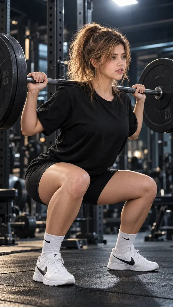
Hyper-realistic IMAX-level Netflix-style cinematic portrait, 9:16 vertical. Use the uploaded image as the primary visual reference and preserve the exact facial identity, proportions, and defining features. Create a beautiful adult woman performing a barbell squat inside a dark, modern gym, wearing an oversized black short-sleeve T-shirt, fitted black athletic shorts, white ribbed crew socks with small black Nike logos, and white Nike training sneakers. A heavy barbell rests horizontally across her upper back and shoulders, with large black weight plates secured on both sides. She grips the bar firmly with both hands just outside shoulder width, elbows angled slightly backward. Her body is lowered into a controlled squat, hips pushed back, knees bent, and feet planted firmly about shoulder-width apart. Her torso remains upright, and her head is turned slightly to her right, eyes focused forward with a calm, concentrated expression. Her dark brown hair is styled in a messy high ponytail, with voluminous, loosely gathered strands and delicate wavy tendrils framing her face and neck. Fair luminous porcelain skin with a bright ivory to light beige tone and a neutral-cool undertone, with natural realistic skin texture and soft highlights, carefully balanced with the gym's dramatic lighting for a lifelike complexion. The background features a shadowy professional weight-training area with blurred gym equipment, metal rack structures, and subtle cool-toned details. A bright, diffused overhead-back light illuminates the edges of her ponytail, face, shoulders, and arms, creating a striking separation from the dark surroundings. **Apply a premium cinematic fitness-editorial colour grade with deep charcoal blacks, cool steel-blue and muted teal shadows, and naturally warm golden-neutral highlights across the skin. Create a dramatic yet realistic chiaroscuro effect, keeping the gym background dark and atmospheric while preserving visible detail in the black clothing and weight plates. Use a controlled filmic S-curve with rich, dimensional shadows, balanced midtones, and soft, carefully rolled-off highlights around the backlight to prevent harsh clipping. Add a subtle cool ambient fill to the shadowed side of her body, balanced by a gentle warm rim light tracing the loose hair strands, cheek, shoulders, and arms. Maintain natural skin colour and realistic texture without excessive smoothing, orange casts, or washed-out highlights. Preserve the deep matte-black tones of her outfit while revealing subtle fabric folds and contours. Keep the white socks and sneakers clean and naturally luminous, with restrained highlights that retain texture. Apply selective contrast, restrained saturation, subtle atmospheric depth, and a refined film-grain finish for a powerful, immersive gym aesthetic. The final colour grading should feel bold, focused, and cinematic, with authentic lighting, rich tonal depth, and a polished high-end sports campaign finish rather than an artificial HDR effect.** Capture the full-body composition from a slightly low, three-quarter side angle, ensuring the entire squat stance, barbell, weight plates, and both sneakers remain visible. Emphasize realistic muscular anatomy, natural squat mechanics, accurate barbell positioning, detailed gym textures, crisp subject focus, and cinematic depth of field. Negative prompt: changed identity, distorted face, deformed hands or fingers, bad anatomy, incorrect squat posture, warped barbell, unnatural pose, plastic skin, excessive HDR, text or watermark.
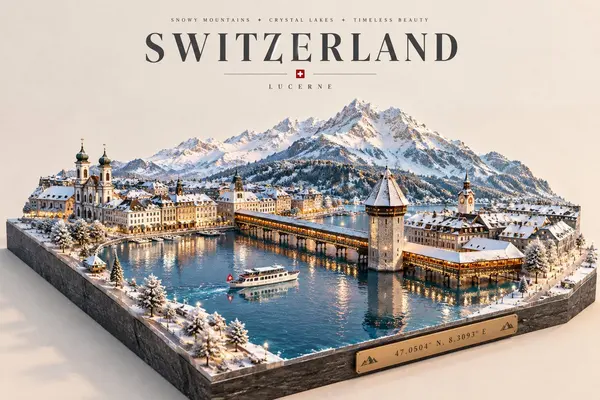
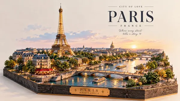
Premium luxury 3D miniature travel poster for [CITY_NAME], 3:4 vertical format. Create an original, sophisticated destination poster combining a raised architectural diorama, elegant vintage travel typography, realistic miniature details, and a beautiful cityscape viewed from a wide three-quarter angle. CITY IDENTITY Build the scene specifically around [CITY_NAME], featuring: One iconic landmark as the main focal point. The city's recognizable river, lake, coastline, or natural landscape where appropriate. Local architecture, bridges, streets, and waterfront areas. One or two authentic transportation elements such as boats, trains, or trams. Small pedestrians and subtle everyday city activity. The entire destination should look like a carefully crafted miniature city model sitting on a thick dark stone base. MAIN DIORAMA Create a highly detailed raised 3D cityscape with: miniature buildings iconic landmark bridges waterways boats or local transport trees and landscaped areas tiny streetlights small pedestrians warm architectural lighting realistic water reflections Use a wide elevated perspective so the city feels expansive while the stone base clearly shows the three-dimensional construction. SEASON & ATMOSPHERE Choose the season that best represents [CITY_NAME]. For winter destinations, use elegant snow-covered rooftops, snowy trees, cool blue water, and warm glowing windows. For warmer destinations, use lush green trees, golden-hour sunlight, warm architecture, and calm reflective water. Keep the atmosphere premium, peaceful, and visually clean. TYPOGRAPHY Place a small elegant tagline at the top, followed by: [CITY_NAME] in large sophisticated serif typography. Below: [COUNTRY] Add one short destination-inspired phrase. Include a small elegant brass or metallic plaque on the front of the stone base containing: [CITY_NAME] [COORDINATES] Typography should be crisp, luxurious, editorial, and correctly spelled. ART DIRECTION Luxury miniature architectural model, premium European travel poster, high-end tourism branding, realistic 3D diorama, elegant editorial design, detailed miniature city, refined architectural modeling, soft natural lighting, sophisticated postcard aesthetic. COLOR SYSTEM Use warm ivory and cream for the background, balanced with architectural neutrals, deep navy, soft blue, natural greens, muted gray, and subtle warm golden lighting. Keep the palette elegant, slightly desaturated, cohesive, and luxurious. MOOD Timeless, peaceful, luxurious, refined, romantic, sophisticated, and atmospheric. IMPORTANT QUALITY RULES Make the composition unique to [CITY_NAME]. Adapt the landmark, architecture, geography, transportation, season, viewpoint, and city layout specifically to the destination. The raised stone base must remain clearly visible and convincingly three-dimensional. Keep the city detailed but uncluttered. The landmark should be recognizable without overwhelming the entire composition. NEGATIVE PROMPT No generic city. No copied template. No random landmarks. No landmark collage. No flat illustration. No watercolor. No painterly brushwork. No messy composition. No excessive snow. No oversized people. No crowded streets. No distorted buildings. No malformed boats or vehicles. No floating architecture. No flat base. No weak 3D depth. No neon colors. No excessive gradients. No cluttered typography. No misspelled text. No watermark. No blurry details. No low-resolution architecture.
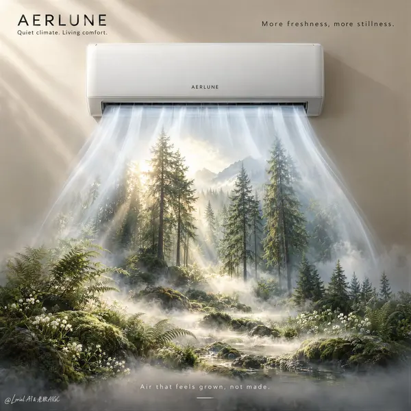
A hyper-real premium air-conditioning poster advertisement for a fictional luxury climate brand called AERLUNE, refined in an Orbit-plus-Transit direction with a more curated, gallery-grade visual language. The composition is built around one sleek wall-mounted split air conditioner, centered high on a warm mineral-beige wall, treated as the absolute hero object. From the lower vent opening, the airflow descends in broad, soft, semi-transparent ribbons of cool mist and light, and within this controlled air stream a distilled natural landscape gradually materializes below: a serene alpine forest micro-world with tall conifer silhouettes, mossy ground, low white wildflowers, layered fern textures, shallow morning fog, and filtered sun shafts. The image must feel as if the machine is releasing an atmosphere of purified nature rather than simply blowing cold air. Framing and composition: vertical poster layout, strict central alignment, generous negative space, clean premium wall plane, air conditioner positioned in the upper third, and the environmental transformation occupying the lower two-thirds. Preserve the core logic of minimal appliance above and nature emerging below, but make the entire frame more curated and refined: fewer visual elements, cleaner spacing, more sculptural airflow, and stronger hierarchy. The forest must clearly remain inside and beneath the descending air column, never reading as a separate pasted landscape. The lower environment should feel like a controlled living installation or spatial reveal, not a wild outdoor scene. Product design: create a premium wall-mounted air conditioner in matte off-white with elegant edges, subtle seam lines, precise proportions, minimal central branding reading exactly: "AERLUNE", and a discreet engineered vent. The product should look globally premium and contemporary, with soft reflections, flawless casing, and no noisy buttons, no cheap appliance detailing, no distracting LED clutter. The airflow must feel engineered and luxurious, expressed as smooth cool-white vapor ribbons with layered translucency, soft diffusion, and believable directional fall from the vent. Environmental reveal: inside the airflow field, create a refined forest atmosphere with slender pine trunks, patches of moss, soft undergrowth, delicate white wildflowers, a few airy fern silhouettes, and low drifting fog hugging the ground. Use filtered early-morning light entering from behind and above the forest zone, creating a luminous freshness. Keep the forest slightly simplified and compositionally restrained so the image feels more editorial and curatorial than illustrative. The mood should suggest silence, purity, oxygen, and temperature control. No dense jungle clutter, no excessive wildlife, no fantasy glow overload. Lighting and color: soft premium commercial key light from upper left across the appliance, with a secondary luminous internal glow emerging from within the forest field. Palette balance: 60% warm mineral beige wall, soft off-white appliance body, and cool mist whites; 30% pine green, moss green, and pale yellow-green filtered foliage; 10% soft sunlight gold and tiny white floral accents. Build a stronger warm-cool contrast than a standard appliance ad so the air stream reads clearly, the forest feels fresh and dimensional, and the overall image feels luxurious without becoming noisy or theatrical. Materials and finish: hyper-real product photography fused with atmospheric environmental compositing. Show smooth matte casing, realistic vent depth, delicate fog diffusion, soft plant textures, filtered sunlight, fine ground moisture, and premium print-level clarity. The final result should feel like a Cannes-level appliance flagship campaign: elegant, conceptual, tactile, and high-end, with a distinctly curated visual restraint. Typography: all visible text in English only, minimal and premium. In the upper-left corner place the brand mark exactly: "AERLUNE". Beneath it add exactly: "Quiet climate. Living comfort." Add one refined support line near the upper area exactly: "More freshness, more stillness." Near the lower area add one understated product statement exactly: "Air that feels grown, not made." Typography should be small, spacious, and restrained, never competing with the appliance silhouette or the forest-air transition. Output and constraints: polished premium appliance poster, product-first hierarchy, no copied source text, no real brand names, no people, no interior furniture, no extra props, no clutter. Keep the appliance geometry correct, airflow physically plausible, forest detail clearly integrated into the descending air, light coherent, and typography crisp. Avoid warped proportions, noisy controls, muddy fog, chaotic vegetation, unreadable text, heavy fantasy effects, dirty greens, black blotches, or drift away from high-end commercial realism.
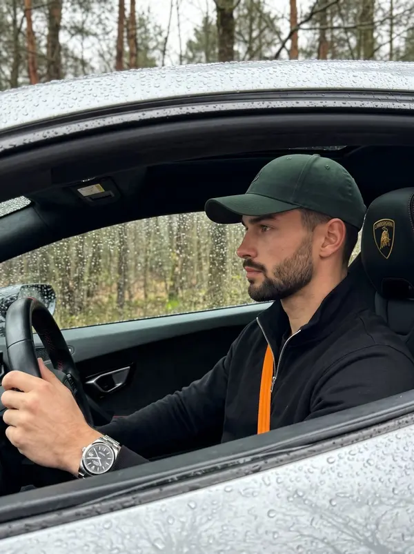
A young adult handsome male is captured in a candid, centered profile view while sitting in the driver's seat of a luxury sports car, wearing a dark green baseball cap and a black zip-up jacket. His expression is serious yet calm, characterized by relaxed eyebrows, a neutral mouth, and a focused direct gaze. The visible portions of his naturally straight to slightly wavy hair feature a neat fade at the sideburns and temple, compressed naturally beneath the cap, with slight organic unevenness blending seamlessly into light facial stubble. His relaxed left hand rests casually on the dark grey steering wheel, fingers gently curled over the rim, revealing a silver metal watch with a black dia. He interacts with a tactile environment, framed by an olive green car door and glass window completely speckled with perfectly crisp, raised circular and streaking clear water droplets from the rain. Inside the deep, dark interior, a subtle orange and red stitching marker is visible on the steering wheel, positioned near a black sport seat headrest that features a vivid gold-yellow embroidered Lamborghini shield logo and a bright orange seatbelt. In the blurred, deep background beyond the wet window glass and pristine black rubber trim, an overcast forest line of weathered bare trees with early budding leaves. The scene is illuminated by single-source, 90-degree side natural window light that casts a cool, blue-tinted diffused soft glow, establishing a moody, rainy day luxury aesthetic. Short, soft gradual gray shadows fall smoothly on the right side of his face and the deep interior, while preserved highlights accentuate his left cheekbone, his jawline, and the specular glints on the exterior raindrops. The split-complementary color profile utilizes dominant olive green and black, accented by desaturated environmental greys and vibrant pops of yellow, creating an asymmetrically balanced atmosphere. Shot as a cinematic editorial lifestyle portrait with a 35mm-50mm lens at f/2.8 to f/4, a shutter speed of 1/250s, and ISO 400, the tack-sharp realistic photograph employs a medium depth of field to keep the subject and foreground water droplets flawlessly clear while smoothly blurring the background elements, processed with cool atmospheric color grading and framed in a 3:4 aspect ratio.
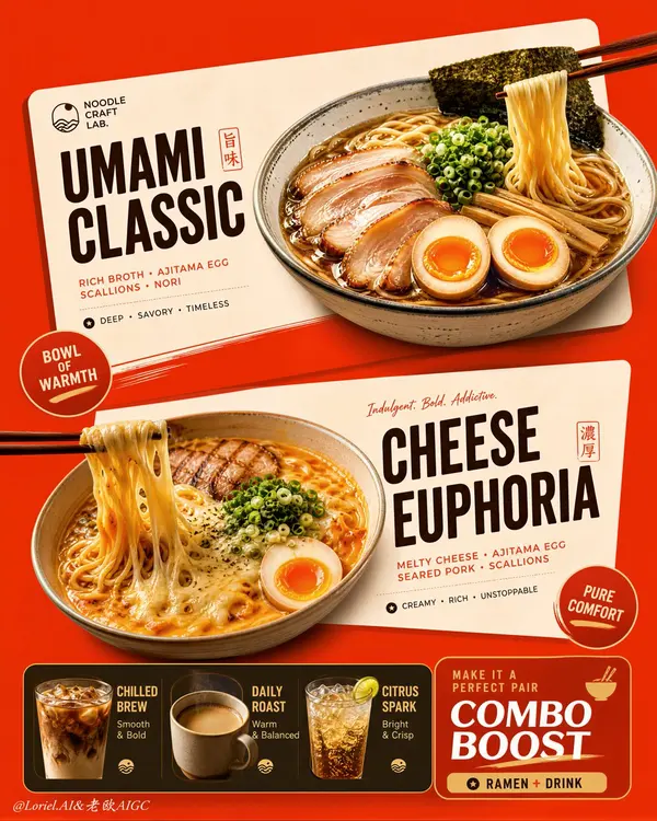
Create an ultra-premium vertical restaurant advertising poster that merges Orbit-style compositional force with Transit-style international polish, preserving the exact logic of a bold ramen combo menu while refining it into a cleaner, sharper, more globally premium flagship campaign. Use one dominant saturated orange-red background field and build the poster around two large cream-toned angled menu-card blocks floating through the center, each framing one ramen hero dish, with a compact drink-combo strip anchored along the bottom. The final image must feel graphic, hot, craveable, modern, and commercially irresistible, with the food and color-block geometry fused into one exact system. Do not copy any original text, logo, price, or wording. Core composition: Use a strict vertical poster architecture with three main beats: 1. a bold upper hero card featuring one ramen bowl, 2. a second slightly offset lower hero card featuring another ramen bowl, 3. a compact bottom combo strip featuring three drinks and one combo-offer zone. The orange-red field must act as the dominant visual stage, while the cream menu-card blocks slice across it with more deliberate angled placement. The whole poster must read instantly as a strong graphic food composition. Orbit enhancement: Push the card geometry harder. The two large cream cards should feel more decisively slanted and more dynamically offset, as if they are thrusting the food forward through the page. The bowls, price badges, and chopstick directions should align with these card angles so the entire poster feels driven by one aggressive compositional motion. The upper and lower ramen heroes should feel like two strong visual hits in a diagonal rhythm. Transit enhancement: Refine the whole image into a more international flagship restaurant-advertising language. Make the orange-red field cleaner and more premium, the cream cards softer and more elegant, the typography more disciplined, and the supporting elements more restrained. Reduce unnecessary icon clutter and decorative noise. The result should feel like a global fast-casual or modern Asian dining brand campaign with polished international art direction. Upper ramen hero: Show one premium ajitsuke tamago-style ramen bowl with rich glossy broth, springy noodles, a halved jammy egg, chopped scallions, and dark nori. The bowl should feel warm, comforting, and immediately craveable. Place it confidently within the upper cream card so the bowl, title zone, and price badge feel locked together. Lower ramen hero: Show one indulgent cheese-and-egg ramen variation with melted cheese stretching from lifted noodles, glossy broth, sliced meat or chashu, chopped scallions, and halved egg. The cheese pull should be clean, appetizing, and visually dramatic. Place the bowl so it balances the lower card while still feeling contained by its geometry. Drink combo strip: At the bottom, include a narrow premium combo strip with three compact drink modules: - iced coffee, - hot coffee, - cold soda or sparkling drink. These should feel like clean supporting products, each inside simple rounded or capsule-like graphic areas. Add one strong combo-value block to anchor the strip, but keep the entire bottom section tight, clean, and secondary to the two ramen heroes. Typography system: Use bold modern display typography with strong hierarchy and clean scanning logic. Dish names should be large and high-contrast. Price elements should sit in compact circular or capsule badges. Supporting lines should be short and minimal. All wording must be fully original and fictional. The typography must align tightly with the cream card structures and feel globally polished. Color-block integration: This is the most important feature. The food must feel inseparable from the color blocks. The orange-red background and cream cards must not behave like passive backgrounds; they must actively shape the poster, frame the dishes, direct the eye, and create rhythm. Bowls, chopsticks, price tags, and text must all appear intentionally positioned according to the card angles and color boundaries. Lighting: Use bright premium food-commercial lighting with warm directional clarity. Broths must glow with rich sheen, noodles must feel elastic, eggs must show soft yolk richness, and cheese must feel molten and luxurious. The drinks should show clean reflections and believable temperature cues. Keep lighting appetizing but controlled so the graphic structure remains dominant. Material rendering: Render ceramic bowls with subtle glaze reflections, broths with translucent depth, noodles with moist sheen, meats with caramelized texture, cheese with smooth melt physics, eggs with creamy yolks, and drinks with realistic ice, crema, or bubbles. The cream cards should feel matte and graphic, contrasting with the realism of the food. Background and cleanliness: Keep the poster tightly controlled and free of clutter. If any subtle texture appears in the orange-red field, keep it minimal and premium. Avoid unnecessary environmental storytelling. This must remain a graphic menu-poster composition first. Color system: Use a disciplined premium restaurant palette of orange-red, cream, warm beige, deep brown, black, noodle gold, broth mahogany, egg orange, scallion green, and coffee tones. The overall effect should be vivid, hot, and globally polished. Image finish: The final poster must feel like a world-class flagship ramen combo campaign: bold, graphic, product-led, appetizing, and commercially exact. Preserve sharp food detail, strong card geometry, clear typographic hierarchy, and immaculate commercial retouching. 8k, premium restaurant advertising quality. Negative prompt: copied brand names, copied pricing, copied slogan, cluttered menu text, weak card angles, weak color-block structure, muddy broth, limp noodles, fake cheese pull, greasy mess, random props, poor hierarchy, dirty background, black blotches, low-resolution food detail
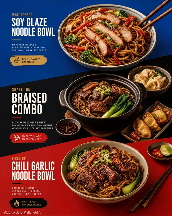
Create an ultra-premium restaurant advertising poster that merges Orbit-style compositional force with Transit-style international polish, preserving the exact structural logic of a bold color-block menu poster while refining it into a cleaner, sharper, more globally premium flagship campaign. Use a tall vertical layout divided into three large graphic color fields with strong angled transitions, where each color block acts as a compositional stage for a specific hero dish or combo. The final artwork must feel bold, graphic, craveable, modern, and Cannes-level commercial, with the food and color planes fused into one precise design system. Do not copy any original text, logo, pricing, or wording. Core composition: Use a vertical poster layout with three major stacked sections connected by strong diagonal or slanted color-block cuts. Top section: a premium blue field featuring one hero stir-fried rice noodle bowl. Middle section: a deep black-charcoal field featuring one larger family combo or shared meal composition. Bottom section: a rich red or terracotta-red field featuring a second hero noodle bowl. The transitions between color fields must feel sharper, more directional, and more deliberate, so the eye travels through the poster in one continuous graphic rhythm. Orbit enhancement: Push the structural energy of the color blocks much harder. The diagonal cuts between blue, black, and red should feel more assertive, almost slicing through the page and directing the viewer’s attention from top hero bowl, through the middle combo, into the lower bowl. The placement of bowls, chopsticks, and side dishes should echo these diagonal vectors, so the food itself appears orchestrated by the color geometry. The poster should feel more immediate and more visually aggressive from a distance. Transit enhancement: Refine the entire poster into an international flagship restaurant-advertising language. Use purer, more controlled color fields, cleaner typography spacing, calmer negative space, and more elegant hierarchy. The blue should feel fresher and more premium, the black deeper and more sophisticated, and the red more refined and less noisy. The result should feel like a global fast-casual or modern Asian dining brand campaign rather than a crowded local promo poster. Food and color-block integration: This is the most important feature. The dishes must feel inseparable from the color fields. Each bowl must sit in its section with exact compositional intention, using plate placement, garnish direction, chopstick angle, and nearby side elements to reinforce the graphic planes. The color blocks should not be passive backgrounds; they must actively frame, support, and sharpen the food presentation. Top hero bowl: Show a premium soy-glazed or stir-fried rice noodle bowl with glossy noodles, sliced roasted pork or chicken, red pepper strips, broccoli, scallions, and rich dark sauce sheen. The bowl should feel fresh, balanced, and immediately appetizing against the vivid blue field. Middle combo section: Show a richer, more abundant combo arrangement in the black-charcoal section: one deep bowl or clay pot with braised meat and noodles, plus one or two supporting side dishes such as soup, dipping bowl, or appetizer plate. The composition should feel generous but controlled, like a hero combo set for sharing. The darker section should make the warm food highlights glow more dramatically. Bottom hero bowl: Show a second noodle variation with deeper glaze, richer meat topping, greens, scallions, and carefully layered garnish. This lower bowl should feel slightly heavier and more indulgent, anchored powerfully against the red field. Typography system: Use bold, modern, highly legible menu typography integrated precisely into each section. Main dish names should be large, confident, and clean. Price blocks should sit inside compact contrasting graphic capsules or bold painted labels. Supporting copy must be short, sharp, and minimal. All wording must be fully original and fictional. Typography must align with the color-block structure and never float loosely. Lighting: Use bright premium food-commercial lighting with warm directional clarity and controlled highlights. The noodles must show moist elasticity, the meat should catch caramelized gloss, and vegetables should remain fresh and crisp. Keep the lighting polished and appetizing, but clean enough that the graphic composition remains dominant. Material rendering: Render noodles with springy tension and sauce sheen, meats with rich caramelized texture, vegetables with natural freshness, eggs or tofu if included with convincing surface detail, ceramic bowls with subtle glaze reflections, and chopsticks with elegant wood texture. The color fields should feel matte, flat, and graphically strong, contrasting with the realism of the food. Background and cleanliness: Keep the entire poster highly controlled and clean. No unnecessary pattern overload, no cluttered prop styling, no random elements outside the color-block logic. The graphic planes and food should carry the entire story. Color system: Use a disciplined premium palette of saturated but controlled blue, deep black-charcoal, refined terracotta-red, noodle gold, roast mahogany, scallion green, citrus green accents, and small off-white typography. The color blocks must feel bolder and more premium, while the warm food tones unify the poster. Image finish: The final poster must feel like a world-class flagship restaurant campaign: bold, directional, graphic, product-led, internationally polished, and instantly memorable. Preserve sharp food detail, precise color-block edges, elegant typography hierarchy, and immaculate commercial retouching. 8k, premium restaurant advertising quality. Negative prompt: copied text, copied pricing, copied logo, cluttered layout, weak color blocks, muddy food texture, limp noodles, greasy mess, random props, poor typography hierarchy, dirty background, black blotches, low-resolution food detail
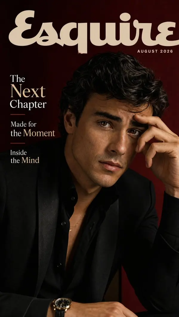
SUBJECT: A charismatic young actor with textured dark hair, expressive eyes, and a relaxed but commanding presence. Create ONE premium magazine cover. Build one cinematic portrait emphasizing charisma, ambition, and contemporary Hollywood style. STYLE: Esquire-quality photography, dramatic directional lighting, black, cream, and deep burgundy palette, modern tailoring, natural skin texture, subtle film grain, cinematic contrast, elegant negative space, shallow depth of field, premium editorial photography, 8K. MAGAZINE TITLE: ESQUIRE ISSUE DATE: AUGUST 2026 HEADLINES: The Next Chapter Made for the Moment Inside the Mind
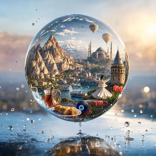
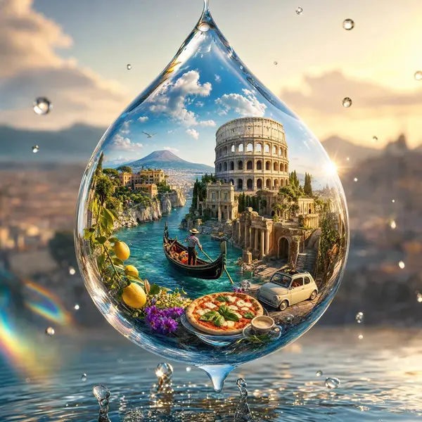
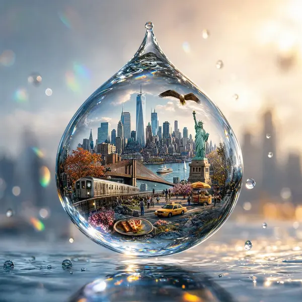
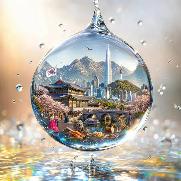
Create a breathtaking 4:5 vertical ultra-realistic artistic image featuring a single crystal-clear waterdrop suspended in mid-air, with the entire visual identity of [COUNTRY] magically contained inside the droplet. The waterdrop is perfectly spherical, extremely detailed, transparent and glass-like, with realistic refraction, caustic light patterns, tiny reflections and delicate water textures. Inside the droplet, create a miniature living world representing [COUNTRY]: its most iconic landmark, recognizable architecture, traditional culture, local landscape, transportation, food, flowers, wildlife and natural scenery, all beautifully integrated into one tiny cinematic environment. The miniature country should appear as if it is floating inside the water, with mountains and landscape in the background, tiny streets and buildings in the middle, and cultural details in the foreground. Everything should feel naturally connected rather than like separate objects. Place the waterdrop above a subtle reflective surface with a few tiny water splashes and suspended droplets around it. Use dramatic soft sunlight passing through the droplet, creating beautiful rainbow refractions and luminous caustic patterns. Visual style: luxury travel campaign, surreal realism, macro photography, miniature world, cinematic lighting, hyper-detailed, photorealistic, elegant, dreamy, premium editorial aesthetic. Composition: one dominant waterdrop centered in the frame, [COUNTRY] clearly recognizable inside it, clean atmospheric background, strong depth of field, realistic reflections, visually stunning and instantly scroll-stopping. No text, no logos, no borders, no collage, no duplicated landmarks.
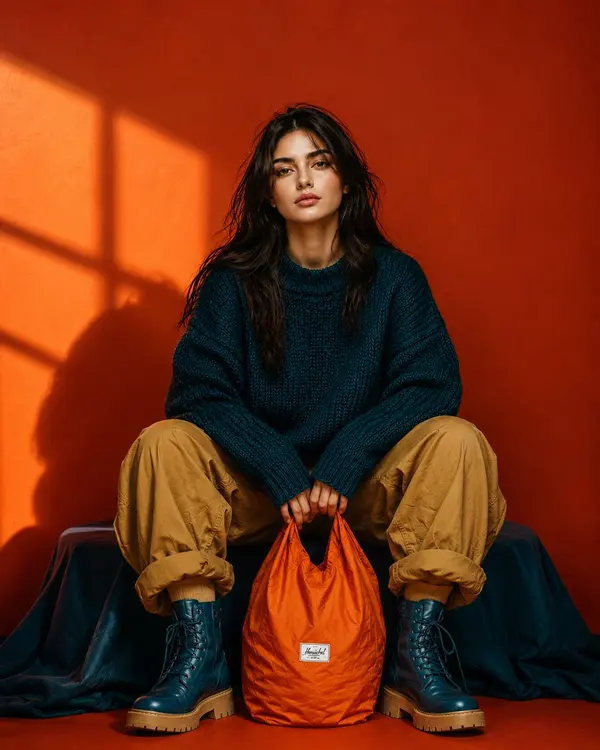
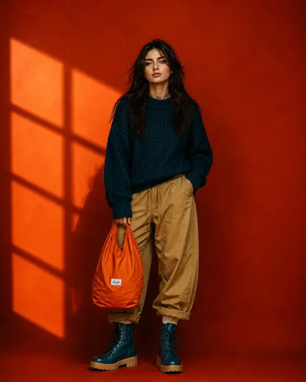
Ultra-realistic full-body editorial fashion portrait of a beautiful young woman sitting low in a relaxed wide-leg pose, knees raised and slightly apart, both hands naturally holding the handles of a bright orange nylon tote bag positioned between her feet. Keep her facial identity and facial proportions exactly consistent with the reference image, long slightly messy dark-brown hair, natural skin texture, minimal makeup, calm confident expression, no glasses. She wears an oversized chunky deep-teal knitted sweater, loose camel/tan cargo pants with casually rolled cuffs, and chunky dark-teal lace-up combat boots with warm tan soles. Bold burnt-orange studio background with dramatic golden sunlight creating geometric window shadows across the wall. Strong teal, orange and camel color blocking, rich saturated colors, stylish but not overly glamorous. Centered symmetrical composition, slightly low camera angle, full body completely visible, relaxed editorial posture, realistic fabric textures, subtle imperfections, cinematic directional lighting, crisp details, premium contemporary fashion campaign photography, natural proportions, photorealistic, 9:16 vertical.
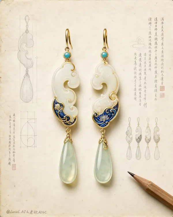
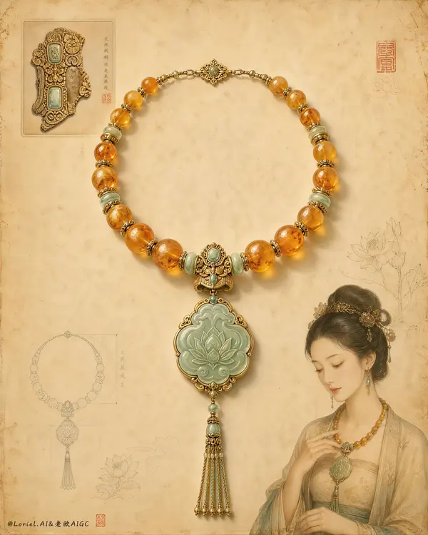
Create an ultra-premium jewelry archive poster that merges a world-class luxury brand design sheet with an East Asian heritage artifact study board. Keep the original structural logic but refine it toward a more international flagship presentation: one pair of exquisite hanging earrings placed at the visual center on a spacious warm-white aged paper ground, surrounded by only a small number of highly disciplined technical sketches, miniature variant studies, elegant manuscript note columns, and one sharpened wooden pencil entering from the lower right corner. The composition must feel calm, expensive, intelligent, and collectible, like a museum-grade design archive reinterpreted as a luxury campaign visual. Design a new pair of statement earrings inspired by traditional jade, archaic cloud-scroll language, and refined enamel ornament, without copying any existing shape. Each earring should feature a slim polished gold hook, a tiny turquoise connector stone, an elongated white-jade main body with graceful asymmetrical cloud curvature, a compact lower section enriched with deep cobalt-blue enamel floral or wave motifs, delicate gold contour filigree, and one long pale celadon translucent teardrop pendant suspended below. The pair should feel handcrafted and subtly varied, not mechanically mirrored, while still reading as a coherent luxury set. Make the earrings occupy roughly 60 percent of the visual attention and remain the absolute hero. Push the Transit direction strongly: the page should be cleaner, more spacious, and more elevated, with more controlled negative space, more disciplined object placement, fewer sketch fragments, and a stronger sense of premium restraint. The jewelry should look like it belongs to an international high-jewelry maison presenting a heritage capsule collection. Push the Port direction strongly: compress the image memory into three dominant symbols only, the central earring pair, the surrounding pale technical sketch aura, and the lower-right pencil. Remove unnecessary tiny distractions so the visual identity becomes sharper and more iconic. Lighting should be soft, refined, and highly controlled from the upper left, creating elegant shallow shadows on the paper, restrained luminous reflections on gold edges, subtle glow through semi-translucent jade, and delicate enamel sheen. Contrast should be gentle but precise, with enough dimensionality to make the jewelry feel tactile and precious while preserving the calm archival atmosphere. The paper background must be matte ivory-white with slight aging, faint fibers, tiny foxing marks, erased graphite residue, and subtle workshop traces, but remain pristine, rarefied, and premium. Supporting elements must be sparse and intentional: faint graphite contour studies, one or two orthographic geometry diagrams, a few miniature alternate earring thumbnails, one or two proportion grids, and several short vertical columns of newly invented decorative manuscript text with tiny seal-like red accents. These note elements must feel like antique jewelry research annotations, not modern readable branding, and they should remain light and secondary. No copied text, no dominant typography, no loud layout blocks. Material rendering must be extremely refined: creamy nephrite-like white jade with soft inner translucency, pale celadon pendants with smooth light transmission, polished gold with warm restrained reflections, cobalt enamel with slight depth and handcrafted surface precision, tiny gemstone bezels, elegant hook curvature, and believable jewelry engineering. The pencil should be natural cedar wood with a sharp graphite tip, rendered realistically but kept subordinate. Style: luxury jewelry campaign, museum archive sheet, heritage object study board, premium product photography fused with technical drawing aesthetics. Color palette: warm ivory paper, white jade, pale celadon, turquoise, cobalt blue, muted antique gold, graphite gray, tiny cinnabar-red seal accents. The overall mood should be noble, scholarly, modernized, and globally premium. No clutter, no extra jewelry piles, no excessive diagrams, no cheap craft feeling, no plastic texture, no oversaturated color, no loud branding, no modern graphic blocks, no messy stains, no dark dirty patches, no distorted metal hooks, no malformed symmetry, no chaotic text, no watermark, no logo.
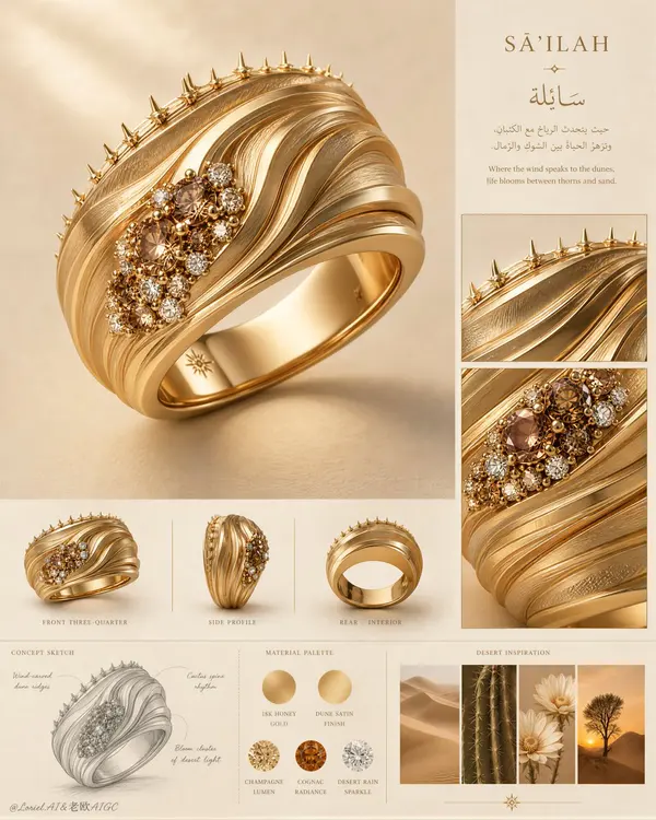
Create an ultra-premium vertical jewelry concept presentation board for a luxury ring collection, merging the clarity of an international high-jewelry maison design archive with the visual poetry of a desert-inspired material study. Preserve the original board logic but refine it to its most powerful form: one oversized hero ring render dominates the upper-left and center, a disciplined right-side editorial column contains a short concept heading and two close-up detail windows, a middle strip presents three smaller orthographic product views, a lower-left graphite concept sketch explains the structural idea, a lower-middle palette section shows metal and gemstone swatches, and a lower-right inspiration strip contains four small desert-nature images. The whole layout must feel exceptionally clean, globally premium, intelligent, and exhibition-ready. Design a new couture statement ring inspired by wind-carved dunes, cactus spine rhythm, and rare blossoms surviving in arid land, without copying any existing form. The ring should be a wide 18k gold band with layered sculptural ridges sweeping diagonally around the surface like flowing desert topography. Strengthen the Orbit energy by making the ridge lines more dynamic and directional, as if shaped by persistent wind, with elegant wave acceleration across the band. Along one upper edge, integrate a refined row of thorn-like micro protrusions inspired by cactus silhouettes, delicate and luxurious rather than aggressive. Near one side of the ring, place a tightly composed cluster of champagne, cognac, and clear stones, like a sudden bloom of desert flowers after rain. The ring must feel iconic, feminine, sculptural, and instantly recognizable. Push the Transit direction strongly: simplify the board, increase negative space, reduce unnecessary explanatory density, refine alignment, and make every section feel more expensive and internationally art-directed. Push the Port direction strongly: compress the entire page memory into three dominant symbols only, the hero ring, the right-side detail windows, and the bottom inspiration strip. All other elements should remain faint, supportive, and highly controlled. The ring must remain the absolute visual sovereign of the page. Lighting should be soft, warm, and precisely directed from the upper left, with premium studio control. Create delicate gradients across the gold ridges, restrained highlights along polished edges, subtle gemstone sparkle, and soft grounded shadows that make the hero ring feel tactile and monumental. Increase material contrast enough to reveal the dune-like topography and gemstone relief, but keep the atmosphere calm, noble, and flagship-level. No harsh glare, no catalog harshness, no overexposed metal. Materials must be exquisitely rendered: rich warm 18k gold, alternating satin-brushed and softly polished ridge planes, tiny claw or bead gemstone settings, realistic champagne and cognac diamond depth, restrained clear diamond fire, and a perfectly smooth polished interior band. The right-side close-up windows should magnify the dune-ridge texture, thorn-edge craftsmanship, and floral gemstone cluster. The middle row of smaller product views should include front three-quarter view, side profile, and rear/interior view, evenly lit and neatly aligned. The lower-left concept sketch should be a fine graphite drawing with elegant original annotation lines. The palette section should present circular swatches of gold tone and gemstone colors with invented premium labels. The lower-right inspiration strip should show coordinated desert dunes, cactus detail, pale desert flowers, and a solitary desert tree at sunset. Typography should be sparse, elegant, and original, using a refined serif Latin title with a graceful Arabic-inspired companion text block. Do not copy any wording from the source. Text must behave like compositional architecture only, never overpowering the ring. Background should be warm sand-beige with subtle matte paper softness and very faint editorial texture. Color system: sand beige, warm ivory, honey gold, matte camel, champagne, cognac amber, soft white sparkle, muted desert brown, and tiny pale botanical accents. The final image must feel like a Cannes-level luxury jewelry concept board: clean, dramatic, collectible, and ready for a flagship campaign or museum exhibition. No copied title, no copied wording, no watermark, no existing brand logo, no clutter, no extra jewelry pieces, no cheap CGI, no plastic gold, no oversaturated orange, no messy layout, no random props, no low-detail sketches, no black blotches, no muddy shadows, no distorted ring geometry, no inconsistent material logic, no illegible typography, no visual noise.
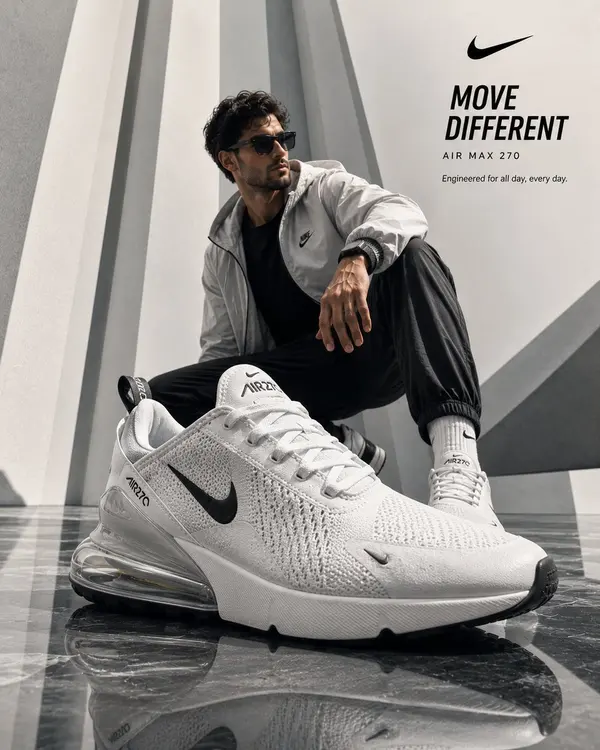
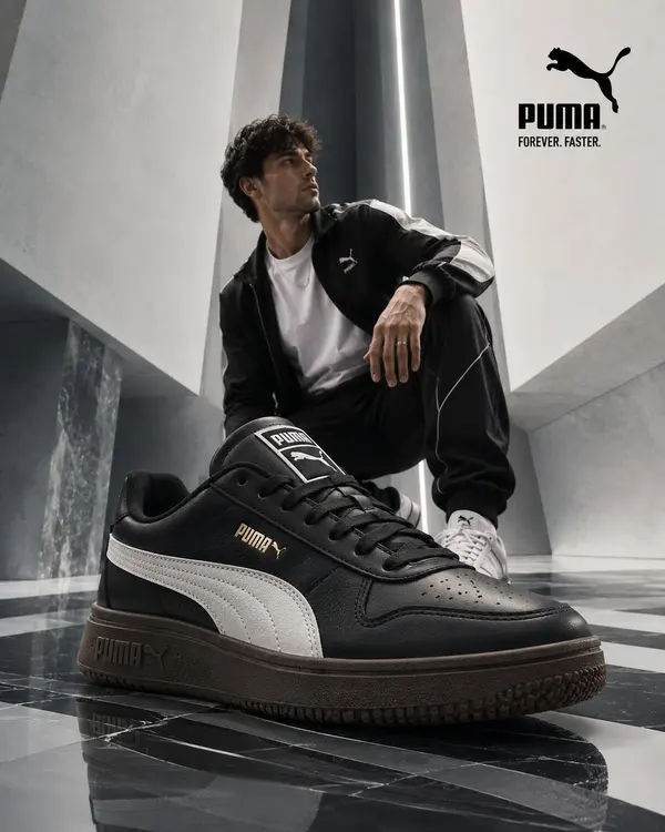
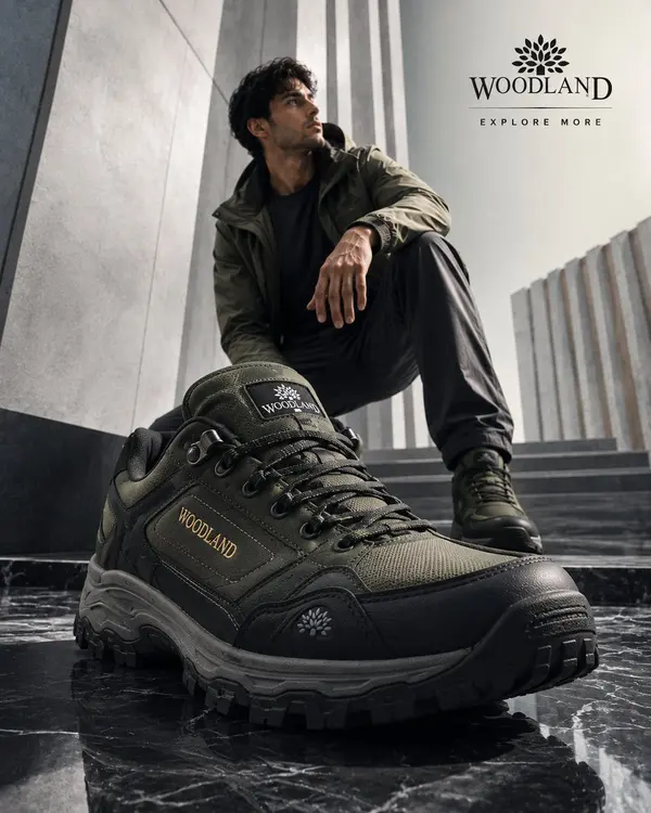
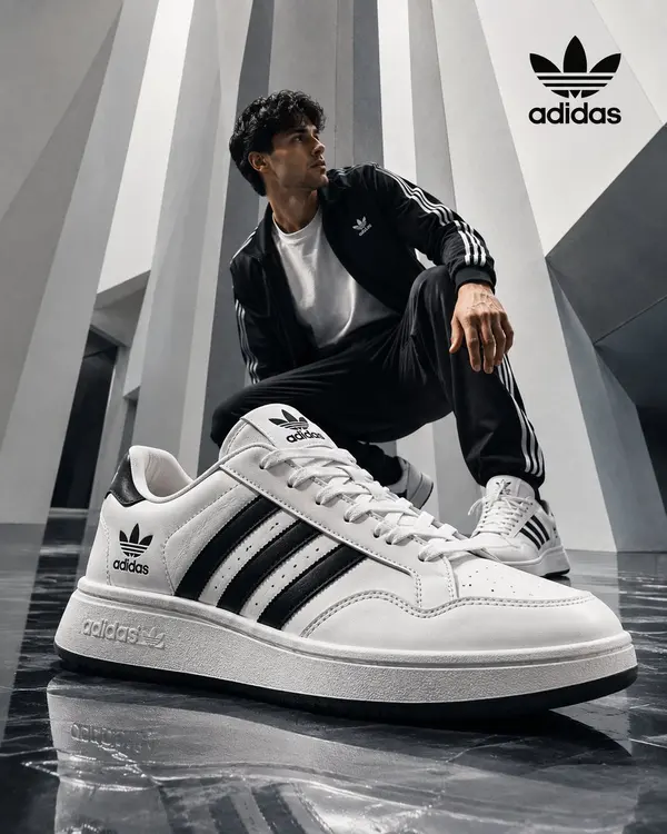
Create an ultra-realistic luxury advertising campaign for [PRODUCT], designed as a premium commercial campaign for a high-end fashion, lifestyle, beauty, or technology brand. Scene & Architecture Set the scene inside a futuristic, minimalist luxury environment featuring [ARCHITECTURAL STYLE / LOCATION], tall sculptural walls or architectural elements, and a glossy reflective floor with a sophisticated geometric pattern. Create a clean, spacious composition with strong visual depth and a refined editorial aesthetic. Hero Product Make [PRODUCT] the dominant hero element in the foreground using dramatic forced perspective. The product should appear oversized, premium, visually striking, and perfectly integrated into the environment. Use [PRODUCT COLORS / MATERIALS / DISTINCTIVE DETAILS] with physically accurate materials, realistic textures, reflections, highlights, and fine surface details. The product must remain the clear visual focal point of the entire composition. Model & Action Place a stylish young fashion model in the background wearing [OUTFIT]. The model should interact naturally with the hero product through a dynamic pose such as [POSE / ACTION], using exaggerated perspective to create a sense of scale, movement, and depth. Keep the model secondary to the product while maintaining a sophisticated fashion-editorial appearance. Lighting & Atmosphere Use premium cinematic lighting with soft natural illumination, subtle volumetric glow, realistic shadows, controlled highlights, and atmospheric depth. Add [OPTIONAL VISUAL EFFECTS] such as subtle dust particles, reflections, sparkles, mist, light streaks, or minimal graphic elements where appropriate. Keep the overall aesthetic clean, luxurious, modern, and commercially polished. Composition Use a strong cinematic composition with the hero product dominating the foreground and the model/environment creating depth behind it. Maintain realistic perspective, balanced proportions, natural spatial relationships, and a clear visual hierarchy. Leave generous negative space at the top for [HEADLINE] and [LOGO / BRAND NAME]. Visual Quality Premium luxury advertising photography, high-end editorial fashion campaign, photorealistic commercial product render, ultra-detailed materials, physically accurate reflections, realistic skin and fabric textures, cinematic depth of field, sharp hero product, subtle background falloff, sophisticated composition, realistic lighting, 8K detail, Octane Render aesthetic. Aspect ratio 4:5 Final goal: Create a visually striking, premium advertisement that feels like an internationally produced luxury brand campaign, while making [PRODUCT] instantly recognizable as the hero.
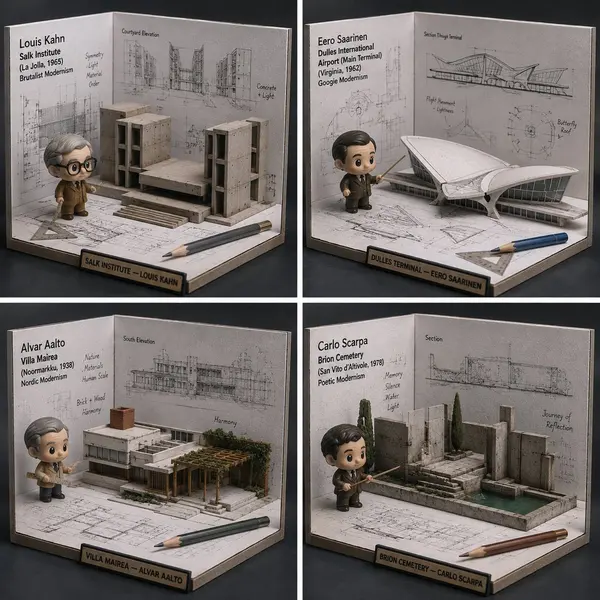
Function DrawArchitecture(input building/architect) Input Variable: [INSERT BUILDING or ARCHITECT] (e.g., Fallingwater, Zaha Hadid) System Instruction: Generate a hyper-realistic, 1:1 product photo of a "Blueprint-to-Model Desk Diorama" (Isometric miniature). 1. Semantic Extraction: - Identify style (brutalist, modernist, gothic), key forms, and one signature feature (cantilever, arch, atrium). - Figure: Chibi “architect” avatar holding a tiny scale ruler. - Finish: Matte PVC. 2. Container (Drafting Corner Box): - Structure: U-shaped cardboard drafting station (two walls + floor), desktop scale. - Props: tiny triangle ruler, pencil, scale bar. 3. Background (Blueprint Walls): - Walls: B&W blueprint lines, elevation drawings, annotations (original, inspired). - Floor: Blueprint fragments “explode” upward into paper folds. 4. Integration: - A 2D blueprint line rises into a 3D model piece (a wall or arch popping out) that the figure points at. 5. Visual Syntax: - Palette: Strict B&W blueprint world; full color figure + one accent prop. - Lighting: soft product photo, crisp details. - Label: "[Subject] — [Style/Architect]" Return: ONE image, 1:1, museum-miniature realism. <instructions> Input: building/architect Analyze style, era, signature geometry. Find 4 MUCH lesser-known buildings/architects in same lineage. Output: a 2x2 grid, each panel is DrawArchitecture for a lesser-known recommendation. </instructions>
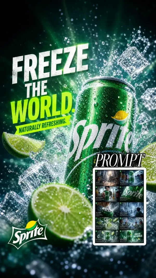
Create a premium, ultra-realistic Sprite advertising poster in a high-energy cinematic style. Feature a chilled green Sprite can standing prominently in the center-right, covered in realistic condensation droplets, surrounded by sparkling ice cubes, splashing carbonated water, fresh lime wedges, and tiny water droplets frozen in mid-air. Use dramatic studio lighting with vivid green and icy cyan tones, strong highlights, deep contrast, and a refreshing cold atmosphere. Add bold typography on the left side: “FREEZE” “THE” “WORLD.” Use large distressed white lettering for “FREEZE THE” and vibrant neon-lime green for “WORLD.” Underneath, add a smaller tagline: “NATURALLY REFRESHING.” Place the Sprite logo naturally on the can and a clean Sprite logo near the bottom-left. Make the composition dynamic, premium, photorealistic, sharp, and highly detailed, like a global beverage campaign. Include realistic ice reflections, fizzy bubbles, water splashes, lime texture, condensation, cinematic depth of field, dramatic perspective, 8K advertising photography, high-end commercial retouching. Vertical 9:16 composition, polished professional advertisement, no people, no extra brands, no distorted text, no duplicate objects.
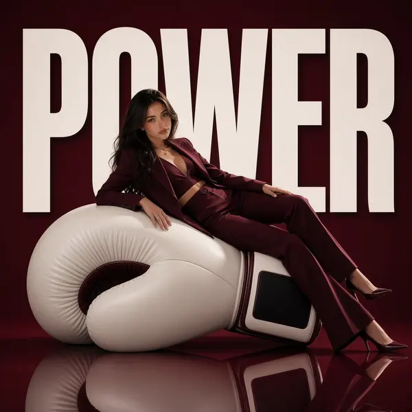
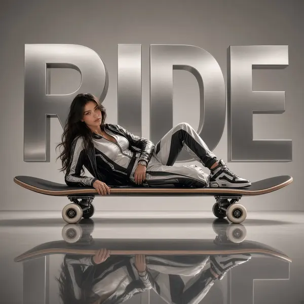
Avant-garde boxing fashion advertising campaign, a huge boxing glove transformed into a monumental sculptural object, a female athlete elegantly reclining across the padded surface of the oversized glove like a piece of modern designer furniture. She wears a futuristic luxury boxing-inspired outfit with a sleek athletic silhouette, premium fabric textures, refined combat-sport details, and confident feminine energy. Her pose is relaxed yet powerful, blending strength, control, and high-fashion editorial attitude. Behind her, the huge word “POWER” appears in bold oversized typography as part of the architectural composition, integrated into the scene rather than simple text overlay. The background is a deep burgundy minimalist studio environment with a glossy mirrored floor reflecting the giant boxing glove sculpture and the athlete. Ultra-clean composition, dramatic negative space, premium sports fashion campaign aesthetic. Cinematic studio lighting, luxury sports editorial photography, high contrast shadows, realistic materials, polished surfaces, futuristic athletic style, Vogue Sport inspired, ultra-detailed, photorealistic, 1:1 composition.
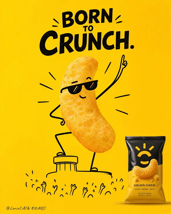
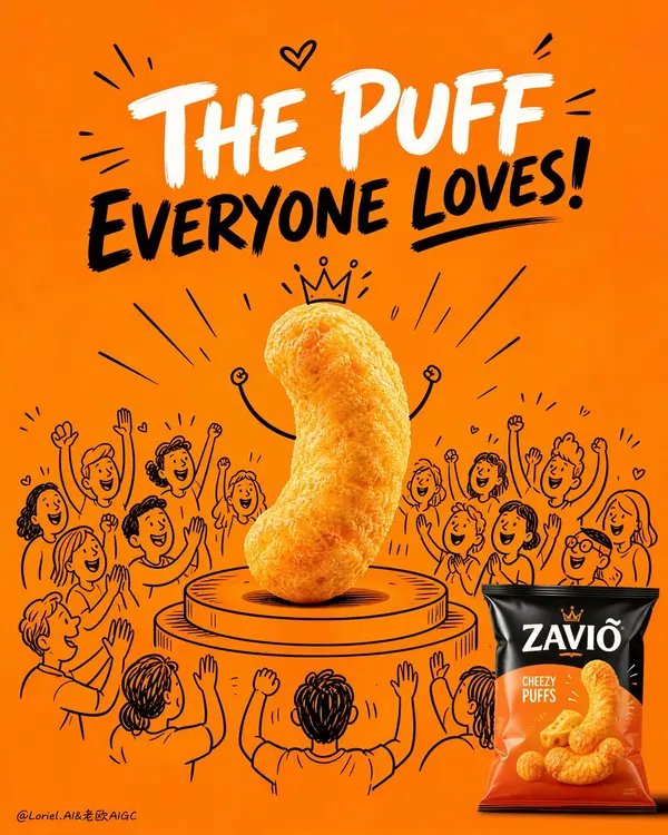
Create an ultra-premium snack advertising poster that merges Orbit-style impact with Port-style symbolic clarity, built around one unforgettable three-part super-symbol: one real crunchy snack hero, one hand-drawn cheering crowd world, and one original product bag in the corner. Use a tall vertical composition on a pure bold saturated background, with the real snack piece placed at the exact center on a simple illustrated stage platform, visually elevated like a star performer. Around it, draw a clean semi-circle of hand-drawn cheering audience characters with raised hands, smiling faces, applause marks, and celebratory motion lines, while keeping all illustrated elements secondary to the real snack. In the lower-right corner, place one original premium snack bag as the commercial anchor. The final image must feel witty, iconic, joyful, minimal, highly brandable, and Cannes-level clever. Do not copy any real brand name, logo, slogan, or packaging text. Core super-symbol composition: Build the entire poster around one instantly legible symbolic structure: 1. one photoreal snack as the superstar, 2. one illustrated cheering crowd as the personality amplifier, 3. one retail-ready product bag as the sales anchor. The central snack must dominate the frame and carry almost all visual power. The doodle crowd should frame and celebrate it without competing for attention. The lower-right package must be small but unmistakably present, clearly linking the emotional hero back to the actual product. The whole image must read immediately from far away like a flagship FMCG poster. Orbit enhancement: Push the “on-stage” energy harder. The snack should feel more triumphant, more central, and more elevated, as if it has just stepped onto a spotlighted podium and the whole illustrated crowd is erupting around it. Make the circular stage slightly more pronounced and the surrounding cheering lines more focused toward the center. Keep the audience gestures more unified and upward-facing so the visual force converges on the snack hero. The impact must feel stronger, but the layout must remain clean. Port enhancement: Distill the image into a sharper brand symbol. Remove any unnecessary decorative clutter and preserve only the most essential components: the real snack hero, the minimal stage, the cheering doodle crowd, and the lower-right product bag. The composition should feel like one complete advertising emblem rather than a busy illustration. Every element must reinforce the snack’s “big personality” and crowd-favorite identity. Product and doodle fusion: This is the most important feature. The snack itself must remain fully photoreal, crunchy, airy, porous, and edible-looking. The stage, crowd, and performance cues must be hand-drawn in clean black line art with confident, premium simplicity. The real snack and the illustrated world must combine effortlessly so the product feels alive, celebrated, and full of character without losing food realism. Hero snack design: Use one real puffed corn snack, popcorn cluster, cheese puff, or airy crispy bite with rich porous texture, light toasted variation, natural irregularity, and obvious edible crunch. The snack must read first as a delicious product, then as a charismatic star. If minimal facial or limb doodles are added, keep them extremely restrained so the snack body remains dominant. Illustrated crowd logic: Draw a semi-circle of hand-drawn audience characters around and behind the snack using simple black line art only. Their expressions must be joyful, supportive, and celebratory. Include raised arms, happy faces, clapping gestures, cheering marks, and small radiating lines, but keep the style graphic, premium, and controlled. The crowd should feel like the snack’s fan club. Packaging design: Create one original premium snack bag in the lower-right corner with elegant fictional branding, clean flavor-color hierarchy, appetizing product photography, and modern FMCG print design. The bag must feel globally marketable, polished, and visually connected to the hero snack. Use realistic flexible-pack film, sealed edges, subtle creases, and refined highlights. Lighting: Use bright polished studio lighting with soft frontal clarity and refined top highlights. The snack texture must be razor-sharp and crunchy. The package should show controlled laminate reflections. The illustrated elements should remain flat, crisp, and graphic against the saturated background. Keep the whole image clean and high-contrast. Background: Use a single strong flagship background color such as vivid premium orange or golden-orange, with a perfectly smooth flat fill and no clutter. The background must function as a pure graphic stage that makes the snack, crowd, and bag pop instantly. Typography space: Reserve a clean upper area for original fictional campaign typography in bold contrasting lettering. The headline should support the product’s beloved, crowd-pleasing personality, but all wording must be newly created and original. Image finish: The final poster must feel like a world-class snack campaign: minimal, cheerful, bold, product-led, graphically memorable, and highly sellable. Preserve razor-sharp snack detail, clean doodle precision, immaculate background flatness, and premium packshot rendering. 8k, flagship advertising quality. Negative prompt: real brand names, copied logo, copied slogan, messy doodles, cluttered layout, childish low-quality illustration, dirty background, fake snack texture, low-detail packaging, muddy colors, black blotches, warped bag shape, weak contrast, low-resolution product render
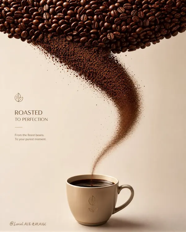
Create an ultra-premium minimalist coffee advertising poster that preserves the exact core logic of the reference image while upgrading it into a more sculptural and brand-complete flagship composition. Build the entire image around one unmistakable three-part visual system: a dense upper canopy of roasted coffee beans, a graceful curved stream of ultra-fine coffee grounds descending in an elegant arc, and one premium branded coffee cup at the bottom center containing rich aromatic liquid coffee. The final artwork must feel precise, aromatic, minimalist, sculptural, and globally premium, with the composition itself functioning like a signature brand symbol. Do not copy any existing logo, text, or wording. Core composition: Use a tall vertical poster layout with three locked layers: 1. a rich dark field of roasted coffee beans spanning the full top zone, 2. a curved powder trajectory flowing downward from the bean field, 3. one refined hero cup placed exactly at the lower center as the final destination, now visibly filled with浓郁 liquid coffee. The bean canopy, powder arc, and cup must feel inseparable, like one complete premium coffee brand asset. Keep the background spacious, quiet, and immaculate so the structure reads instantly from a distance. Curved powder-flow logic: The coffee-powder arc must begin fuller and denser near the upper transition from whole beans, then follow a graceful curved descent, and as it approaches the cup rim it must gradually become less, finer, lighter, and narrower, creating a beautiful tapered flow. Near the cup mouth, the powder should transition into a delicate fine-threaded granular stream with fewer particles and softer edge diffusion, so the eye experiences a refined density gradient from top to bottom. The powder should feel like aroma and roast character concentrating into the drink. Liquid coffee in cup: This is the key update. The cup must not appear empty. Inside the cup, show rich, dark, freshly prepared liquid coffee with a smooth glossy surface and a deep espresso-brown tone. The liquid should feel aromatic, warm, and concentrated, with subtle reflective highlights along the top surface and a slight meniscus hugging the cup edge. The cup interior should suggest depth and warmth, as if the descending coffee particles are completing their transformation into a luxurious drink. The final landing point must feel satisfying, flavorful, and complete. Brand presence: The poster must feel like a complete premium coffee brand visual. The cup should carry a subtle but clear original fictional brand mark or emblem area. The curved powder path must visually guide attention into the liquid coffee surface so the cup becomes both the compositional endpoint and the emotional payoff of the whole poster. Coffee material rendering: Render the roasted beans with hyper-real premium detail: rich espresso-brown and cocoa variation, subtle oily satin highlights, visible center seams, and tactile roast irregularity. Render the grounds as ultra-fine, dry, aromatic granules with precise texture readability. Render the liquid coffee as dense, dark, smooth, and premium, with a velvety reflective surface and elegant tonal depth. Keep the transformation from whole beans to powder to drink visually coherent. Cup design: Place one elegant premium coffee cup in the lower center, small but visually authoritative. Use a refined cream, pale sand, muted ochre, or warm neutral tone, with minimal original fictional branding. The cup must feel calm, modern, and premium, with a soft shadow beneath it and a delicate highlight on the rim. The liquid coffee inside should be clearly visible from the viewing angle. Lighting: Use soft premium studio lighting from upper left-front with refined editorial polish. The bean canopy should catch restrained rich highlights, the powder arc should reveal granular structure throughout its density gradient, and the cup should carry clean controlled highlights. The liquid coffee surface should catch a subtle glossy sheen, making it feel warm, rich, and drinkable. Background: Use a clean matte background in pale stone, cool beige, or warm cream-gray. No clutter, no props, no decorative noise. The simplicity of the background must elevate the dark bean mass, the graceful tapered powder motion, and the liquid coffee endpoint. Typography logic: If typography is included, place it minimally in the left-side negative space or upper-left area, using original premium brand-style wording. Keep it secondary to the bean-to-powder-to-liquid-cup symbol. Color system: Use a disciplined palette of deep roast brown, espresso black-brown, cocoa, dark coffee liquid, pale cream, warm stone beige, muted sand, and subtle ochre accents. Keep saturation restrained and luxurious. Image finish: The final poster must feel like a world-class flagship coffee campaign: minimal, sculptural, aromatic, elegant, iconic, and strongly brand-owned. Preserve razor-sharp detail on bean texture, coffee granules, the curved density gradient, liquid coffee surface, cup silhouette, and negative-space balance. 8k, world-class commercial retouching. Mood: aromatic, elegant, precise, sculptural, premium, concentrated, minimalist, brand-owned, globally polished Rendering style: ultra-premium coffee advertising, sculptural ingredient motion, roasted bean canopy, gracefully tapered curved coffee-powder flow, premium cup filled with rich liquid coffee, minimalist studio background, hyper-real material photography, world-class commercial retouching, 8k Negative prompt: copied text, copied logo, cluttered props, empty cup, stiff powder funnel, equal-width powder stream, muddy powder texture, fake smoke effect, weak composition, plastic beans, low-detail grounds, flat coffee liquid, chaotic granules, dirty background, black blotches, low-resolution product render, oversaturated colors
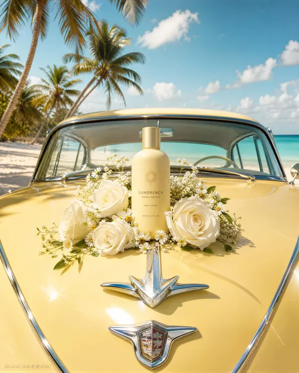
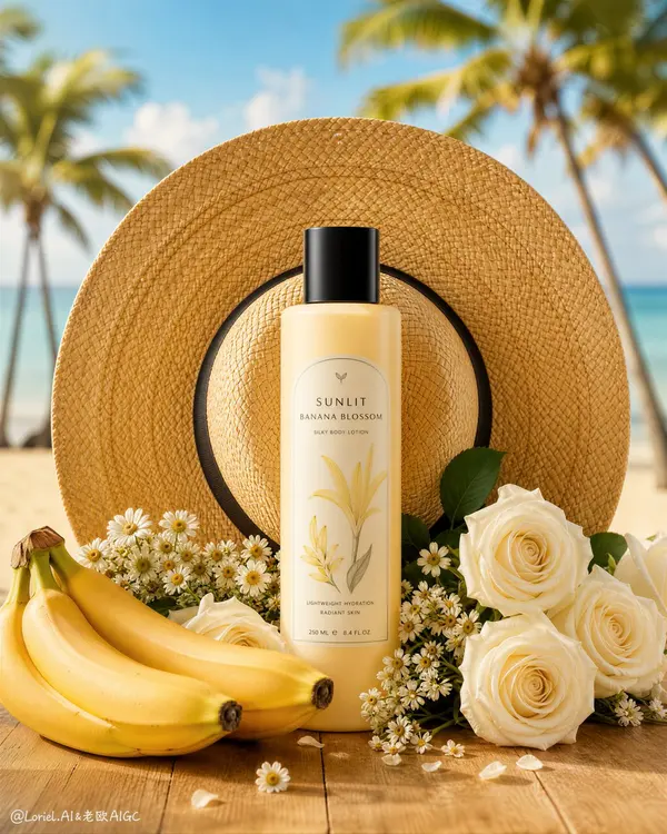
Create an ultra-premium tropical beauty advertising poster that preserves the exact still-life logic of the reference image while refining it into a more international, cleaner, and more compositionally complete flagship campaign visual. Show one elegant cosmetic or body-care bottle standing upright at the exact visual center of a carefully art-directed summer still life. Behind the bottle, place a large woven straw sun hat with a dark ribbon band so its circular form becomes the dominant compositional halo. Around the product, arrange white roses, tiny daisies, and a restrained cluster of ripe bananas in the lower-left foreground, all resting on a warm natural wooden tabletop. In the softly blurred background, reveal a pale tropical beach, calm blue sea, and several elegant palm trees. The final image must feel radiant, feminine, nostalgic, luxurious, globally polished, and product-led. Do not copy any real brand name, logo, slogan, or original wording. Core composition: Use a strict vertical luxury-poster composition with the bottle as the absolute visual center. The straw hat behind it must function as the primary framing device, creating a warm circular backdrop that naturally locks the viewer’s eye onto the product. The flowers and bananas should form a low asymmetrical foreground base that visually supports the bottle without distracting from it. Remove unnecessary scattered edge text or decorative side elements so the composition feels cleaner, more complete, and more premium. The whole image should appear built around the bottle. Transit enhancement: Refine the image into a more international flagship beauty-advertising language. Use a cleaner palette of creamy banana yellow, honey straw gold, soft ivory, sea-salt blue, and restrained warm wood tones. Reduce any noisy warm-orange cast and keep the color grading polished, elegant, and editorial. The image should feel like a global body-care or fragrance campaign with calm luxury rather than local promotional clutter. Product and composition integration: This is the key requirement. The bottle must feel inseparable from the composition. The straw hat provides the summer halo, the bananas reinforce the scent story, the white flowers create softness and femininity, and the tropical beach blur supplies escapist atmosphere. Every element must visually converge toward the bottle so the product feels like the natural heart of the entire scene. Product design: Design one original premium beauty bottle suitable for body lotion, body mist, sunscreen, or tropical fragrance. Use a smooth rounded silhouette, elegant cylindrical black cap, and a warm cream-to-banana label palette with minimal fictional branding. The bottle should feel satin-matte, refined, and globally marketable, with clean edges and no cheap plastic look. Still-life styling: Keep the still life elegant and restrained. The straw hat must show rich woven texture and beautiful sunlit depth. The roses should feel velvety and soft, the daisies delicate and airy, and the bananas ripe and smooth with natural curve rhythm. The wood tabletop should feel tactile, sun-warmed, and premium, but not rustic or messy. Background environment: The tropical background must remain softly blurred and secondary: pale sand, calm sea, and a few palm trees catching bright coastal light. The environment should feel aspirational and clean, with no clutter, no crowd, and no extra props. Lighting: Use radiant tropical daylight from upper left-front or left side with warm but controlled sunlit softness. The straw hat should catch honey-gold highlights, the bottle should receive a strong clean frontal highlight and elegant cap reflection, the flowers should glow at the edges, and the bananas should show smooth ripe sheen. Shadows should remain soft, premium, and flattering. Material rendering: Render the bottle with luxurious precision and subtle satin reflection. Render the straw hat with intricate natural weave structure, the flowers with layered petal softness, the bananas with smooth ripe skin, and the tabletop with warm natural grain. Every material must feel carefully art-directed and globally premium. Typography and layout: If text is included, keep it extremely minimal and original. Use only one restrained editorial text zone if needed, placed in a clean negative-space area. Avoid scattered corner text, side text, and decorative micro-copy. The visual priority must remain the product, the straw-hat halo, and the tropical still-life structure. Color system: Use a disciplined tropical-luxury palette of banana yellow, cream, ivory, honey straw gold, black cap accents, warm brown wood, sea-salt blue, and small fresh green touches. The bottle and bananas should carry the main scent-story relationship, while the hat and beach background complete the summer mood. Image finish: The final poster must feel like a world-class flagship beauty campaign: clean, radiant, elegant, nostalgic, tropical, and compositionally complete. Preserve sharp detail on the bottle, woven hat texture, floral softness, banana surface, and premium shallow-depth tropical background. 8k, world-class commercial retouching. Negative prompt: real brand names, copied logo, copied slogan, excessive edge text, cluttered side typography, weak product focus, cheap plastic bottle, muddy straw texture, dirty tabletop, harsh shadows, oversaturated orange, black blotches, low-resolution product render, cluttered beach background
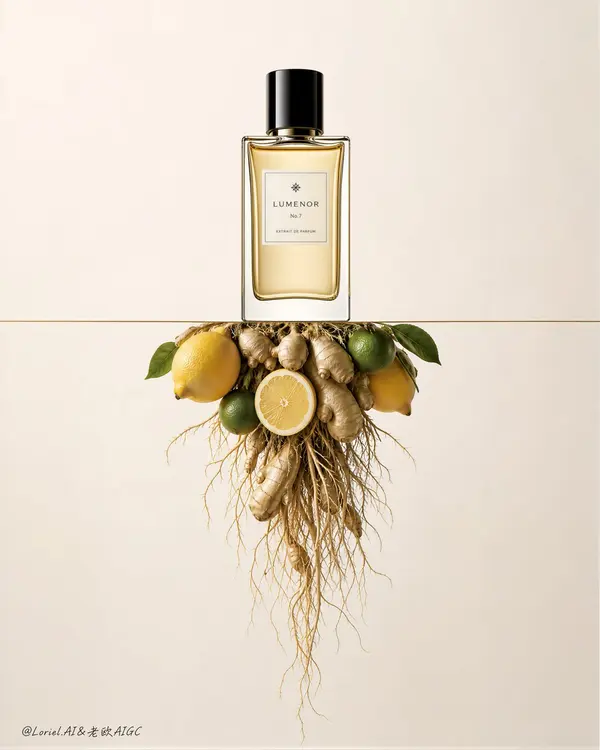
Create an ultra-premium luxury fragrance advertising poster that merges Orbit-style conceptual impact with Port-style symbolic clarity, while refining the glass reflections into a calmer, more restrained international high-end fragrance aesthetic. Build the entire image around one unforgettable three-part super-symbol: one elegant perfume bottle standing upright above a thin horizontal line, one sharply controlled inverted ingredient cluster suspended beneath it, and one clean field of negative space binding the two into a single iconic composition. The final artwork must feel minimal, intelligent, product-led, globally luxurious, and Cannes-level refined. Do not copy any real brand name, logo, slogan, or original wording. Core super-symbol composition: Use a strict vertical composition with one premium fragrance bottle positioned in the upper center, standing precisely on a razor-thin horizontal line. Below the line, suspend an upside-down aromatic ingredient cluster so it hangs like a root system beneath the bottle world. The bottle, the line, and the inverted source cluster must read instantly as one complete luxury visual sentence. The composition should feel architecturally controlled, calm, and memorable from a distance. Orbit enhancement: Push the conceptual reversal harder by making the lower ingredient cluster feel more root-like and structurally intentional. Keep the upper attachment area compact and concentrated, then allow ginger roots and fine strands to loosen and descend with increasing delicacy. The visual energy should move from the calm bottle above into the dense-to-loose root structure below, creating a stronger sense of vertical tension and conceptual depth without losing elegance. Port enhancement: Distill the image into a cleaner and more iconic brand symbol. Remove all non-essential visual noise and preserve only the most important relationship: bottle above, line divider, inverted ingredient root cluster below. The result should feel less like a styled still life and more like a proprietary high-luxury fragrance emblem. Every element must reinforce the product identity through precision and restraint. Bottle design: Design one original premium perfume bottle with a clear glass body, pale golden liquid, an elegant rectangular or softly rounded silhouette, a glossy black cylindrical cap, and a minimal refined cream label with fictional branding. The bottle must feel serene, expensive, and architecturally balanced. Its presence should dominate through placement, calm symmetry, and proportion rather than exaggerated size. Glass reflection treatment: This is the key refinement. The bottle glass reflections must be calm, restrained, and internationally premium. Avoid flashy specular glare or overly glossy cosmetic highlights. Use clean, narrow, elegant reflection bands with soft rolloff and precise edge control. The reflections should feel like a world-class niche fragrance campaign: polished, minimal, and sophisticated, never loud or commercial-cheap. Inverted ingredient cluster: Use a refined citrus-and-ginger composition: two fresh yellow lemons, one or two small green citrus fruits, one sliced citrus section, sculptural ginger rhizomes, and long fine tangled roots descending below. Keep the upper cluster compact near the dividing line, then let the roots disperse downward with fine natural rhythm. The ingredients must feel fresh, tactile, and luxurious, but always secondary to the bottle. Lighting: Use soft high-end studio lighting with a warm-neutral to slightly cool editorial balance. The bottle should receive subtle frontal illumination and controlled edge reflections. The liquid inside should glow softly without looking sugary or overly warm. The ingredients below should be clearly readable, with enough light to reveal peel texture, ginger surface, and root delicacy, while preserving the bottle as the brightest compositional authority. Material rendering: Render the glass bottle with impeccable clarity, subtle refraction, and restrained luxury reflection control. Render the liquid with soft golden transparency and refined meniscus detail. Render lemons with fine pore texture and quiet waxy sheen, green citrus with gentle gloss, ginger with fibrous matte irregularity, and roots with dry tangled botanical precision. Every material must feel hyper-real, premium, and physically truthful. Background: Use a seamless luxury studio background in pale cream, cool ivory, soft stone, or refined warm-white beige. Keep it immaculate and spacious. The negative space must feel as important as the objects themselves, reinforcing the high-end fragrance mood. Color system: Use a restrained luxury palette of pale cream, soft ivory, cool warm-white, lemon yellow, muted green, ginger beige, root tan, glossy black, and subtle pale gold liquid tones. Keep saturation elegant and subdued. The overall emotional tone must feel elevated, calm, and internationally luxurious. Typography logic: If any text is included, keep it minimal, original, and discreetly placed in the negative space. The visual concept must carry the message more than the copy. Image finish: The final poster must feel like a world-class international fragrance KV: minimal, conceptual, serene, precise, and product-led. Preserve razor-sharp bottle geometry, controlled glass reflections, fresh ingredient realism, fine root structure, and immaculate negative-space balance. 8k, world-class commercial retouching. Negative prompt: copied logo, copied slogan, cluttered props, ordinary tabletop still life, flashy reflections, harsh specular glare, dirty background, low-detail roots, muddy citrus texture, plastic ginger, distorted bottle, black blotches, oversaturated colors, low-resolution luxury product render
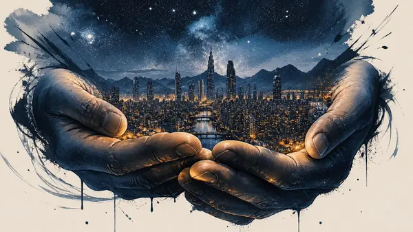
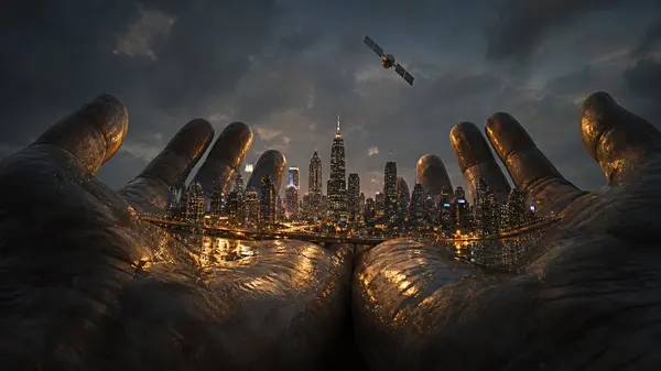
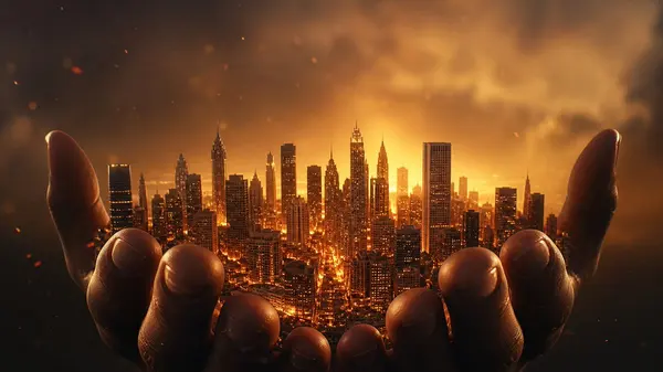
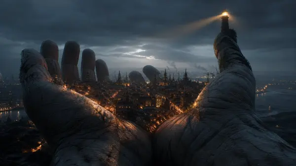
Two enormous hands hold an entire metropolis in their palms, the city lights reflecting across their fingers. 1. Art: Fine art illustration of two colossal hands cradling a sprawling metropolis, their palms cupped like a living basin. bold graphic ink strokes define the fingers, while gouache washes of deep indigo and amber capture city lights shimmering across knuckles. negative space frames the composition, expressive mark-making suggesting motion, an ethereal starry sky above featuring in a fine art illustration style, under blue hour twilight, solitary isolation atmosphere, handheld camera. consistent identity across frames facial expression consistency rich background detail rich skin detail with natural pores real physics no artifacts. 2. Cinematic: Widescreen cinematic frame of two colossal, weathered hands cradling a sprawling metropolis at dusk, warm amber window-light and neon reflections pooling across their creased palms like liquid gold. shot on anamorphic 35mm, shallow depth-of-field, low-angle tilt, kodak vision3 500t grade, a lone satellite drifting overhead as a poetic counterpoint featuring in a cinematic film still style, under natural overcast daylight, humble grounded authenticity atmosphere, slow push-in. perfect liquid physics simulation no AI-style warping rich background detail consistent identity across frames physically accurate shadows accurate reflections and refractions. 3. Ads: Luxury brand campaign shot of two colossal hands cradling a glowing metropolis, warm sunset light spilling through city towers and reflecting off polished skin, cinematic 35mm anamorphic lens, shallow depth of field, rim-lit fingers with soft golden highlights, dusk atmosphere, nostalgic amber and honey color grade, subtle haze and floating dust particles, poster-ready composition with negative space above featuring in a high-end advertising campaign style, under glowing firelight, building dread atmosphere, macro beauty shot. accurate reflections and refractions facial expression consistency no AI-style warping fluid cloth simulation sharp focus perfect motion blur only on moving elements. 4. Bizarre: Luxury brand campaign shot of two colossal hands cradling a glowing metropolis, warm sunset light spilling through city towers and reflecting off polished skin, cinematic 35mm anamorphic lens, shallow depth of field, rim-lit fingers with soft golden highlights, dusk atmosphere, nostalgic amber and honey color grade, subtle haze and floating dust particles, poster-ready composition with negative space above featuring in a high-end advertising campaign style, under glowing firelight, building dread atmosphere, macro beauty shot. accurate reflections and refractions facial expression consistency no AI-style warping fluid cloth simulation sharp focus perfect motion blur only on moving elements.
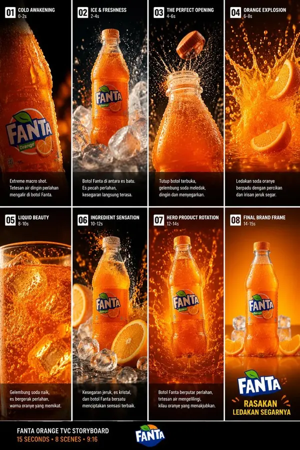
Create a 15-second vertical 9:16 cinematic Fanta Orange commercial with 8 connected scenes. Use the uploaded storyboard as the visual reference and maintain the same Fanta Orange bottle, label, colors, proportions, and premium advertising aesthetic throughout. Ultra-realistic product photography, macro detail, dramatic studio lighting, realistic liquid physics, sparkling carbonation, water droplets, orange splashes, ice crystals, shallow depth of field, high-speed camera effects, smooth cinematic motion, premium beverage commercial quality. Scene 01 — Cold Awakening | 0–2s Extreme macro close-up of a chilled Fanta Orange bottle covered in realistic condensation and tiny water droplets. Slowly reveal the orange bottle emerging from darkness. Warm orange highlights against a black background, refreshing cold atmosphere, crisp product texture. Scene 02 — Ice & Freshness | 2–4s The Fanta bottle sits dramatically among crystal-clear ice cubes. Ice and water splash around it in slow motion. Condensation glistens on the bottle while carbonation bubbles move inside the orange soda. Fresh, energetic, highly realistic. Scene 03 — The Perfect Opening | 4–6s Close-up of the bottle opening. The cap pops upward in slow motion as fizzy soda erupts from the bottle neck. Tiny droplets and carbonation particles fly through the air, creating a powerful refreshing moment. Scene 04 — Orange Explosion | 6–8s A spectacular explosion of vibrant orange soda fills the frame. Fresh orange slices fly through the splash while droplets freeze beautifully in mid-air. Dynamic camera movement, dramatic backlighting, realistic liquid simulation and intense freshness. Scene 05 — Liquid Beauty | 8–10s Macro shot of sparkling orange soda flowing and bubbling inside a glass. Large ice cubes move slowly through the liquid. Extreme detail in bubbles, reflections, condensation and orange color, luxurious beverage-advertising look. Scene 06 — Ingredient Sensation | 10–12s Hero shot of the chilled Fanta Orange bottle surrounded by crystal ice and fresh orange slices. Orange soda droplets float through the air as the bottle remains perfectly sharp and centered. Cinematic slow motion and premium lighting. Scene 07 — Hero Product Rotation | 12–14s The Fanta Orange bottle slowly rotates on a glossy reflective surface while sparkling soda droplets surround it. Dramatic orange-and-black background, glowing highlights, perfect product focus, smooth 360-degree camera movement. Scene 08 — Final Brand Frame | 14–15s Clean premium hero shot of the Fanta Orange bottle standing upright on a glossy orange surface with ice and fresh orange slices around it. Warm orange gradient background. Camera slowly pushes toward the product, ending on a strong recognizable Fanta brand composition. Final visual style: photorealistic, cinematic commercial, premium beverage advertising, 4K/8K detail, HDR, realistic condensation, realistic carbonation, physically accurate liquid simulation, high-speed photography, macro lens, shallow depth of field, dramatic reflections, smooth transitions, no cartoon look, no CGI appearance, consistent bottle identity and label throughout, energetic and refreshing mood.
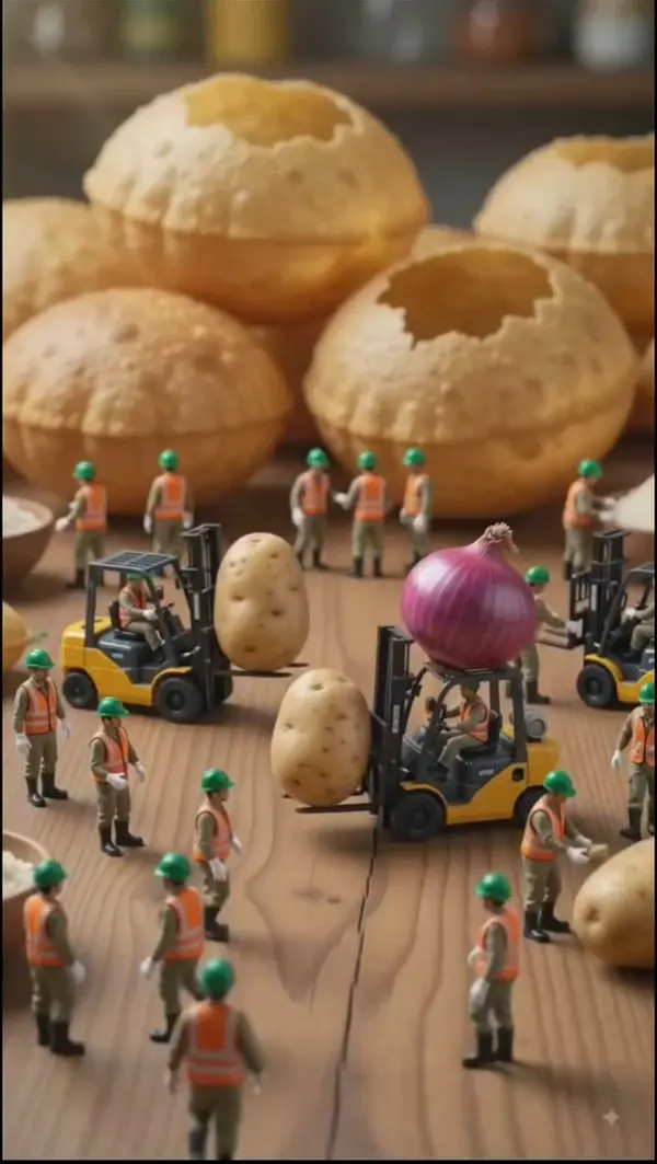
Create a cinematic, ultra-realistic miniature food factory scene based on the reference image. Tiny construction workers wearing green safety helmets and orange reflective vests operate small yellow forklifts around giant golden-brown puffed puris. Some workers carefully load and transport oversized potatoes and a huge purple onion using forklifts. The workers move naturally and interact with the food like a busy industrial construction site. Start with a slow cinematic camera push-in, then smoothly track alongside the forklifts as they carry the giant vegetables. Add realistic forklift movements, tiny workers walking and communicating, subtle dust particles, soft warm studio lighting, shallow depth of field, highly detailed food textures, realistic miniature scale, smooth motion, and a playful whimsical atmosphere. Make the scene feel like a professional miniature food-processing factory commercial. Vertical 9:16, cinematic 4K, photorealistic, smooth camera movement, realistic physics, detailed textures, no text, no watermark.
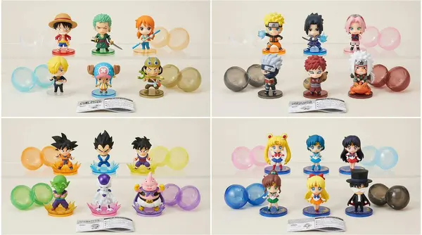
2x2 g rid, 16:9, do this for 4 famous manga: INPUT: [$subject] SYSTEM: Render the input as a complete six-piece premium Japanese gashapon capsule-toy collection. Automatically infer six distinct but immediately understandable variants of the concept, then translate each into believable miniature collectible design with consistent manufacturing language. SEMANTIC SOLVE: GASHAPON_AUTOPSY = (INFER(collection FROM six semantically distinct variants of the input + one coherent visual family) ::5) + (INFER(materials FROM injection-molded PVC + translucent ABS accents + tiny printed decals + miniature display bases) ::4) + (INFER(manufacturing FROM simplified seams + separate molded accessories + compact silhouettes + capsule-friendly proportions) ::4) + (INFER(collectibility_psychology FROM rarity tiers + completeness desire + tiny details + adorable consistency) ::5 - (random unrelated characters + realistic human proportions + cheap dollar-store toys + inconsistent scales) ::-5 COMPOSITION: Six tiny figures arranged neatly as a complete collector lineup. Several translucent capsules sit open beside them with miniature folded Japanese-style instruction inserts. Every figure clearly belongs to the same collection while representing a different interpretation of the input. STYLE DNA: Japanese capsule toy photography ::0.35 premium miniature figure design ::0.25 kawaii product styling ::0.20 crisp macro studio photography ::0.20 OUTPUT: Extremely convincing collectible manufacturing, tiny molded seams, sharp decals, adorable miniature proportions and enough variation that viewers immediately want to choose a favorite. NEGATIVE: no Funko Pop proportions, no giant bobbleheads, no random anime characters, no messy toy-store shelves, no excessive packaging text, no inconsistent art styles.
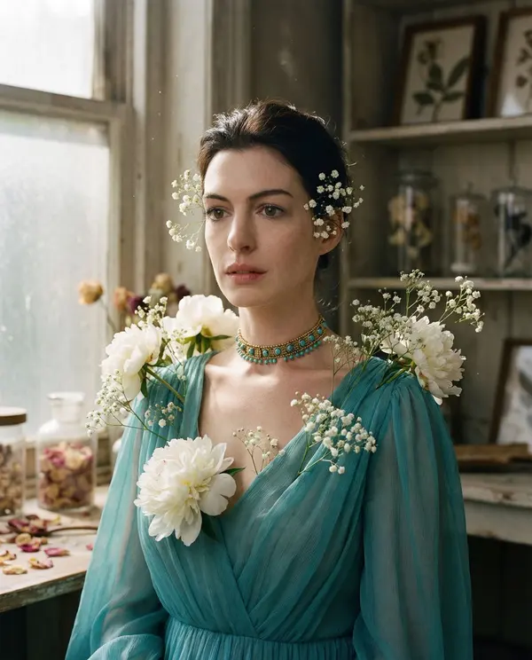
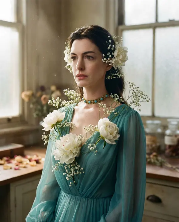
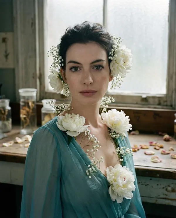
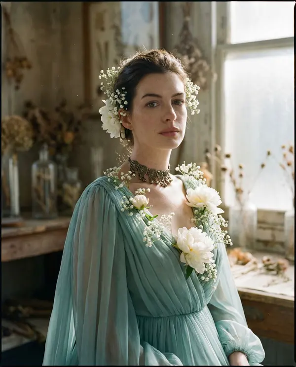
{ "vibe_title_en": "Fluid Flora", "master_prompt": "A hyper-realistic, medium-format portrait of The Protagonist situated in a weathered, sun-drenched botanical preservation laboratory. The subject is draped in voluminous, translucent teal chiffon that does not merely sit on the body but physically morphs into living white peonies and wild gypsophila at the neckline and temples. The floral elements appear to be growing directly from the weave of the fabric, blurring the line between textile and biology. The lighting is soft, directional north-facing window light filtering through antique frosted glass, illuminating floating dust motes and creating a creamy, painterly fall-off on the skin. Captured with a Hasselblad 500C/M, 80mm f/2.8 Planar lens, on Kodak Portra 160 film. The image features distinct analog grain, true-to-life skin pores, and microscopic details on the flower petals, strictly avoiding any CGI or digital illustration aesthetics.", "meta": { "intent": "Editorial Surrealism", "priorities": "Texture, Organic Integration, Soft Light", "device_profile": "Hasselblad 500C/M" }, "frame": { "aspect": "4:5", "composition": "Medium Close-Up, Centralized", "layout": "Symmetrical Weight, Negative Space Balance", "camera_angle": "Eye Level", "tilt_roll_degrees": "0" }, "subject": { "gender": "Female", "identity": "The Protagonist", "demographics": "Adult, ethereal presence", "face": "Neutral expression, soft gaze, natural skin texture with visible pores", "hair": "Swept back, integrated with organic floral growth", "body": "Relaxed shoulders, graceful posture", "expression": "Serene, introspective, slightly parted lips", "pose": "Static, facing forward with a slight 15-degree turn" }, "wardrobe_accessories": { "garments": [ { "item": "Surreal Morphing Gown", "material": "Chiffon transitioning into organic petals", "color": "Pale Teal / Cyan", "fit": "Loose, flowing, off-shoulder" } ], "accessories": [ { "item": "Living Floral Headpiece", "color": "Cream White / Soft Green", "material": "Real Peonies and Gypsophila", "brand_style": "Avant-Garde Floristry" }, { "item": "Choker", "color": "Gold / Turquoise", "material": "Antique Metal and Beads", "brand_style": "Vintage Artisan" } ] }, "environment": { "setting": "Botanical Preservation Laboratory / Old Conservatory", "surfaces": "Frosted glass, aged wood, scattered dried petals", "depth": "Shallow depth of field, background soft and creamy", "atmosphere": "Dusty, humid, serene, suspended in time", "lens_interaction": "Soft bloom on highlights, natural vignetting" }, "lighting": { "key": "Soft directional window light (North facing)", "fill": "Ambient reflection from white walls", "rim": "Subtle backlight on hair texture", "shadows": "Open, soft, pastel-toned", "color_temperature": "5600K (Daylight balanced)", "sensor_flare": "Minimal, organic haze" }, "camera": { "lens_type": "Prime Portrait Lens", "focal_length": "80mm", "aperture": "f/2.8", "focus": "Sharp on eyes and floral details", "sensor_format": "Medium Format (6x6)", "perspective_distortion": "None" }, "post_processing": { "color": "Pastel palette: Teal, Cream, Soft Skin Tones", "tonality": "Low contrast, lifted blacks, creamy highlights", "texture": "Fine grain (Kodak Portra 160 simulation)", "digital_sharpening": "Low (Natural softness)", "chromatic_aberration": "None" }, "negative_specifications": [ "neon", "cyberpunk", "cgi", "3d render", "cartoon", "illustration", "high contrast", "harsh shadows", "plastic skin", "vector art" ] }
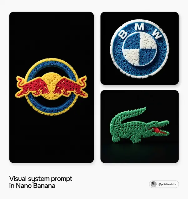
[BRAND NAME] Act as a Senior Product Photographer specializing in hyperrealistic sponge-material brand logos — a brand's exact logo shape physically carved from a real porous sponge, shot as macro studio photography, tinted in the brand's authentic colors. PHASE 1: BRAND LOGIC (AUTONOMOUS) - Autonomously determine [BRAND NAME]'s actual, authentic real-world logo — reproduce its exact silhouette, proportions and geometry with complete accuracy. Do not simplify, distort or reinterpret the shape. - Autonomously determine [BRAND NAME]'s real, official brand color(s) (primary logo color, and secondary color if the logo uses more than one). PHASE 2: FIXED MATERIAL — POROUS SPONGE - The material is ALWAYS a real kitchen/cleaning sponge texture — dense, irregular open-cell foam structure with cavities and holes of varying size and depth across the entire surface. - This material choice is fixed and never changes regardless of [BRAND NAME]'s industry — do not substitute sponge for any other material under any circumstances. - Sponge texture must look physically authentic: porous, slightly rough surface, uneven cavity distribution, visible depth inside each hole, torn/frayed micro-edges consistent with real foam. PHASE 3: COLOR-LOCK RULE (CRITICAL) - The sponge material filling the logo silhouette must be rendered in [BRAND NAME]'s exact official brand color(s) from Phase 1 — as if the sponge itself was manufactured/dyed in that color. - If the logo uses multiple colors in different sections, each section keeps its correct brand color, all rendered in the same sponge texture. - Do NOT default to any "typical" sponge color (yellow, orange, blue) unless that happens to be the brand's actual color — brand color always overrides any assumed material color. - Lighting may create natural highlights/shadows and slight value shifts (lighter/darker) within the texture, but the base hue family must stay locked to the brand's color(s) throughout — no hue drift. PHASE 4: LOGO-AS-SPONGE CONSTRUCTION - Render [BRAND NAME]'s exact logo silhouette as if it were physically cut/carved from a solid block of sponge foam, entirely filling the shape with porous cellular texture. - Cavities and holes are dense and consistent across the whole logo, with natural size/distribution variation — never uniform, never tiled, never repeating in an obvious pattern. - Render visible shadow depth inside each cavity (within the locked brand color's tonal range) to sell real three-dimensional porous volume. - Outer edges of the logo shape are not perfectly clean/vector-sharp — allow slight natural sponge-edge irregularity (a few torn/frayed fibers at the boundary) consistent with a real sponge being shaped, while the overall silhouette remains instantly recognizable as the brand's real logo. PHASE 5: LIGHTING & BACKGROUND - Background: solid, deep black, completely flat, no gradient, no texture. - Lighting: single dramatic directional studio light source from upper-left or upper-right, creating strong highlight on raised/convex sponge surfaces and deep shadow within the pores — high-contrast product-photography quality. - Shadows stay rich and deep to emphasize the porous dimensionality; optional subtle rim light on one edge to separate the logo cleanly from the background. - Camera: frontal, orthographic, no perspective tilt, logo centered and filling roughly 55-65% of canvas width/height with generous even negative space margin. TECH SPECS - Aspect Ratio: 1:1 - Style: hyperrealistic macro product photography, brand-logo sponge sculpture - Resolution: 4K, tack-sharp focus across the entire logo, true macro-level porous texture detail - Lighting: single-source directional studio light, high contrast, deep naturalistic shadows, no flattening ambient fill - Color Mode: sponge texture rendered strictly in the brand's official color(s), true-to-brand hue accuracy, pure black background, sRGB high fidelity - Composition: dead-center logo, frontal angle, generous even negative space margin, subtle grounding shadow beneath the form - No watermarks, no UI chrome, no added text, no props beyond the single sponge logo
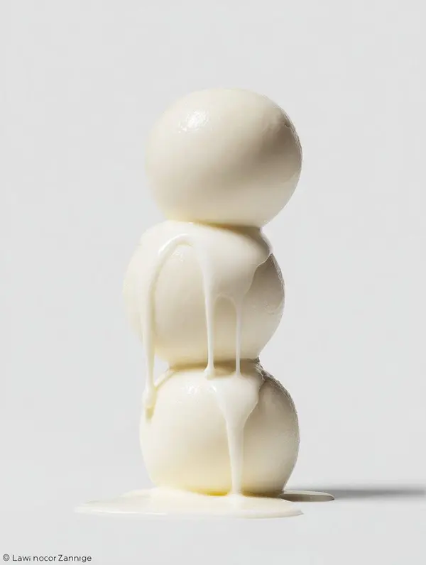
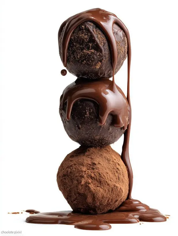
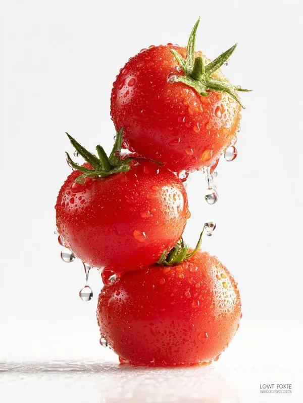
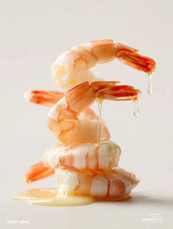
a stack of three [Tomatoes, Eggs, and Sweatshirt and Ice creams ] with [LIQUID] dripping down, on a white background, in the style of food photography, macro shot, studio lighting, nikon z6 ii, volumetric lighting, neutral tones.