ChatGPT Images 2.0 is OpenAI's image generation model for creating production-ready visuals from prompts, including posters, ads, infographics, comics, layouts, and multilingual text-heavy designs.
How are the prompts collected?
The gallery is hand-picked by our team from creators sharing their work in public communities. If a prompt of yours is featured and you'd prefer it taken down, just reach out and we'll remove it right away.
How do I try a prompt?
Hit the Try button on any card and you'll be taken straight to Playyy with the prompt pre-filled — generate the image with one click, no copy-pasting needed.
Can I submit my own prompts?
Submissions are coming soon. In the meantime, share standout prompts with us on X or Discord and we'll review them for inclusion.
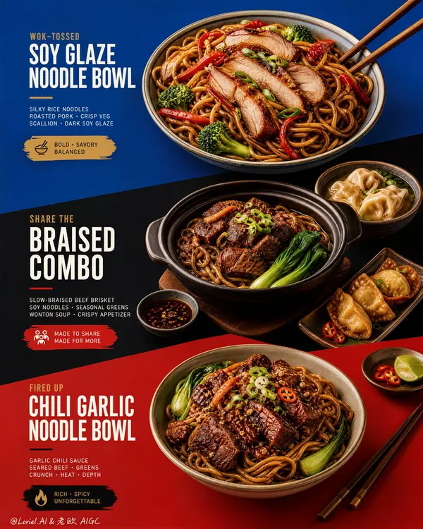
Create an ultra-premium restaurant advertising poster that merges Orbit-style compositional force with Transit-style international polish, preserving the exact structural logic of a bold color-block menu poster while refining it into a cleaner, sharper, more globally premium flagship campaign. Use a tall vertical layout divided into three large graphic color fields with strong angled transitions, where each color block acts as a compositional stage for a specific hero dish or combo. The final artwork must feel bold, graphic, craveable, modern, and Cannes-level commercial, with the food and color planes fused into one precise design system. Do not copy any original text, logo, pricing, or wording.
Core composition:
Use a vertical poster layout with three major stacked sections connected by strong diagonal or slanted color-block cuts.
Top section: a premium blue field featuring one hero stir-fried rice noodle bowl.
Middle section: a deep black-charcoal field featuring one larger family combo or shared meal composition.
Bottom section: a rich red or terracotta-red field featuring a second hero noodle bowl.
The transitions between color fields must feel sharper, more directional, and more deliberate, so the eye travels through the poster in one continuous graphic rhythm.
Orbit enhancement:
Push the structural energy of the color blocks much harder. The diagonal cuts between blue, black, and red should feel more assertive, almost slicing through the page and directing the viewer’s attention from top hero bowl, through the middle combo, into the lower bowl. The placement of bowls, chopsticks, and side dishes should echo these diagonal vectors, so the food itself appears orchestrated by the color geometry. The poster should feel more immediate and more visually aggressive from a distance.
Transit enhancement:
Refine the entire poster into an international flagship restaurant-advertising language. Use purer, more controlled color fields, cleaner typography spacing, calmer negative space, and more elegant hierarchy. The blue should feel fresher and more premium, the black deeper and more sophisticated, and the red more refined and less noisy. The result should feel like a global fast-casual or modern Asian dining brand campaign rather than a crowded local promo poster.
Food and color-block integration:
This is the most important feature. The dishes must feel inseparable from the color fields. Each bowl must sit in its section with exact compositional intention, using plate placement, garnish direction, chopstick angle, and nearby side elements to reinforce the graphic planes. The color blocks should not be passive backgrounds; they must actively frame, support, and sharpen the food presentation.
Top hero bowl:
Show a premium soy-glazed or stir-fried rice noodle bowl with glossy noodles, sliced roasted pork or chicken, red pepper strips, broccoli, scallions, and rich dark sauce sheen. The bowl should feel fresh, balanced, and immediately appetizing against the vivid blue field.
Middle combo section:
Show a richer, more abundant combo arrangement in the black-charcoal section: one deep bowl or clay pot with braised meat and noodles, plus one or two supporting side dishes such as soup, dipping bowl, or appetizer plate. The composition should feel generous but controlled, like a hero combo set for sharing. The darker section should make the warm food highlights glow more dramatically.
Bottom hero bowl:
Show a second noodle variation with deeper glaze, richer meat topping, greens, scallions, and carefully layered garnish. This lower bowl should feel slightly heavier and more indulgent, anchored powerfully against the red field.
Typography system:
Use bold, modern, highly legible menu typography integrated precisely into each section. Main dish names should be large, confident, and clean. Price blocks should sit inside compact contrasting graphic capsules or bold painted labels. Supporting copy must be short, sharp, and minimal. All wording must be fully original and fictional. Typography must align with the color-block structure and never float loosely.
Lighting:
Use bright premium food-commercial lighting with warm directional clarity and controlled highlights. The noodles must show moist elasticity, the meat should catch caramelized gloss, and vegetables should remain fresh and crisp. Keep the lighting polished and appetizing, but clean enough that the graphic composition remains dominant.
Material rendering:
Render noodles with springy tension and sauce sheen, meats with rich caramelized texture, vegetables with natural freshness, eggs or tofu if included with convincing surface detail, ceramic bowls with subtle glaze reflections, and chopsticks with elegant wood texture. The color fields should feel matte, flat, and graphically strong, contrasting with the realism of the food.
Background and cleanliness:
Keep the entire poster highly controlled and clean. No unnecessary pattern overload, no cluttered prop styling, no random elements outside the color-block logic. The graphic planes and food should carry the entire story.
Color system:
Use a disciplined premium palette of saturated but controlled blue, deep black-charcoal, refined terracotta-red, noodle gold, roast mahogany, scallion green, citrus green accents, and small off-white typography. The color blocks must feel bolder and more premium, while the warm food tones unify the poster.
Image finish:
The final poster must feel like a world-class flagship restaurant campaign: bold, directional, graphic, product-led, internationally polished, and instantly memorable. Preserve sharp food detail, precise color-block edges, elegant typography hierarchy, and immaculate commercial retouching. 8k, premium restaurant advertising quality.
Negative prompt:
copied text, copied pricing, copied logo, cluttered layout, weak color blocks, muddy food texture, limp noodles, greasy mess, random props, poor typography hierarchy, dirty background, black blotches, low-resolution food detail
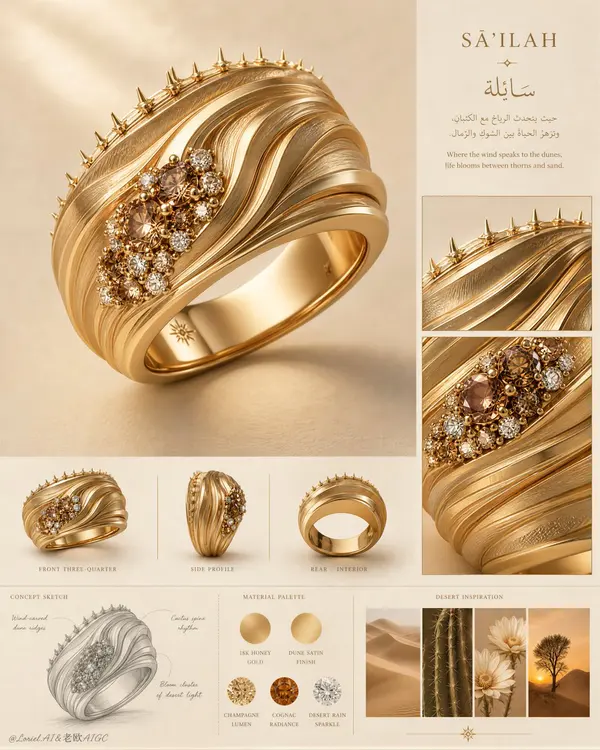
Create an ultra-premium vertical jewelry concept presentation board for a luxury ring collection, merging the clarity of an international high-jewelry maison design archive with the visual poetry of a desert-inspired material study. Preserve the original board logic but refine it to its most powerful form: one oversized hero ring render dominates the upper-left and center, a disciplined right-side editorial column contains a short concept heading and two close-up detail windows, a middle strip presents three smaller orthographic product views, a lower-left graphite concept sketch explains the structural idea, a lower-middle palette section shows metal and gemstone swatches, and a lower-right inspiration strip contains four small desert-nature images. The whole layout must feel exceptionally clean, globally premium, intelligent, and exhibition-ready.
Design a new couture statement ring inspired by wind-carved dunes, cactus spine rhythm, and rare blossoms surviving in arid land, without copying any existing form. The ring should be a wide 18k gold band with layered sculptural ridges sweeping diagonally around the surface like flowing desert topography. Strengthen the Orbit energy by making the ridge lines more dynamic and directional, as if shaped by persistent wind, with elegant wave acceleration across the band. Along one upper edge, integrate a refined row of thorn-like micro protrusions inspired by cactus silhouettes, delicate and luxurious rather than aggressive. Near one side of the ring, place a tightly composed cluster of champagne, cognac, and clear stones, like a sudden bloom of desert flowers after rain. The ring must feel iconic, feminine, sculptural, and instantly recognizable.
Push the Transit direction strongly: simplify the board, increase negative space, reduce unnecessary explanatory density, refine alignment, and make every section feel more expensive and internationally art-directed. Push the Port direction strongly: compress the entire page memory into three dominant symbols only, the hero ring, the right-side detail windows, and the bottom inspiration strip. All other elements should remain faint, supportive, and highly controlled. The ring must remain the absolute visual sovereign of the page.
Lighting should be soft, warm, and precisely directed from the upper left, with premium studio control. Create delicate gradients across the gold ridges, restrained highlights along polished edges, subtle gemstone sparkle, and soft grounded shadows that make the hero ring feel tactile and monumental. Increase material contrast enough to reveal the dune-like topography and gemstone relief, but keep the atmosphere calm, noble, and flagship-level. No harsh glare, no catalog harshness, no overexposed metal.
Materials must be exquisitely rendered: rich warm 18k gold, alternating satin-brushed and softly polished ridge planes, tiny claw or bead gemstone settings, realistic champagne and cognac diamond depth, restrained clear diamond fire, and a perfectly smooth polished interior band. The right-side close-up windows should magnify the dune-ridge texture, thorn-edge craftsmanship, and floral gemstone cluster. The middle row of smaller product views should include front three-quarter view, side profile, and rear/interior view, evenly lit and neatly aligned. The lower-left concept sketch should be a fine graphite drawing with elegant original annotation lines. The palette section should present circular swatches of gold tone and gemstone colors with invented premium labels. The lower-right inspiration strip should show coordinated desert dunes, cactus detail, pale desert flowers, and a solitary desert tree at sunset.
Typography should be sparse, elegant, and original, using a refined serif Latin title with a graceful Arabic-inspired companion text block. Do not copy any wording from the source. Text must behave like compositional architecture only, never overpowering the ring. Background should be warm sand-beige with subtle matte paper softness and very faint editorial texture.
Color system: sand beige, warm ivory, honey gold, matte camel, champagne, cognac amber, soft white sparkle, muted desert brown, and tiny pale botanical accents. The final image must feel like a Cannes-level luxury jewelry concept board: clean, dramatic, collectible, and ready for a flagship campaign or museum exhibition.
No copied title, no copied wording, no watermark, no existing brand logo, no clutter, no extra jewelry pieces, no cheap CGI, no plastic gold, no oversaturated orange, no messy layout, no random props, no low-detail sketches, no black blotches, no muddy shadows, no distorted ring geometry, no inconsistent material logic, no illegible typography, no visual noise.
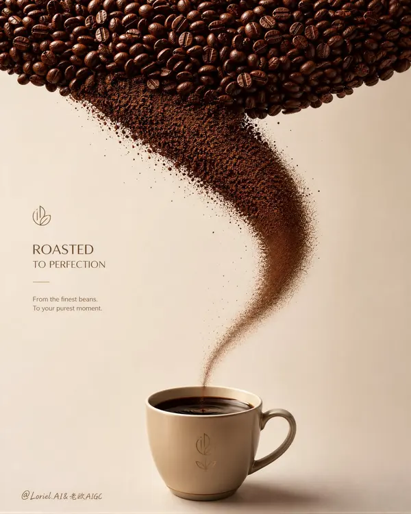
Create an ultra-premium minimalist coffee advertising poster that preserves the exact core logic of the reference image while upgrading it into a more sculptural and brand-complete flagship composition. Build the entire image around one unmistakable three-part visual system: a dense upper canopy of roasted coffee beans, a graceful curved stream of ultra-fine coffee grounds descending in an elegant arc, and one premium branded coffee cup at the bottom center containing rich aromatic liquid coffee. The final artwork must feel precise, aromatic, minimalist, sculptural, and globally premium, with the composition itself functioning like a signature brand symbol. Do not copy any existing logo, text, or wording.
Core composition:
Use a tall vertical poster layout with three locked layers:
1. a rich dark field of roasted coffee beans spanning the full top zone,
2. a curved powder trajectory flowing downward from the bean field,
3. one refined hero cup placed exactly at the lower center as the final destination, now visibly filled with浓郁 liquid coffee.
The bean canopy, powder arc, and cup must feel inseparable, like one complete premium coffee brand asset. Keep the background spacious, quiet, and immaculate so the structure reads instantly from a distance.
Curved powder-flow logic:
The coffee-powder arc must begin fuller and denser near the upper transition from whole beans, then follow a graceful curved descent, and as it approaches the cup rim it must gradually become less, finer, lighter, and narrower, creating a beautiful tapered flow. Near the cup mouth, the powder should transition into a delicate fine-threaded granular stream with fewer particles and softer edge diffusion, so the eye experiences a refined density gradient from top to bottom. The powder should feel like aroma and roast character concentrating into the drink.
Liquid coffee in cup:
This is the key update. The cup must not appear empty. Inside the cup, show rich, dark, freshly prepared liquid coffee with a smooth glossy surface and a deep espresso-brown tone. The liquid should feel aromatic, warm, and concentrated, with subtle reflective highlights along the top surface and a slight meniscus hugging the cup edge. The cup interior should suggest depth and warmth, as if the descending coffee particles are completing their transformation into a luxurious drink. The final landing point must feel satisfying, flavorful, and complete.
Brand presence:
The poster must feel like a complete premium coffee brand visual. The cup should carry a subtle but clear original fictional brand mark or emblem area. The curved powder path must visually guide attention into the liquid coffee surface so the cup becomes both the compositional endpoint and the emotional payoff of the whole poster.
Coffee material rendering:
Render the roasted beans with hyper-real premium detail: rich espresso-brown and cocoa variation, subtle oily satin highlights, visible center seams, and tactile roast irregularity. Render the grounds as ultra-fine, dry, aromatic granules with precise texture readability. Render the liquid coffee as dense, dark, smooth, and premium, with a velvety reflective surface and elegant tonal depth. Keep the transformation from whole beans to powder to drink visually coherent.
Cup design:
Place one elegant premium coffee cup in the lower center, small but visually authoritative. Use a refined cream, pale sand, muted ochre, or warm neutral tone, with minimal original fictional branding. The cup must feel calm, modern, and premium, with a soft shadow beneath it and a delicate highlight on the rim. The liquid coffee inside should be clearly visible from the viewing angle.
Lighting:
Use soft premium studio lighting from upper left-front with refined editorial polish. The bean canopy should catch restrained rich highlights, the powder arc should reveal granular structure throughout its density gradient, and the cup should carry clean controlled highlights. The liquid coffee surface should catch a subtle glossy sheen, making it feel warm, rich, and drinkable.
Background:
Use a clean matte background in pale stone, cool beige, or warm cream-gray. No clutter, no props, no decorative noise. The simplicity of the background must elevate the dark bean mass, the graceful tapered powder motion, and the liquid coffee endpoint.
Typography logic:
If typography is included, place it minimally in the left-side negative space or upper-left area, using original premium brand-style wording. Keep it secondary to the bean-to-powder-to-liquid-cup symbol.
Color system:
Use a disciplined palette of deep roast brown, espresso black-brown, cocoa, dark coffee liquid, pale cream, warm stone beige, muted sand, and subtle ochre accents. Keep saturation restrained and luxurious.
Image finish:
The final poster must feel like a world-class flagship coffee campaign: minimal, sculptural, aromatic, elegant, iconic, and strongly brand-owned. Preserve razor-sharp detail on bean texture, coffee granules, the curved density gradient, liquid coffee surface, cup silhouette, and negative-space balance. 8k, world-class commercial retouching.
Mood:
aromatic, elegant, precise, sculptural, premium, concentrated, minimalist, brand-owned, globally polished
Rendering style:
ultra-premium coffee advertising, sculptural ingredient motion, roasted bean canopy, gracefully tapered curved coffee-powder flow, premium cup filled with rich liquid coffee, minimalist studio background, hyper-real material photography, world-class commercial retouching, 8k
Negative prompt:
copied text, copied logo, cluttered props, empty cup, stiff powder funnel, equal-width powder stream, muddy powder texture, fake smoke effect, weak composition, plastic beans, low-detail grounds, flat coffee liquid, chaotic granules, dirty background, black blotches, low-resolution product render, oversaturated colors
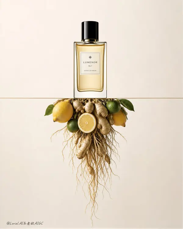
Create an ultra-premium luxury fragrance advertising poster that merges Orbit-style conceptual impact with Port-style symbolic clarity, while refining the glass reflections into a calmer, more restrained international high-end fragrance aesthetic. Build the entire image around one unforgettable three-part super-symbol: one elegant perfume bottle standing upright above a thin horizontal line, one sharply controlled inverted ingredient cluster suspended beneath it, and one clean field of negative space binding the two into a single iconic composition. The final artwork must feel minimal, intelligent, product-led, globally luxurious, and Cannes-level refined. Do not copy any real brand name, logo, slogan, or original wording.
Core super-symbol composition:
Use a strict vertical composition with one premium fragrance bottle positioned in the upper center, standing precisely on a razor-thin horizontal line. Below the line, suspend an upside-down aromatic ingredient cluster so it hangs like a root system beneath the bottle world. The bottle, the line, and the inverted source cluster must read instantly as one complete luxury visual sentence. The composition should feel architecturally controlled, calm, and memorable from a distance.
Orbit enhancement:
Push the conceptual reversal harder by making the lower ingredient cluster feel more root-like and structurally intentional. Keep the upper attachment area compact and concentrated, then allow ginger roots and fine strands to loosen and descend with increasing delicacy. The visual energy should move from the calm bottle above into the dense-to-loose root structure below, creating a stronger sense of vertical tension and conceptual depth without losing elegance.
Port enhancement:
Distill the image into a cleaner and more iconic brand symbol. Remove all non-essential visual noise and preserve only the most important relationship: bottle above, line divider, inverted ingredient root cluster below. The result should feel less like a styled still life and more like a proprietary high-luxury fragrance emblem. Every element must reinforce the product identity through precision and restraint.
Bottle design:
Design one original premium perfume bottle with a clear glass body, pale golden liquid, an elegant rectangular or softly rounded silhouette, a glossy black cylindrical cap, and a minimal refined cream label with fictional branding. The bottle must feel serene, expensive, and architecturally balanced. Its presence should dominate through placement, calm symmetry, and proportion rather than exaggerated size.
Glass reflection treatment:
This is the key refinement. The bottle glass reflections must be calm, restrained, and internationally premium. Avoid flashy specular glare or overly glossy cosmetic highlights. Use clean, narrow, elegant reflection bands with soft rolloff and precise edge control. The reflections should feel like a world-class niche fragrance campaign: polished, minimal, and sophisticated, never loud or commercial-cheap.
Inverted ingredient cluster:
Use a refined citrus-and-ginger composition: two fresh yellow lemons, one or two small green citrus fruits, one sliced citrus section, sculptural ginger rhizomes, and long fine tangled roots descending below. Keep the upper cluster compact near the dividing line, then let the roots disperse downward with fine natural rhythm. The ingredients must feel fresh, tactile, and luxurious, but always secondary to the bottle.
Lighting:
Use soft high-end studio lighting with a warm-neutral to slightly cool editorial balance. The bottle should receive subtle frontal illumination and controlled edge reflections. The liquid inside should glow softly without looking sugary or overly warm. The ingredients below should be clearly readable, with enough light to reveal peel texture, ginger surface, and root delicacy, while preserving the bottle as the brightest compositional authority.
Material rendering:
Render the glass bottle with impeccable clarity, subtle refraction, and restrained luxury reflection control. Render the liquid with soft golden transparency and refined meniscus detail. Render lemons with fine pore texture and quiet waxy sheen, green citrus with gentle gloss, ginger with fibrous matte irregularity, and roots with dry tangled botanical precision. Every material must feel hyper-real, premium, and physically truthful.
Background:
Use a seamless luxury studio background in pale cream, cool ivory, soft stone, or refined warm-white beige. Keep it immaculate and spacious. The negative space must feel as important as the objects themselves, reinforcing the high-end fragrance mood.
Color system:
Use a restrained luxury palette of pale cream, soft ivory, cool warm-white, lemon yellow, muted green, ginger beige, root tan, glossy black, and subtle pale gold liquid tones. Keep saturation elegant and subdued. The overall emotional tone must feel elevated, calm, and internationally luxurious.
Typography logic:
If any text is included, keep it minimal, original, and discreetly placed in the negative space. The visual concept must carry the message more than the copy.
Image finish:
The final poster must feel like a world-class international fragrance KV: minimal, conceptual, serene, precise, and product-led. Preserve razor-sharp bottle geometry, controlled glass reflections, fresh ingredient realism, fine root structure, and immaculate negative-space balance. 8k, world-class commercial retouching.
Negative prompt:
copied logo, copied slogan, cluttered props, ordinary tabletop still life, flashy reflections, harsh specular glare, dirty background, low-detail roots, muddy citrus texture, plastic ginger, distorted bottle, black blotches, oversaturated colors, low-resolution luxury product render
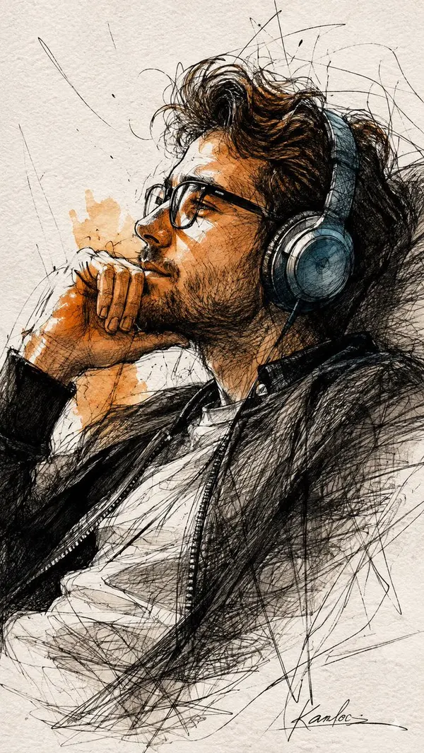
Expressive ink sketch portrait of a contemplative man (image Uploaded), in profile reclining with headphones, chin resting on his hand, made with loose gestural pen strokes and frenetic cross-hatching, energetic scribbles and overlapping lines suggesting motion and thoughtful stillness, warm orange watercolor washes on the face and hand for dramatic highlights, a cool blue accent on the headphone, high-contrast black ink, textured cold-press paper grain visible, minimalist negative-space background, cinematic side lighting, raw spontaneous illustrative style, fine-detail linework with splashes of color, artistic signature at the bottom, moody, intimate atmosphere
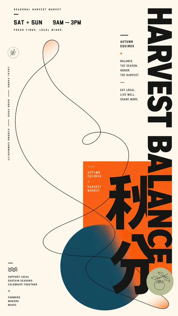
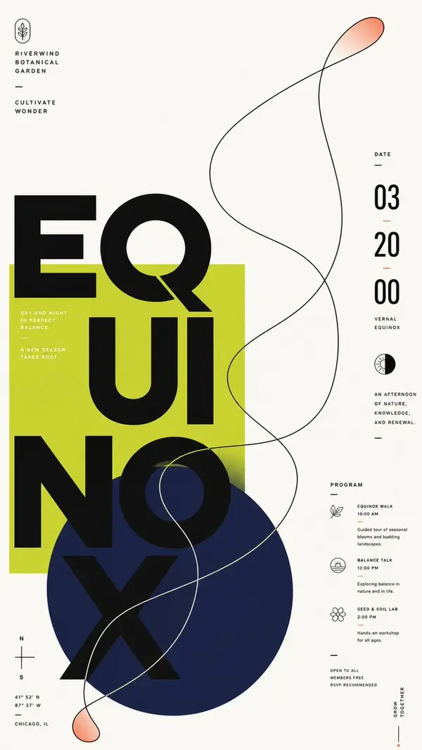
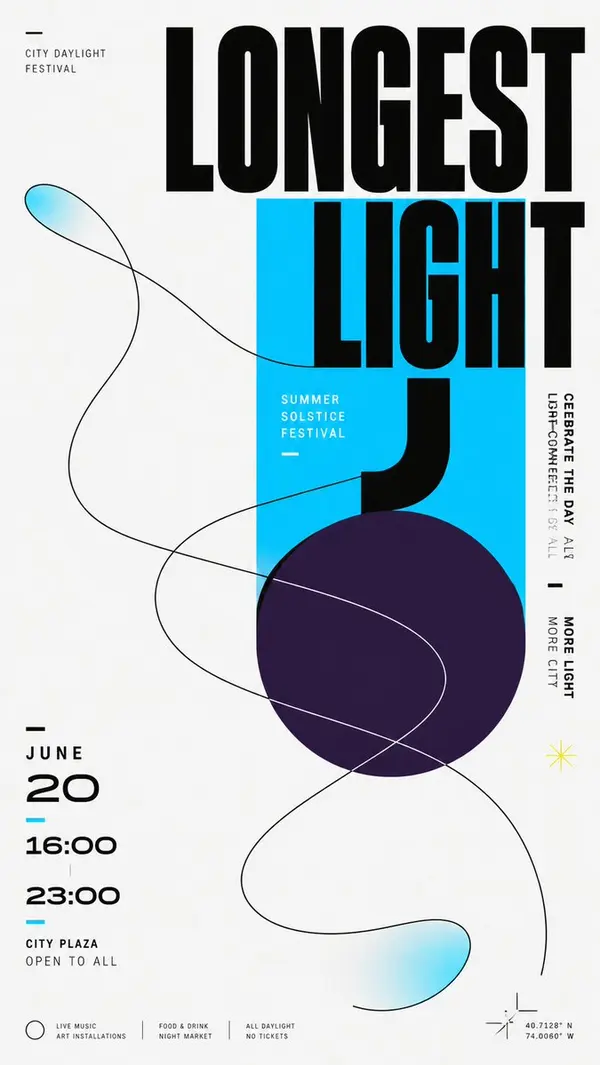
Build a modern flat graphic around any chosen subject object, with a huge Chinese theme character, geometric color blocks, and a single-line organic contour interlacing through one another. Keep an overall bright, clean background field, letting approximately two-thirds or more of the space remain empty, and concentrate the main weight in an off-center cluster: a saturated rectangular block in the theme's primary color first establishes a stable plane; a deeper, low-lightness, cool-toned circle overlaps from beneath it and extends beyond the boundary; the core Chinese theme character advances vertically in oversized, heavy, geometric black strokes across the white background, rectangle, and circle, with partial occlusion and cropping creating a strong scale jump; on the left, the date and a bilingual subtitle form a compact numeric column, while on the right, short vertical sentences set in two stroke-weight tiers balance the weight; a few miniature captions, short dashes, and linear symbols scatter along the edges, creating a three-level reading rhythm from main character to side notes to details. Abstract the dynamic relationship derived from the theme into one continuous organic contour, drawn as a broad sweeping loop with a clear, near-black single line that enters from the large empty field, passes through the color blocks, and crosses the edge; the curve intersects itself several times while remaining legible as a single path; keep most of its interior as the underlying background color, adding only localized, transparent, fading fills in the theme's primary color at the tips and extended sections, so the light line creates tension with the heavy giant character. Adapt the color scheme to the theme: let a clean, high-lightness neutral background carry the largest area; keep the theme's primary color vivid and highly saturated, using it for the rectangle and the localized transparent gradient; use a deep cool support color for the circle, separated in hue from the primary color and blending softly into the primary color at its end; use near-black for text and the contour, with a very small amount of light text reversed onto the primary color block; fix unequal areas, lightness hierarchy, and saturation differences, but do not fix specific color names. Render all elements as flat surfaces like matte digital printing, with sharp contour edges and gradients only as two localized, slowly feathered transitions; do not add dimensional shadows, paper grain, or global lighting effects. Keep typography in a low-contrast, broad, thick, near-geometric black sans-serif skeleton; allow the main character's parts to be elongated, offset, cut out, and switched between color-block backgrounds; give numbers a rounded futuristic structure and compress small text with narrow letterforms and loose tracking. Replace brand names, advertising copy, and concrete dates with new theme information. Preserve in the final result the extreme whitespace, the geometric cluster positioned lower-center, the opposing pull between horizontal and vertical text, and the moment an organic line crosses rigid geometric shapes, while avoiding evenly filling every part or reducing the contour to an isolated decoration.
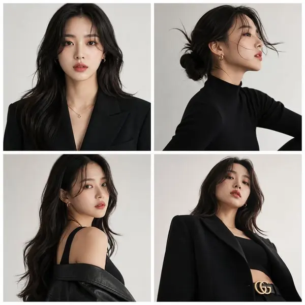
Create a premium high-fashion editorial series in a 2x2 grid layout, composed of four separate vertical posters with thin white spacing between panels. Feature the same stylish adult Korean female model in all four panels, preserving exact facial identity and a sharp, elegant, modern beauty aesthetic. Panel 1: front-facing portrait with a soft, confident expression.
Panel 2: refined side profile with cinematic lighting and a subtle motion pose. Panel 3: over-the-shoulder glance with strong editorial attitude. Panel 4: dramatic low-angle shot for a powerful luxury fashion mood.
Style direction: ultra-stylish Korean model aesthetic blending Seoul street fashion and luxury editorial sensibility. Use clean modern studio photography, softbox lighting, smooth shadows, and a minimal off-white or light gray background.
Outfits should be simple yet premium, combining modern streetwear and luxury tailoring. Natural makeup, flawless skin, elegant hair, polished styling. Overall mood: ultra-clean, minimal, premium Korean fashion magazine cover series, ultra-detailed 8K.
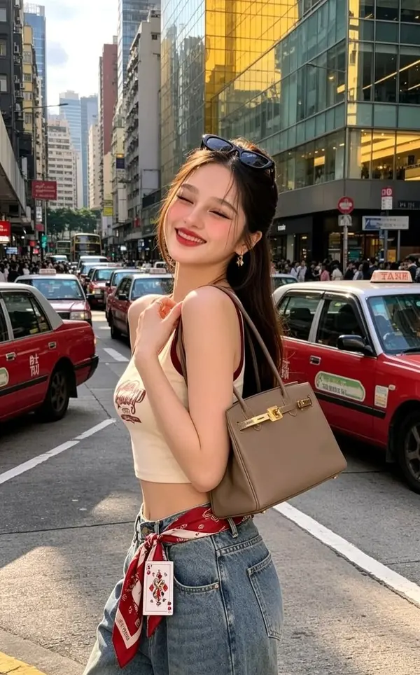
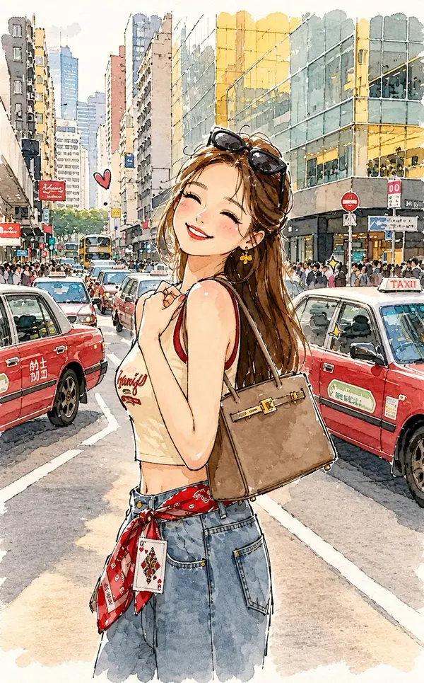
Transform the reference image into a charming minimalist doodle illustration while keeping the original white-grounded background and the complete street environment recognizable.
Preserve the original subject, pose, outfit, handbag, red taxis, buildings, road, and overall composition, but simplify everything into cute, playful, childlike forms. Use loose brush-pen outlines with naturally uneven, slightly wobbly hand-drawn strokes and tiny imperfections. Keep the white/light background visible around the illustrated elements, with the city scene softly simplified rather than removed.
Add subtle watercolor-ink textures, minimal pastel washes, expressive cartoon-like features, and a clean sketchbook aesthetic. The final artwork should feel airy, adorable, whimsical, handmade, and effortlessly hand-sketched while still retaining the recognizable original setting.
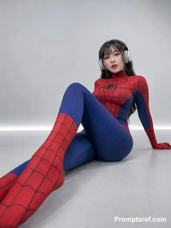
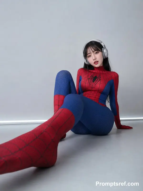
Create a vertical 3:4 minimalist studio cosplay portrait with a very low-angle wide-lens perspective. An adult woman sits directly on a smooth light-gray studio floor wearing a fully enclosed red-and-blue superhero stretch bodysuit that covers her continuously from the high collar through the arms, hands, legs and feet. Bright red sections cover the collar, shoulders, chest, arms, lower legs and feet and are printed with fine black web lines. A bold black spider-shaped emblem sits at the center of the chest. Deep royal-blue sections wrap around the side waist, thighs and most of the legs and carry a clearly visible fine pebbled or honeycomb textile texture. The entire outfit must read as real stretch fabric rather than hard armor or glossy latex, showing tiny believable areas of tension, compression and wrinkling around the waist, hips, knees and arms. She wears large silver-white over-ear headphones with thick rounded ear cups, a broad headband, pale gray cushioning and a subtle metallic finish. Long straight deep-black hair falls behind the headphones and continues below the shoulders. Light wispy straight bangs cover the forehead. The headphones physically compress part of the hair around the sides of the head, while a few fine strands remain loose around the cheeks, preserving believable weight and gravity. Her hips are firmly grounded on the floor while her torso leans backward and slightly toward frame-right. One arm reaches behind her and the fully covered palm presses into the floor as the main support point. The spine forms a gentle natural backward curve and the shoulders remain relaxed. Her legs create strong overlapping foreground perspective: one leg bends and then projects dramatically toward the lower-left and the camera, causing its red-covered foot to become the closest and largest foreground element, entering strongly from the lower-left corner. The other leg bends upward with the knee positioned higher in front of the body. Preserve accurate weight distribution through the hips, supporting hand, hip joints, knees and ankles; the pose must never look suspended or anatomically unsupported. Her physique is slim with narrow shoulders and a clearly defined waist. Because of the fitted costume, seated posture and wide-angle perspective, the hips and legs appear more volumetric, but keep the anatomy believable and do not further exaggerate the bust, waist or hips. The chest remains completely covered by the high-neck fabric and its contour comes only from natural stretch-fabric tension. The hands and feet are also entirely enclosed in the suit, with no exposed fingers, bare feet or external shoes. Preserve the reference image's small oval facial structure, soft jawline and naturally balanced features. Use a clean East-Asian pop-portrait, idol-beauty and cosplay-photo makeup direction: fair neutral skin with a subtle rosy component, soft-matte base, fine natural brows, muted taupe-brown eyeshadow, slim black eyeliner extending slightly outward, defined but restrained lashes, and soft nude-pink lips. She looks directly at the lens; because the camera is positioned extremely low, her gaze falls very slightly downward toward it. Her lips remain gently parted as if she had been speaking, humming along with music, or reacting to the photographer a second before the shutter. The expression should feel relaxed, playful and quietly confident rather than like a standard commercial smile. Visible bare skin is limited to the face and a tiny amount around the ears. The neck, shoulders, arms, hands, torso, legs and feet are all covered by the bodysuit. Facial skin appears smooth and lightly retouched at first glance, yet preserves fine human texture around the nose, under-eyes, mouth and cheeks. Its implied tactile quality should feel soft, fine-grained and slightly dry—not plastic, waxy or like a 3D character material. Place the camera extremely low, almost at floor level, directly in front of the woman and slightly toward frame-left, pointing gently upward. Emulate a modern smartphone wide main camera or a roughly 24–30mm full-frame equivalent lens. The lens is much closer to the nearest red-covered foot than to the head, creating a strong but controlled near-large/far-small effect: the foreground foot and lower leg are visibly enlarged while the torso and head become relatively smaller. Avoid fisheye distortion. Keep the entire head, headphones, torso, both legs and feet inside the vertical frame. Compose the subject primarily in the lower-middle and right side of the image while leaving a large expanse of empty gray negative space in the upper-left. The nearest red foot should act as a strong foreground anchor entering from the lower-left corner. This off-center balance is important to the visual identity of the reference. The background is a clean light-gray to gray-white seamless studio or minimalist futuristic interior. There are no decorations, furniture or urban elements. The floor is smooth cool gray, and a very thin horizontal bright seam or structural line appears where the wall meets the floor. The upper wall is slightly brighter while the lower region is subtly darker, creating a restrained laboratory or modern technology-showroom feeling. Use broad, soft, high-key studio illumination. The key source comes from the front-left and slightly above, like a large softbox or wide diffused window, evenly illuminating the face and red-blue costume. Allow gentle highlights on the forehead, nose bridge, upper cheeks, metallic headphones and textured fabric. Preserve very shallow shaping shadows along the subject's right side. Where her hips, supporting palm and costume touch the floor, include soft pale-gray contact shadows so she unmistakably feels grounded and weighted. No hard flash, no strong artificial rim light, no colored neon illumination and no cinematic orange-teal grading. The final image should feel as though she had just shifted into a comfortable seated position while listening to music. One leg had slid closer to the lens, her palm had moved backward to support her weight, and when the photographer lowered the camera she happened to glance directly into it, her slightly parted lips preserving the emotional residue of the previous second. Retain the imperfect physics of wide-angle perspective, seated-body compression, tiny garment stretches, hair pressed beneath the headphones and real floor-contact shadows. The result should look like a polished photograph of a real cosplay model, not a weightless CGI or video-game character.
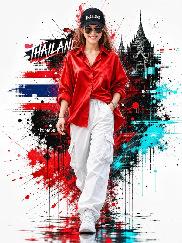
Use the uploaded face as the exact Face Reference. Preserve 100% facial identity, facial structure, skin tone, eye shape, eyebrows, nose, lips, expression, hairstyle (where applicable), and all unique facial features. Do not change, beautify, or replace the face. Keep the exact identity while placing her into the following scene.
A stylish young Thai woman confidently walking forward with one hand in her pocket and the other swinging naturally, wearing an oversized vibrant red satin button-up shirt with rolled-up sleeves, loose white cargo pants, clean white sneakers, a black baseball cap with bold white text "THAILAND", dark aviator sunglasses, a silver wristwatch, and subtle silver jewelry. Head slightly tilted downward, projecting a cool, confident attitude with a strong fashion-model presence.
Minimal clean white background with dramatic red, black, and cyan paint splashes, ink drips, abstract glitch effects, and dynamic graphic elements behind the subject. High-end fashion editorial look, urban streetwear aesthetic, digital splash art, dynamic motion blur, ultra-detailed realistic skin texture, cinematic lighting, crisp focus, vibrant colors, premium poster composition, centered full-body portrait, modern graphic design, trending on ArtStation, hyper-realistic, 8K, HDR, ultra-sharp details, vertical 9:16.
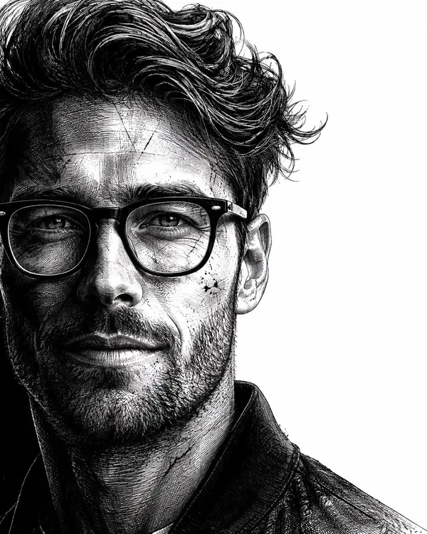
Use the uploaded reference image as the identity source. Preserve the subject's identity with maximum accuracy. Maintain the original facial structure, facial proportions, skin tone, eye shape, nose, lips, eyebrows, age, and all unique identifying features. Do not replace, reinterpret, beautify, or alter the person's identity. Transform only the artistic style while keeping the subject instantly recognizable. Create a hyper-realistic, dramatic black-and-white neo-noir assassin portrait illustrated in an ultra-detailed ink engraving and cross-hatching style. COMPOSITION & FRAMING • Vertical 4:5 aspect ratio. • Position the subject on the far left with virtually no left margin. • The subject should occupy approximately 60–65% of the frame. • Keep the remaining 35–40% on the right as clean white negative space with no distractions. • Show approximately two-thirds of the face using a vertical crop passing near the center of one eye. • Tight cinematic close-up: - Top crop slightly through the hair. - Bottom crop just above the shoulders. • Face oriented almost directly toward the viewer with only a subtle forward angle. • The eyes must be the strongest visual focal point. HAIR (ADAPTIVE TO REFERENCE) Analyze the hairstyle from the reference image and recreate it faithfully while enhancing it with a dramatic neo-noir aesthetic. Preserve: • Overall hairstyle • Hairline • Length • Parting • Natural texture • Volume • Curl or wave pattern Enhance with: • Rich, highly detailed strand rendering • Natural thickness and density • Dynamic movement and layered flow • Slightly windswept appearance • Subtle damp or wet texture • Individual flyaway strands • Fine engraved line work • High-detail cross-hatching throughout the hair The hairstyle should remain authentic to the reference while appearing cinematic and intense. FACIAL HAIR (ADAPTIVE) Analyze the reference image and preserve the subject's natural facial-hair characteristics. If clean-shaven: • Add only subtle rugged skin texture with extremely light natural stubble. If light stubble: • Increase density slightly while maintaining realism. If a beard or mustache is present: • Preserve the original style while enhancing depth, texture, and volume using engraved strokes. Render facial hair using: • Individual hair strokes • Cross-hatched shadowing • Natural density • Strong facial contour definition • Rugged but believable appearance (For subjects without facial hair, do not add a full beard.) SKIN TEXTURE Create a battle-hardened cinematic appearance using: • Fine skin texture • Subtle scars • Light scratches • Tiny ink splatter accents • Engraved pores • Dense cross-hatching instead of smooth gradients • High-detail etched shading LIGHTING Extreme noir chiaroscuro lighting. • One side of the face illuminated dramatically. • The opposite side fades into deep shadow. • Strong directional contrast. • Shadows created entirely through dense engraved cross-hatching. • Extremely high contrast with rich blacks and bright whites. ILLUSTRATION STYLE Ultra-detailed ink engraving illustration featuring: • Dense cross-hatching • Fine line engraving • Ink scratches • Etched textures • Vintage engraving techniques • Graphic novel aesthetics • Crime-thriller poster style • Museum-quality monochrome illustration • Crisp, razor-sharp line work BACKGROUND • Pure white background. • Large clean negative space on the right. • No objects. • No patterns. • No textures. • No distractions MOOD Dark, cinematic, mysterious, and powerful. The subject should project calm confidence, unwavering determination, and quiet intensity, resembling a legendary neo-noir protagonist while remaining unmistakably the same person as in the reference image. QUALITY Ultra-high resolution, hyper-realistic engraving detail, razor-sharp focus, exceptional micro-detail, dramatic contrast, premium editorial composition, masterpie
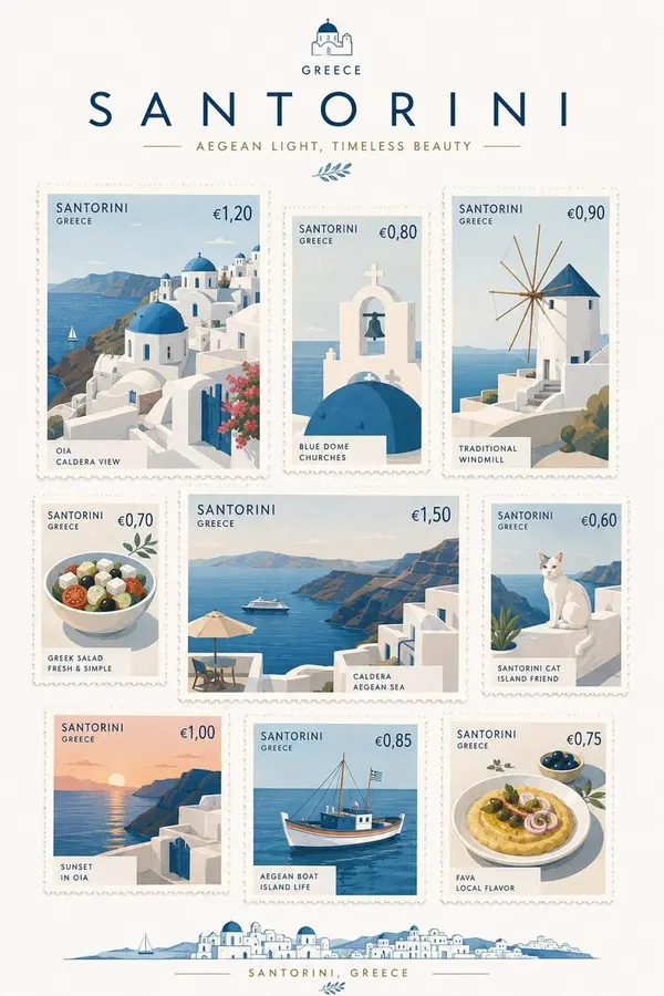
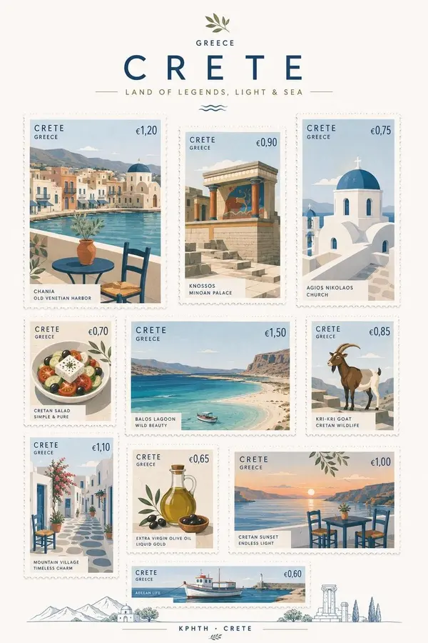
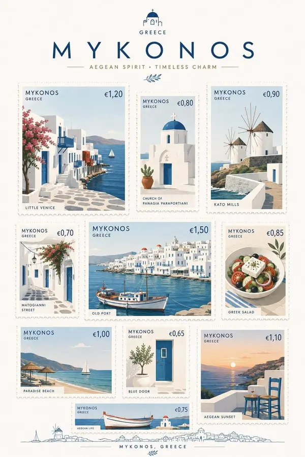
[DESTINATION] = [ENTER DESTINATION]
Create a premium commemorative postage-stamp collection inspired by [DESTINATION], presented as a beautifully designed A4 vertical stamp sheet.
Create 7–9 individual stamps featuring a thoughtful mix of iconic landmarks, architecture, local food, transportation, nature, cultural objects, and small everyday symbols that uniquely evoke [DESTINATION].
All stamps must keep the same elegant 3:4 portrait proportion, but vary noticeably in physical size. Arrange them freely across the sheet with gentle asymmetry, visual rhythm, and comfortable white space — NOT a rigid grid.
STYLE
Premium Scandinavian minimalism with sophisticated contemporary postal design. Simplify each subject into elegant geometric forms, clean silhouettes, restrained details, subtle graphic abstraction, and refined editorial composition.
Use a fresh but limited color palette inspired naturally by [DESTINATION]. Keep the background clean warm-white or pure white.
Avoid vintage sepia, excessive decoration, cartoonish illustration, photorealism, or generic tourist-poster aesthetics.
STAMPS
Every stamp must feel like a real collectible postage stamp:
• crisp perforated edges
• beautifully printed paper texture
• country or destination name
• authentic local currency symbol and realistic current postage denomination
• subtle, elegant typography
• one distinctive subject per stamp
Research and use plausible current local postage values and currency conventions for [DESTINATION].
Make every stamp visually different while maintaining one coherent art direction. Mix bold architectural compositions, close-up objects, landscapes, food, transportation, flora, and charming local details.
PRESENTATION
Show the complete A4 vertical commemorative stamp sheet straight-on, like a premium limited-edition postal release photographed or scanned for a design archive.
The final result should feel exceptionally collectible, tactile, sophisticated, and physically believable — something so beautifully designed that the viewer would genuinely want to tear off and keep each stamp.
No rigid grid.
No identical stamp sizes.
No excessive empty space.
No mockup frame.
No hands.
No envelopes.
A4 vertical ratio.
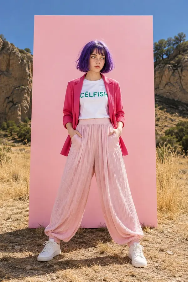
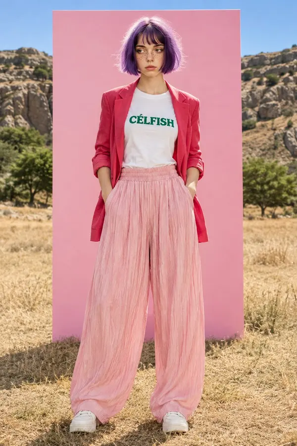
Create two separate high-end fashion editorial photos of the same character: a fair-skinned young woman with natural freckles, expressive brown eyes, and a short purple bob haircut with soft bangs.
She wears a white crew-neck T-shirt with green “CÉLFISH” text, an open reddish-pink blazer with rolled sleeves, flowing pastel blush-pink wide-leg pleated trousers, and clean white sneakers. Both images are set outdoors in a dry grassy field with rocky hills, sparse trees, and a clear blue sky, with a large vertical pastel-pink backdrop panel centered behind her.
Image 1: wider full-body composition, confident stance with feet slightly spread and both hands in the trouser pockets, looking slightly to the side.
Image 2: cleaner centered full-body fashion portrait, upright relaxed posture, hands in pockets, subtle sideward gaze.
Bright direct sunlight, crisp natural shadows, vivid colors, photorealistic skin and hair, detailed clothing texture, surreal outdoor-studio fashion aesthetic, premium magazine photography, ultra-realistic, 8K.
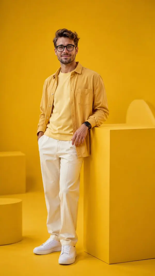
Ultra-realistic luxury editorial fashion photography of a handsome young Indonesian man in a premium monochromatic yellow studio.
The entire photography studio features a seamless matte yellow backdrop that blends perfectly into a matching matte yellow floor, creating a bold monochromatic environment. A large yellow cube pedestal and a few minimalist yellow geometric props are placed naturally, keeping the composition clean, modern, and sophisticated. Every element is carefully designed so that yellow dominates nearly the entire frame while maintaining a luxurious editorial aesthetic.
The model wears a premium oversized mustard yellow overshirt layered over a soft pastel yellow heavyweight crew-neck T-shirt, paired with cream straight-leg trousers and clean white leather sneakers. A black smartwatch is worn on his left wrist, creating a subtle modern contrast.
He stands confidently beside the yellow pedestal with one hand casually in his pocket and the other resting naturally. His body is turned slightly toward the camera with a relaxed posture and a warm genuine smile, radiating happiness, confidence, and positive energy.
Soft diffused studio lighting evenly illuminates the entire scene, producing smooth shadows, realistic skin tones, and beautiful separation while preserving the rich yellow color palette. The composition is perfectly balanced, minimalist, premium, and visually striking.
Luxury fashion editorial, monochromatic yellow concept, dominant yellow color palette, cheerful atmosphere, contemporary studio photography, extremely realistic skin texture, natural facial expression, realistic fabric texture, crisp details, Canon EOS R5, RF 85mm f/1.2L, f/2.0, ISO 100, HDR, 8K, masterpiece, award-winning fashion photography.
[DESTINATION]=[Destination]
[COUNTRY]=[Country]
[CHARACTER MODE]=[Auto]
[OPTIONAL CHARACTER]=[Auto]
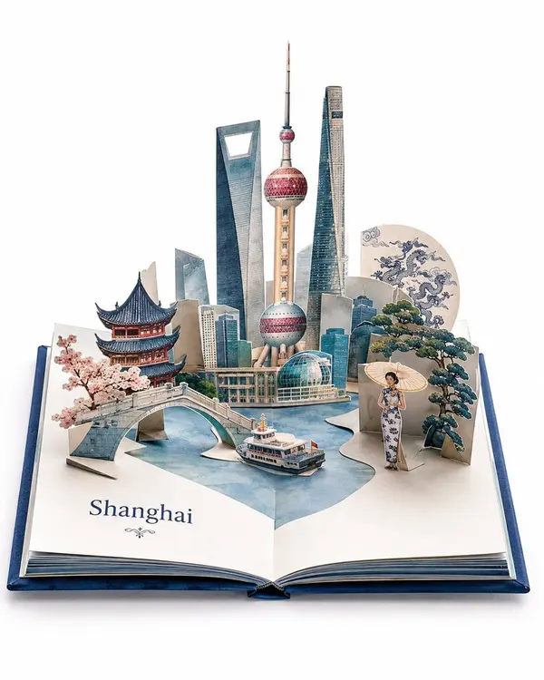
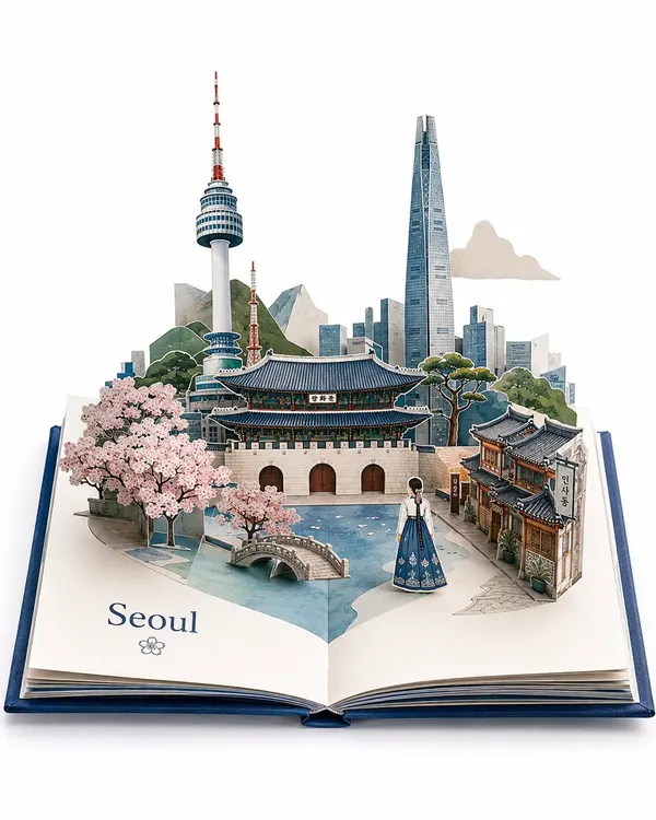
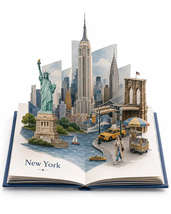
Create a premium travel pop-up book artwork of [DESTINATION], [COUNTRY] as a functional luxury sculptural paper storybook.
An open hardcover book rests on a bright white studio surface, captured the instant it opens as flat illustrated paper structures spring upward. Every element must remain attached to the pages and clearly appear capable of folding completely flat when the book closes. It must look like a real collectible pop-up book—not a miniature city, diorama, dollhouse, or architectural model.
Design the unfolding mechanism around the unique geography, architecture, culture, or iconic features of [DESTINATION]. The transformation should feel specific to the location, avoiding repetitive layouts.
Automatically select exactly 3 real, instantly recognizable landmarks or place-defining elements. One serves as the focal point while the other two integrate into a single continuous composition with asymmetry, overlap, layered depth, and natural visual flow.
Construct everything from thin illustrated cardstock using authentic pop-up engineering such as V-folds, accordion folds, box folds, hinged façades, interlocking slots, curved strips, and collapsing platforms. Supports must be elegant, minimal, and integrated into the design.
Include exactly 1 destination-inspired full-body character. If [OPTIONAL CHARACTER] is empty, generate one automatically based on [DESTINATION] or [CHARACTER MODE]. Keep it 25–40% smaller than the main landmark, naturally placed within the scene as a layered paper figure attached with a subtle fold or tab.
Add only 3–5 authentic supporting details specific to [DESTINATION], naturally integrated into the environment.
Use a three-quarter front view from slightly above with the entire open book visible. Create one dramatic composition with strong asymmetry, layered paper depth, foreground-midground-background separation, diagonal movement, and elegant negative space.
Use premium museum-white cardstock with refined watercolor, gouache, or editorial print textures, crisp die-cut edges, precise folds, subtle fibers, and soft paper shadows.
Apply bright professional studio lighting on a pure white background. Generate a cohesive 6–9 color palette inspired by [DESTINATION], using mostly refined muted tones with one or two accent colors. Avoid beige, sepia, muddy colors, glossy finishes, and excessive saturation.
Show a premium clothbound or embossed hardcover with minimal decorative page graphics. Display only the destination name: "[DESTINATION]".
Requirements
Exactly 3 real landmarks or defining elements.
Exactly 1 character.
Only 3–5 supporting details.
Entire open book visible.
All structures attached to the pages and visibly foldable.
No symmetry, oversized supports, mascot characters, souvenir layouts, antique paper, or miniature-city appearance.
The artwork must communicate a beautifully engineered paper world unfolding from flat pages, emphasizing destination-specific transformation, sculptural silhouettes, elegant paper geometry, premium editorial design, and magical physical movement.
Format: Vertical 4:5, centered premium product photography, bright white studio background, ultra-high resolution, sharp paper edges, strong dimensional depth, elegant negative space.
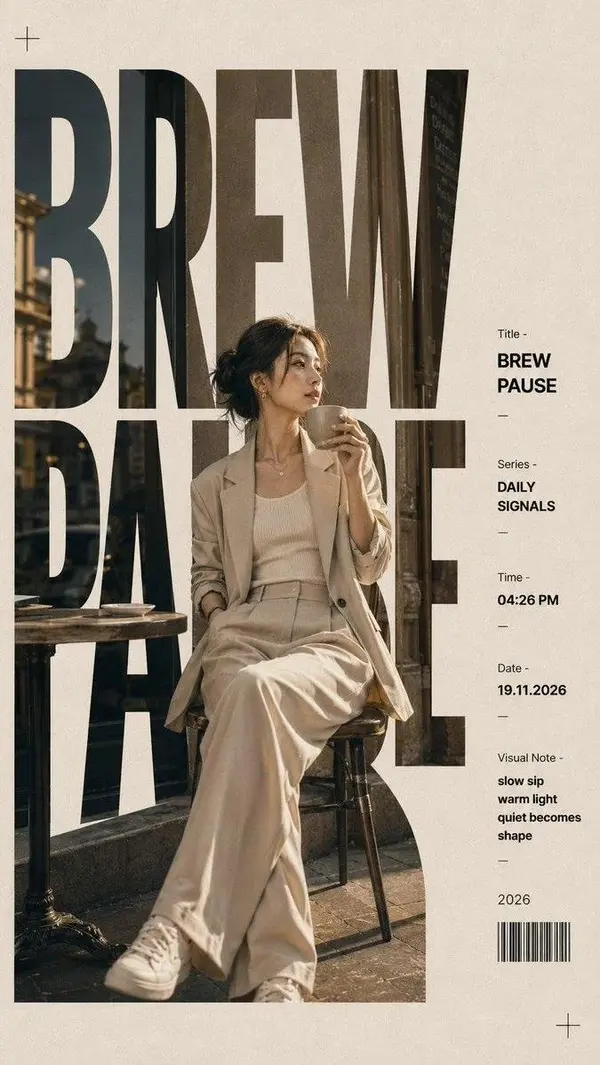
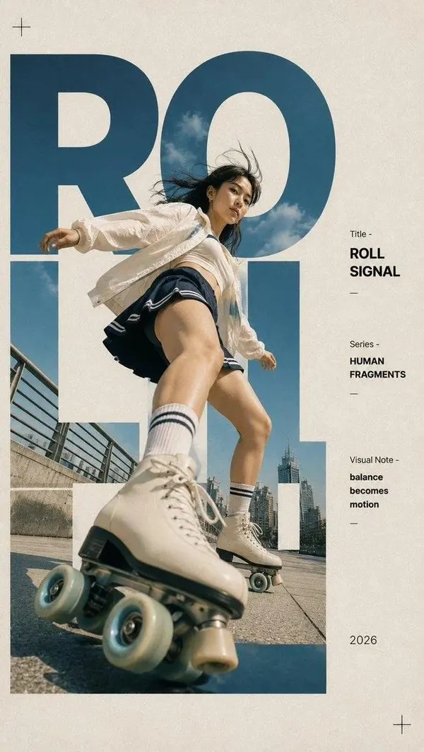
Modern editorial poster design featuring a stylish young woman in a minimalist fashion look, seated at a cozy outdoor café holding a ceramic coffee cup, or captured from a dramatic low-angle while roller skating in an urban plaza. Clean neutral outfit in beige, cream, white, or monochrome tones with tailored blazer, relaxed trousers, or sporty streetwear. Large bold oversized sans-serif typography integrated behind and around the subject, with giant cropped letters spelling a single word (e.g., "BREW", "ROLL", "CREATE", "MOVE"), where the photo is seamlessly masked inside the typography. Elegant magazine layout on a warm off-white paper background with premium editorial composition. Minimal information panel on the right featuring small clean typography, title, series, time, date, visual notes, barcode, thin divider lines, and subtle graphic symbols. Warm golden-hour lighting, cinematic shadows, soft natural sunlight, muted earthy color palette, luxury fashion magazine aesthetic, Swiss graphic design, Bauhaus-inspired typography, contemporary poster layout, premium branding, negative space, ultra-clean composition, high-end editorial photography, realistic skin texture, sharp clothing details, subtle film grain, 35mm photography, Adobe InDesign style, Vogue × Kinfolk × Monocle aesthetic, print-ready, ultra-detailed, 8K, no watermark, no logo, no random text, only clean editable placeholder typography.
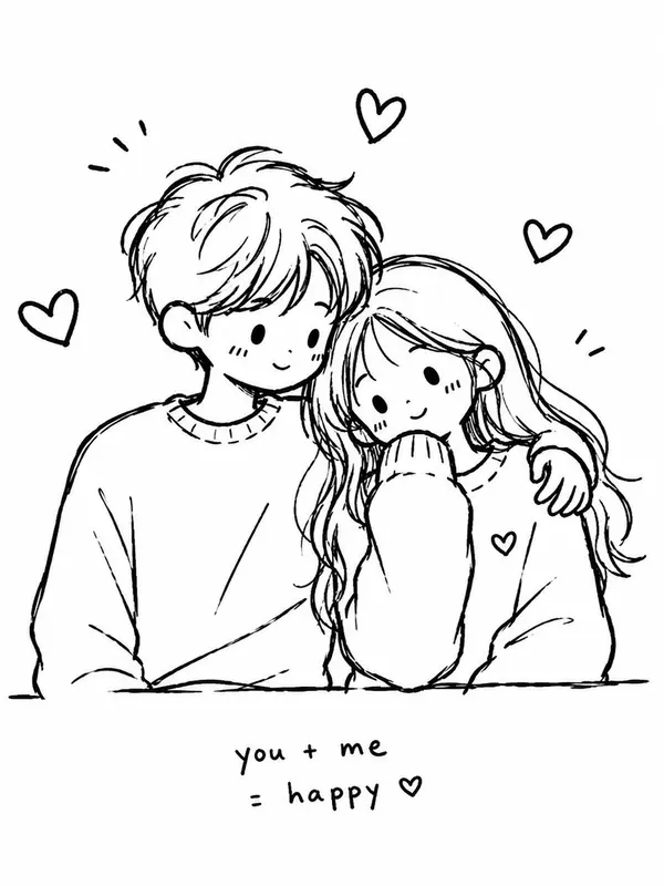
Transform the image into a minimalist hand-drawn doodle illustration. Use simple black brush-pen outlines with slightly wobbly, imperfect strokes. Reduce all details to cute, childlike shapes while preserving the main subject and composition. Naive sketchbook aesthetic, playful and whimsical character design, clean white background, minimal linework, expressive simplicity, handmade doodle style, black ink drawing, charming imperfections, simple cartoon illustration.
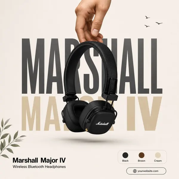
Create a premium, minimalist product advertisement inspired by modern Apple-style poster design. Use the Marshall Major IV Wireless Bluetooth On-Ear Headphones (Black) as the only product, preserving every design detail, proportions, and branding exactly as in the uploaded image.
Composition:
Aspect Ratio: 3:4 (portrait) Clean matte off-white/light beige background with soft studio lighting. Place the headphones hanging naturally from the top center, suspended by a realistic human hand entering from the top edge. The hand should gently hold the headband, creating a premium lifestyle feel. Behind the product, add one oversized bold condensed typography element in the background (for example: "MARSHALL" or "MAJOR IV"), using very large uppercase letters.
Use a combination of black, light gray, and muted gold/tan sections with low opacity so the text acts as a graphic background rather than readable content. Keep the headphones centered and overlapping the typography to create depth.
Minimal Elements:
Add only 2-3 small decorative elements such as tiny flying birds or subtle botanical leaves in opposite corners for balance. No unnecessary graphics, icons, or clutter. Plenty of negative space.
Bottom Layout:
Bottom left: Marshall Major IV Wireless Bluetooth Headphones Use clean bold sans-serif typography with minimal text only. Bottom right: A small rounded color selection card showing Black, Brown, Cream color circles. Add one small rounded pill-shaped website/contact placeholder below (simple and clean).
Lighting & Style:
Soft diffused studio lighting. Premium product photography. Gentle realistic shadows beneath the headphones. High contrast with crisp edges. Luxury editorial advertising aesthetic. Ultra-clean layout with balanced spacing. No gradients except very subtle background lighting. No excessive text, no promotional badges, no price, no QR code, no watermark, no extra logos besides the uploaded Marshall branding. Hyper-realistic, premium commercial product poster, elegant, minimal, modern.
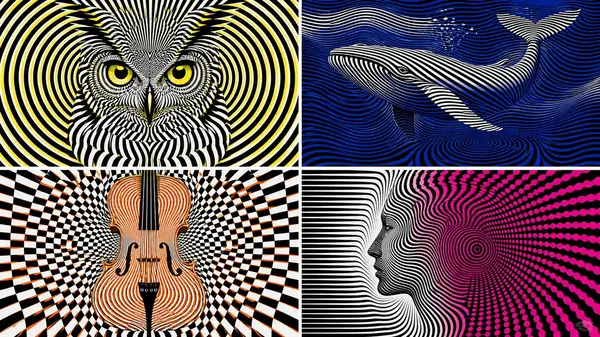
latent_op_art_subject select visual_output from latent_graphic_systems where subject = [subject] and representation_mode = 'hidden emergence' and style = 'op art' and geometry = infer(pattern_family from subject_dna) and illusion = infer(illusion_behavior from subject_dna) and color_scheme = 'stark contrasting' and drawing_rule = 'subject not directly outlined' order by delayed_recognition desc, optical_vibration desc, geometric_precision desc, hidden_depth desc, graphic_clarity desc limit 1;
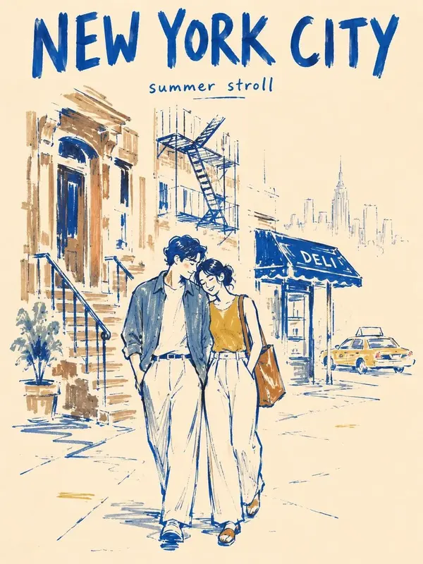
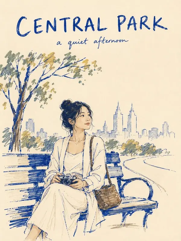
Create a vertical 3:4 minimalist marker-pen travel poster of NEW YORK CITY on warm ivory paper.
STYLE:
Use a rough, imperfect editorial marker illustration style with a modern folk-art feel. Draw with thick, slightly uneven cobalt-blue contour lines. Apply color with visible felt-tip marker strokes, streaky coverage, pressure variation, dry-skip texture, and patchy density. Do not fill shapes completely. Leave many small and medium uncolored gaps so the warm ivory paper remains visible through clothing, buildings, and street elements. Some outlines should break, skip, or fade.
SCENE:
Depict two lovers walking closely together on a quiet brownstone street in Manhattan. One gently leans toward the other in a natural affectionate pose. Keep the scene intimate and understated.
BACKGROUND SIMPLIFICATION:
Include only 4 essential New York cues: one brownstone stoop, one black fire escape, one small corner deli awning, and one faint yellow taxi. Optionally suggest a very faint distant skyline silhouette, but do not add more city elements. Keep the background visually quiet.
COMPOSITION:
Place the couple slightly below center as the emotional focus. Let the supporting background elements sit loosely behind them with incomplete marker fills and broken contour fragments. At least 40 percent of the page should remain untouched warm ivory paper. Keep the layout airy, elegant, and uncluttered.
FINISH GRADIENT:
The couple is the most resolved area. Nearby background objects are only about 40 to 60 percent rendered. Distant details and outer edges fade into loose marker strokes and untouched paper before reaching the border.
POSTER TYPOGRAPHY:
Add the title "NEW YORK CITY" at the top in bold hand-drawn uppercase lettering. Add a small handwritten subtitle such as "summer stroll".
COLOR PALETTE:
Use a restrained palette of deep cobalt blue, muted slate blue, mustard ochre, warm brown, taxi yellow, and warm ivory paper. Keep the palette limited and slightly muted.
MOOD:
Romantic, calm, urban, nostalgic, stylish, handmade.
NEGATIVE PROMPT:
fully filled marker coloring, solid flat fills, smooth vector color, polished digital finish, clean perfect outlines, overly complete rendering, crowded background, too many city elements, dense architecture, detailed signage, realistic textures, glossy surfaces, photorealism, watercolor, oil painting, airbrush shading, 3D render, cinematic lighting, dramatic shadows, cluttered layout, billboard overload, hyper-detailed buildings, perfect symmetry, extra fingers, extra limbs, distorted anatomy, blurry face
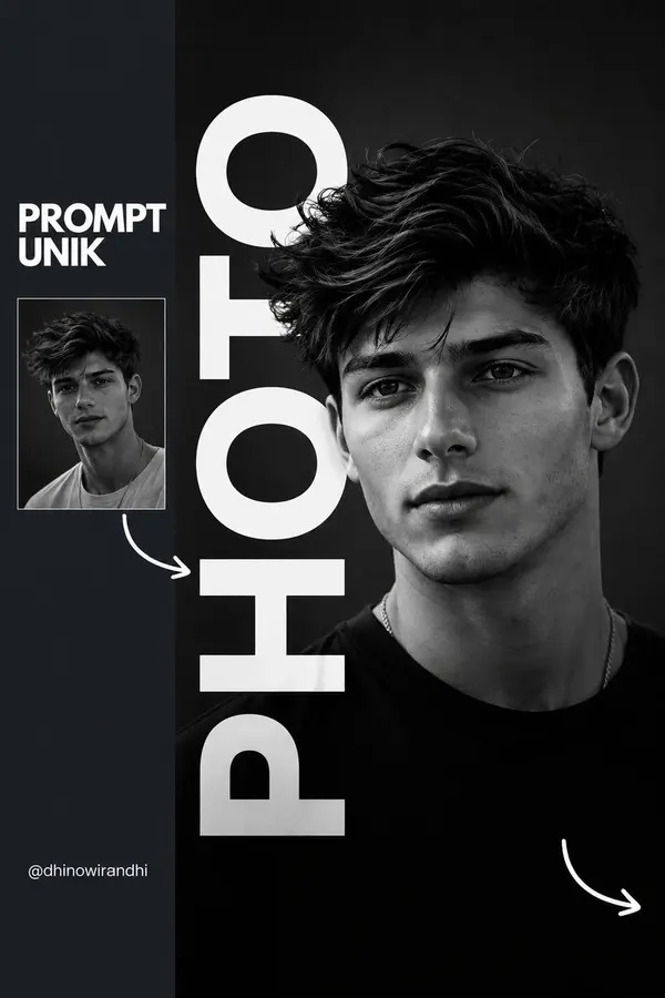
Create a premium minimalist editorial portrait poster with a monochrome black-and-white aesthetic. The composition features a cinematic close-up portrait of a stylish young man with neatly combed black hair, subtle stubble, wearing oversized black square eyeglasses and a fitted black t-shirt. The subject looks slightly to the right with a calm, confident expression under soft studio lighting, creating deep contrast and realistic skin texture.
Design the layout like a modern fashion magazine cover. Place the portrait on the right side over a dark charcoal background. Add a huge bold white vertical sans-serif word (e.g., "PHOTO") running from top to bottom, partially hidden behind the subject to create a layered depth effect.
On the left, include a dark slate sidebar containing:
A bold uppercase title reading "PROMPT UNIK" in white.
A small thumbnail version of the portrait below the title.
A hand-drawn white curved arrow pointing from the thumbnail toward the main portrait.
A small creator handle at the bottom in clean white typography.
Add another hand-drawn white curved arrow in the bottom-right corner for visual balance. Use generous negative space, clean alignment, sharp typography, and subtle shadows. The overall design should feel luxurious, modern, premium, and suitable for Instagram, Behance, or a creative portfolio.
Style: Minimalist, editorial, Swiss design, luxury branding, fashion magazine, monochrome, cinematic lighting, ultra-realistic, high contrast, crisp typography, premium graphic design, 8K quality, professional poster layout, Instagram aesthetic.
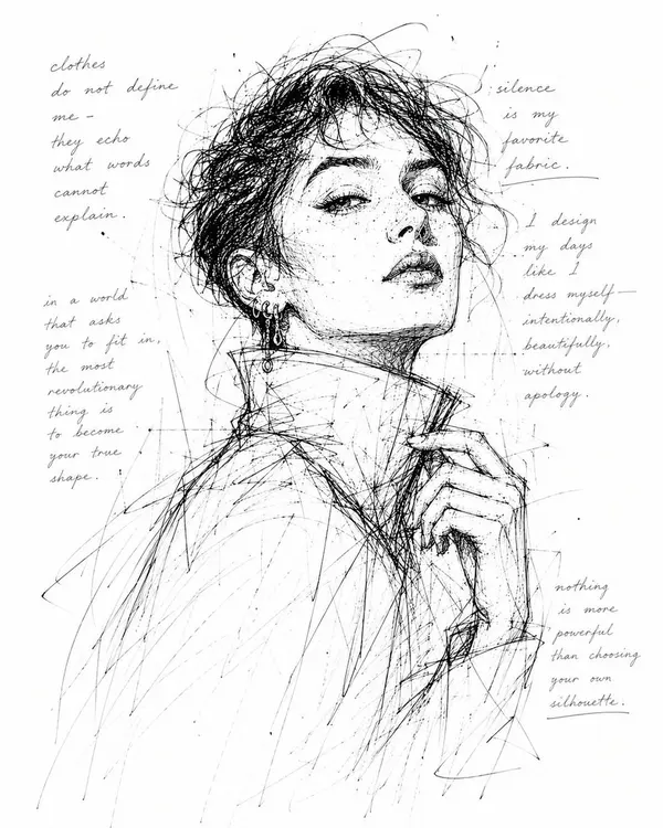
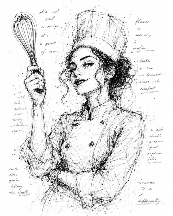
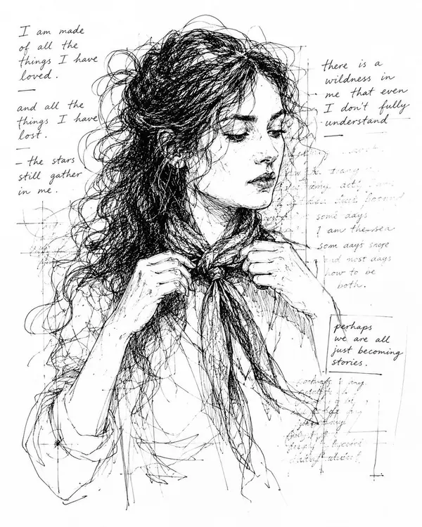
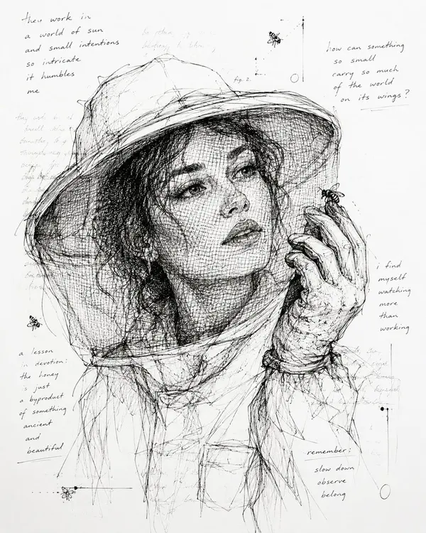
Monochrome scribble ink drawing on clean white paper featuring [SUBJECT] with [EXPRESSION], [POSE]. Add loose handwritten text fragments layered behind the subject like a ghosted notebook texture, partially visible through the sketch. Use black ink only, chaotic scratchy pen lines, loose crosshatching, unfinished contours, thin construction marks, minimal shading, large white negative space, raw sketchbook energy, poetic handwritten overlays, airy composition, imperfect expressive linework, vertical 4:5.
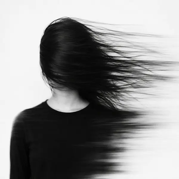
A surreal monochrome portrait of an anonymous young woman standing against a pure white studio background, wearing a simple matte black crew-neck shirt. Her long black hair violently sweeps horizontally across her entire face from left to right, completely hiding her eyes and facial identity. The strands stretch into extremely long fine motion trails as though her identity is being pulled apart by invisible wind. Parts of her shoulders and clothing dissolve into smooth directional smears. Minimalist black-and-white fine-art photography, high key lighting, deep charcoal blacks, delicate individual hair strands, realistic motion blur, psychological tension, haunting elegance, experimental editorial photography, subtle film grain, no visible facial features, clean negative space, vertical composition, 9:16
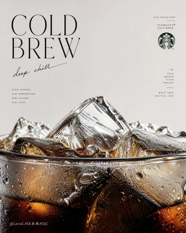
Create an ultra-premium vertical advertising poster for Starbucks Cold Brew, preserving the same minimalist editorial skeleton while pushing the image into a more flagship, more sculptural, and more internationally fashion-magazine-level direction. Keep the composition built from a large field of clean negative space in the upper half and an extreme macro close-up of the cup rim, cold brew surface, and ice structure dominating the lower half. The final result should feel like a hybrid of a world-class Starbucks campaign, a luxury beverage poster, and a collectible international magazine cover: light, cold, precise, modern, and visually unforgettable.
The hero product is Starbucks Cold Brew shown in an extreme macro close-up focused on the very top rim of the cup. The lower half of the poster must be dominated by the cup edge, the liquid meniscus, and a dense frozen landscape of crystal-clear ice rising above the rim. The cup should emerge from the bottom edge of the frame so only the upper portion is visible, making the viewer feel intimately close to the drink. The rim must be hyper-realistic: thin transparent edge, subtle glass thickness, wet reflections, elegant refraction, tiny cold condensation beads, meltwater traces, and perfect surface tension. The cold brew inside must feel dark, deep, and luxurious, with black-brown density, amber undertones, chilled transparency, and beautiful depth beneath the ice.
Push the cold-drink identity to an even more extreme level. The interaction between coffee and ice should be astonishingly rich in detail: large angular ice cubes, fractured transparent planes, trapped air bubbles, melting edges, floating smaller ice fragments, cold condensation droplets clinging to the cup, micro-beads of water, faint cooling haze, and sharp liquid transitions where dark coffee meets thinner translucent zones. The lower macro area should feel like an icy coffee world or a cold-brew geological cutaway, highly tactile and physically believable.
Preserve the same poster logic, but boldly reconstruct the lower beverage zone into a more sculptural and iconic frozen landscape. Let the ice cluster at the rim feel less like ordinary drink styling and more like a monumental cold-brew horizon: cracked clear ice peaks, wet reflective ridges, dark liquid depth below, subtle meltwater channels, and refined tonal separation between transparent ice, amber light, and dense coffee shadow. The drink should feel monumental while remaining product-true and hyper-real.
Refine the upper text system completely so it feels lighter, colder, and more like the cover language of an international design or lifestyle magazine. Use a clean, airy, editorial English title such as "Cold Brew" or "COLD / BREW" with elegant spacing, taller vertical rhythm, and restrained sophistication. Pair it with a short handwritten-style line that feels cool, intelligent, and fresh, such as "deep chill", "slow and cold", "stay crisp", or "cool begins here". Add a very subtle Starbucks siren mark or official brand signature, plus a few tiny editorial fragments or fine-line supporting copy arranged with the intelligence of a collectible magazine cover. Typography must feel black or deep charcoal, crisp, modern, slightly fashion-oriented, and premium, with only the most restrained use of Starbucks green if needed.
The text composition must no longer feel warm or cafe-like. It should feel colder, more airy, more modern, and more internationally editorial. Let the title float with elegant asymmetry, the handwritten note arc gently or lean lightly through the negative space, and small copy fragments behave like magazine-cover coverlines without clutter. The typography should echo the line of the rim and the geometry of the ice below, creating a strong dialogue between graphic design and product form. The upper half should feel spacious, calm, and expensive.
Lighting must be extremely soft, crisp, and premium, with more coolness and brightness than a standard coffee ad. Use delicate highlights on ice edges, refined reflections on the cup rim, wet sparkle on condensation droplets, soft luminous gradients inside the coffee, and impeccable tonal control from deep cold-brew brown to translucent amber to icy clear highlights. Every ice fracture, droplet, and liquid shift must feel macro-photography-grade, razor-sharp yet elegant. The realism must be extreme, but the mood remains clean, quiet, cold, and premium.
Keep the palette tightly controlled: pale cool beige or soft stone background above, deep cold-brew brown, near-black coffee depth, translucent amber light, clear ice highlights, soft silver-gray chill reflections, and only minimal restrained Starbucks green for tiny brand cues. The final image should feel like a world-class Starbucks flagship cold-drink poster and a collectible magazine-cover object at the same time: hyper-real cold brew, monumental ice detail, refined cold editorial typography, minimal official branding, luxury cooling atmosphere, premium print texture, and ultra-sharp detail.
Avoid cluttered layout, avoid too many props, avoid full-cup dominance, avoid muddy liquid, avoid weak ice detail, avoid warm cozy coffee-shop typography, avoid excessive green, avoid cheap poster design, avoid cartoon illustration style, avoid chaotic composition, avoid low-detail condensation.
Create a promotional poster using the uploaded photo. Do not alter the product, logo, packaging, shape, texture, or colors in any way. Arrange the products on minimalist white pedestals with a layered composition to create a more premium look and enhance visual depth. Adjust the camera angle to make the products appear more attractive, tempting, and appetizing.
Include a header featuring the brand/store name, an automatically generated tagline, the product name, and a dedicated description for each product consisting of at least three sentences.
Use a pure white background with clean studio lighting and soft, natural shadows. Leave sufficient negative space to maintain an elegant and uncluttered layout. Add a three-sentence promotional description, include a price label, and use minimalist, modern, elegant typography with a soft, refined appearance rather than a rigid style.
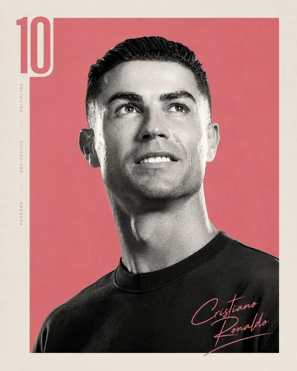
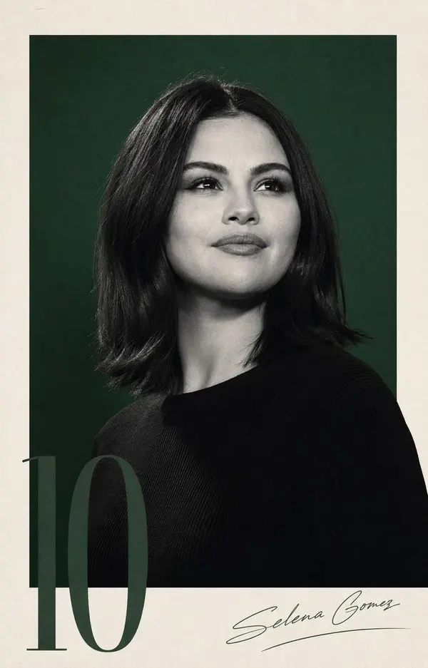
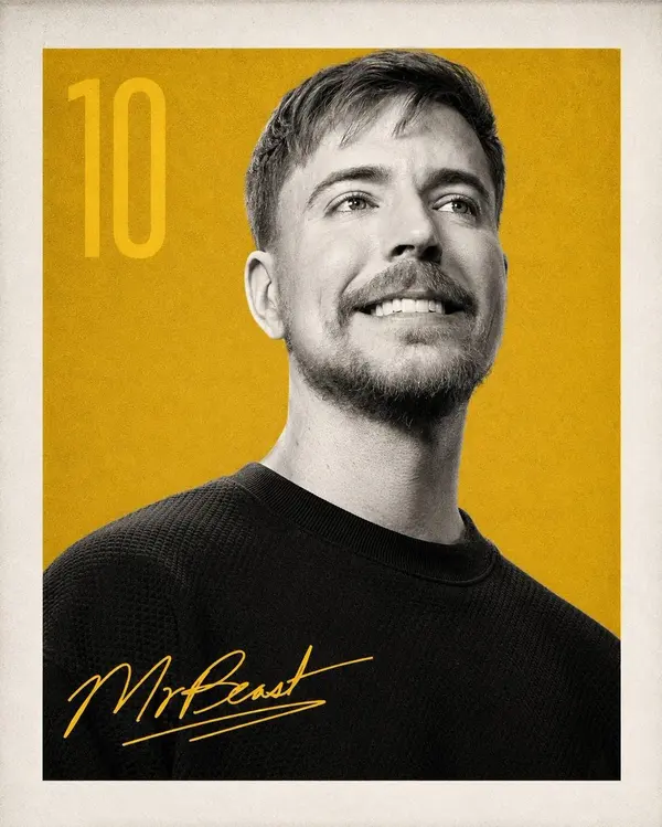
Create a premium editorial portrait poster featuring a single subject from the chest up, looking slightly upward and away from the camera with a calm, confident expression. Use a high-contrast black-and-white portrait with crisp facial detail, soft studio lighting, and subtle film grain. Place the portrait inside a large centered colored rectangle (choose a single bold background color such as coral pink, emerald green, mustard yellow, royal blue, or crimson) surrounded by a wide warm ivory/off-white paper border with a subtle vintage texture.
Add a large semi-transparent number "10" vertically along the left edge in a matching tone of the background color. Keep the typography elegant and minimal. Place a handwritten signature of the subject in the bottom-right corner using the same accent color as the background. The subject wears a simple black crewneck sweater with no logos or patterns.
The overall aesthetic should feel like a luxury magazine cover meets modern sports/editorial branding: minimalist Swiss-inspired layout, premium typography, clean negative space, balanced composition, timeless design, matte paper texture, subtle print imperfections, cinematic lighting, ultra-sharp focus, monochrome portrait with selective color background, sophisticated and iconic.
Style keywords: editorial portrait, minimalist poster design, monochrome photography, luxury branding, Swiss design, premium magazine cover, cinematic studio lighting, Kodak Portra-inspired tonality, fine art print, textured paper, modern typography, elegant, high-end, photorealistic, 8k.
Negative prompt:
Low quality, blurry, oversaturated, cluttered background, multiple subjects, harsh shadows, distorted face, extra limbs, text errors, watermark, logos, excessive accessories, busy composition, cartoon, CGI, low detail, noisy skin, poor anatomy.
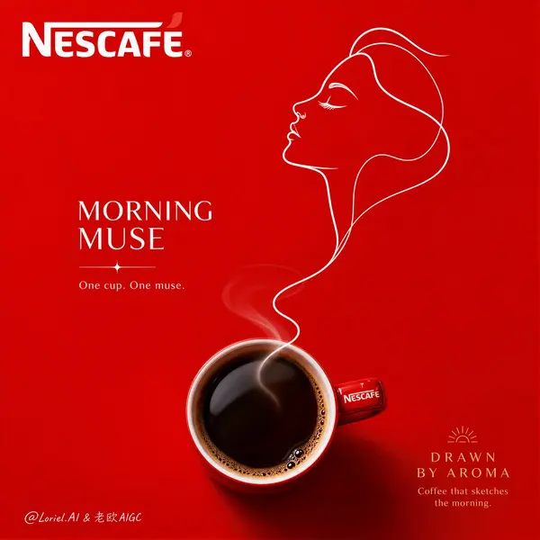
Create a premium vertical brand poster for Nescafé, "Morning Muse Outline" edition, built around a minimalist composition where one real coffee cup becomes the visual origin of a continuous-line female profile. The poster must feel elegant, light, artistic, and emotionally refined, like a luxury coffee brand campaign with a poetic morning identity. The core visual idea is that the warmth and aroma of coffee draw a muse into existence through a single flowing outline line.
Main composition:
Use a pure highly saturated Nescafé-red background with a perfectly clean, uncluttered studio look. Place one real premium coffee cup near the lower third of the frame, either in top view or with a slight angle that clearly shows the rich dark coffee inside. The cup must be rendered with extreme realism: smooth ceramic surface, realistic glossy coffee reflection, subtle crema or fine bubble detail near the rim, soft natural shadow, and delicate rising steam. The product must feel elegant, rich, and undeniably premium.
Continuous-line muse logic:
From the cup or its steam, a single continuous white line should rise and seamlessly transform into the side profile of a refined female face. The face should feel like a "morning muse": graceful, calm, inspired, and softly awakened. The line should form forehead, nose, lips, chin, neck, and perhaps a simplified suggestion of closed eyes, lashes, or hair sweep, all with one clean fluid rhythm. The linework must feel light, confident, premium, and poetic, like a fashion illustration made from coffee aroma. It should not look like a random doodle or generic portrait; it must feel distinctly elegant and emotionally resonant.
Female figure styling:
The profile should evoke a modern muse rather than a detailed person. Keep it refined, slim, serene, and aspirational, with a sense of quiet morning beauty and inner inspiration. The line can suggest soft hair movement or a small feminine detail like a contour of lashes, cheek curve, or jawline, but everything must remain minimal. The expression should feel peaceful, reflective, and subtly awakened by the coffee below.
Associated visual accents:
Use only a few minimal supporting elements if needed: a tiny steam flourish, one or two delicate aroma curves, a subtle radiant note, or a small symbolic gesture that suggests clarity, inspiration, or early-morning thought. These accents must be secondary and extremely restrained so the cup and line portrait remain the dominant system.
Branding and typography:
Use English as the main title language. Integrate the Nescafé logo prominently in the upper area. Add a refined premium campaign headline such as: "MORNING MUSE" or "DRAWN BY AROMA" or "WAKE INTO INSPIRATION". Add a small elegant supporting line such as: "One cup. One muse." or "Coffee that sketches the morning." Typography must feel artistic, spacious, and premium, perfectly balanced with the line portrait. No clutter, no oversized commercial copy, no crude fonts.
Lighting:
Use polished commercial product lighting. The coffee cup must feel rich and tactile, with subtle specular highlights and realistic depth in the liquid. The white outline portrait should appear crisp and clean, softly floating with a premium print-like sharpness. The entire image must feel smooth, elegant, and expertly art-directed.
Mood:
poetic, elegant, feminine, inspired, minimal, aromatic, brand-forward, premium, refined, morning-fresh.
Rendering style:
hyper-realistic coffee product photography combined with elegant one-line continuous female profile illustration, premium minimalist brand poster, saturated red background, refined typography integration, polished advertising lighting, 8k, sharp but graceful finish.
Negative prompt:
messy background, cluttered design, low-detail coffee cup, random doodles, stiff line art, generic portrait, cheap poster styling, flat lighting, distorted branding, cartoon-heavy style, too many decorative elements, low-end coffee ad
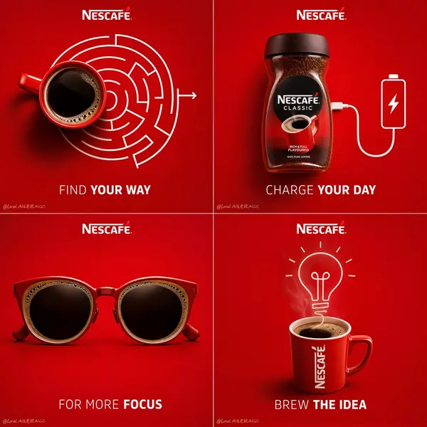
Create a premium 4-panel campaign poster for Nescafé, built as a clean 2x2 grid of minimalist conceptual coffee ads. Each panel must feature a real Nescafé product or real coffee cup as the central hero, combined with a witty visual event or object transformation directly related to coffee. The overall composition should feel highly organized, brand-consistent, modern, and clever, with all four panels sharing the same saturated Nescafé-red background, premium lighting, minimal layout, and strong visual simplicity. The entire campaign should feel like one unified idea expressed through four different coffee moments.
Overall layout:
Use a perfectly balanced 2x2 square grid, each panel framed like an individual premium ad card within one larger poster. The background of every panel should be a rich saturated Nescafé red with subtle tonal variation and soft studio depth. Keep the whole design extremely minimal and clean, with generous negative space. Each panel contains one real coffee object and one clever event, transformation, or visual metaphor built around that object. Add the Nescafé logo consistently at the top of each panel, with short English taglines beneath or near the central visual.
Panel 1 – Wake:
A real top-view coffee cup becomes the starting point of a simple maze or route system, suggesting that coffee helps you find your way into the day. The cup should be rendered with extreme realism, rich black coffee surface, subtle crema details, and premium ceramic texture. The maze or route should be minimal white linework, highly graphic and clean, integrated naturally with the cup.
Panel 2 – Charge:
A real Nescafé jar or cup is visually connected to the idea of power or charging. For example, the product may be linked to a charging cable, battery icon logic, or a clean energy metaphor, but executed in a premium minimalist way. The product remains fully realistic, clearly readable, and visually dominant. The event must feel smart and instantly understandable, not gimmicky.
Panel 3 – Focus:
A real coffee cup or pair of coffee-filled sunglasses creates a visual metaphor for concentration, alertness, or mental sharpness. The object transformation must feel elegant and witty, with realistic coffee surface details and refined shadows. This panel should feel slightly more fashion-like and graphic, but still consistent with the system.
Panel 4 – Create:
A real coffee cup becomes the source of creativity through a clean event connected to steam, linework, or idea generation. For example, steam can subtly evolve into a lightbulb, idea sketch, signal line, or abstract brain-like shape. The visual must remain minimal and premium, with the coffee cup as the anchor and the event as the conceptual payoff.
Visual language:
Each panel must combine hyper-realistic product photography with very restrained white line graphics or minimal object transformations. The linework should feel polished, premium, and intelligent, never childish. The coffee objects should always remain the visual hero. The event or metaphor should look as if it naturally grows out of the product.
Branding and typography:
Use English as the dominant title language. Place the Nescafé logo clearly in each panel. Add a short, punchy English tagline for each concept, for example:
Panel 1: "Find Your Way"
Panel 2: "Charge Your Day"
Panel 3: "For More Focus"
Panel 4: "Brew the Idea"
Typography must be minimal, well-spaced, bold in hierarchy but still elegant, with no clutter or cheap poster styling.
Lighting:
Use polished commercial product lighting across all four panels. Coffee surfaces should have subtle reflections and realistic depth. Cups and jars should cast soft, clean shadows. The white graphics and visual metaphors should remain crisp and beautifully integrated. The entire campaign should feel premium, graphic, and expertly art-directed.
Mood:
minimal, clever, energetic, modern, premium, brand-forward, memorable, witty, editorial.
Rendering style:
hyper-realistic commercial coffee product photography combined with restrained conceptual white-line graphics, premium 4-grid campaign poster, saturated monochrome red branding background, elegant typography integration, polished advertising lighting, 8k, sharp but clean finish.
Negative prompt:
messy layout, cluttered props, weak product focus, low-detail coffee cup, cheap infographic style, childish doodles, flat lighting, distorted branding, random unrelated objects, low-end coffee ad, noisy composition