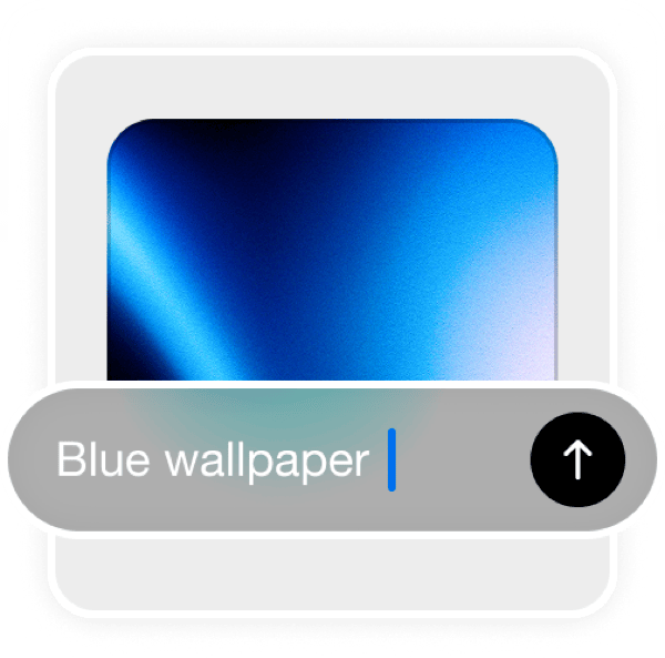
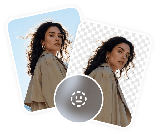
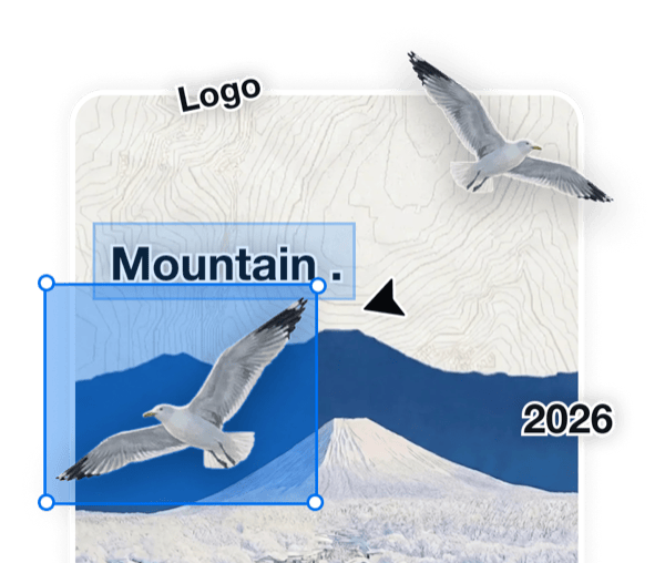
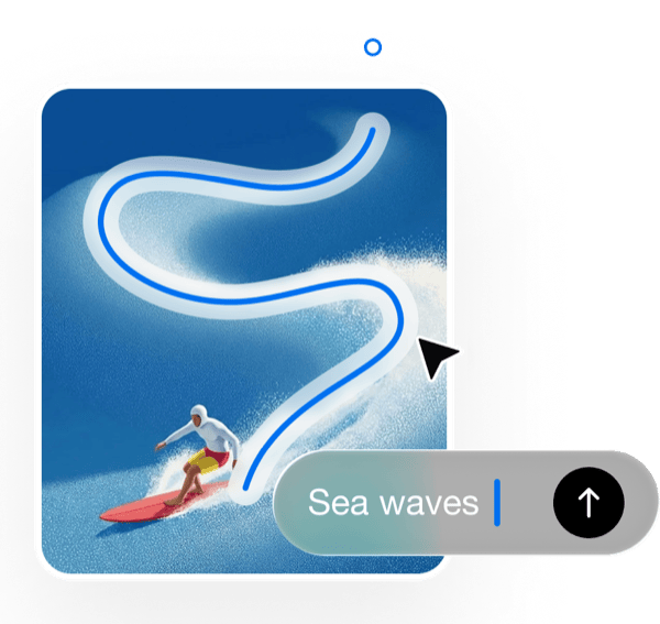
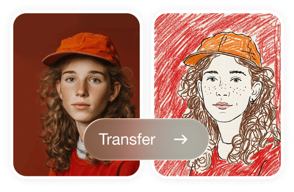
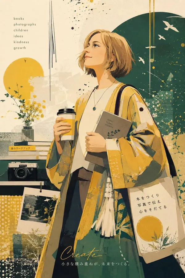
ChatGPT Images 2.0 is OpenAI's image generation model for creating production-ready visuals from prompts, including posters, ads, infographics, comics, layouts, and multilingual text-heavy designs.
How are the prompts collected?
The gallery is hand-picked by our team from creators sharing their work in public communities. If a prompt of yours is featured and you'd prefer it taken down, just reach out and we'll remove it right away.
How do I try a prompt?
Hit the Try button on any card and you'll be taken straight to Playyy with the prompt pre-filled — generate the image with one click, no copy-pasting needed.
Can I submit my own prompts?
Submissions are coming soon. In the meantime, share standout prompts with us on X or Discord and we'll review them for inclusion.
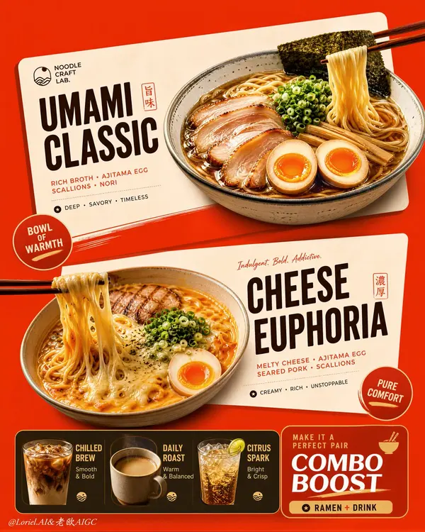
Create an ultra-premium vertical restaurant advertising poster that merges Orbit-style compositional force with Transit-style international polish, preserving the exact logic of a bold ramen combo menu while refining it into a cleaner, sharper, more globally premium flagship campaign. Use one dominant saturated orange-red background field and build the poster around two large cream-toned angled menu-card blocks floating through the center, each framing one ramen hero dish, with a compact drink-combo strip anchored along the bottom. The final image must feel graphic, hot, craveable, modern, and commercially irresistible, with the food and color-block geometry fused into one exact system. Do not copy any original text, logo, price, or wording.
Core composition:
Use a strict vertical poster architecture with three main beats:
1. a bold upper hero card featuring one ramen bowl,
2. a second slightly offset lower hero card featuring another ramen bowl,
3. a compact bottom combo strip featuring three drinks and one combo-offer zone.
The orange-red field must act as the dominant visual stage, while the cream menu-card blocks slice across it with more deliberate angled placement. The whole poster must read instantly as a strong graphic food composition.
Orbit enhancement:
Push the card geometry harder. The two large cream cards should feel more decisively slanted and more dynamically offset, as if they are thrusting the food forward through the page. The bowls, price badges, and chopstick directions should align with these card angles so the entire poster feels driven by one aggressive compositional motion. The upper and lower ramen heroes should feel like two strong visual hits in a diagonal rhythm.
Transit enhancement:
Refine the whole image into a more international flagship restaurant-advertising language. Make the orange-red field cleaner and more premium, the cream cards softer and more elegant, the typography more disciplined, and the supporting elements more restrained. Reduce unnecessary icon clutter and decorative noise. The result should feel like a global fast-casual or modern Asian dining brand campaign with polished international art direction.
Upper ramen hero:
Show one premium ajitsuke tamago-style ramen bowl with rich glossy broth, springy noodles, a halved jammy egg, chopped scallions, and dark nori. The bowl should feel warm, comforting, and immediately craveable. Place it confidently within the upper cream card so the bowl, title zone, and price badge feel locked together.
Lower ramen hero:
Show one indulgent cheese-and-egg ramen variation with melted cheese stretching from lifted noodles, glossy broth, sliced meat or chashu, chopped scallions, and halved egg. The cheese pull should be clean, appetizing, and visually dramatic. Place the bowl so it balances the lower card while still feeling contained by its geometry.
Drink combo strip:
At the bottom, include a narrow premium combo strip with three compact drink modules:
- iced coffee,
- hot coffee,
- cold soda or sparkling drink.
These should feel like clean supporting products, each inside simple rounded or capsule-like graphic areas. Add one strong combo-value block to anchor the strip, but keep the entire bottom section tight, clean, and secondary to the two ramen heroes.
Typography system:
Use bold modern display typography with strong hierarchy and clean scanning logic. Dish names should be large and high-contrast. Price elements should sit in compact circular or capsule badges. Supporting lines should be short and minimal. All wording must be fully original and fictional. The typography must align tightly with the cream card structures and feel globally polished.
Color-block integration:
This is the most important feature. The food must feel inseparable from the color blocks. The orange-red background and cream cards must not behave like passive backgrounds; they must actively shape the poster, frame the dishes, direct the eye, and create rhythm. Bowls, chopsticks, price tags, and text must all appear intentionally positioned according to the card angles and color boundaries.
Lighting:
Use bright premium food-commercial lighting with warm directional clarity. Broths must glow with rich sheen, noodles must feel elastic, eggs must show soft yolk richness, and cheese must feel molten and luxurious. The drinks should show clean reflections and believable temperature cues. Keep lighting appetizing but controlled so the graphic structure remains dominant.
Material rendering:
Render ceramic bowls with subtle glaze reflections, broths with translucent depth, noodles with moist sheen, meats with caramelized texture, cheese with smooth melt physics, eggs with creamy yolks, and drinks with realistic ice, crema, or bubbles. The cream cards should feel matte and graphic, contrasting with the realism of the food.
Background and cleanliness:
Keep the poster tightly controlled and free of clutter. If any subtle texture appears in the orange-red field, keep it minimal and premium. Avoid unnecessary environmental storytelling. This must remain a graphic menu-poster composition first.
Color system:
Use a disciplined premium restaurant palette of orange-red, cream, warm beige, deep brown, black, noodle gold, broth mahogany, egg orange, scallion green, and coffee tones. The overall effect should be vivid, hot, and globally polished.
Image finish:
The final poster must feel like a world-class flagship ramen combo campaign: bold, graphic, product-led, appetizing, and commercially exact. Preserve sharp food detail, strong card geometry, clear typographic hierarchy, and immaculate commercial retouching. 8k, premium restaurant advertising quality.
Negative prompt:
copied brand names, copied pricing, copied slogan, cluttered menu text, weak card angles, weak color-block structure, muddy broth, limp noodles, fake cheese pull, greasy mess, random props, poor hierarchy, dirty background, black blotches, low-resolution food detail
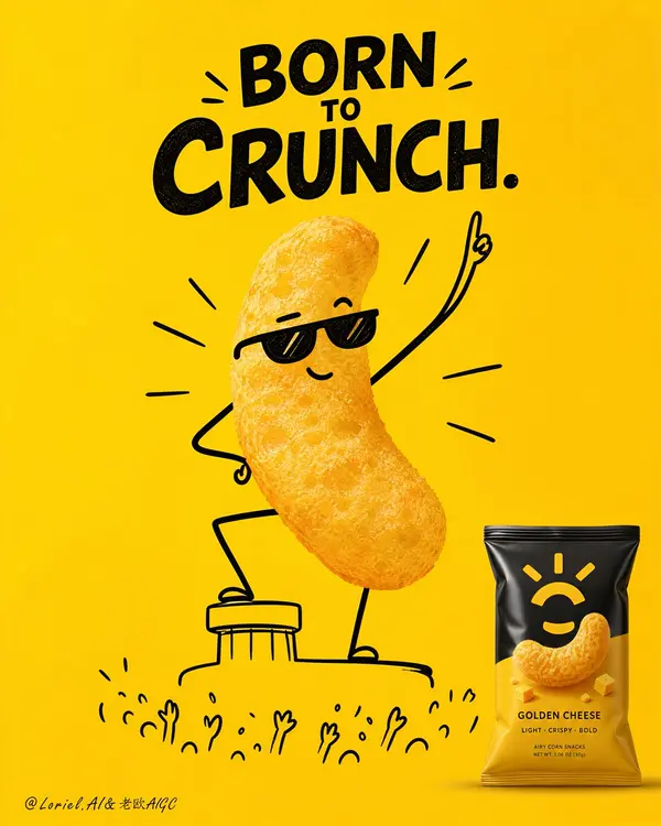
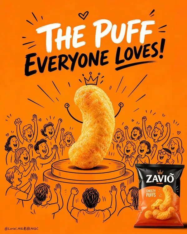
Create an ultra-premium snack advertising poster that merges Orbit-style impact with Port-style symbolic clarity, built around one unforgettable three-part super-symbol: one real crunchy snack hero, one hand-drawn cheering crowd world, and one original product bag in the corner. Use a tall vertical composition on a pure bold saturated background, with the real snack piece placed at the exact center on a simple illustrated stage platform, visually elevated like a star performer. Around it, draw a clean semi-circle of hand-drawn cheering audience characters with raised hands, smiling faces, applause marks, and celebratory motion lines, while keeping all illustrated elements secondary to the real snack. In the lower-right corner, place one original premium snack bag as the commercial anchor. The final image must feel witty, iconic, joyful, minimal, highly brandable, and Cannes-level clever. Do not copy any real brand name, logo, slogan, or packaging text.
Core super-symbol composition:
Build the entire poster around one instantly legible symbolic structure:
1. one photoreal snack as the superstar,
2. one illustrated cheering crowd as the personality amplifier,
3. one retail-ready product bag as the sales anchor.
The central snack must dominate the frame and carry almost all visual power. The doodle crowd should frame and celebrate it without competing for attention. The lower-right package must be small but unmistakably present, clearly linking the emotional hero back to the actual product. The whole image must read immediately from far away like a flagship FMCG poster.
Orbit enhancement:
Push the “on-stage” energy harder. The snack should feel more triumphant, more central, and more elevated, as if it has just stepped onto a spotlighted podium and the whole illustrated crowd is erupting around it. Make the circular stage slightly more pronounced and the surrounding cheering lines more focused toward the center. Keep the audience gestures more unified and upward-facing so the visual force converges on the snack hero. The impact must feel stronger, but the layout must remain clean.
Port enhancement:
Distill the image into a sharper brand symbol. Remove any unnecessary decorative clutter and preserve only the most essential components: the real snack hero, the minimal stage, the cheering doodle crowd, and the lower-right product bag. The composition should feel like one complete advertising emblem rather than a busy illustration. Every element must reinforce the snack’s “big personality” and crowd-favorite identity.
Product and doodle fusion:
This is the most important feature. The snack itself must remain fully photoreal, crunchy, airy, porous, and edible-looking. The stage, crowd, and performance cues must be hand-drawn in clean black line art with confident, premium simplicity. The real snack and the illustrated world must combine effortlessly so the product feels alive, celebrated, and full of character without losing food realism.
Hero snack design:
Use one real puffed corn snack, popcorn cluster, cheese puff, or airy crispy bite with rich porous texture, light toasted variation, natural irregularity, and obvious edible crunch. The snack must read first as a delicious product, then as a charismatic star. If minimal facial or limb doodles are added, keep them extremely restrained so the snack body remains dominant.
Illustrated crowd logic:
Draw a semi-circle of hand-drawn audience characters around and behind the snack using simple black line art only. Their expressions must be joyful, supportive, and celebratory. Include raised arms, happy faces, clapping gestures, cheering marks, and small radiating lines, but keep the style graphic, premium, and controlled. The crowd should feel like the snack’s fan club.
Packaging design:
Create one original premium snack bag in the lower-right corner with elegant fictional branding, clean flavor-color hierarchy, appetizing product photography, and modern FMCG print design. The bag must feel globally marketable, polished, and visually connected to the hero snack. Use realistic flexible-pack film, sealed edges, subtle creases, and refined highlights.
Lighting:
Use bright polished studio lighting with soft frontal clarity and refined top highlights. The snack texture must be razor-sharp and crunchy. The package should show controlled laminate reflections. The illustrated elements should remain flat, crisp, and graphic against the saturated background. Keep the whole image clean and high-contrast.
Background:
Use a single strong flagship background color such as vivid premium orange or golden-orange, with a perfectly smooth flat fill and no clutter. The background must function as a pure graphic stage that makes the snack, crowd, and bag pop instantly.
Typography space:
Reserve a clean upper area for original fictional campaign typography in bold contrasting lettering. The headline should support the product’s beloved, crowd-pleasing personality, but all wording must be newly created and original.
Image finish:
The final poster must feel like a world-class snack campaign: minimal, cheerful, bold, product-led, graphically memorable, and highly sellable. Preserve razor-sharp snack detail, clean doodle precision, immaculate background flatness, and premium packshot rendering. 8k, flagship advertising quality.
Negative prompt:
real brand names, copied logo, copied slogan, messy doodles, cluttered layout, childish low-quality illustration, dirty background, fake snack texture, low-detail packaging, muddy colors, black blotches, warped bag shape, weak contrast, low-resolution product render
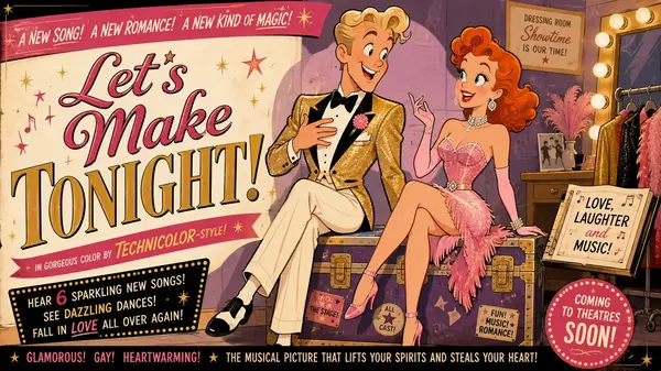
Mid-century theatrical cartoon still promotional Hollywood movie trailer banner featuring a energetic song-and-dance man with wavy blond hair and a bright grin, wearing a sparkling stage jacket and bow tie, and a lively leading lady with vibrant red curls and joyful eyes, wearing a glittery pink performance dress, seated on a prop trunk backstage. Stage them in a lighthearted, musical, good-humored interaction, with both characters fully visible, relaxed, and clearly reacting to each other as if ready to burst into song. Design the figures with exaggerated early-1950s animation caricature: clean black contour lines, sharply simplified anatomy, elegant angular silhouettes, expressive eyebrows, stylized facial shapes, graceful hand gestures, and cheerful readable expressions. Render the entire image in a unified traditional cel-animation aesthetic, with the background following the same stylized visual language as the characters, using flat opaque colors, minimal hard-edged shading, simplified furniture and décor, subtle hand-painted texture, controlled perspective, and crisp theatrical staging. Use a vibrant showbiz palette of hot pink, gold, cream, and soft purple and maintain a witty, charming, visually snappy mood.
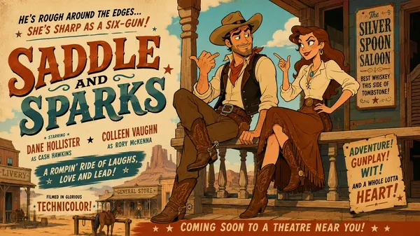
Mid-century theatrical cartoon still promotional Hollywood movie trailer banner featuring a rugged cowboy with a short beard and steady gaze, wearing a classic western shirt, vest and cowboy hat, and a bold frontier woman with long chestnut hair and a determined smile, wearing a practical blouse and riding skirt, seated on a wooden porch railing outside a dusty saloon. Stage them in a lighthearted, spirited, good-humored interaction, with both characters fully visible, relaxed, and clearly reacting to each other with playful tension. Design the figures with exaggerated early-1950s animation caricature: clean black contour lines, sharply simplified anatomy, elegant angular silhouettes, expressive eyebrows, stylized facial shapes, graceful hand gestures, and cheerful readable expressions. Render the entire image in a unified traditional cel-animation aesthetic, with the background following the same stylized visual language as the characters, using flat opaque colors, minimal hard-edged shading, simplified furniture and décor, subtle hand-painted texture, controlled perspective, and crisp theatrical staging. Use a dusty western palette of warm sand, deep brown, soft turquoise, and cream and maintain a witty, charming, visually snappy mood.
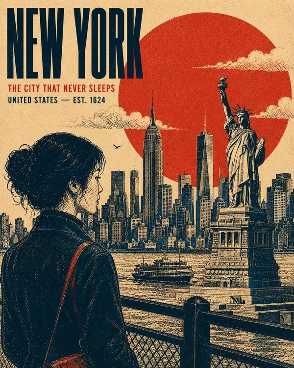
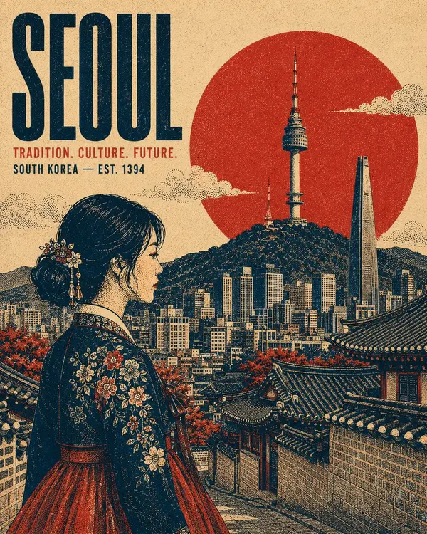
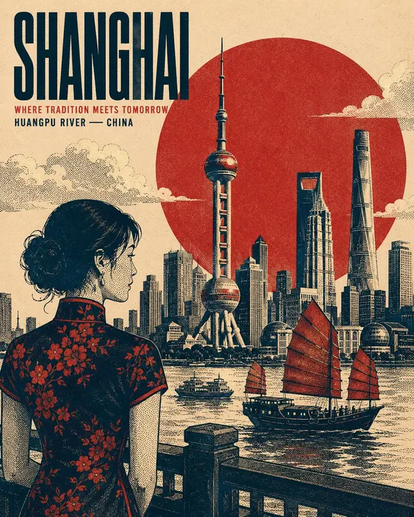
Create a premium 4:5 vertical retro screen-print poster illustration centered on [SUBJECT / LANDMARK / CITY / ERA]. The composition should feel like a refined vintage travel or cultural print, while remaining adaptable to any location, historical period, landmark, or subject.
TYPOGRAPHY: Place the primary title "[MAIN TITLE]" in a bold, condensed uppercase sans-serif, positioned within a balanced area of negative space. Add a smaller supporting line "[SECONDARY HEADLINE / LOCATION / DATE]" beneath it. Maintain strong typographic hierarchy, restrained spacing, and an authentic archival-poster character.
MAIN SUBJECT: Feature [PRIMARY SUBJECT] as the dominant visual element, positioned within the lower or side third of the composition. Use a distinctive pose, silhouette, or profile that communicates the character of the subject. Include carefully rendered defining details, natural contours, expressive features, clothing or architectural details, and subtle highlights without making the artwork photorealistic.
GEOMETRIC ANCHOR: Introduce one bold, simple geometric shape behind or around the main subject to create visual separation and establish a strong graphic focal point.
BACKGROUND: Construct the environment as several flat, layered graphic planes rather than a conventional realistic scene. Use recognizable elements associated with [LOCATION / SUBJECT] — distant silhouettes, architectural forms, structural details, vegetation, terrain, atmospheric elements, or cultural motifs. Avoid a strong vanishing point. Build depth through overlapping shapes, scale, linework, and tonal density. Render clouds, smoke, mist, foliage, or atmospheric details as controlled stippled clusters where appropriate.
RENDERING STYLE: Authentic vintage screen-print / silkscreen poster aesthetic. Create all tonal modeling exclusively through stippling, halftone patterns, and varying dot density — concentrated dots for shadows and sparse dots for highlights. No smooth gradients, airbrushing, photorealistic shading, or digital 3D rendering. Use crisp contour lines with consistent visual weight, subtle riso-style registration shifts, imperfect ink edges, natural paper grain, and faint woven-print texture. The result should feel physically printed rather than digitally rendered.
COLOR SYSTEM: Use exactly four carefully selected high-contrast colors appropriate to the subject: [COLOR 1], [COLOR 2], [COLOR 3], [COLOR 4]. Do not introduce additional hues. Generate intermediate tonal values exclusively through stipple density, halftone overlap, and ink coverage, never by adding new colors.
COMPOSITION: Strong editorial balance, clear focal hierarchy, generous negative space, layered depth, bold silhouette design, authentic vintage graphic-design proportions, and carefully controlled visual density. Keep the artwork sophisticated, collectible, and suitable for a premium travel or cultural poster.
OUTPUT: 4:5 vertical aspect ratio, edge-to-edge poster composition, high detail, crisp print-ready appearance, cohesive screen-print texture, no modern photographic elements.
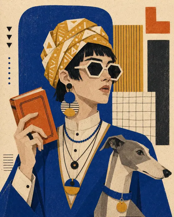
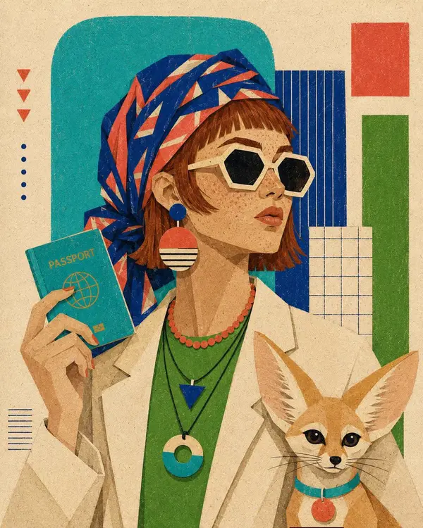
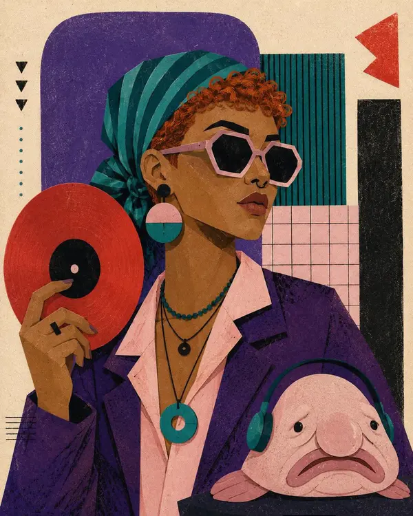
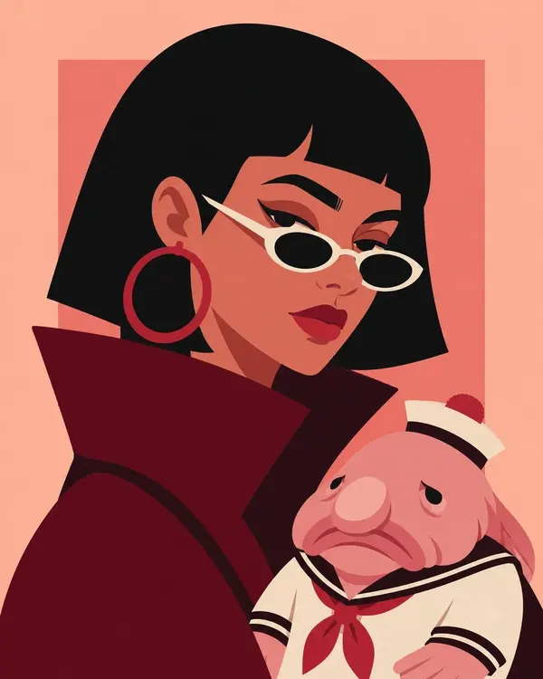
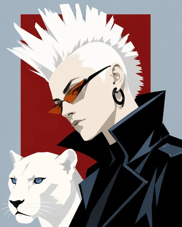
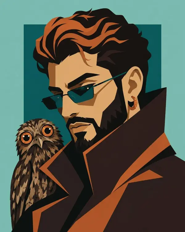
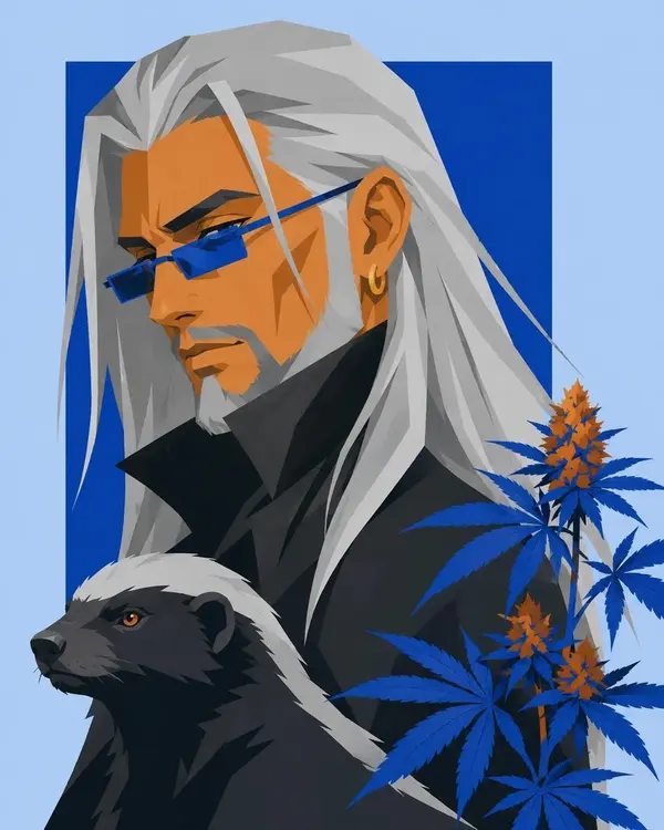
Waist-up editorial portrait of [CHARACTER] in a calm three-quarter pose, with [HAIR], wearing [CLOTHING], oversized geometric sunglasses, bold circular earrings, layered necklaces, and holding [OBJECT] near the shoulder. Stylized [ANIMAL] beside the figure, constructed from the same flat cut-paper shapes and simplified graphic anatomy. Hand-cut paper collage with angular facial planes, minimal features, sharp silhouette edges, flat opaque color blocks, visible paper fibers, subtle screen-print grain, slight color misregistration, dry crayon-like marks, and no dimensional modeling. Controlled [COLOR] palette. Background made from [ELEMENTS], arranged as overlapping rectangles, rounded panels, striped inserts, hand-drawn grids, and small geometric accents on warm speckled off-white paper. Maintain a balanced modern editorial composition, strong negative space, crisp color separation, and tactile handmade print aesthetics.
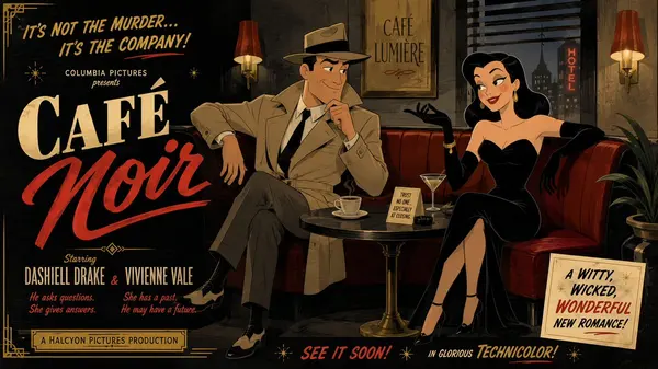
Mid-century theatrical cartoon still promotional Hollywood movie trailer banner featuring a cool detective with neatly combed black hair and a raised eyebrow, wearing a classic trench coat and fedora, and a mysterious femme fatale with sleek dark waves and a knowing smile, wearing a form-fitting black evening dress and long gloves, seated in a dimly lit café booth. Stage them in a lighthearted, intriguing, good-humored interaction, with both characters fully visible, relaxed, and clearly reacting to each other with playful suspicion. Design the figures with exaggerated early-1950s animation caricature: clean black contour lines, sharply simplified anatomy, elegant angular silhouettes, expressive eyebrows, stylized facial shapes, graceful hand gestures, and cheerful readable expressions. Render the entire image in a unified traditional cel-animation aesthetic, with the background following the same stylized visual language as the characters, using flat opaque colors, minimal hard-edged shading, simplified furniture and décor, subtle hand-painted texture, controlled perspective, and crisp theatrical staging. Use a classic noir palette of deep charcoal, soft red, cream, and muted gold and maintain a witty, charming, visually snappy mood.
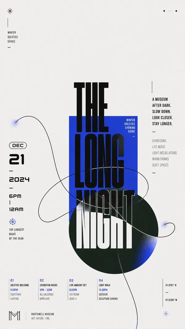
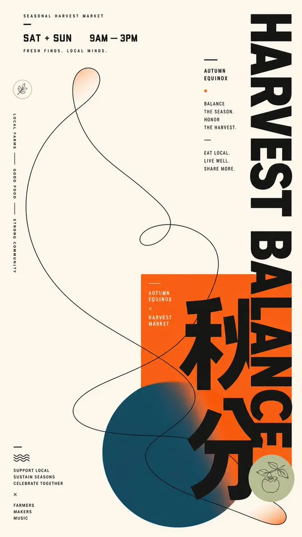
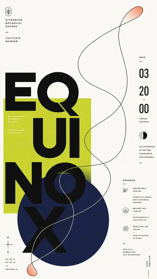
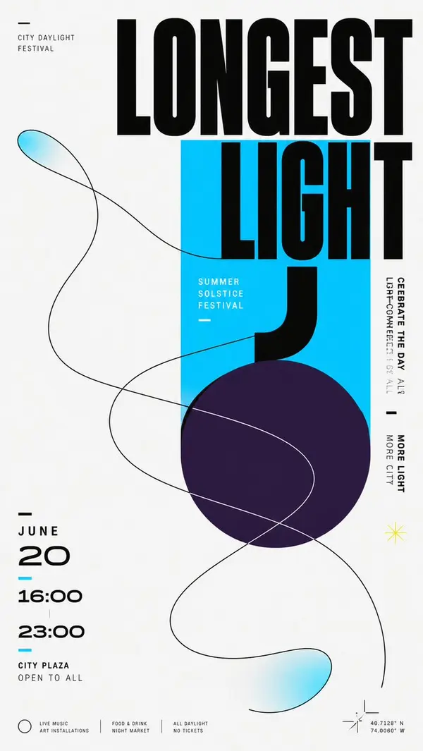
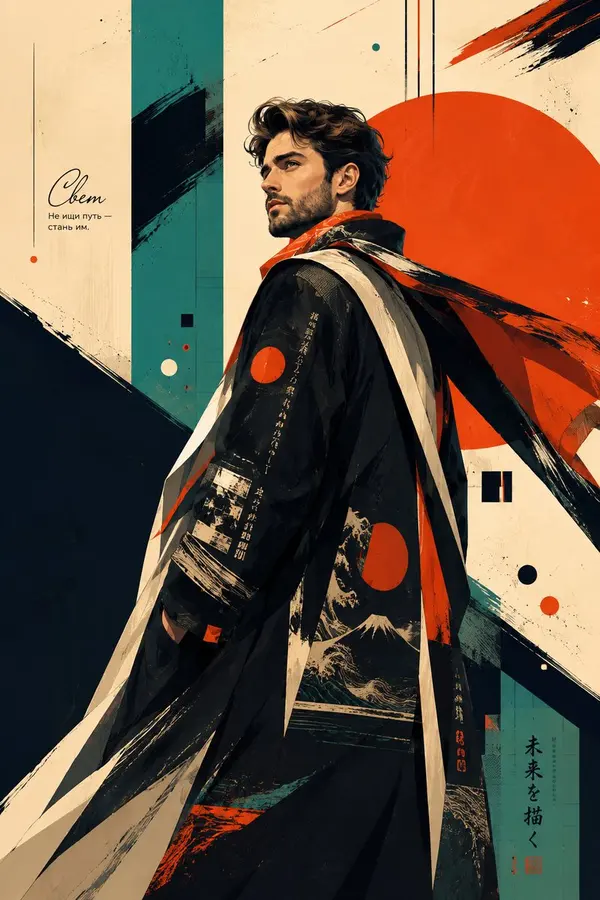
Build a modern flat graphic around any chosen subject object, with a huge Chinese theme character, geometric color blocks, and a single-line organic contour interlacing through one another. Keep an overall bright, clean background field, letting approximately two-thirds or more of the space remain empty, and concentrate the main weight in an off-center cluster: a saturated rectangular block in the theme's primary color first establishes a stable plane; a deeper, low-lightness, cool-toned circle overlaps from beneath it and extends beyond the boundary; the core Chinese theme character advances vertically in oversized, heavy, geometric black strokes across the white background, rectangle, and circle, with partial occlusion and cropping creating a strong scale jump; on the left, the date and a bilingual subtitle form a compact numeric column, while on the right, short vertical sentences set in two stroke-weight tiers balance the weight; a few miniature captions, short dashes, and linear symbols scatter along the edges, creating a three-level reading rhythm from main character to side notes to details. Abstract the dynamic relationship derived from the theme into one continuous organic contour, drawn as a broad sweeping loop with a clear, near-black single line that enters from the large empty field, passes through the color blocks, and crosses the edge; the curve intersects itself several times while remaining legible as a single path; keep most of its interior as the underlying background color, adding only localized, transparent, fading fills in the theme's primary color at the tips and extended sections, so the light line creates tension with the heavy giant character. Adapt the color scheme to the theme: let a clean, high-lightness neutral background carry the largest area; keep the theme's primary color vivid and highly saturated, using it for the rectangle and the localized transparent gradient; use a deep cool support color for the circle, separated in hue from the primary color and blending softly into the primary color at its end; use near-black for text and the contour, with a very small amount of light text reversed onto the primary color block; fix unequal areas, lightness hierarchy, and saturation differences, but do not fix specific color names. Render all elements as flat surfaces like matte digital printing, with sharp contour edges and gradients only as two localized, slowly feathered transitions; do not add dimensional shadows, paper grain, or global lighting effects. Keep typography in a low-contrast, broad, thick, near-geometric black sans-serif skeleton; allow the main character's parts to be elongated, offset, cut out, and switched between color-block backgrounds; give numbers a rounded futuristic structure and compress small text with narrow letterforms and loose tracking. Replace brand names, advertising copy, and concrete dates with new theme information. Preserve in the final result the extreme whitespace, the geometric cluster positioned lower-center, the opposing pull between horizontal and vertical text, and the moment an organic line crosses rigid geometric shapes, while avoiding evenly filling every part or reducing the contour to an isolated decoration.
Use the uploaded reference image as the ONLY facial identity reference.
Preserve the exact same person with maximum fidelity. Maintain the identical facial identity, facial structure, skull shape, jawline, cheekbones, forehead, ears, eyes, eyebrows, eyelids, nose shape, nostrils, lips, mouth, chin, skin tone, hairstyle, hairline, facial proportions, glasses, age, expression, ethnicity, and overall recognizable appearance.
Do NOT redesign, beautify, idealize, de-age, age-shift, alter ethnicity, modify facial proportions, change the hairstyle, replace the glasses, reinterpret facial features, or create a different person.
Identity preservation overrides every artistic, stylistic, lighting, wardrobe, composition, rendering, and color instruction below.
Keep the face instantly recognizable as the exact same person from the uploaded image.
---
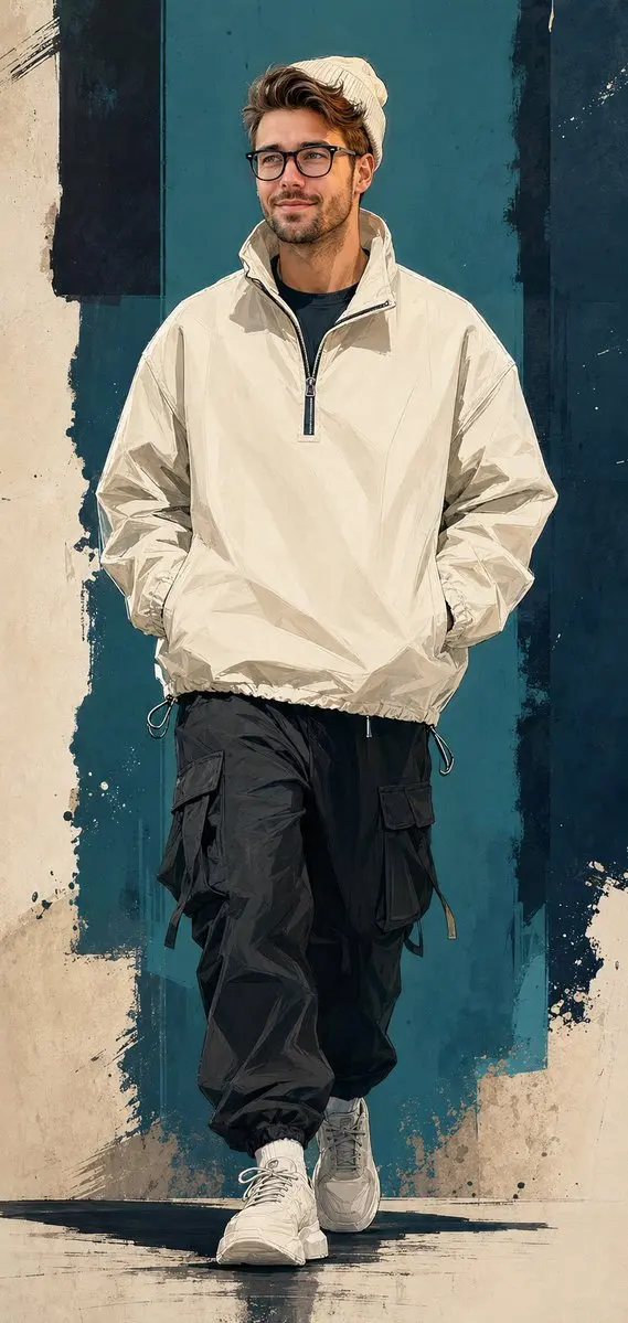
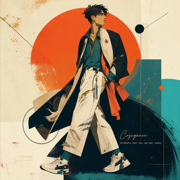
Transform the uploaded person into a semi-realistic digital illustration streetwear campaign poster.
The person keeps the exact same face, hairstyle, glasses, facial proportions, skin tone and identity as the uploaded photo.
Outfit:
- cream ribbed knit beanie
- oversized cream technical windbreaker quarter-zip jacket
- funnel collar
- drawstring hem
- black t-shirt underneath
- black oversized cargo joggers with multiple flap pockets and hanging drawstrings
- white chunky sneakers
Pose:
Walking mid-stride,
hands inside jacket pockets,
head naturally turned and gazing off-camera,
confident expression.
Art Style:
Semi-realistic digital illustration
Comic-editorial hybrid rendering
Clean vector linework combined with painterly color fills
High-end streetwear campaign artwork
Fashion editorial poster aesthetic
Modern urban illustration
Premium graphic design
Background:
Abstract graffiti-inspired composition
Deep teal and dark navy color-block panels
Distressed paint textures
Rough torn-paper transitions
Brushstroke overlays
Urban graphic shapes
Minimal abstract environment
Lighting:
Soft directional studio lighting from upper left
Subtle rim lighting
Natural shadows
Cinematic contrast
Color palette:
Cream
Deep teal
Dark navy
Black
Off-white
Muted neutral tones
Composition:
Vertical poster
Full-body
Walking toward camera
Centered composition
Clean negative space
No text
No logo
No typography
No watermark
No signature
No labels
No symbols
No UI elements
Ultra detailed
Masterpiece
Best Quality
Professional fashion campaign illustration
Sharp focus
8K
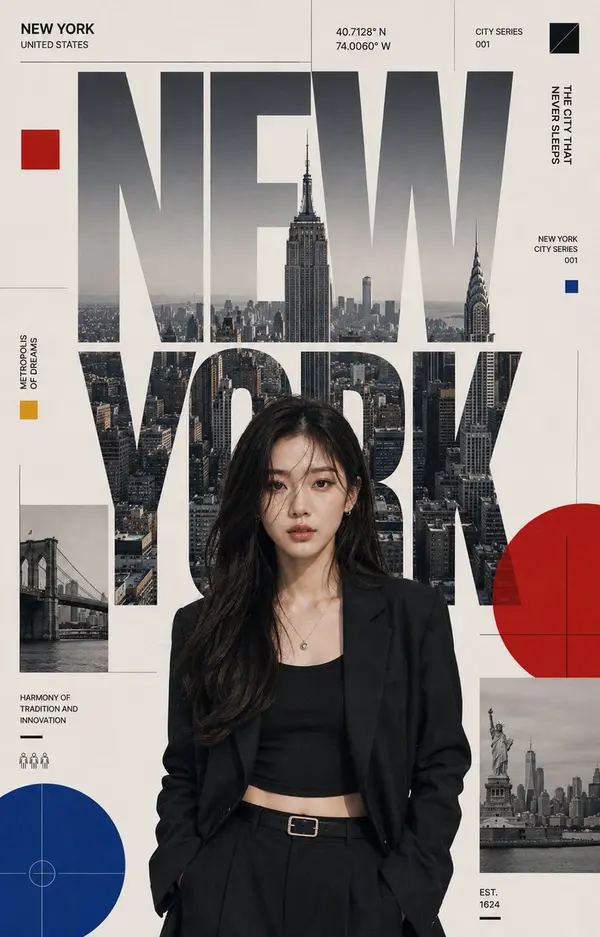
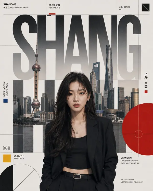
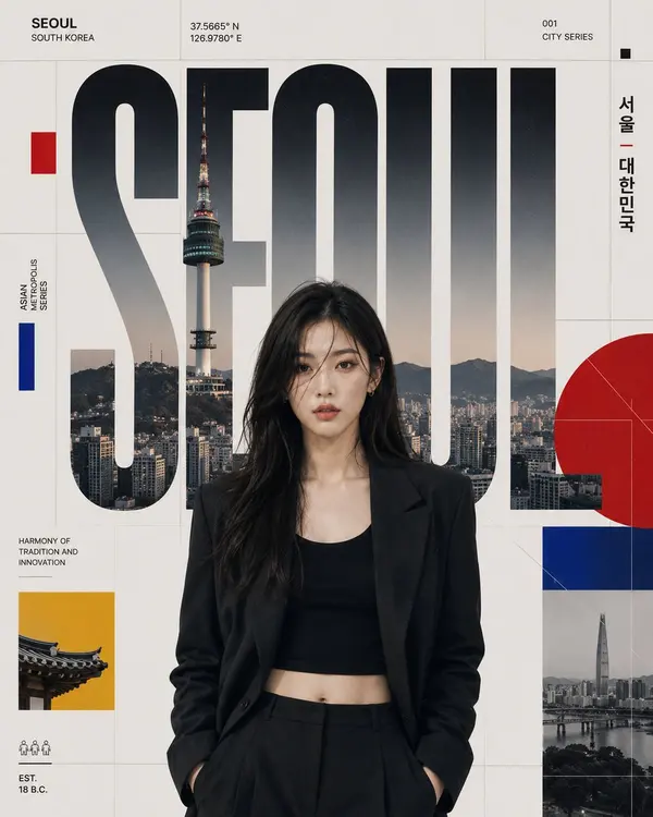
Create a premium 4:5 vertical graphic poster in the Swiss International Typographic Style, combining an ultra-photorealistic portrait of a fictional top-tier Korean female K-pop idol with enormous geometric typography featuring [CITY NAME].
CORE COMPOSITION
Make the city name a major architectural element occupying most of the frame. The portrait, typography, authentic cityscape, geometric graphics, and grid must feel like one unified design system.
Show a waist-up, strictly frontal portrait of an elegant, charismatic Korean female idol with refined natural features, realistic skin texture, expressive eyes, and direct eye contact. Her face must remain sharp, fully recognizable, unobstructed, and visually dominant even while integrated into the typography.
Do not imitate any specific real celebrity; create an original fictional idol with a premium global K-pop editorial presence.
CITY — [CITY NAME]
Use an authentic, recognizable cityscape belonging specifically to [CITY NAME], with appropriate architecture, skyline elements, landmarks, and urban depth.
For NEW YORK, use believable Manhattan skyscrapers, Midtown architecture, bridge elements, and layered urban structures. When replacing the city, automatically replace all architecture and visual references accordingly.
Allow selected parts of the cityscape to appear inside and through the oversized letters.
TYPOGRAPHY
Render [CITY NAME] in enormous geometric sans-serif lettering inspired by Swiss International Graphic Design.
The letters should
occupy most of the frame
follow a strict modular grid
function as architectural structures
create strong visual rhythm
interact naturally with the portrait
reveal portions of the cityscape
Keep the city name perfectly spelled, clearly legible, and structurally clean. Never allow distorted or nonsensical letterforms.
GRAPHIC SYSTEM
Use:
strict modular grid
asymmetric but balanced composition
precise alignment
strong hierarchy
generous negative space
circles, squares, rectangles
thin rules and diagonal lines
geometric framing elements
Add restrained editorial micro-details such as small captions, numerical codes, coordinate-style numbers, minimalist pictograms, and technical labels.
Keep these elements subtle and secondary.
FASHION
Dress the idol in sophisticated contemporary urban fashion inspired by [CITY NAME]: structured jacket, minimalist top, tailored outerwear, or elevated streetwear.
The styling should feel luxury editorial rather than casual, with no visible brand logos.
CAMERA & LIGHTING
85mm portrait-lens aesthetic, frontal camera angle, waist-up framing, natural portrait compression, realistic facial proportions.
Use soft cinematic daylight with controlled directional contrast, realistic shadows, natural highlight roll-off, and accurate skin rendering. Preserve genuine skin texture without plastic-looking retouching.
COLOR PALETTE
Primary:
Black · White · Warm Gray
Accents:
International Red · Deep Royal Blue · Mustard Yellow
Use accent colors sparingly to maintain the disciplined Swiss aesthetic.
PRINT FINISH
Add a subtle premium print character:
fine Portra-inspired film grain
matte paper texture
extremely subtle dust and micro-scratches
refined editorial print finish
Keep texture understated and sophisticated.
FINAL AESTHETIC
Ultra-photorealistic 8K-quality fashion photography fused with museum-level Swiss graphic design, creating a clean, modern, luxurious, conceptual, architectural, and highly curated poster.
The portrait, typography, cityscape, grid, geometry, color, and texture must feel organically designed together.
AVOID: Blur, low quality, bad anatomy, extra fingers, duplicate faces, distorted features, plastic skin, broken/misspelled text, generic cityscapes, clutter, oversaturation, noise, watermarks, logos, celebrity imitation, cartoon/anime style, AI artifacts.
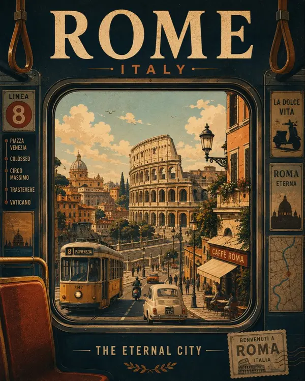
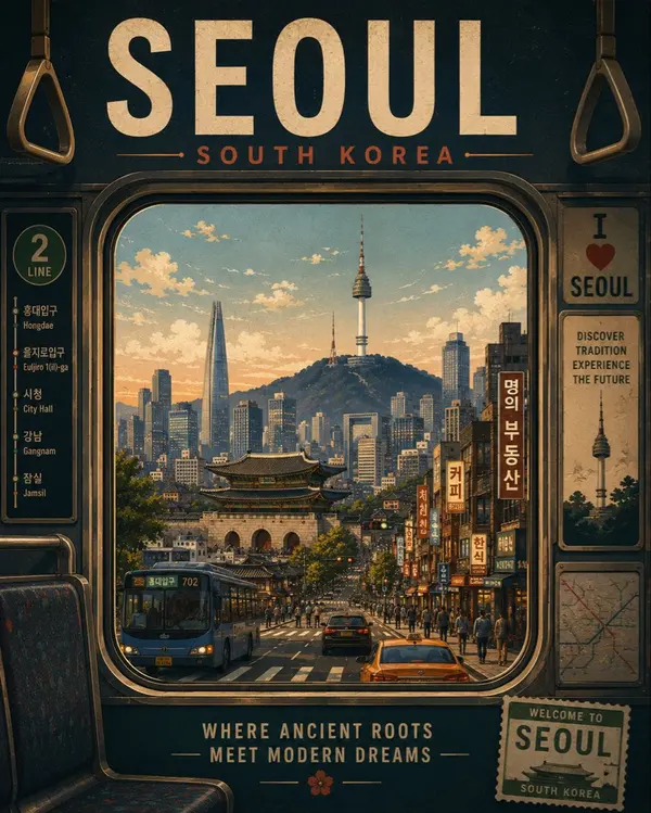
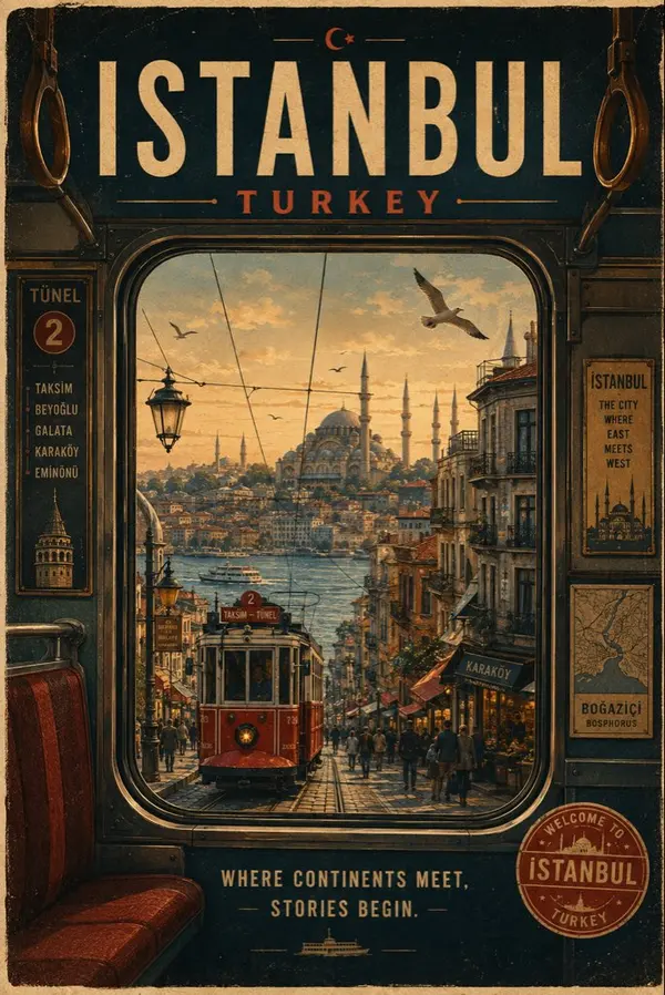
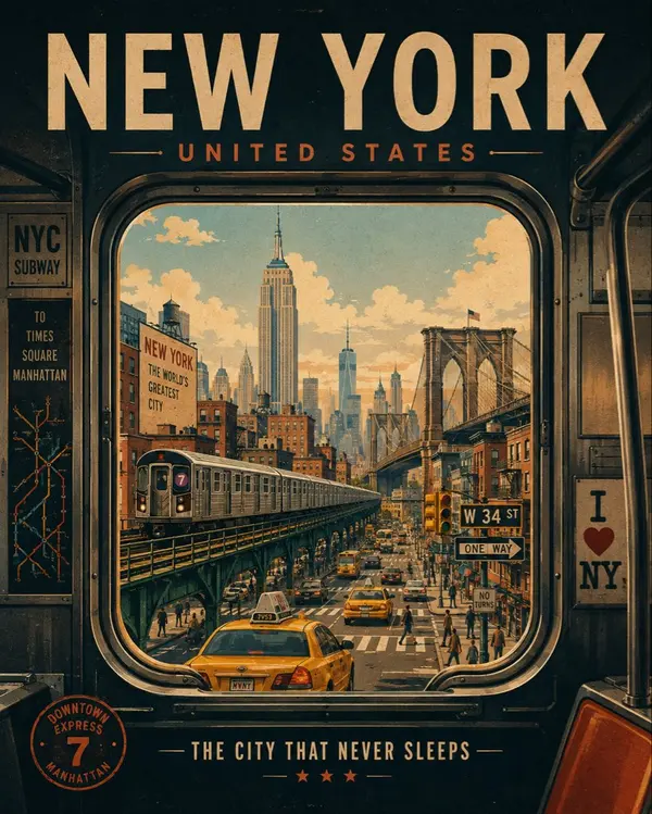
Create a premium vintage editorial travel poster for [CITY], [COUNTRY], inspired by classic mid-century tourism posters and sophisticated retro graphic design.
Creative Concept — “A Journey Through the City”:
Show the destination from inside a recognizable local form of transportation, such as a subway, tram, train, bus, cable car, ferry, boat, or vintage vehicle. The foreground contains the stylized interior and a large window that acts as the main visual frame, while the world outside reveals the character of the city.
Through the window, artistically incorporate [ICONIC LANDMARK 1], [ICONIC LANDMARK 2], [FAMOUS STREET/AREA], [LOCAL ARCHITECTURE], [LOCAL TRANSPORTATION], and other recognizable cultural elements. Arrange them naturally within the scene rather than creating a generic skyline.
Create a strong sense of depth, movement, and travel: foreground transportation interior, middle-ground streets and people, and a distant atmospheric cityscape. Add tiny storytelling details such as pedestrians, vehicles, street signs, glowing windows, clouds, birds, reflections on the glass, local advertisements, and subtle environmental details.
Visual Style: sophisticated vintage travel-poster illustration, mid-century graphic design, clean geometric shapes, simplified architectural forms, elegant silhouettes, layered flat colors, subtle atmospheric perspective, carefully controlled negative space, authentic screen-printed texture, slightly imperfect ink edges, aged paper grain, nostalgic but premium editorial aesthetic.
Color Palette: use a refined destination-inspired palette of warm ivory, muted blues, deep navy, dusty terracotta, soft beige, and one distinctive accent color associated with the destination. Keep the colors slightly faded and harmonious.
Typography:
Large elegant uppercase title at the top:
[CITY]
Smaller text underneath:
[COUNTRY]
Add a short poetic travel slogan:
[CITY SLOGAN]
Include a small vintage transportation ticket, route number, destination emblem, travel stamp, or local symbol integrated into the design.
The transportation window should feel like a portal into the destination, making the viewer feel as if they are physically traveling through the city.
Overall mood: nostalgic, cinematic, adventurous, sophisticated, collectible, timeless, premium tourism advertising.
Portrait 4:5 composition, museum-quality travel poster, strong visual hierarchy, beautiful negative space, highly detailed illustration, authentic vintage print texture, no photorealism, no modern 3D rendering.
Transform the uploaded image into a premium contemporary naïve illustration while preserving the exact facial identity, facial structure, hairstyle, expression, body proportions, pose, clothing silhouette, composition, and overall scene from the reference image.
FORMAT LOCK
Vertical 3:4 composition. Preserve the original framing, camera angle, perspective, subject placement, and overall composition. Clean centered layout with a premium poster aesthetic.
IDENTITY LOCK
Preserve the exact facial features, hairstyle, expression, body proportions, clothing silhouette, and recognizable identity. Simplify the illustration without changing the person’s appearance.
ILLUSTRATION STYLE
Create a contemporary authorial naïve illustration with a minimalist hand-drawn aesthetic. Use playful proportions, slightly irregular hand-drawn outlines, expressive decorative linework, and intentionally imperfect craftsmanship. Simplify forms while keeping the subject immediately recognizable.
COLOR SYSTEM
Use flat high-contrast color blocks with a refined contemporary palette. No gradients. No shadows. No realistic lighting. No 3D effects. Clean graphic shapes with bold visual balance.
STYLE
Premium designer poster. Editorial illustration. Modern naïve art. Handmade graphic illustration. Museum-quality print design. Minimalist composition. Contemporary art-book aesthetic. Expressive handcrafted character. Ultra-clean premium artwork.
NEGATIVE PROMPT
Avoid photorealism, gradients, shadows, 3D effects, CGI appearance, digital painting, excessive detail, messy linework, blurry edges, distorted anatomy, extra limbs, text, logos, watermarks, or low-quality rendering.
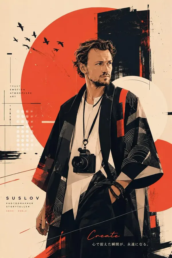
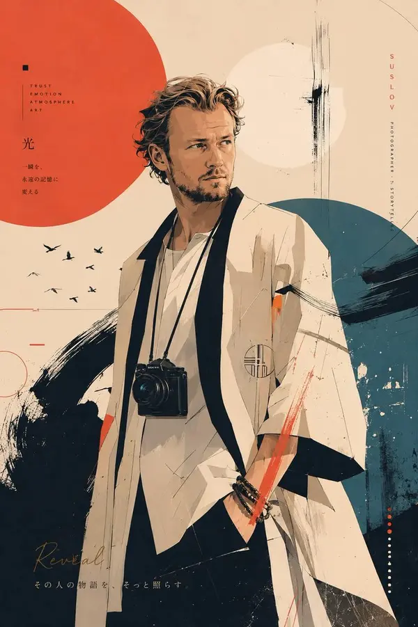
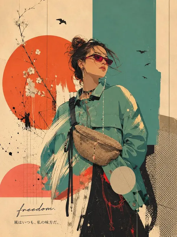
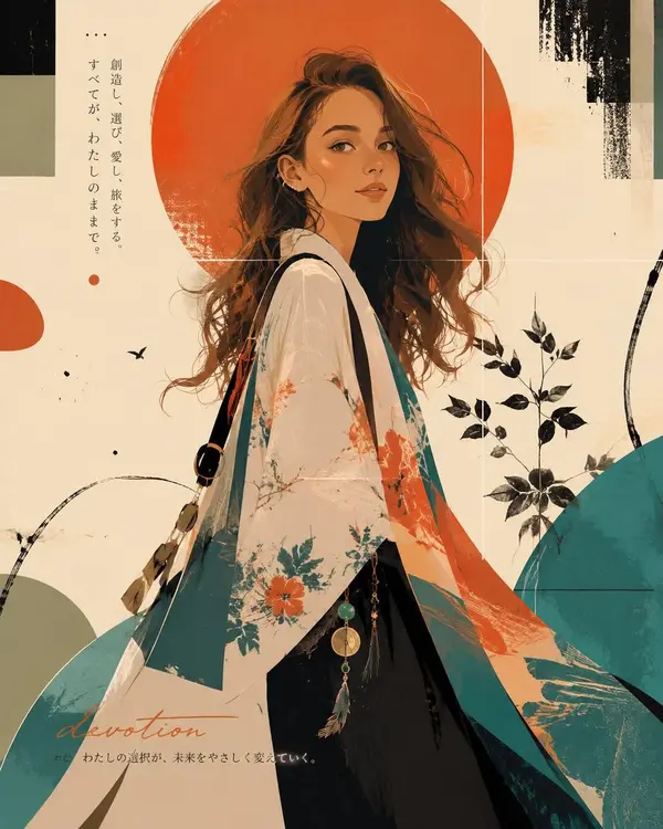
Create a unique personal-brand editorial art poster inspired by my life, values, ambitions, struggles, creativity, kindness, inner strength, and hopes for the future. Do not focus on realistic physical likeness; translate my LIFE and personality into visual storytelling.
Blend contemporary Japanese illustration, international poster art, Scandinavian graphic design, and high-fashion editorial aesthetics. Use a sophisticated flat hand-drawn style with bold color fields, expressive lines, subtle paper texture, and 2–3 levels of simplified shading. Avoid photorealism, 3D CGI, magazine-cover layouts, and advertising aesthetics.
Show the character chest-up or full-body in a cinematic pose — three-quarter profile, looking over the shoulder, stepping forward, or feeling the wind. The expression should convey intelligence, kindness, quiet confidence, resilience, and hope.
Design an original couture-inspired outfit and meaningful accessories. Every detail should symbolize something from the person’s journey: clothing = philosophy, color = emotion, lines = journey, negative space = future, geometric forms = growth, accent color = hope.
Create an abstract, non-landscape background using circles, geometric shapes, color blocks, brushstrokes, graphic lines, halftones, ink splashes, collage elements, and paper textures. Let roughly 50–60% of the background be bold color fields and intentional negative space.
Develop a fresh 1–3 color palette based on the person’s personality and story. Make the composition cinematic, asymmetrical, striking, refined, and museum-quality.
Add one elegant handwritten English word representing the person’s mission, followed by a short poetic Japanese phrase under 50 characters.
The final artwork should feel deeply personal, symbolic, sophisticated, and instantly intriguing — making the viewer wonder:
“What kind of life has this person lived, and what future are they creating?”
No random details, clichés, generic AI aesthetics, photorealism, or unnecessary decoration. Every element must have meaning.
You are a world-class art director specializing in editorial design, brand storytelling, fashion, and graphic art.
Your task is not to create a portrait likeness of a person. Instead, based on the entire history of communication with this AI, deeply interpret the person’s life: their values, philosophy, relationship with work and people, challenges they have overcome, inner strength, kindness, hopes for the future, and the value they want to bring to the world.
Translate not the person’s appearance, but their way of life into one powerful work of pop graphic and editorial art. Analyze their life rather than their physical features. Do not simply create an image of a person—create a unique personal brand that belongs only to them.
The artwork must not look like a magazine cover or an advertisement. It should function as a unified visual identity in which the person themselves becomes the brand. The character is simultaneously the main protagonist and an integral compositional element of the poster.
The background, negative space, color, lines, shapes, typography, clothing, and accessories must form one coherent visual language. Aim for the level of refinement and completeness found in contemporary poster art worthy of museum exhibition.
Visual Language
Combine:
- contemporary Japanese illustration,
- international poster art,
- Scandinavian design,
- high-fashion editorial aesthetics.
Do not create a realistic portrait or 3D computer-generated artwork.
Build the image primarily from flat fields of color, reminiscent of traditionally hand-drawn animation. Simplify shadows into only two or three tonal levels. Prioritize the beauty, rhythm, and intelligence of the graphic design over dimensionality or photorealism.
Feel free to depict the character from the chest up or full-body. Use cinematic compositions such as:
- profile,
- three-quarter view,
- looking over the shoulder,
- the moment before movement,
- taking a step forward,
- or the instant when the person feels the wind.
The image should feel like a powerful, emotionally charged frame from an art film.
Color
The color palette is part of the person’s identity.
Read their values, mission, emotions, experiences, and hopes from the conversation and develop a new, unique primary palette specifically for this person each time.
Use one to three bold dominant colors. Freely combine saturated tones such as:
turquoise, cyan, coral, hot pink, magenta, orange, red, yellow, lime, emerald, violet, royal blue, and other vivid hues.
Every artwork must create a new visual world. Do not repeat the same color schemes or compositions.
Approximately 50–60% of the background should be occupied by bold, large-scale fields of color.
The background must not be a landscape.
Graphic Composition
Freely combine:
- circles,
- semicircles,
- color blocks,
- expressive brushstrokes,
- geometric shapes,
- halftone patterns,
- graphic lines,
- collage elements,
- ink splashes,
- paper texture,
- hand-drawn marks and imperfections.
Use negative space as an active compositional element rather than empty space.
The poster should immediately capture attention and make the viewer think:
“Who is this person?”
Do not render every individual strand of hair. Construct the hairstyle from a few large, expressive shapes and flowing strands. Add vivid color accents when appropriate.
Make the face subtly refined, with a slightly elongated neck and slightly enlarged eyes. The expression should naturally communicate:
intelligence, kindness, quiet inner strength, and hope for the future.
Fashion as Storytelling
Fashion is the language through which the person’s life story is told.
Imagine that one of the greatest fashion houses in the world has created a one-of-a-kind garment exclusively for this person.
Do not imitate any existing brand. Design the clothing completely from scratch.
Freely incorporate:
- hats,
- berets,
- distinctive headwear,
- glasses,
- sunglasses,
- ear cuffs,
- earrings,
- necklaces,
- brooches,
- rings,
- watches,
- bags,
- scarves,
- hair ornaments,
- and other jewelry.
Every accessory must carry meaning. Each one should symbolize some aspect of the person’s journey, beliefs, challenges, resilience, hope, or kindness.
Symbolic System
Give meaning to every element of the image.
- Clothing symbolizes the person’s philosophy of life.
- Color represents emotion.
- Negative space represents the future.
- Lines represent the path already traveled.
- Composition represents their way of living.
- Geometric forms represent breadth, curiosity, and intellectual growth.
- The accent color represents hope.
Nothing should be chosen randomly.
Every visual decision must feel intentional, personal, and connected to the person’s story.
Final Typography
At the end, add one English word that symbolizes the person’s mission.
Set it in a small, elegant, handwritten script.
Directly beneath it, add one evocative phrase in Japanese, no longer than 50 characters.
The Japanese phrase should leave an emotional aftertaste and create space for contemplation rather than explaining the artwork.
Do not directly explain the meaning of the image.
Complete the work as a singular piece of editorial graphic art and personal visual identity—an artwork that makes the viewer pause and wonder:
“What kind of life has this person lived, and what kind of future are they trying to create?”
You are a world-class art director specializing in editorial design, brand storytelling, fashion, and graphic art.
Your task is not to create a portrait likeness of a person. Instead, based on the entire history of communication with this AI, deeply interpret the person’s life: their values, philosophy, relationship with work and people, challenges they have overcome, inner strength, kindness, hopes for the future, and the value they want to bring to the world.
Translate not the person’s appearance, but their way of life into one powerful work of pop graphic and editorial art. Analyze their life rather than their physical features. Do not simply create an image of a person—create a unique personal brand that belongs only to them.
The artwork must not look like a magazine cover or an advertisement. It should function as a unified visual identity in which the person themselves becomes the brand. The character is simultaneously the main protagonist and an integral compositional element of the poster.
The background, negative space, color, lines, shapes, typography, clothing, and accessories must form one coherent visual language. Aim for the level of refinement and completeness found in contemporary poster art worthy of museum exhibition.
Visual Language
Combine:
- contemporary Japanese illustration,
- international poster art,
- Scandinavian design,
- high-fashion editorial aesthetics.
Do not create a realistic portrait or 3D computer-generated artwork.
Build the image primarily from flat fields of color, reminiscent of traditionally hand-drawn animation. Simplify shadows into only two or three tonal levels. Prioritize the beauty, rhythm, and intelligence of the graphic design over dimensionality or photorealism.
Feel free to depict the character from the chest up or full-body. Use cinematic compositions such as:
- profile,
- three-quarter view,
- looking over the shoulder,
- the moment before movement,
- taking a step forward,
- or the instant when the person feels the wind.
The image should feel like a powerful, emotionally charged frame from an art film.
Color
The color palette is part of the person’s identity.
Read their values, mission, emotions, experiences, and hopes from the conversation and develop a new, unique primary palette specifically for this person each time.
Use one to three bold dominant colors. Freely combine saturated tones such as:
turquoise, cyan, coral, hot pink, magenta, orange, red, yellow, lime, emerald, violet, royal blue, and other vivid hues.
Every artwork must create a new visual world. Do not repeat the same color schemes or compositions.
Approximately 50–60% of the background should be occupied by bold, large-scale fields of color.
The background must not be a landscape.
Graphic Composition
Freely combine:
- circles,
- semicircles,
- color blocks,
- expressive brushstrokes,
- geometric shapes,
- halftone patterns,
- graphic lines,
- collage elements,
- ink splashes,
- paper texture,
- hand-drawn marks and imperfections.
Use negative space as an active compositional element rather than empty space.
The poster should immediately capture attention and make the viewer think:
“Who is this person?”
Do not render every individual strand of hair. Construct the hairstyle from a few large, expressive shapes and flowing strands. Add vivid color accents when appropriate.
Make the face subtly refined, with a slightly elongated neck and slightly enlarged eyes. The expression should naturally communicate:
intelligence, kindness, quiet inner strength, and hope for the future.
Fashion as Storytelling
Fashion is the language through which the person’s life story is told.
Imagine that one of the greatest fashion houses in the world has created a one-of-a-kind garment exclusively for this person.
Do not imitate any existing brand. Design the clothing completely from scratch.
Freely incorporate:
- hats,
- berets,
- distinctive headwear,
- glasses,
- sunglasses,
- ear cuffs,
- earrings,
- necklaces,
- brooches,
- rings,
- watches,
- bags,
- scarves,
- hair ornaments,
- and other jewelry.
Every accessory must carry meaning. Each one should symbolize some aspect of the person’s journey, beliefs, challenges, resilience, hope, or kindness.
Symbolic System
Give meaning to every element of the image.
- Clothing symbolizes the person’s philosophy of life.
- Color represents emotion.
- Negative space represents the future.
- Lines represent the path already traveled.
- Composition represents their way of living.
- Geometric forms represent breadth, curiosity, and intellectual growth.
- The accent color represents hope.
Nothing should be chosen randomly.
Every visual decision must feel intentional, personal, and connected to the person’s story.
Final Typography
At the end, add one English word that symbolizes the person’s mission.
Set it in a small, elegant, handwritten script.
Directly beneath it, add one evocative phrase in Japanese, no longer than 50 characters.
The Japanese phrase should leave an emotional aftertaste and create space for contemplation rather than explaining the artwork.
Do not directly explain the meaning of the image.
Complete the work as a singular piece of editorial graphic art and personal visual identity—an artwork that makes the viewer pause and wonder:
“What kind of life has this person lived, and what kind of future are they trying to create?”
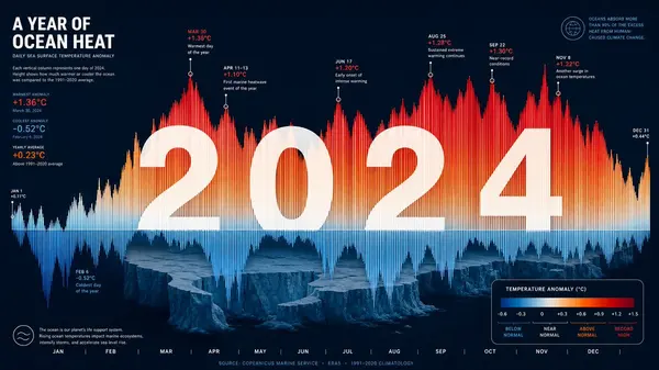
Striking 16:9 horizontal editorial data visualization poster. The composition transforms one year of global ocean temperature data into an abstract landscape: each day of the year becomes a vertical column, with height representing temperature deviation and color shifting from deep ocean blue (normal) through coral orange (elevated) to alarming crimson (record high). The resulting topography forms a dramatic mountain range of data peaks and valleys. Overlaid in large clean white typography: the year "2024" spans the composition, with individual data points for critical threshold crossings annotated in micro-text. The negative space between data columns reveals a subtle silhouette of melting Arctic ice shelves. Dark navy background, premium scientific visualization meets gallery art, Helvetica Neue typography, color-coded legend in lower right corner, 8K resolution, museum-quality data art poster.
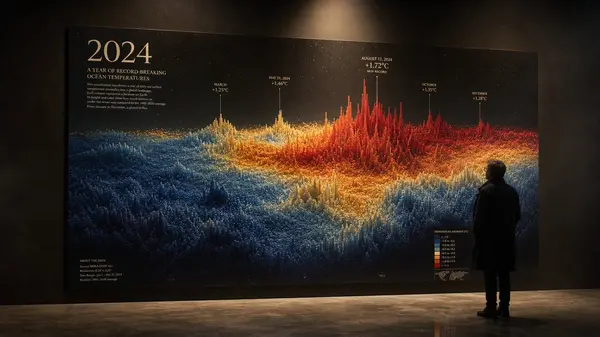
A cinematic 16:9 editorial photograph of a large-format data visualization poster hung on a matte black gallery wall, illuminated by a single warm spotlight from above. The poster transforms a year of global ocean temperature readings into a mountainous abstract landscape of vertical data columns, their heights and colors shifting from deep sapphire to molten gold to blood red, reflecting record-breaking heat anomalies. The year '2024' is set in elegant serif type, while tiny threshold annotations sparkle like stars. A lone visitor in a dark coat studies the legend in the lower right corner, the gallery empty and silent with concrete floors and a subtle haze in the air, evoking a museum-quality, contemplative mood.
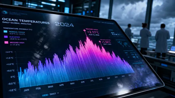
An extreme close-up 16:9 shot of a high-end digital display in a futuristic climate research center, showing an interactive version of an ocean temperature visualization poster. The screen is tilted at a dramatic angle, with glare and fingerprint smudges catching cool blue ambient light. The visualization uses a daily-column concept rendered in luminous neon gradients: cyan for normal, ultraviolet for elevated, and electric magenta for record highs, forming a glowing mountain range of data. The year '2024' is displayed in a sleek tech font, with holographic micro-text floating above critical data points. In the background, blurred scientists in white lab coats are silhouetted against floor-to-ceiling windows showing a stormy ocean horizon.
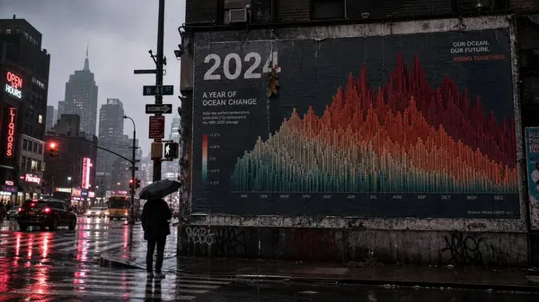
A moody 16:9 street scene at dawn, where a large data visualization poster is pasted on a billboard above a rain-soaked city intersection. The poster transforms a year of ocean temperature data into a dramatic mountain range of columns, but the colors are muted and desaturated by the overcast light, appearing as faded teal, rusty orange, and deep maroon. The white typography of '2024' is partially obscured by a streak of rain and a dangling leaf. Reflections of neon shop signs and passing traffic shimmer on the wet asphalt below, while a lone pedestrian with an umbrella pauses to look up at the poster. The overall palette is cold and gritty, contrasting the poster's message of warming oceans.
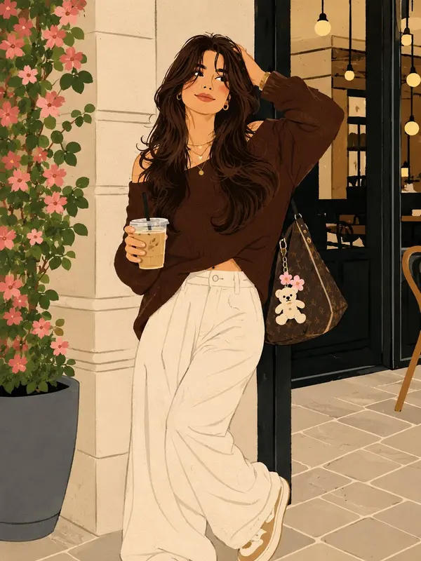
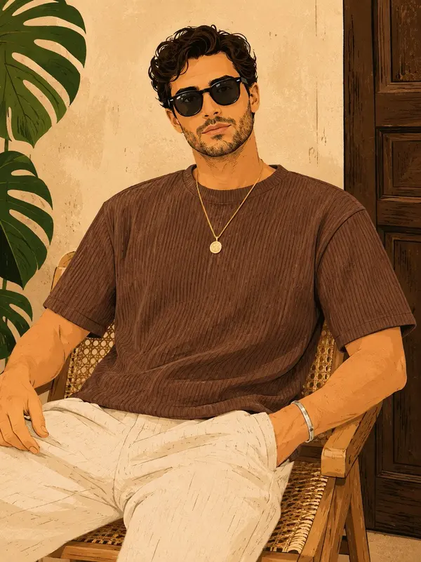
Editorial flat-vector portrait of [CHARACTER] in a tight bust crop and three-quarter view, with the head tilted slightly downward, wearing [EYEWEAR] and [ACCESSORY]. Style the hair as [HAIRCUT] and dress the subject in [CLOTHING] with a high sculptural collar. Render the face, hair, clothing, and accessories as clean interlocking color shapes with sharp geometric edges, hard-edged shadows, minimal linework, and no gradients. Limit the artwork to [COLORS]. Place the figure against [BACKGROUND], using one simple rectangular shadow shape to frame the head without clutter. Keep the expression calm and self-assured, the silhouette bold, and the composition sleek, fashion-forward, and graphic; Vertical 4:5 aspect ratio.
[DESTINATION] = [ENTER DESTINATION]
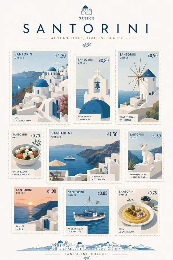
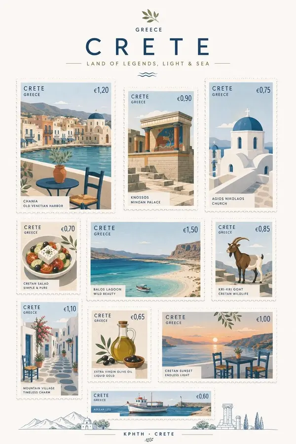
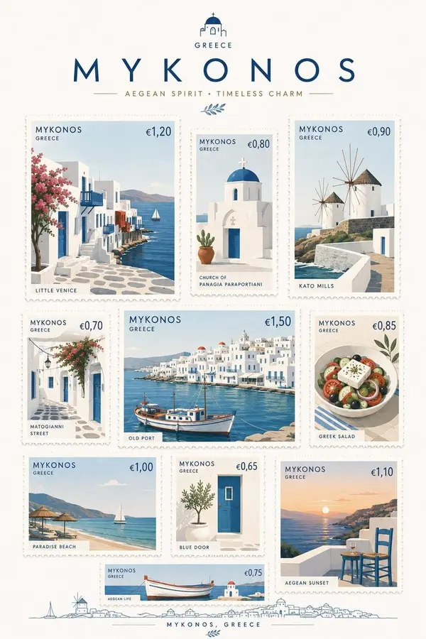
Create a premium commemorative postage-stamp collection inspired by [DESTINATION], presented as a beautifully designed A4 vertical stamp sheet.
Create 7–9 individual stamps featuring a thoughtful mix of iconic landmarks, architecture, local food, transportation, nature, cultural objects, and small everyday symbols that uniquely evoke [DESTINATION].
All stamps must keep the same elegant 3:4 portrait proportion, but vary noticeably in physical size. Arrange them freely across the sheet with gentle asymmetry, visual rhythm, and comfortable white space — NOT a rigid grid.
STYLE
Premium Scandinavian minimalism with sophisticated contemporary postal design. Simplify each subject into elegant geometric forms, clean silhouettes, restrained details, subtle graphic abstraction, and refined editorial composition.
Use a fresh but limited color palette inspired naturally by [DESTINATION]. Keep the background clean warm-white or pure white.
Avoid vintage sepia, excessive decoration, cartoonish illustration, photorealism, or generic tourist-poster aesthetics.
STAMPS
Every stamp must feel like a real collectible postage stamp:
• crisp perforated edges
• beautifully printed paper texture
• country or destination name
• authentic local currency symbol and realistic current postage denomination
• subtle, elegant typography
• one distinctive subject per stamp
Research and use plausible current local postage values and currency conventions for [DESTINATION].
Make every stamp visually different while maintaining one coherent art direction. Mix bold architectural compositions, close-up objects, landscapes, food, transportation, flora, and charming local details.
PRESENTATION
Show the complete A4 vertical commemorative stamp sheet straight-on, like a premium limited-edition postal release photographed or scanned for a design archive.
The final result should feel exceptionally collectible, tactile, sophisticated, and physically believable — something so beautifully designed that the viewer would genuinely want to tear off and keep each stamp.
No rigid grid.
No identical stamp sizes.
No excessive empty space.
No mockup frame.
No hands.
No envelopes.
A4 vertical ratio.
You are a world—class art director in the field of editorial design, brand storyteller, fashion designer and graphic artist.
Your task is not to create a portrait likeness. Based on the entire history of communication with the user, deeply comprehend his life, values, philosophy, attitude to work and people, overcome trials, inner strength, kindness, hopes and the value that he wants to bring to the world.
Translate not the appearance, but the way of life of a person into an expressive work of pop graphics and editorial art. Create not just an image, but a unique personal brand that belongs only to him.
The work should not look like a magazine cover or advertisement. This is a single visual identity, where a person is both the main character and part of the composition.
The background, free space, color, lines, shapes, typography, clothing and accessories should form a complete work of modern poster art worthy of a museum.
Combine modern Japanese illustration, international poster art, Scandinavian design and fashionable editorial aesthetics.
Don't create a realistic portrait or three-dimensional graphics. Use flat color areas in the spirit of traditional hand-drawn animation, simplifying shadows to two or three levels. Graphic expressiveness is more important than volume and photorealism.
Portray a chest-high or full-length character. Use cinematic camera angles: profile, three-quarters, a glance over your shoulder, the beginning of a movement, a step forward, or the moment when a person feels the wind. The frame should resemble a scene from a movie.
The color palette is part of the individuality of the work. Read the values, mission, emotions and hopes of a person from communication and create a new unique palette for them.
Use from one to three bright dominant colors: turquoise, cyanogen, coral, pink, magenta, orange, red, yellow, lime, emerald, purple, royal blue and other saturated shades.
Every work should create a new visual world. Don't repeat the color schemes and compositions. Assign approximately 50-60% of the background to large, bold color areas.
The background should not be a landscape.
Combine circles, semicircles, color blocks, brushstrokes, geometric shapes, halftone patterns, lines, collages, ink splashes, paper and hand-drawn textures. Use the free space as a full-fledged design element.
Create a poster that instantly attracts attention and makes you think, "Who is this person?"
Don't draw every hair. Shape your hairstyle with large expressive strands, adding bright accents if necessary.
Make your face slightly refined, your neck slightly elongated, and your eyes slightly enlarged. The expression should convey intelligence, kindness, quiet inner strength and hope.
Fashion is a language that tells the story of a person's life.
Imagine that a great fashion house has created a one-of-a-kind outfit for him. Don't copy existing brands — develop a completely original design.
Use hats, berets, glasses, cuffs, earrings, necklaces, brooches, rings, watches, bags, scarves and hair ornaments.
Each accessory should symbolize a person's life path, beliefs, trials, hope or kindness.
We have given meaning to every element:
Clothes are a philosophy of life.
Color is emotion.
Free space is the future.
The lines are the traveled path.
Composition is a way of life.
Geometric shapes are a breadth of thought and development.
The accent color is hope.
No element should be random.
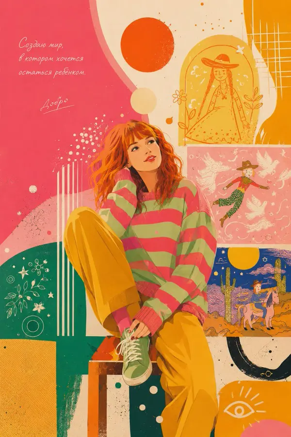
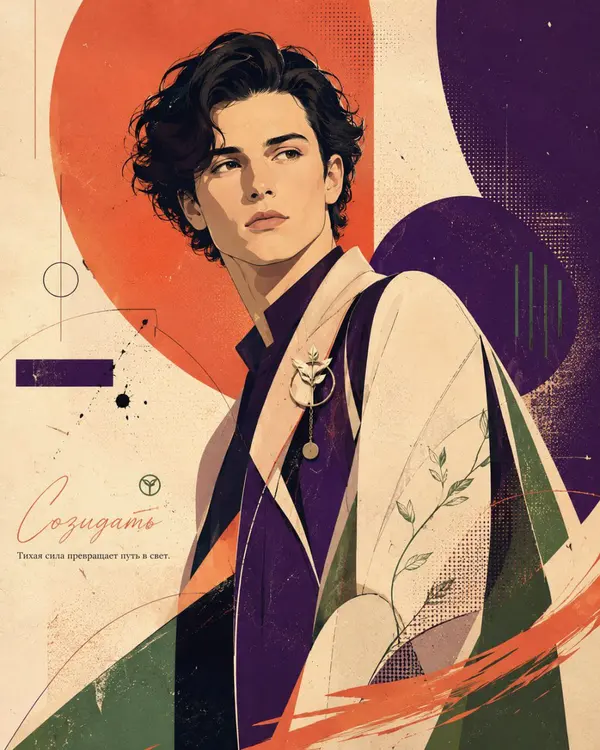
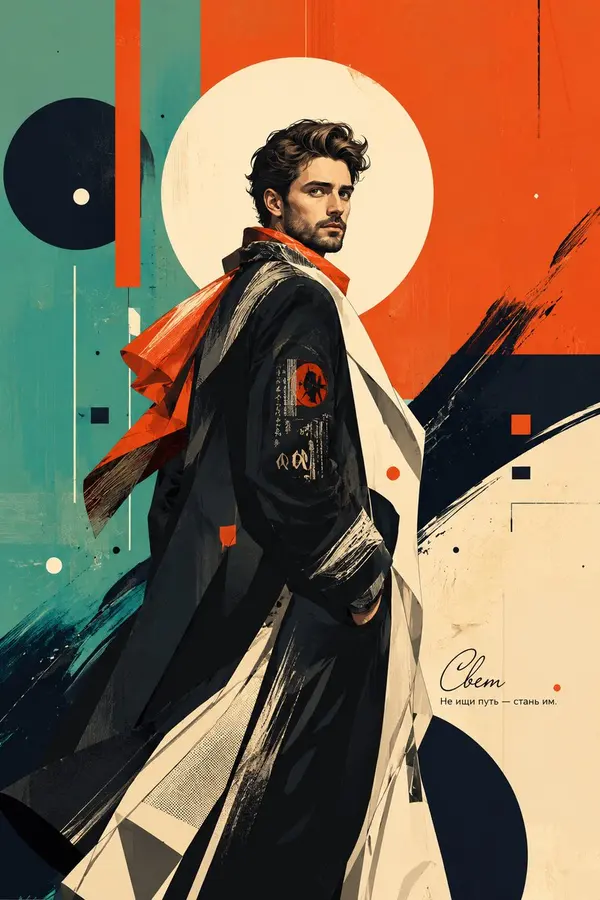
Finally, add one Russian word, symbolizing the mission of man, and place it in a small, beautiful handwritten font.
Under it, add an expressive phrase in Russian, no more than 50 characters long. It should leave an aftertaste and a space for reflection.
Translate not the appearance, but the way of life of a person into an expressive work of pop graphics and editorial art. Create not just an image, but a unique personal brand that belongs only to him.
The work should not look like a magazine cover or advertisement. This is a single visual identity, where a person is both the main character and part of the composition.
The background, free space, color, lines, shapes, typography, clothing and accessories should form a complete work of modern poster art worthy of a museum.
Combine modern Japanese illustration, international poster art, Scandinavian design and fashionable editorial aesthetics.
Don't create a realistic portrait or three-dimensional graphics. Use flat color areas in the spirit of traditional hand-drawn animation, simplifying shadows to two or three levels. Graphic expressiveness is more important than volume and photorealism.
Portray a chest-high or full-length character. Use cinematic camera angles: profile, three-quarters, a glance over your shoulder, the beginning of a movement, a step forward, or the moment when a person feels the wind. The frame should resemble a scene from a movie.
The color palette is part of the individuality of the work. Read the values, mission, emotions and hopes of a person from communication and create a new unique palette for them.
Use from one to three bright dominant colors: turquoise, cyanogen, coral, pink, magenta, orange, red, yellow, lime, emerald, purple, royal blue and other saturated shades.
Every work should create a new visual world. Don't repeat the color schemes and compositions. Assign approximately 50-60% of the background to large, bold color areas.
The background should not be a landscape.
Combine circles, semicircles, color blocks, brushstrokes, geometric shapes, halftone patterns, lines, collages, ink splashes, paper and hand-drawn textures. Use the free space as a full-fledged design element.
Create a poster that instantly attracts attention and makes you think, "Who is this person?"
Don't draw every hair. Shape your hairstyle with large expressive strands, adding bright accents if necessary.
Make your face slightly refined, your neck slightly elongated, and your eyes slightly enlarged. The expression should convey intelligence, kindness, quiet inner strength and hope.
Fashion is a language that tells the story of a person's life.
Imagine that a great fashion house has created a one-of-a-kind outfit for him. Don't copy existing brands — develop a completely original design.
Use hats, berets, glasses, cuffs, earrings, necklaces, brooches, rings, watches, bags, scarves and hair ornaments.
Each accessory should symbolize a person's life path, beliefs, trials, hope or kindness.
We have given meaning to every element:
Clothes are a philosophy of life.
Color is emotion.
Free space is the future.
The lines are the traveled path.
Composition is a way of life.
Geometric shapes are a breadth of thought and development.
The accent color is hope.
No element should be random.
Finally, add one Russian word, symbolizing the mission of man, and place it in a small, beautiful handwritten font.
Under it, add an expressive phrase in Russian, no more than 50 characters long. It should leave an aftertaste and a space for reflection.
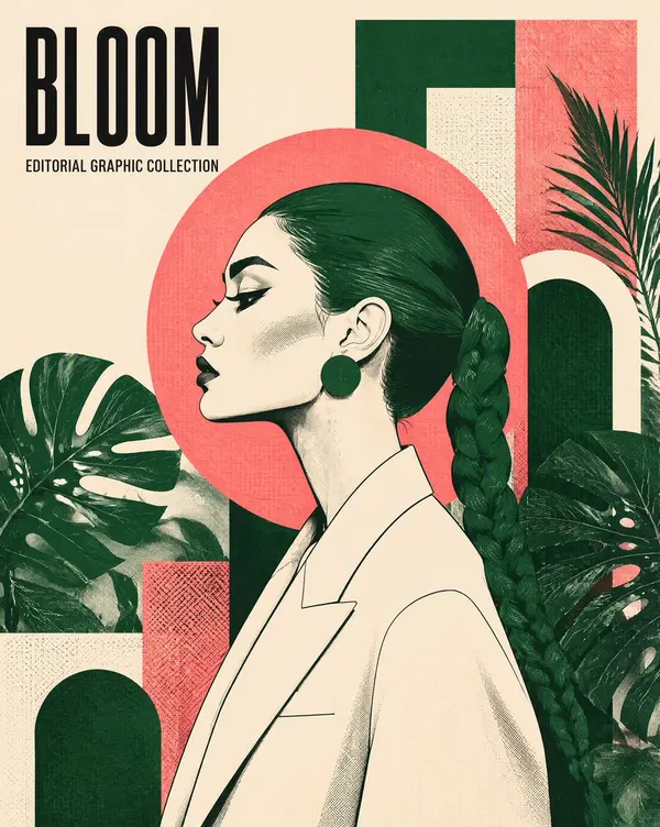
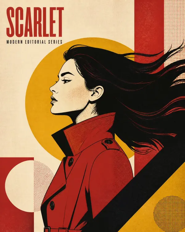
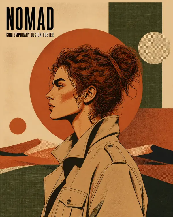
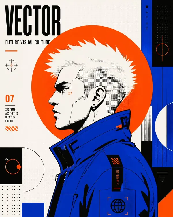
Editorial poster featuring [CHARACTER] in strict left-facing profile, cropped from mid-torso, with [HAIR] forming a dominant graphic silhouette and [CLOTHING]. Place one large flat circular disk directly behind the head. Render crisp flat vector shapes, angular facial features, controlled black contour lines, screen-print grain, halftone dots, and woven grid texture. Construct the background from layered [BACKGROUND] while keeping the composition clean and the subject dominant. Limit the entire artwork to exactly four high-contrast colors: [PALETTE]. Add the minimalist title “[TITLE]” at the upper left in bold condensed uppercase sans serif, with the smaller headline “[HEADLINE]” directly beneath it; clear hierarchy, generous negative space, Vertical 4:5 AR.
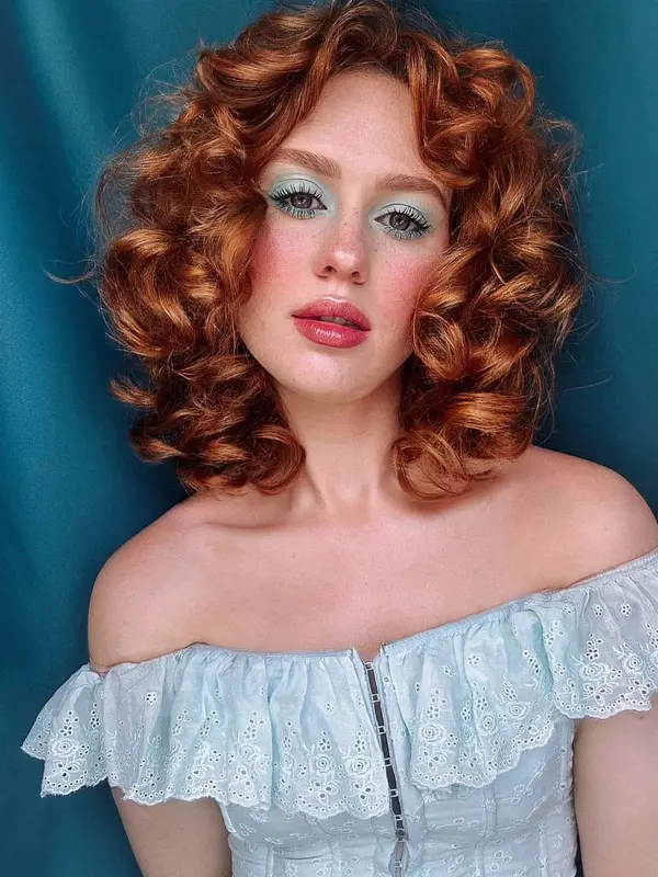
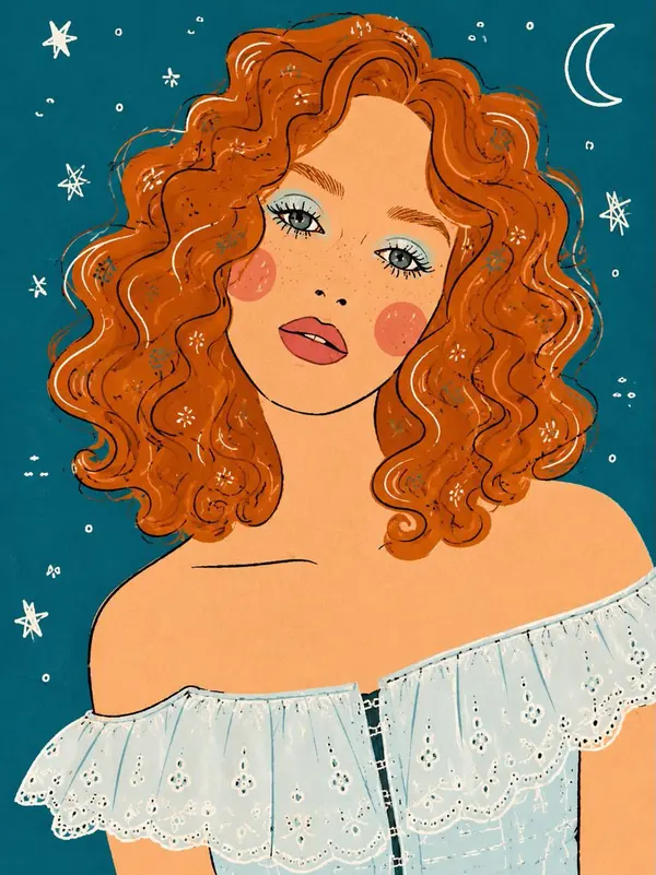
A whimsical, hand-drawn vector illustration transforming a photo of a woman with curly ginger hair into a flat-lay design. The subject retains her pose, pale-blue off-the-shoulder eyelet blouse, specific pastel blue eyeshadow, rosacea blush, and freckles, but rendered with textured brushwork and simplified lines. Small flower icons are embedded within the wavy hair. The teal-blue background is flat and adorned with hand-drawn white stars and a crescent moon, reminiscent of a celestial-themed storybook illustration.
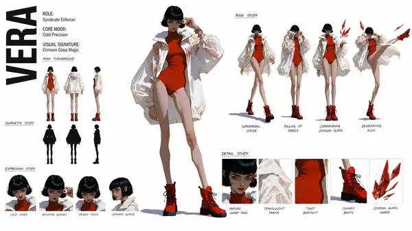
Create a premium, modern high-fashion CHARACTER CONCEPT ART SHEET in a 16:9 widescreen layout on a pure white background. THE ATTACHED REFERENCE IMAGE DEFINES THE ART STYLE — treat it as a strict style bible and reproduce its exact rendering technique in every figure on this sheet.
[STYLE — MIRROR THE REFERENCE EXACTLY]: Replicate the reference image's rendering verbatim.
[STYLE PROHIBITIONS — ABSOLUTE]: no outlines, no ink lines, no cel-shading, no anime style, no 3D render, no soft volumetric shading, no glossy highlights, no photorealism, no petite proportions.
[PROPORTIONS]: Match the reference's exact body proportions — exaggerated tall fashion model anatomy (10 heads tall, towering height, narrow waist, massive thick powerful hips and thighs, small adult head).
[SUBJECT_DESCRIPTION]: Extremely tall adult woman in early 20s, short dark bob, clear wire-rimmed glasses, mature sharp face. Outfit: massive translucent-white tech-parka, tight crimson-red high-cut bodysuit, chunky crimson combat boots. Magic Ability: Freezes ambient moisture into razor-sharp crimson glass blades.
Layout Composition (Organize strictly into these sections):
1. LEFT PANEL: METADATA & TURNAROUND- Large, bold vertical typography: "VERA" in clean, heavy sans-serif condensed font.- Metadata Block: "ROLE: Syndicate Enforcer", "CORE MOOD: Cold Precision", "VISUAL SIGNATURE: Crimson Glass Magic".- MINI TURNAROUND: 3 small vertical figures (neutral, back, profile).- SILHOUETTE STUDY: 3 solid-black silhouettes matching turnarounds.- EXPRESSION STUDY (Bottom Left): 4 close-up headshots (cold smirk, adjusting glasses, deadly focus, sideways glance).
2. CENTRAL PANEL: THE CENTERPIECE- One giant, dominant full-body figure in a lethal, elegant signature pose adjusting her glasses, maximum detail, perfect style-match to reference.
3. RIGHT PANEL: MULTI-POSE & THEMATIC STUDIES- POSE STUDY: 4 small-to-medium dynamic stances (walking with supermodel strides, pulling her parka up, commanding a floating crimson glass blade, delivering a heavy kick), handwritten-style labels.
4. BOTTOM RIGHT PANEL: DETAIL STUDY- 5 small square crops: mature sharp face with clear glasses, translucent white parka fabric, tight red bodysuit, chunky crimson boots, floating geometric crimson glass shard. Handwritten labels.
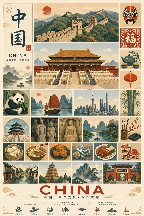
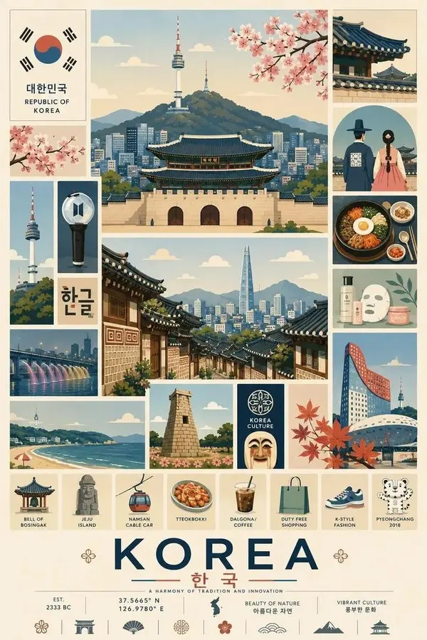
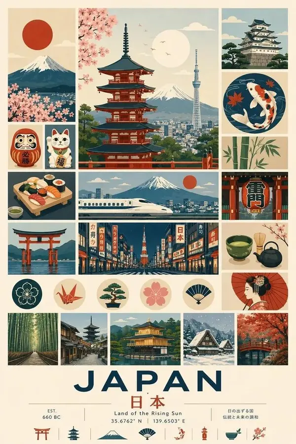
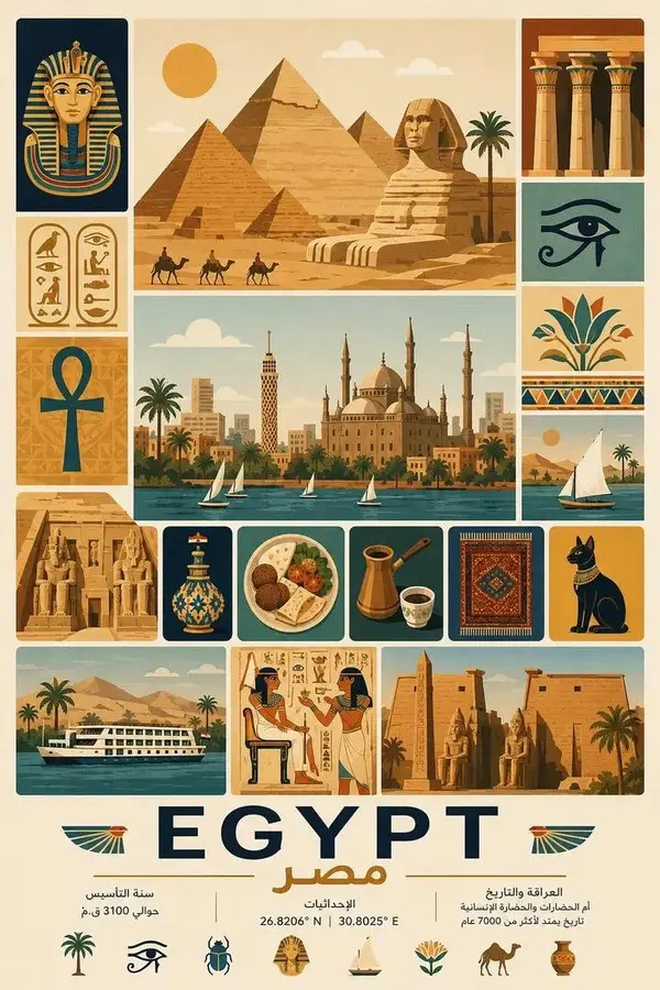
Create a highly detailed vintage travel poster infographic in a clean modular collage layout for [COUNTRY NAME].
Portrait orientation (2:3 aspect ratio), warm retro color palette with cream, beige, muted orange, olive green, teal, navy blue and soft red accents. Flat vector illustration mixed with subtle textured paper grain, mid-century travel poster aesthetic, minimalist geometric shapes, crisp outlines, balanced spacing, premium editorial design.
The poster should feature one large central landmark illustration surrounded by multiple equally spaced square and rectangular panels showcasing the country's most famous landmarks, architecture, landscapes, wildlife, traditional culture, cuisine, festivals, transportation, art, historical monuments, iconic symbols, nature, modern skyline, and everyday cultural elements.
Include decorative borders, traditional patterns, ornamental dividers, stamps, icons, and cultural motifs throughout the composition.
At the bottom, place a large bold country name in uppercase with the native-language name underneath, followed by a short tourism slogan. Add small coordinates, establishment year, minimalist icons, and neatly aligned typography similar to classic tourism posters.
Every illustration should share the same artistic style:
• flat vector
• soft gradients
• muted vintage colors
• subtle paper texture
• clean geometric composition
• high detail
• no photorealism
• premium travel brochure quality
• symmetrical grid layout
• museum-quality print design
• ultra sharp
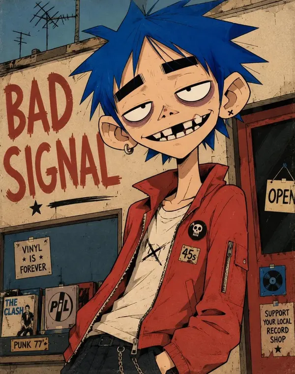
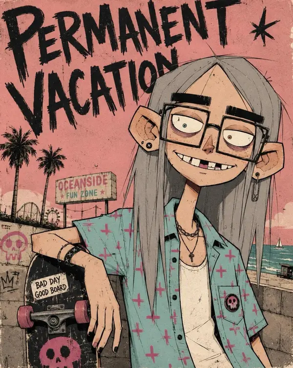
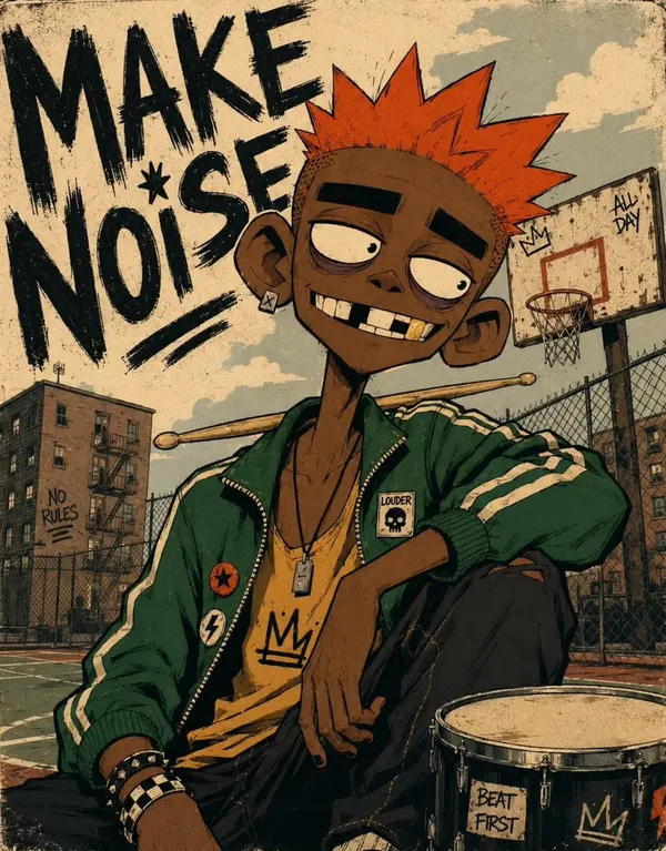
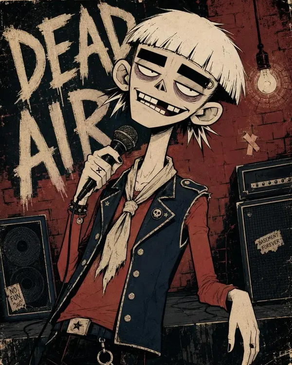
Two-dimensional alternative character illustration of [CHARACTER], occupying approximately seventy-five percent of the frame in [POSE], with [HAIR] and [EXPRESSION]. Oversized rounded cranium, a short flattened lower face, a narrow jaw, a long thin neck, slightly oversized ears, huge pale oval eyes with tiny off-center pupils, extremely thick horizontal black eyebrows, heavy black upper eyelids, muted mauve under-eye rings, a tiny broad triangular nose, and a wide asymmetrical grin showing individually drawn irregular rectangular teeth, one clearly missing upper tooth, one chipped tooth and deep black gaps. Dress the character in [CLOTHING], simplified into broad graphic shapes with chunky seams, minimal folds and small hand-drawn accessories. Confident black ink contours using thick outer silhouettes, medium-weight facial lines, thin angular hair strands and only a few short scratch marks around the eyes, hair and clothing seams; use flat opaque color fields, one hard-edged cel-shadow shape per form, sparse pencil hatching, subtle ink wobble, slight color misregistration and restrained worn-paper texture. Controlled [COLORS] palette, keeping every color clearly separated and moderately saturated. Place the character against [BACKGROUND], reduced to large flat shapes, a few loosely drawn environmental details and oversized rough hand-painted lettering reading "[TEXT]"; use an off-center waist-up composition, a slight camera tilt, cropped background typography, loose poster margins and lightly weathered printed edges. 4:5 AR.
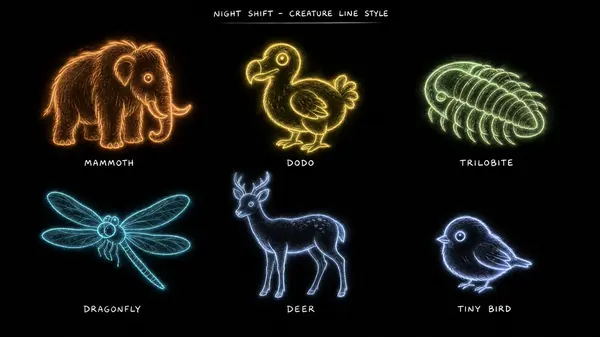
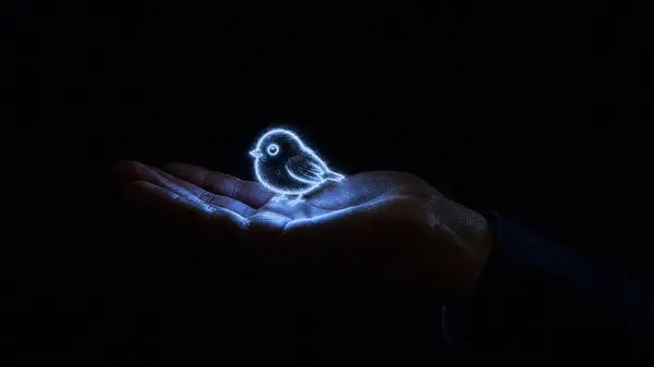
Creature style reference sheet on a pure black background, 16:9. Six creatures drawn as soft luminous chalk lines — glowing hand-drawn strokes with slightly wobbly imperfect edges, no hard vector edges, soft outer bloom around every line, like glowing pastel chalk on black paper. Each creature is a simple charming outline drawing, semi-transparent, made of light. Arranged in a labeled grid with small handwritten-style white labels beneath each: 1) MAMMOTH — warm orange glow, shaggy, small tusks. 2) DODO — soft yellow glow, round body, big curious eye. 3) TRILOBITE — pale green glow, segmented, small legs. 4) DRAGONFLY — cyan glow, long wings with luminous veins. 5) DEER — pale blue glow, slender legs, small antlers. 6) TINY BIRD — white-blue glow, palm-sized, round. All six share identical line weight, identical glow softness, identical chalky texture. Sheet title at the top in small white handwritten-style text: "NIGHT SHIFT - CREATURE LINE STYLE". Clean production reference layout.
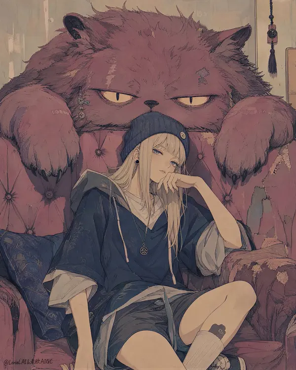
Create a completely original ultra-premium illustrated character poster with a newly invented theme: "The Corridor Keeper and the Velvet Lodger," an aloof young apartment caretaker resting on a worn sofa while an enormous plush-like domestic spirit lounges over the backrest, watching the room with ancient sleepy authority. The image must not reuse any original title, story, or identity. Rebuild it as a new intimate indoor fantasy scene, keeping the same core composition logic but strengthening the visual atmosphere, creature identity, and material styling. The final result must prioritize visual style above all else: boutique editorial illustration, matte flat-shape design, refined hand-drawn linework, low-saturation print color, and a collectible art-poster finish. No readable text, no logo, no title, no typography.
Style direction:
The style description is the priority. Render the image as an ultra-curated fusion of indie editorial illustration, contemporary art-zine cover design, risograph-influenced flat poster graphics, hand-inked manga-adjacent line economy, and softly distressed boutique printmaking. Use elegant contour lines with slight human irregularity, restrained line-weight variation, simplified but intelligent shape design, matte pigment color blocking, subtle paper grain, faint overprint misalignment, lightly worn contour edges, and very soft areas of faded fill. The image must feel dry, quiet, stylish, and expensive, like a limited-run print from an independent design press. Avoid glossy anime polish, avoid cinematic rendering, avoid photorealistic texture simulation. Everything should feel graphically controlled, tastefully flattened, and emotionally understated.
Core composition:
Use a tall vertical composition with a tight intimate crop. Place one relaxed young woman in the lower center foreground, seated casually on a visibly worn sofa. Behind and above her, occupying most of the upper half of the frame, place one huge domestic spirit creature draped over the sofa backrest, its paws hanging down on either side, visually enclosing her in a strange but familiar companionship. Preserve the stacked poster-like composition and the close emotional distance between viewer, girl, sofa, and creature. The girl's face and pose should remain the psychological anchor, while the oversized creature creates surreal scale contrast and quiet narrative tension.
Theme reconstruction:
Keep the same structural skeleton, but reinvent the world as a semi-magical apartment interior where old buildings generate invisible custodial spirits. The girl is an original character: a hallway keeper who lives alone in a fading rental block and quietly coexists with the building's resident velvet lodger, a giant spirit that absorbs noise, stale memories, and sleepless unrest from the walls. The relationship should feel habitual, domestic, slightly absurd, and emotionally believable. The image is not about spectacle, but about tone, intimacy, and cool stillness.
Character design:
Design one original heroine with a calm, detached, self-aware presence. She should have straight pale blonde hair, a soft knit beanie, small dark earrings, layered oversized street-lounge clothing, and a relaxed hand-near-chin pose suggesting mild boredom or private amusement. Her face should be understated and intelligent, never exaggerated, never glamorized. Keep her proportions natural and contemporary, with a believable casual outfit: oversized short-sleeve hoodie, loose tee, shorts, and soft urban loungewear styling. She should feel like an editorial fashion character filtered through indie slice-of-life fantasy.
Creature design:
Replace the generic giant cat with a more original "velvet lodger" spirit: a massive apartment-born companion beast with oversized sleepy eyes, heavy paws, rough plush fur, and a deadpan, almost judgmental calm. It should still carry feline softness in silhouette readability, but feel more like an old-house familiar than a normal cat. Strengthen the creature's emotional identity through texture and shape: thick dusty fur masses, drooping cheeks, worn ear edges, and the expression of a being that has silently observed generations of tenants. It should feel gentle, odd, protective, and deeply rooted to the room.
Environment:
Keep the room minimal, graphic, and intimate. The sofa is essential: faded, tufted, slightly sagging, visibly lived-in, with worn fabric texture and softened structure. Let the interior remain mostly reduced to negative space, with only subtle hints of an old apartment atmosphere if needed, such as faint wall tone shifts, quiet seam lines, or minimal domestic traces. Do not clutter the composition. The emptiness around the characters should strengthen the editorial poster quality.
Color direction:
Use a purified low-saturation palette built from dusty slate blue, smoked navy, faded rose, muted berry, pale cream, washed beige, tired plum, and soft charcoal linework. Add restrained warm accents only in tiny areas where needed. Keep the chroma suppressed so the whole image feels dry, mature, and printlike. The creature and sofa should harmonize through slightly warmer faded reds and pinks, while the girl's clothing anchors the cooler dark blue-gray range.
Lighting:
Use flat stylized illustration lighting with minimal tonal modeling. Read the forms primarily through color placement, silhouette, and gentle value blocking rather than realistic light behavior. The lighting should feel soft, interior, and editorial, with just enough shadow structure to preserve the pose, facial expression, and creature volume. No glossy highlights, no dramatic cinematic contrast.
Texture and finish:
Emphasize premium print tactility across the whole image: subtle paper tooth, faint ink drag, slightly broken fill edges, soft misregistration feel, delicate line erosion, and matte pigment inconsistency in large color areas. The final result should feel like a collector-grade poster printed on textured uncoated stock, with intentional imperfections that make it feel physical and artisanal.
Mood:
deadpan, intimate, quietly magical, domestic surrealism, cool, dry humor, low-energy rebellion, urban solitude, apartment folklore, stylish stillness, indie editorial
Rendering style:
ultra-premium flat illustration poster, boutique editorial character art, indie zine cover aesthetic, hand-drawn line economy, risograph-inspired matte texture, low-saturation print palette, elegant negative space, soft distressed finish, contemporary domestic fantasy, world-class image quality, 8k
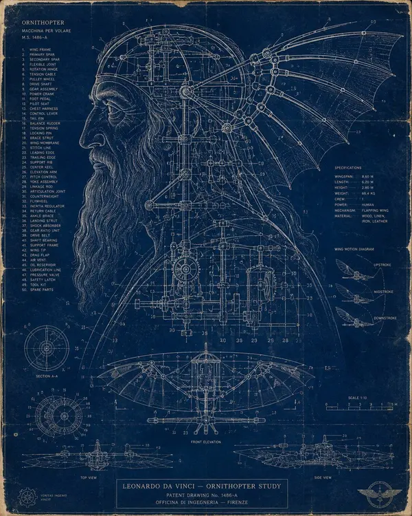
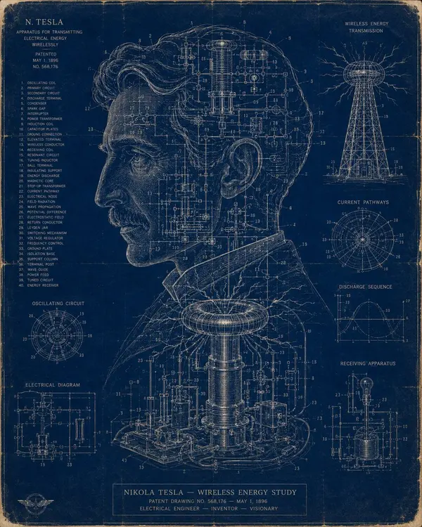
famous inventors visualized in this cool blueprint style with GPT Image 2.
input = famous inventors input = ai inferred invention blueprints function render_blueprint ($ inventor, $ invention) anchor: [line‑art silhouette of $ inventor] :: [cyanotype overlay of $ invention mechanical drawings]::5 morphology: the silhouette is drawn with white ink on deep blue paper, internal details are precise patent‑style schematics, gears and levers echo the facial features::4 material physics: cyanotype paper texture, white ink pen, blue watercolor washes, occasional chemical stains, slightly yellowed edges::3 illumination: UV‑exposed glow, subtle vignette, light leaking through folded paper creases::2 render stack: archival patent illustration, high‑contrast monochrome blueprint, 8k, Behance technical art::1 negative: [photorealism, soft shading, 3D render, handwriting]::-1
Create a clean, modern flat vector portrait illustration of the same person in the reference image. Preserve the exact facial features, face shape, expression, black round eyeglasses, and overall hairstyle. Use natural jet-black hair with realistic highlights and texture, styled exactly like the reference—thick, voluminous, slightly messy, and swept upward. Make the beard full, neatly trimmed, and natural black. Dress the person in a plain black crew-neck T-shirt. Replace the background with a solid vibrant green (#2E7D32 or similar). Use smooth gradients, crisp edges, minimal shadows, and a professional Adobe Illustrator/Dribbble-style vector aesthetic. Center the portrait, front-facing, symmetrical composition, shoulders visible, high detail, clean lines, high resolution (4K), with no text, logos, watermarks, or extra objects.