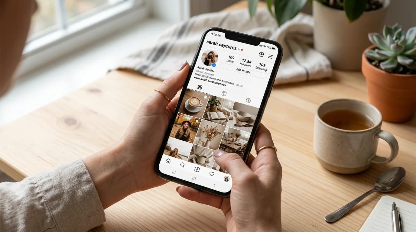
How to Stay Visually Consistent Across Every Social Platform
Here's what inconsistent social media branding actually looks like from the inside: each individual post looks fine. The Tuesday Instagram post is on-brand. The Thursday LinkedIn graphic is on-brand. But when you look at a month of content together — or when a new visitor sees your profile for the first time — it reads as slightly incoherent. Different energy, different visual weight, different version of the same color.
The cause is almost always the same: each platform got treated as a separate design project, and each week's content got made fresh rather than from a shared visual system.
Brand consistency on social media isn't about making everything identical — it's about making everything recognizable as yours, even when the formats and subjects are completely different.
Direct answer. To stay visually consistent across social media, define your brand constants once — color palette, typography, image style — then build one template per platform format rather than redesigning each post from scratch. Use a shared brand kit as the source for every tool and team member, and adapt format dimensions without changing the underlying visual direction.
Why Social Media Branding Is Harder Than It Used to Be
In 2019, a brand needed to think about one or two platforms seriously. Now the typical content calendar spans Instagram (feed posts, Stories, Reels), TikTok (thumbnails, overlays), LinkedIn (posts, banners), email (header, hero image), and often a newsletter visual layer on top.
Each platform has different native dimensions, different visual conventions, and a different viewer psychology. What works as a calm, typography-forward LinkedIn post reads as lifeless on TikTok. What reads as premium and minimal on Instagram can read as low-effort on platforms where higher-energy visuals are the norm.
The temptation is to adapt the design strategy for each platform separately. The problem is that when you do this, you end up with four different visual identities instead of one — and the recognition that comes from consistent branding never builds.
The right approach is a shared visual core adapted per platform, not separate visual identities per platform.
The Three Layers of Social Media Brand Consistency
Layer 1: The brand constants These don't change regardless of platform: your primary color palette, your typographic choices (the specific fonts and weight treatments that define your visual voice), your logo usage, and your photographic style (the tonal quality, the compositional approach, the subject matter that feels like you).
These constants are the anchor. Every piece of content should share them, whether it's a square Instagram post or a wide LinkedIn banner.
Layer 2: The platform adaptations Each platform has its own visual conventions and dimensions. The platform adaptation takes your brand constants and applies them to the formats and visual language of that specific platform. LinkedIn content benefits from more structured, professional layout treatment. Instagram content can carry more visual texture and atmosphere. TikTok thumbnails need strong contrast and readability at small size.
The adaptation is execution, not strategy. You're not changing what your brand is — you're changing how it sits within each platform's context.
Layer 3: The campaign variables Within your brand constants and platform adaptations, campaign themes introduce seasonal variation: a spring palette shift, a launch campaign's energy accent, a holiday visual layer. These are the elements that change most frequently and most visibly — but they need to sit within the brand system, not override it.
When brands have inconsistent social media branding, it's usually because Layer 1 is weak (the constants aren't defined clearly enough to anchor the adaptation decisions) or Layer 3 is being applied without Layer 1 in place.
Building a Visual System That Travels
The practical setup for multi-platform brand consistency:
Start with a single reference image. Create or identify one image that represents exactly how your brand should look and feel: the right palette, the right mood, the right visual density. This isn't a logo — it's a complete compositional reference. When you use AI image generation tools like Playyy's AI image generator, you're generating this reference at the start and using it to anchor everything that follows.
Build one template per format. Not one design per post, but one template per recurring format: a square post template, a Story template, a LinkedIn post template, an email header template. Each template applies your brand constants to its platform's dimensions and conventions. Once the templates exist, new content is produced by filling the template rather than designing from scratch.
Use your brand kit as the source. Every tool you use for social media content production should reference the same brand kit: your palette's exact hex values, your font files, your logo in each approved variation. When team members or freelancers access brand assets, they should all be pulling from the same source. Playyy's brand kit stores your visual constants and applies them automatically when generating new content — so the outputs start from your brand rather than from whatever the tool's defaults happen to be.
Adapt images between formats with expansion, not redesign. When a landscape LinkedIn image needs to become a square Instagram post or a vertical Story, use image expansion rather than recreating the design. Playyy's Image Expander extends the image canvas to the new ratio while maintaining the visual composition — a 30-second operation rather than a 30-minute redesign. This is what makes true multi-platform consistency achievable at the content calendar volume most brands need.
The Content Calendar as a Brand Consistency Tool
Your content calendar isn't just a schedule — it's the first place you can enforce visual consistency before any design work happens.
When a week's content is planned by type (educational post, product feature, behind-the-scenes, testimonial), you can assign which template applies to which type before the design starts. The visual decision-making happens at the planning stage, not the production stage. By the time someone is making the Tuesday post, the answer to "what should this look like?" is already determined by the template assignment in the calendar.
This is particularly valuable for teams where content production is distributed — a social media manager, a marketing coordinator, and a founder all contributing to the same calendar. The template system means brand consistency doesn't depend on individual visual judgment; it depends on which template row the post type falls in.
Where AI Tools Change the Equation
Historically, producing brand-consistent social media content at volume required either a full-time designer, an extensive template library, or both. AI design tools have changed this for small teams and solo social media managers in three specific ways:
Style continuity at generation. Tools like Playyy that accept brand kit inputs generate new content within your visual system rather than from a generic default. Instead of producing an image and then adjusting it to match your brand, the image starts from your brand constants and requires minor adjustment rather than a complete rework.
Format adaptation without redesign. Image Expander and similar tools handle the per-platform format adaptation in seconds rather than minutes. For a brand that posts across four platforms three times a week, this single capability saves hours per week.
Style Transfer for consistency across varied subjects. When your content covers different topics — a product feature one day, a team moment the next, an inspirational quote the third — maintaining a consistent visual style across wildly different subjects is genuinely difficult manually. Style Transfer applies your established visual language to new images, so a photo of your product and a photo from a brand event can both carry the same tonal quality and visual treatment that makes them feel like they come from the same brand.
What Consistent Social Media Branding Actually Produces
The return on a well-implemented visual system shows up in two places:
Research on social media brand performance consistently shows that visual recognition — the ability of followers to identify your content before reading the caption — is the primary driver of organic engagement lift. When audiences recognize a brand in the feed, they give the post more attention than they would an unfamiliar visual, which compounds over time as the brand becomes a known presence in their scroll.
Follower recognition. When your brand constants are consistent enough that followers recognize your content before reading the caption, each post gets more of their attention than it would as an unrecognized visual. This is the "scroll stop" effect that matters for organic reach — and it builds with every consistent post you publish. According to a 2025 Sprout Social report, brands with consistent social media visuals see 40% higher engagement rates on average than those with inconsistent content.
Cross-platform compound effect. A follower who sees your LinkedIn content and then encounters your Instagram profile recognizes you immediately — the visual language carries the trust built on the first platform to the second. This cross-platform recognition is one of the strongest drivers of the kind of inbound inquiry that feels effortless: people who feel like they already know your brand before the first conversation.
The investment required to build this is lower than it appears. A one-time investment in a brand kit setup, a platform template library, and an AI-assisted content workflow produces consistent visual output indefinitely — not just for the week you built it.
For multi-platform social media branding, Playyy's brand kit and style tools let you establish your visual constants once and apply them across every format your content calendar requires — without rebuilding the design for each platform or each week.

Sophie Whitmore
I help lifestyle, wellness and education brands keep visual content consistent across Instagram, TikTok, LinkedIn and email campaigns. I specialise in content calendar planning and multi-platform visual production for small teams.
Frequently asked questions
Social media branding is the consistent application of your brand's visual identity — colors, typography, image style, tone — across your social media profiles and content. It includes your profile photos, cover images, post templates, Stories frames, and the visual treatment of every piece of content you publish. Strong social media branding means a follower can recognize your content in their feed before reading your name.


