Why Brand Consistency Matters for Local Businesses
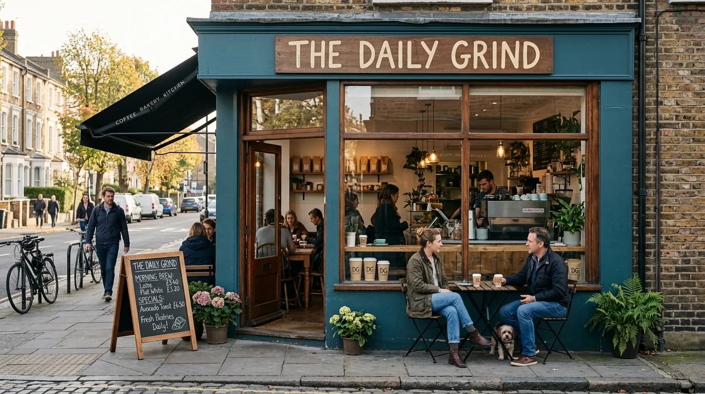
Let me tell you about a scenario I see often when I start working with a local restaurant or venue.
I ask the owner to show me every piece of promotional material they produced in the last three months. Usually this means: a hand-designed flyer for a special event (made by whoever had Canva open that day), a few Instagram posts (from different team members at different times), a printed menu (probably designed by someone who no longer works there), and maybe a Facebook event cover image.
I lay them all out. Different fonts. Different color treatments. Different visual energies. Some of them are individually fine — even good. Together, they don't look like they belong to the same business.
I ask: "If a customer saw this flyer in a coffee shop window and then found you on Instagram, would they connect the two?" Usually: probably not.
For local businesses, brand consistency is what converts passing familiarity into "I know that place" — and "I know that place" is the feeling that drives walk-ins, bookings, and word-of-mouth.
Direct answer. Brand consistency for local businesses means every flyer, social post, and in-venue sign uses the same colors, fonts, and visual style — so customers recognize you before reading your name. The practical starting point is defining two or three colors and one or two fonts, saving them as a brand kit, and applying them to every piece of promotional material you produce.
What Brand Consistency Actually Looks Like in Practice
I'm not talking about the brand strategy documents that agencies produce for big companies. For a restaurant, a yoga studio, a children's music school, or a local event venue, brand consistency is much simpler:
It means your flyers look like your Instagram posts look like your email header looks like your in-venue signage. The same two or three colors. The same font treatment. The same visual energy — whether that's warm and cosy, clean and modern, vibrant and playful, or professional and polished.
When this consistency is in place, something happens over time: people start to recognize your brand without reading your name. A regular at your café sees a flyer in the window of another local business and thinks "that's the place I go on Saturday mornings" before they read it. That recognition is the result of seeing the same visual identity over and over — and it's one of the most powerful things a local business can build.
Where Local Business Branding Falls Apart
The visual inconsistency I see in local business marketing almost always comes from the same causes:
Different people creating different materials. The café manager designs the weekly special board. A weekend staff member makes the Instagram post. The owner's friend helped with the seasonal flyer. Each person is working from what they think the brand looks like, rather than from a shared visual reference. The results are three different interpretations of the same business.
Materials created in different tools with no brand kit shared. The flyer was made in Canva with one font. The Instagram post was made in a phone app with a different font. The email header was copy-pasted from a template that uses different colors. Without a brand kit loaded in every tool, every material starts from the tool's defaults rather than from your brand.
Seasonal or event materials that drift from the house style. Christmas is a common example. The brand is typically navy and gold, but Christmas materials are red and green because that's what "feels Christmassy." One holiday season of inconsistent materials isn't a problem. Four years of Christmas materials, Valentine's Day materials, and Summer promotion materials that each drift from the house style produces a brand that's visually incoherent.
No visual reference for "what on-brand looks like." Without a reference — an example of what a correct on-brand flyer looks like — every new material is produced from scratch. When the answer to "what should this look like?" is "something like what we usually do," consistency depends on memory rather than reference.
The Brand Kit for Local Businesses
Building a brand kit for a local business is simpler than most owners expect. Here's what you actually need:
Two to three colors, with their exact values.
Not "green and brown" but #2D5A27 (forest green) and #8B6914 (warm gold). These exact values are what you enter in every design tool to get the same color every time. Write them down, save them somewhere accessible, and use them — only them — for every piece of promotional material.
One or two fonts. One for headings (your event name on a flyer, your post's main text), one for body text (dates, times, details). Google Fonts has hundreds of free, professional options — pick one heading font you genuinely like and one supporting font that pairs well with it. Use those, always, on everything.
Your logo in the right formats. A PNG file with a transparent background (for placing on any background color) and a white version (for placing on dark backgrounds). Don't let team members use a screenshot of the logo from the website — give them the actual files so the logo is always sharp.
A style reference image. This is the piece most local businesses skip and shouldn't. Find three to five photos that capture the visual mood you want for your business's promotional materials — the warmth or energy or clean precision that represents your place at its best. When you're generating event images with AI tools, these references guide the visual direction. When a team member is making a social post, the reference tells them what "right" looks like.
Producing Consistent Materials Every Week
Here's where AI design tools change the equation for local businesses producing materials at regular volume.
If you're a venue running four to six events a week, every event needs: a flyer (print), an Instagram post, and ideally a Story. That's up to eighteen pieces of promotional content per week. Without a streamlined process, this either becomes a part-time job or it gets done inconsistently by whoever has time.
Playyy's event flyer and brand tools handle this with a workflow that takes forty-five minutes to an hour per event: describe the event, generate an appropriate background image (the AI uses your saved brand kit to apply your visual style automatically), add the event details with Edit Elements, and adapt to each format with Image Expander. The result is a flyer, an Instagram post, and a Story that all look like they came from the same place — because they were produced from the same brand kit.
For businesses that currently spend three days and several hundred dollars per event on freelance design work, this workflow compresses both the time and the cost while improving visual consistency. The brand kit ensures that this week's Halloween Party flyer and next week's Wine Tasting invite both look like they belong to the same business.
According to industry research, local businesses with consistent visual branding across their social media, print materials, and in-store presence are significantly more likely to be recalled by customers than businesses with inconsistent visual presentation — with brand recognition studies consistently linking visual coherence to higher first-visit inquiry rates and stronger repeat customer behavior over time.
The Recognition Compound
Here's the thing about brand consistency that takes a while to notice and then is very hard to unsee: it compounds.
The first month of consistent visual materials doesn't do much. The third month, regular customers start to recognize your promotions without consciously noticing why. The sixth month, someone picks up your flyer from a local notice board because the colors and style look familiar — they've seen your posts, they associate those colors with a place they want to go back to.
This recognition is the mechanism behind brand consistency's return. Each consistent piece of material adds to the accumulated impression. Each inconsistent piece dilutes it slightly.
For a local restaurant, venue, school, or workshop, the audience is the same community, seeing your materials repeatedly over months and years. The compound effect of consistent branding in a local community context is particularly strong because the same people encounter your materials repeatedly, and each encounter adds to the recognition they have of your brand.
According to a 2025 Local Business Marketing Report by BrightLocal, local businesses with consistent visual branding across their social media, print materials, and website received an average of 24% more first-time customer inquiries than similar businesses with inconsistent visual presentation. This isn't because they were more visible — it's because consistent branding passes the trust threshold that drives the inquiry.
Getting Started Without Overthinking It
If you're reading this and feeling like your own local business's visual materials are inconsistent, here's the practical starting point:
1. Pull together everything you've published or distributed in the last three months — social posts, flyers, email headers, any printed materials. Look at them all together. What's consistent? What isn't?
2. Identify your actual brand constants — the colors and fonts that appear most often and feel most right for your business. These are your starting palette and typography.
3. Save those colors and fonts as a brand kit in your design tools. Playyy's brand kit lets you save your palette, fonts, logo, and visual reference, so every new promotional material starts from those constants automatically.
4. Create one complete example of what a correct on-brand flyer looks like for your business. Print it or save it somewhere accessible. This is the reference that answers "what should this look like?" for everyone who produces materials.
5. Apply the kit to your next three promotional materials and see how they look together. Then keep going.
The investment is a few hours to set up, and a consistent application of the system to everything you produce afterward. The return is a local brand that people recognize — and recognition is what turns a transaction into a relationship.
Complete Guide: Brand Identity: The Complete Guide (2026)

Luca Moretti
I help restaurants, venues, schools, workshops and small service businesses create posters, menus, invitations, event flyers and social promotions. I write for non-designers who need practical, good-looking visuals for real-world promotions.
Frequently asked questions
Brand consistency means that every piece of visual communication from your business — your signage, social posts, flyers, menus, event invitations, and email newsletters — looks like it came from the same source. The same colors, the same fonts, the same overall visual style. When a customer sees your Instagram post and then walks through your door, the experience should feel like the same place. That coherence is brand consistency, and it's what builds the kind of trust that turns first-time visitors into regulars.


