What Makes a Brand Identity Instantly Recognizable
Brand identity is the most leveraged investment a company makes in how it looks. Get it right, and every piece of content — every ad, every email, every social post — reinforces a coherent perception of what the brand is. Get it wrong, and every piece of content works against every other piece, producing a company that looks like it's run by different teams with different visions, because it is.
This guide covers the complete brand identity framework: what it is and what it isn't, the core elements that every identity system needs, how to build brand guidelines that teams actually use, how to maintain consistency as the company scales, and how AI tools have changed the economics of brand identity work at every level from solo creators to growing DTC brands.
Brand identity is the deliberate visual and tonal language that makes a brand recognizable across every context. It answers the question: if you removed the company name from this piece of content, could you still identify the brand? The stronger the identity, the more clearly the answer is yes.
Direct answer. A brand identity becomes instantly recognizable when its visual elements — logo, color palette, typography, photography style, and tone — are specific enough to be distinctive and applied consistently enough that audiences learn to associate them with the brand. Specificity and consistency together create recognition; either alone is insufficient.
What Is Brand Identity?
Brand identity is the sum of the deliberate choices a company makes about how it presents itself visually and verbally. It includes the logo and its variations, the color palette and how it's used, the typography system and its hierarchy, the style and subject matter of photography and imagery, the tone and vocabulary of written communication, and the spatial and compositional conventions that govern how these elements relate to each other.
Brand identity is not the same as brand image, which is how audiences actually perceive the brand. Identity is the input you control; image is the output shaped by everything — including how well your product works, what people say about you, and the cultural context your brand appears in. A company can have a carefully considered brand identity that produces a different image than intended if the product experience doesn't match the visual promise.
Brand identity is also not brand awareness, which is the percentage of your audience that recognizes your brand at all. You can have high awareness with a weak identity (everyone knows you exist but no one can describe what you stand for visually), or you can have low awareness with a strong identity (only a small audience knows you, but they recognize you immediately).
According to a 2025 Lucidpress study, consistent brand presentation increases revenue by an average of 23% across companies that track brand consistency metrics. The mechanism is straightforward: recognition reduces cognitive friction in the purchase decision. Brands that look the same everywhere are easier to trust than brands that look different depending on where you encounter them.
For the full conceptual framework behind brand identity, including how creative directors approach it at the highest level, see what is brand identity and why it's more than a logo.
The Core Elements of Brand Identity
Every brand identity system, regardless of the company's size or sector, contains the same core components. The sophistication of each component scales with company size; the components themselves don't change.
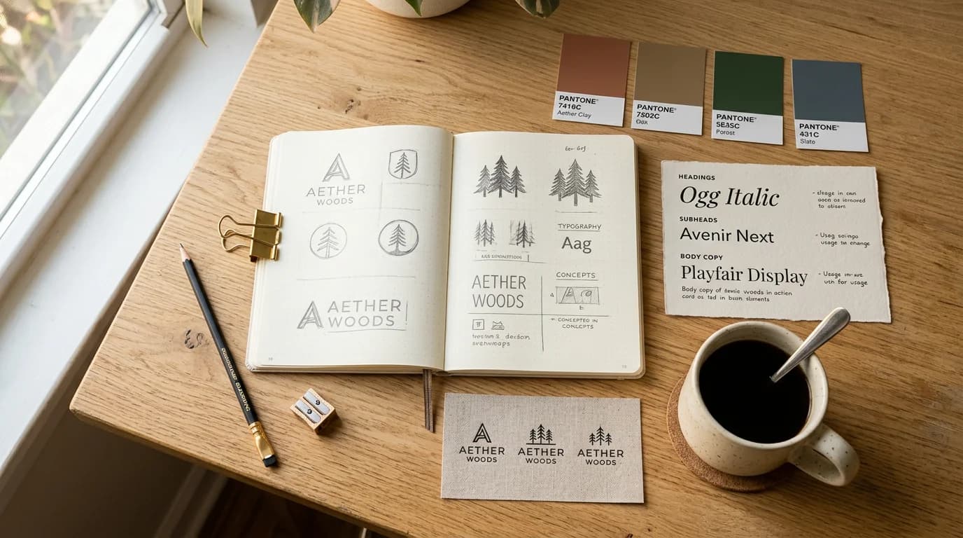
Logo and Mark
The logo is the most visible identity element but not the most important one. A distinctive logo applied inconsistently to inconsistent visual work produces weak brand recognition. A simple logo applied consistently to visually coherent work produces strong recognition.
Most modern identity systems contain multiple logo variants: a primary horizontal lockup, a stacked version for square contexts, a simplified mark or icon for small-scale use, and versions cleared for use on both light and dark backgrounds. The rules governing when to use which variant are as important as the variants themselves.
Color Palette
The color palette communicates more instantly than any other identity element. Research by the Institute for Color Research shows that color increases brand recognition by up to 80% — consumers form brand color associations faster and retain them longer than logo or name associations.
A well-defined palette typically contains three tiers: a primary palette of one to three colors that appear in almost every application, a secondary palette of supporting colors for variety within the system, and a neutral palette for backgrounds, text, and negative space. Each color should have a clear functional role, not just an aesthetic one.
Typography System
Typography communicates brand personality through the specific choices made about typeface character, weight hierarchy, and spatial relationship. The distinction between a brand that uses a geometric sans-serif at high weight and one that uses a humanist serif at regular weight communicates different personalities before a single word is read.
Most identity systems define two to three type families: a display typeface for headlines and large-scale applications, a body typeface for longer reading contexts, and occasionally a utility typeface for highly functional contexts like data, UI, or small print. The rules governing size, weight, and spacing across formats are documented in the brand style guide.
Deep Dive: How to Build a Brand Style Guide That Teams Actually Use
Photography and Imagery Style
Photography direction is the most underspecified element in most brand identity systems and the one that contributes most to whether the identity holds together across touchpoints. Two companies can use the same colors and typefaces and still look completely different because their photography direction is different — or undefined.
Photography direction covers: light quality (warm or cool, hard or diffused, directional or flat), subject matter and casting, composition conventions (close-up or environmental, centered or asymmetric), color temperature and post-processing style, and the relationship between people and products in lifestyle contexts.
Playyy's Style Transfer tool lets you define a visual reference — a photograph that captures the right light quality, color temperature, and compositional approach — and apply that style consistently to new images across your production pipeline, maintaining photography coherence even when source images vary significantly.
Tone of Voice
Tone of voice is the verbal component of brand identity: the vocabulary, sentence construction, level of formality, and personality that characterizes all brand communication. A brand that writes "Get started free" communicates a different personality than one that writes "Begin your journey today" — and both are different from "Try it now, no credit card required."
Tone documentation typically covers the three to five most important personality characteristics (e.g., "direct, specific, not casual but never formal") with positive and negative examples for each. The negative examples — what the brand explicitly doesn't sound like — are usually more useful than the positive ones.
Building Brand Guidelines That Teams Actually Use
Brand guidelines are only as useful as the rate at which they're referenced. Most brand guidelines documents are too long, too abstract, and stored somewhere that team members can't easily find when they need them. A well-designed brand guidelines system has two tiers: the full documentation for brand-building decisions, and a practical brand kit for day-to-day execution.
The Full Guidelines Document
Comprehensive brand guidelines cover the origin and rationale for each identity decision, the complete specification of every element, rules for correct and incorrect usage, examples across common formats, and the rationale for consistency requirements. This document is the source of truth for brand decisions and the brief for anyone building a new format or application from scratch.
For startups specifically, brand guidelines serve a second function: communicating the brand vision to investors, agency partners, and senior hires before the brand has the track record to communicate it through work. A well-produced brand guidelines document tells the story of what the brand is becoming, not just what it currently looks like.
Deep Dive: Brand Guidelines for Startups: What You Actually Need
The Practical Brand Kit
The brand kit is the packaged, accessible version of brand standards: the actual logo files in all required formats, the hex codes and RGB values, the font files or Google Fonts links, and the three or four most important usage rules. It's what gets loaded into every design tool, AI generation platform, and template system that anyone on the team uses.
Without an accessible brand kit, brand drift is inevitable. Team members improvise with available fonts and approximate colors because the correct files are buried in a folder nobody knows exists. AI generation tools default to generic visual styles because no brand context has been provided. The brand kit solves both problems by making correct brand application the path of least resistance.
Playyy's brand kit system stores your palette, typography, logo, and style references and applies them to every AI-generated and designed asset — so every output starts from your visual language rather than a generic default.
According to a 2024 CMO Survey, 68% of brand managers at companies with documented brand consistency programs report strong or very strong brand recognition in their target market, compared to 31% at companies without formal consistency programs. The gap is largest in categories with multiple competing options at similar price points, where visual recognition becomes a primary differentiator at the moment of purchase consideration.
Maintaining Brand Consistency at Scale
Brand consistency is the hardest part of brand identity work — not because the rules are unclear, but because the number of people, tools, and platforms producing brand assets grows faster than the governance systems designed to manage them.
In our experience working with DTC brands and SaaS companies, brand drift typically accelerates at two inflection points: when the team grows beyond five or six people producing visual content, and when a brand adds a second marketing channel with different format requirements. Both points introduce new people or new constraints that expose the gaps in the brand kit.
The most effective consistency frameworks share three characteristics: they're specific about the non-negotiables (the four or five elements that must be consistent across everything), tolerant about the variables (the elements that can flex across formats without damaging recognition), and they make correct application easier than incorrect application through tool integration rather than enforcement.
According to a 2024 CMO Survey, 68% of brand managers at companies with documented brand consistency programs report "strong or very strong" brand recognition in their target market, compared to 31% at companies without formal consistency programs.
Deep Dive: Brand Consistency: How to Keep Visual Identity Coherent as You Scale
Visual Brand Strategy: Connecting Identity to Business Outcomes
Brand identity execution without strategic alignment produces aesthetically coherent content that doesn't perform. Visual brand strategy is the framework that connects identity decisions to business objectives — ensuring that the visual language you're building reinforces the position you're competing from, targets the audience you're trying to reach, and differentiates you from the specific competitors you're positioned against.
The most common gap in brand identity work is between what a brand wants to communicate and what its visual language actually communicates. A brand that wants to communicate "approachable expertise" but uses heavy formal typography, dark color palette, and minimal imagery reads as "intimidating expertise" — or just "corporate." The visual execution contradicts the strategic intent.
Strategic visual alignment requires periodically auditing what the brand's current visual output actually communicates — pulling 20 recent assets, removing all text and logo elements, and asking whether the images alone communicate the intended positioning. The gap between intended and actual communication is the visual strategy problem to solve.
Deep Dive: Visual Brand Strategy: How to Build a Visual Execution Plan
Brand Identity for Ecommerce: Where Identity Meets Conversion
For ecommerce brands, brand identity has a direct and measurable relationship with conversion rate. Product images, category pages, email campaigns, and ad creative that share a consistent visual language produce higher conversion rates than the same formats with inconsistent visual treatment — because recognition reduces purchase hesitation.
A 2025 Shopify study of 15,000+ stores found that stores with a defined visual identity system (documented color palette, consistent photography style, and typographically consistent product pages) converted 34% better than comparable stores without defined visual standards, controlling for product category and price point.
The specific identity elements that most directly affect ecommerce performance are photography consistency (same lighting direction, same background treatment, same relationship between product and negative space across the catalog) and color cohesion (product pages, email design, and ad creative that share a recognizable palette). These two elements produce the majority of the brand recognition benefit.
Playyy's AI background remover and scene generation tools maintain consistent product photography standards across large catalogs — removing background inconsistencies from supplier images and placing products in consistent scenes without reshooting.
Deep Dive: Ecommerce Branding: How Visual Identity Drives Store Revenue
Personal Brand Identity for Creators and Professionals
Personal brand identity operates on the same principles as company brand identity, with one important difference: the brand is a person, which means personality and authenticity carry more weight than polish. The signal that resonates most in personal branding is specificity — a clear point of view that's consistent across every content format — rather than the visual sophistication that matters more in product brand contexts.
The core elements of personal brand identity are: a defined visual aesthetic for content (color palette, typography choices, photography style), a consistent tone of voice, a specific area of expertise that the content consistently addresses, and the visual standards for professional contexts like LinkedIn profiles, speaking bios, and press photos.
For professionals changing careers or repositioning their personal brand, the visual alignment between their current content and their target positioning is often the first thing a recruiter or potential client assesses before reading a word. See personal branding for creators and independent professionals for the specific visual standards that matter most in professional repositioning contexts.
How AI Has Changed Brand Identity Execution
The economics of brand identity work have shifted significantly since 2024. Tasks that previously required a photographer, a retoucher, a graphic designer, and coordination across multiple tools can now be executed by a single person with a well-defined brand kit and AI generation tools. The constraint has moved from production capacity to decision-making quality.
Specifically, three capabilities have changed what's possible in brand identity execution:
AI image generation from brand briefs. Rather than sourcing stock photography that approximates the right aesthetic and then adjusting it, Playyy's AI Image Generator generates original images from brand-specific briefs — audience description, mood, color temperature, compositional approach — that match the visual language precisely rather than approximately. For brands that previously depended on expensive photography for on-brand visual content, this changes the cost-per-asset calculation fundamentally.
Style-consistent generation across content types. When a brand spans multiple content formats — product photography, lifestyle imagery, campaign visuals, social posts, email headers — maintaining visual coherence across them traditionally required the same photographer or the same retouching style applied manually. Style Transfer in Playyy's visual enhancement suite applies a reference image's visual language to new content, so a product photo and a lifestyle image share the same tonal quality even when their subjects and shooting conditions are entirely different.
Batch visual enhancement for legacy catalogs. Many brands have existing image libraries with inconsistent quality — older product photos, supplier images, content from before the current brand direction was defined. AI upscaling and visual enhancement tools restore and standardize this content without reshooting, which is the only economically viable approach for catalogs with hundreds or thousands of SKUs.
In our testing across DTC brands using Playyy's full brand identity toolkit — brand kit storage, AI image generation, and visual enhancement — teams that previously spent 8-12 hours per campaign on visual production reduced that to 2-3 hours while maintaining or improving output quality. The time savings compound: more campaigns become feasible at the same headcount, and the quality floor rises because every asset starts from the brand kit rather than a blank canvas.
Building Brand Identity with Playyy: An AI-Native Workflow
The traditional brand identity workflow moves in one direction: strategy → design → guidelines → execution → approval. Each stage involves different tools, different people, and handoffs that introduce delay and inconsistency.
An AI-native brand identity workflow collapses several of these stages. The brand kit is loaded into the AI tools from the start, so visual exploration, direction testing, and production execution all happen in the same environment with the same brand context. Approval cycles shorten because every output already starts from the brand's visual language rather than a blank canvas that needs to be corrected toward the brand.
The Playyy workflow for brand identity execution starts with your brand kit — hex codes, font references, logo, and a style reference image. Every AI-generated and edited asset uses these inputs automatically. The brand doesn't need to be applied after the fact because it's present at the moment of generation.
This matters most for teams without a dedicated brand manager: the brand kit enforces standards that would otherwise require someone to check every asset. For growing teams, it means brand quality scales with headcount rather than degrading as more people produce more content.
Start building your brand identity with Playyy — the AI image generator, brand kit, design editor, and visual enhancement tools are available on the free tier, with no design experience required to produce on-brand visual content from day one.
Brand Identity Examples Across Visual Aesthetics
Understanding brand identity in the abstract is less useful than seeing how the same principles produce different outcomes across distinct visual languages. The same five components — logo, color, typography, photography, tone — combine differently depending on the market position and audience the brand is built for.
Quiet luxury brands (premium DTC, professional services, fine hospitality) use constrained palettes of neutral tones, refined typography with visible refinement in spacing and weight, photography that communicates quality through material rather than staging, and copy that relies on precision rather than enthusiasm. The absence of visual noise is the signal.
High-energy consumer brands (sportswear, energy drinks, youth fashion) use high-contrast color combinations, aggressive typography at maximum weight, photography that emphasizes motion and expression, and copy that uses fragment sentences and second-person urgency. Restraint would undermine the positioning.
Creative and artisan brands (independent design, craft food and beverage, specialty services) use color palettes with visible hand-craft quality, typography that shows character rather than system, photography with natural light and visible imperfection, and copy that communicates expertise without authority. The personality needs to feel human rather than institutional.
Each of these directions requires not just different design choices but different AI generation approaches — different prompts, different reference images, different style transfer parameters. The brand kit makes these parameters persistent and reusable, so brand character is maintained across everyone who uses the tools.
Frequently Asked Questions
See the FAQ answers embedded in this guide's meta section — covering what brand identity is, the 5 P's framework, brand identity examples, the 4 C's of branding, how long it takes to build an identity, the difference between brand identity and brand image, and whether you need a brand kit.
The most important practical summary: brand identity is a deliberate system, not an aesthetic preference. Every element should have a functional role in the positioning, and every usage rule should make correct application easier than incorrect application. When those conditions are met, brand consistency is a product of how the tools work rather than how well people remember the rules.
Build your brand identity with Playyy — AI image generation, style transfer, brand kit storage, and a full design editor in one platform. Free to start.

Daniel Brooks
I work with SaaS founders, indie makers and early-stage teams on positioning, launch assets, pitch visuals and founder-led content. I write for small teams making smart decisions with limited time and resources.
Frequently asked questions
Brand identity is the deliberate, consistent set of visual and tonal elements — logo, color palette, typography, photography style, and tone of voice — that makes a brand recognizable across every context where it appears. It's distinct from brand image (how audiences perceive the brand) and brand awareness (how many people recognize it). Brand identity is what a company controls; brand image is how the world responds.


