Burgundy Color: 20 Shades, Hex Codes and Palettes
 Aiko Tanaka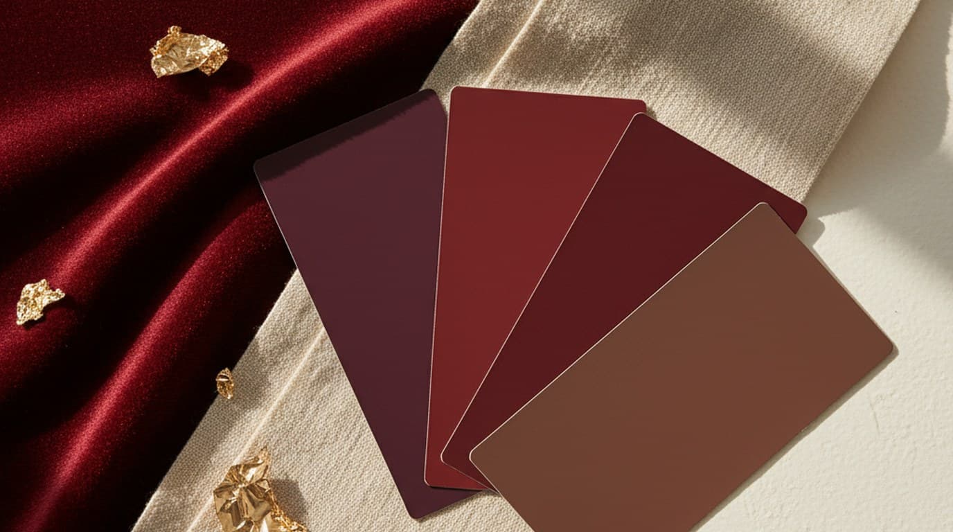
The burgundy hex code is #800020, which is RGB 128, 0, 32 and CMYK 0, 100, 75, 50. It's a deep red with a faint purple undertone, named after the wines of the Burgundy region in France. Below you'll find the burgundy color code in every format, a chart of 20 burgundy shades with hex and RGB values, six ready-made palettes and the colors that pair well with it.
Direct answer. Burgundy is #800020 in hex, RGB 128, 0, 32, CMYK 0, 100, 75, 50 and HSL 345°, 100%, 25%. It sits between maroon (#800000, browner) and claret (#7B1F3A, more purple). For print, treat the CMYK values as a starting point and proof on your paper before finalizing.
Burgundy color code in every format
| Format | Value |
|---|---|
| HEX | #800020 |
| RGB | rgb(128, 0, 32) |
| CMYK | 0, 100, 75, 50 |
| HSL | hsl(345, 100%, 25%) |
| HSV | 345°, 100%, 50% |
These values match the color coordinates listed on Wikipedia's burgundy page, which traces #800020 to Maerz and Paul's A Dictionary of Color (1930). The exact CMYK conversion gives 49.8% black, which most tools round to 50.
20 shades of burgundy: hex and RGB codes
Burgundy is a family of dark reds rather than a single swatch. A version that skews warm reads as maroon or oxblood; one that skews cool starts to look like plum. These 20 shades run from deepest to lightest, so you can pick a dark anchor, a mid-tone and a light tint from the same family.
| Shade | Hex | RGB | Character |
|---|---|---|---|
| Black cherry | #3D0C11 | 61, 12, 17 | Near-black red; a softer alternative to black for text |
| Oxblood | #4A0000 | 74, 0, 0 | Dark leather red; strong in menswear and accessories |
| Rosewood | #65000B | 101, 0, 11 | Deep and warm, like polished wood |
| Deep merlot | #5E1224 | 94, 18, 36 | Dark wine with a cool edge; good for shadows and footers |
| Dark burgundy | #6D0F1C | 109, 15, 28 | Deeper and more intense; an anchor color |
| Maroon | #800000 | 128, 0, 0 | Pure dark red, no purple; warmer and earthier |
| Burgundy | #800020 | 128, 0, 32 | The reference point: deep, balanced, slight purple bias |
| Burgundy plum | #6E1F45 | 110, 31, 69 | Burgundy tipping toward purple; moody and fashion-led |
| Claret | #7B1F3A | 123, 31, 58 | More purple than wine, a touch brighter than burgundy |
| Wine | #722F37 | 114, 47, 55 | Slightly browner; closest to red wine in a glass |
| Garnet | #8B1E2B | 139, 30, 43 | A clearer red; jewel-like on dark backgrounds |
| Bordeaux | #8C1C3A | 140, 28, 58 | Rich and cool; works for labels and packaging |
| Bright burgundy | #990033 | 153, 0, 51 | Brighter and more saturated; common in beauty |
| Vivid burgundy | #9F1D35 | 159, 29, 53 | Lighter, livelier red for buttons and highlights |
| Rusty burgundy | #94342F | 148, 52, 47 | Burgundy with a brick undertone; made for autumn |
| Raspberry burgundy | #A3214F | 163, 33, 79 | Pink-leaning and lively; good for accents |
| Dusty burgundy | #9B4F5C | 155, 79, 92 | Muted and soft; pairs well with greige and sage |
| Pale burgundy | #C3637A | 195, 99, 122 | Much lighter; tints and secondary surfaces |
| Blush burgundy | #D4919E | 212, 145, 158 | Near-blush; bridges burgundy and pink in gradients |
| Burgundy tint | #EBCBD1 | 235, 203, 209 | A pale wash for backgrounds behind burgundy text |

Standard burgundy (#800020) is the right starting point for most brand and editorial work: dark enough to hold authority, with just enough purple to keep it from reading as plain dark red. Wine (#722F37) is the better pick when warmth matters, which is why food, drink and lifestyle packaging often looks better in it.
Burgundy vs. maroon, wine, claret and crimson
- Maroon (#800000) has the same red value as burgundy but no blue, so it reads warm and earthy. On screen the difference is obvious; on uncoated paper it can be subtle.
- Wine (#722F37) is lighter and browner. Burgundy feels formal; wine feels convivial.
- Claret (#7B1F3A) leans further toward purple, so it shows up more in fashion and cosmetics than in brand identities with warm palettes.
- Crimson is far brighter and more saturated. Crimson reads vivid and energetic, burgundy reads deep and settled, so they don't substitute for each other.
6 burgundy color palettes to copy
Each palette has five colors listed from the largest area to the smallest: background first, then structure, then accents. Copy the hex codes straight into your design tool or brand guide.
1. Classic burgundy and cream. #FFF8F0 (ivory), #E9DCC9 (linen), #800020 (burgundy), #C9A060 (muted gold), #2C1A1D (warm near-black). The safest premium combination: ivory and linen as backgrounds, burgundy for headings and structure, gold for small details, near-black for body text.
2. Burgundy and forest green. #F5F0E8 (bone), #800020 (burgundy), #354A1E (forest green), #8A9A5B (moss), #B8860B (dark goldenrod). Rich and seasonal. Keep the two strong colors at a similar depth so the pair feels considered rather than festive, and use moss as the softer bridge.
3. Burgundy and blush. #FFF8F0 (ivory), #E8C4B8 (dusty blush), #D4A9A1 (rose clay), #800020 (burgundy), #4A0000 (oxblood). Softer and more modern, common in beauty, fashion and wedding work. Blush acts as the mid-tone between burgundy and the light neutral; oxblood adds a deeper note for text.
4. Burgundy and navy. #F5F0E8 (bone), #8A93A6 (slate), #1A2744 (deep navy), #800020 (burgundy), #9F1D35 (vivid burgundy). Serious and editorial. Both main colors are dark, so the light neutral carries the layout and slate handles secondary text and dividers.
5. Burgundy and sage. #F4F1EA (warm white), #A3B18A (sage), #6B7F5E (olive sage), #800020 (burgundy), #3B2A26 (espresso). Burgundy and green sit opposite each other on the color wheel, and a muted sage keeps the contrast gentle. A good fit for food, wellness and botanical brands; see the sage green color guide for more greens.
6. Monochrome burgundy. #EBCBD1 (burgundy tint), #C3637A (pale burgundy), #9F1D35 (vivid burgundy), #800020 (burgundy), #4A0000 (oxblood). One hue from light to dark. It gives you backgrounds, buttons, headings and text from a single family, which keeps a layout calm and unmistakably burgundy.

What colors go with burgundy
- Cream or ivory is the foundational pairing. A warm ivory (#FFF8F0) or bone (#F5F0E8) looks intentional; stark white next to burgundy looks generic.
- Gold is the most luxurious pairing and the easiest to get wrong. Use aged brass tones (#C9A060, #B8860B), not bright yellow-gold, which drifts toward holiday packaging.
- Forest green (#2D5016, #354A1E) shares burgundy's depth, which is why the combination feels rich. It suits editorial work and autumn or winter campaigns.
- Blush (#E8C4B8, #D4A9A1) softens burgundy for beauty, fashion and wedding brands. Choose dusty pinks over bubblegum.
- Navy (#1A2744, #0D1B3E) creates the most serious palette, a good fit for finance, legal and menswear brands that want premium without warmth.
How to use burgundy in design
As a background. White text on #800020 has a contrast ratio of about 10.8:1, far above the WCAG AA minimum of 4.5:1 for body text. Lighter shades are a different story: pale burgundy (#C3637A) only reaches about 3.9:1 against white, which passes for large text only. On websites, keep full-bleed burgundy to sections rather than whole pages.
As a text color. Burgundy works well for headings, pull quotes and labels on cream or warm white. Long runs of colored body text tire the eye, so keep paragraphs in a near-black.
As an accent. A button, an underline or a rule between sections adds richness without committing the whole layout to a dark color. This is the most contemporary way to use it.
In print. Deep reds are hard to hold on press: too much ink and burgundy reads nearly black, too little and it looks brown. Ask for a press proof on your actual stock. Uncoated paper absorbs ink and darkens it; gloss-coated stock keeps the depth and purple bias closest to the screen.
What burgundy communicates
Burgundy signals depth, confidence and restrained luxury. Unlike bright red, which feels urgent and promotional, it reads as experienced and crafted. It also carries autumn and harvest associations (aged wine, pomegranate, winter berries), which makes it a natural choice for fall campaigns, holiday packaging and food and drink brands, and a harder sell for bright spring or summer work.
Its warmth is interior warmth: firelight, leather, velvet. That's why it's strong in hospitality, interiors and luxury goods, and less suited to brands that need to feel fast, light or technical.
Create burgundy visuals with Playyy
Once you've picked a burgundy, the next step is seeing it in real assets. Playyy's brand kit generator stores your chosen palette, fonts and logo in one place, so every design it generates keeps #800020 (or your own shade) consistent across posts, ads and documents.
To test the color on existing images, the AI color changer pulls out a photo's dominant colors as swatches, so you can retune a product, garment or background toward burgundy while its texture and shading stay intact. You can also generate mood board images from a prompt such as "product photo on burgundy velvet, cream background, warm candlelight" to check a palette before committing to it.
For a whole look rather than a single color, the style transfer tool applies a warm, deep-red aesthetic to reference photos, which helps brand consultants show clients how a burgundy-led identity would carry across their existing photography.
Conclusion
Burgundy is #800020, RGB 128, 0, 32, CMYK 0, 100, 75, 50. Pick the shade deliberately from the 20 above (wine for warmth, claret for refinement, standard burgundy for balance), start from one of the six palettes or pair it with one light neutral and one accent, and give it a structural role in the layout. To turn a palette into finished visuals, try Playyy's AI image generator.

Aiko Tanaka
I work with boutique brands, cafes, creators and small businesses on visual systems, layout discipline, typography and moodboards. My focus is on fast concept exploration that still has a strong design point of view.
Frequently asked questions
The standard burgundy hex code is #800020, a deep red with strong red values and very low green and blue (RGB 128, 0, 32). Designers often use nearby variations too: #722F37 for a browner wine tone, #6D0F1C for a darker burgundy, and #9F1D35 for a brighter, more vivid burgundy.