Launch Visuals for Creators and Indie Makers Without a Design Team
From brand identity direction to a complete launch kit — without hiring a designer or an agency.
Explore workflowTurn a brand name into a typography logo — name the feeling you want, compare the letterforms, and leave with a vector that holds up at sign size
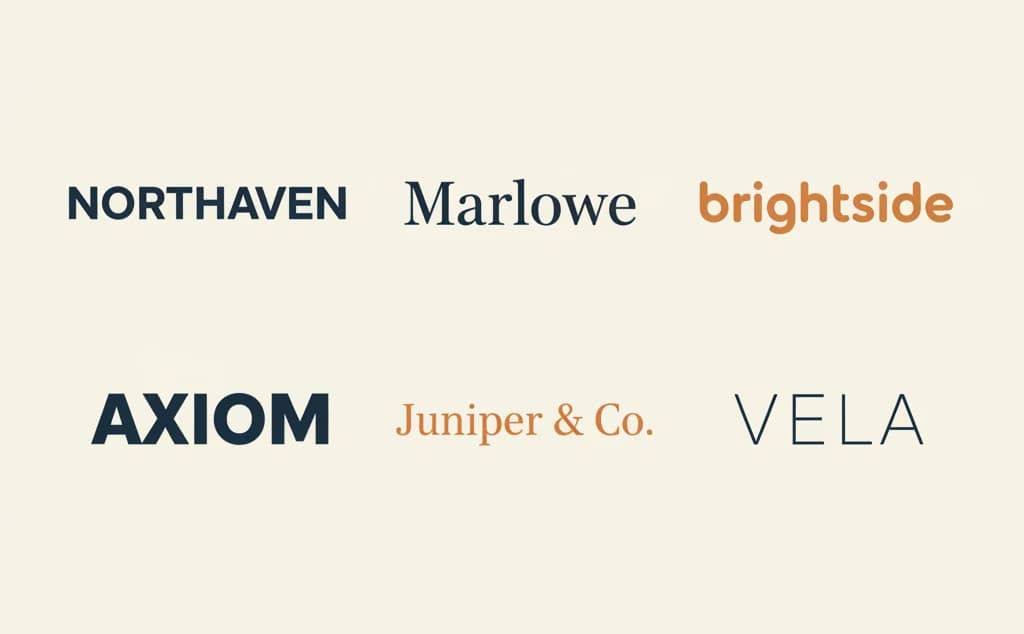
A wordmark is a logo made of the name itself — no symbol, no icon, nothing to hide behind. Google, FedEx, and Coca-Cola are all wordmarks. Everything rides on the lettering.
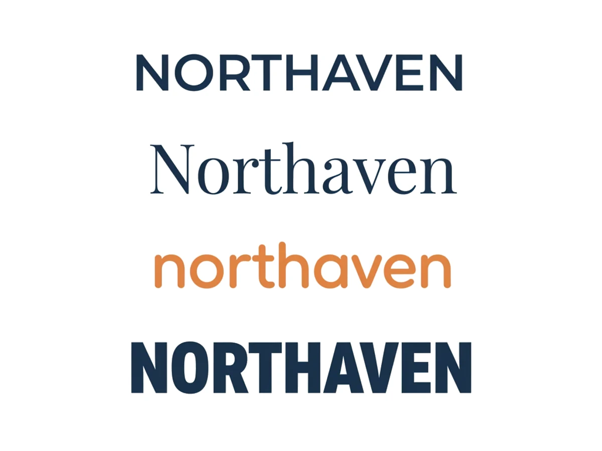
Type the name exactly as it should read and say what it needs to convey — a coastal hotel that should feel quiet and expensive, a hardware brand that should feel blunt and industrial, a bakery that should feel warm without being cute. The AI sets the name in several typographic directions at once: wide-tracked geometric, high-contrast serif, soft rounded lowercase, heavy condensed. Comparing four treatments of the same name settles the question faster than describing a font you can't name.
Try for free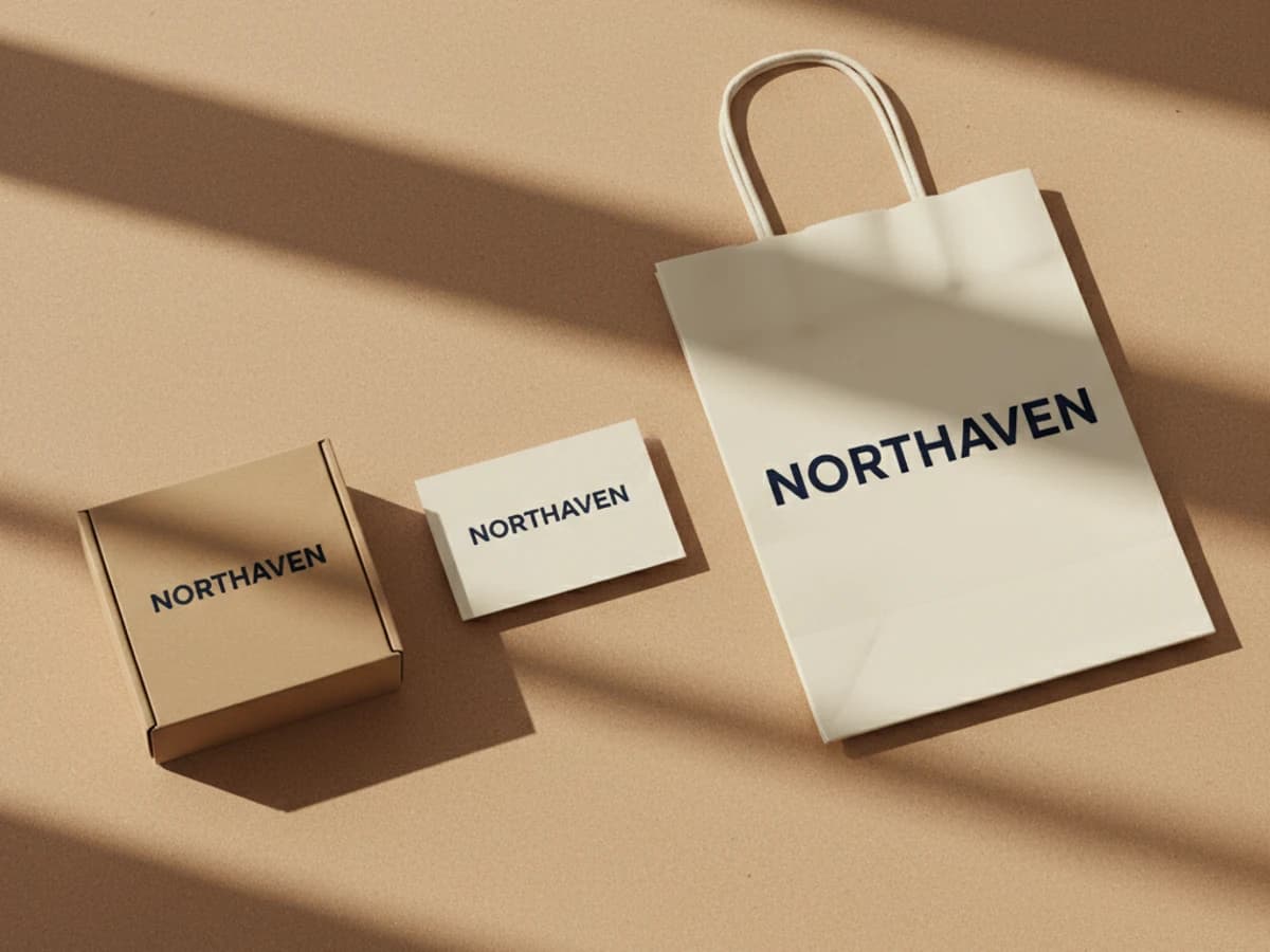
A wordmark lives at extremes: an awning across a street, then a favicon. Put it on the things it has to survive — a card, a paper bag, a shipping box — and look for what only shows up in context: letters that crowd each other at small sizes, an ampersand that turns into a smudge, a stroke weight that disappears in one color print. Generate the mockup from the same design you are judging, so what you approve is what gets made.
Try for free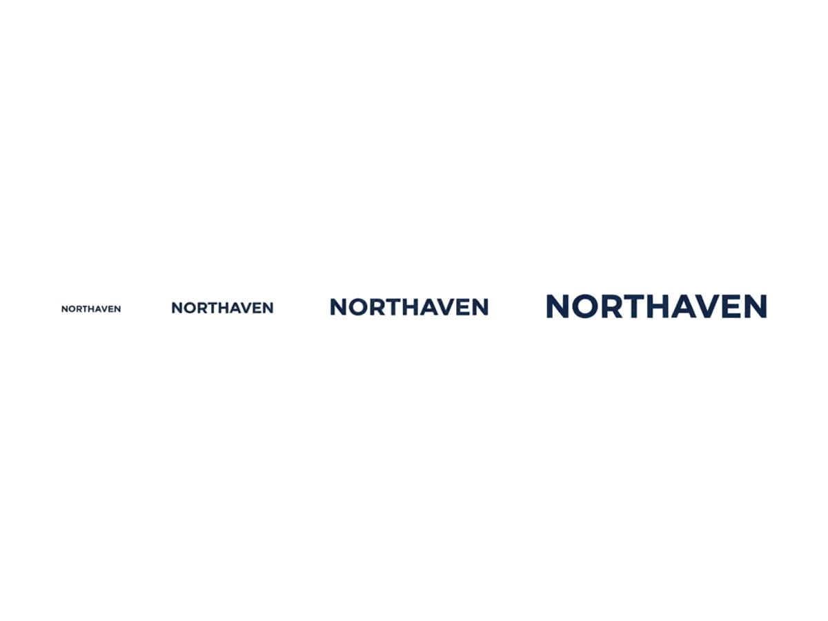
Generated lettering needs one careful pass before it becomes a logo: check the spelling character by character, then look at the spacing between the pairs that usually break — RN, VA, LT. When it reads right, download the SVG. Vector type carries no resolution ceiling, so the storefront sign and the 16-pixel favicon come out of one file, and a printer, sign shop, or embroidery digitizer can take it without asking you for artwork again. Transparent PNGs cover the places that only accept raster.
Try for freeWant a symbol rather than the name? Generate a logo mark instead
Describe the character you want instead of naming a typeface. Quiet and editorial, technical, playful, luxury — the type follows from that.
Geometric sans, high-contrast serif, condensed grotesque, monoline caps with wide tracking, or rounded lowercase — side by side, from the same name.
Set the full name, shorten it to initials for tight spaces, or generate a stacked version for square slots — all reading as one identity.
Vector for signage, packaging, and embroidery; transparent raster for the web, social profiles, and app stores.
A long name rarely fits a square avatar. Generate the wide version and the stacked version together instead of squeezing one into both.
Put the name on a card, a bag, or a storefront before committing, and catch the spacing problems a white artboard hides.
With no symbol to carry it, a wordmark stands or falls on letterforms and spacing. Seeing several treatments of your own name next to each other is worth more than picking a font from a dropdown.
A name you can read across a street works as a wordmark. A long or hard-to-spell one usually needs initials or a symbol beside it — worth knowing before you print anything.
A wordmark ends up on awnings, vehicle doors, and packaging. An SVG scales to all of them from one file, which is the format every printer and sign shop asks for.
From brand identity direction to a complete launch kit — without hiring a designer or an agency.
Explore workflow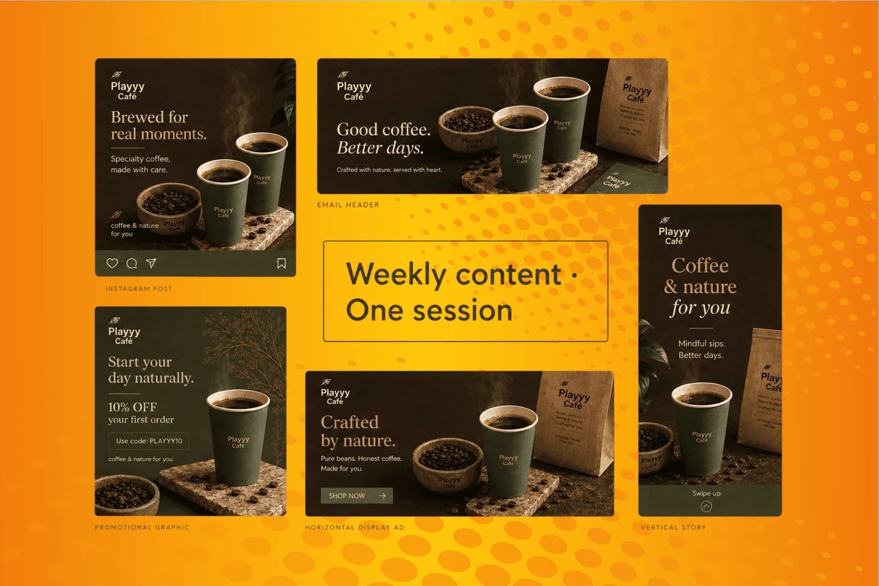
From content gap to publish-ready creative — AI image generator, brand style matching, and copy placement in one session.
Explore workflowA wordmark is a logo made only of the brand name, set in custom or carefully chosen type, with no symbol or icon. Google, FedEx, and Coca-Cola are wordmarks. Because there is nothing else in the mark, the typeface, letter spacing, and proportions carry the whole identity.
A wordmark spells out the full name; a lettermark reduces it to initials — IBM and HBO instead of International Business Machines and Home Box Office. Lettermarks suit long names and tight spaces like app icons. Many brands use both: the wordmark as the primary logo, the lettermark as the compact version.
In practice, yes — a typography logo, a text logo, and a wordmark all describe a logo built from lettering rather than a symbol. Designers tend to say wordmark for the full name and lettermark for initials, and use typography logo loosely for both.
Enter the name, describe the feeling you want, and generate several typographic treatments of it. Refining the result — different weight, wider tracking, lowercase instead of caps — is free. You sign in to download the vector SVG or the transparent PNG.
Usually, but check it every time. Generated lettering can drop, duplicate, or merge a character, and an unusual name or an ampersand raises the odds. Read the result letter by letter before you export it, and regenerate rather than accepting a mark you would have to fix in an editor.
The one that matches how the brand should feel and stays readable at your smallest use. Geometric sans reads modern and neutral, high-contrast serif reads established and editorial, condensed grotesque reads bold and industrial, rounded lowercase reads friendly. Generate the name in several of them and compare — that comparison is the decision.
Yes. Export the wordmark as an SVG and it stays sharp from favicon to storefront sign, which is what printers, sign makers, and embroidery digitizers ask for. Transparent PNG is there for platforms that only take raster.
Yes — what you generate is yours to use commercially. Two cautions apply to any logo: don't prompt for an existing brand's lettering, and before you build an identity on the name, check trademark availability in the markets you operate in. Generating a mark doesn't clear the name behind it.
See how teams are using Playyy to ship better visuals, faster.

A legal-tech startup founder, no designer, 22 YouTube thumbnails — how the startup built a consistent channel identity in one week using Playyy's brand kit.
 Daniel Brooks
18 staff, new brand colours, £3,200 designer quote — and a 3-week timeline. The managing director finished the LinkedIn rollout in 3 days with Playyy.
 Sophie Whitmore
Channel repositioning, three visual touchpoints, one weekend — how a YouTube creator built a new visual identity without a designer.
 Minji Park
Keep every image on brand, control the final look, and turn campaign ideas into polished assets without waiting on another design cycle.














