How a Creator Rebuilt Her YouTube Channel's Visual Identity
 Minji Park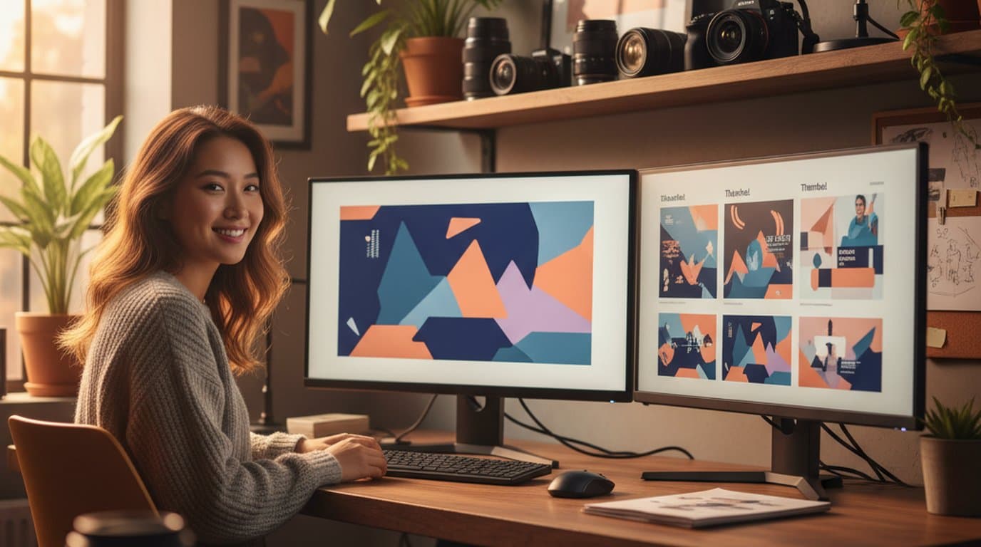
Maya Chen had been making YouTube videos for three years when she decided to reposition her channel. The channel had started as a general lifestyle channel and grown a steady audience, but her content had evolved toward focused personal development and productivity — and the channel's visual identity hadn't followed.
The YouTube banner still reflected the earlier broad aesthetic. The thumbnail style was inconsistent. The Instagram bio image that linked to the channel felt disconnected from both — a common problem for creators managing social media visuals across multiple platforms without a unified visual system. Maya knew what she wanted the rebrand to look like — she had collected reference images, defined a color palette, written a description of the mood she was after. What she didn't have was a designer, a budget for one, or the time to learn the tools a designer would use.
The bottleneck in most creator rebrands isn't the creative vision — it's the production gap between knowing what you want and being able to make it. An AI image generator with format expansion capabilities closes that gap without requiring design software expertise.
The result. Maya used Playyy's AI image generator, Image Expander, and Edit Elements to produce a complete YouTube banner, thumbnail template, and Instagram bio image over one weekend. The rebrand launched with her next video, and subscriber conversion from channel profile visits increased noticeably in the two months that followed.
Why Channel Visual Identity Matters at the Moment of Repositioning
For established YouTube channels, repositioning creates a specific problem: the existing audience has a learned visual expectation, and new visitors arriving from search or recommendations will form an immediate impression before watching a single video.
According to a 2025 YouTube Creator Academy report, channel banner and thumbnail consistency are the two visual signals that most strongly correlate with subscriber conversion from first-time visitors. A viewer who clicks through to a channel and sees a banner that doesn't match the content they just watched is less likely to subscribe — the visual mismatch registers as a signal that the channel isn't professionally managed, regardless of the content quality.
For Maya, the repositioning was an opportunity to fix the visual identity she'd been living with — but only if she could execute the rebrand before returning to her regular upload schedule. A multi-week design process wasn't compatible with maintaining her posting rhythm.
For the full workflow behind this approach — generating a visual direction and adapting it to every platform banner ratio — see Create YouTube and LinkedIn Banners with AI.
Saturday: Finding the Visual Direction
YouTube channel visual identity carries a disproportionate influence on subscriber conversion relative to the effort most creators invest in it. Research into creator platform behavior consistently shows that a viewer's decision to subscribe happens within the first visit — and that the channel banner and thumbnail style, not the specific video that drove the click, are the primary visual inputs to that decision. For creators repositioning to a new content direction, updating the visual identity in parallel with the content shift is not a cosmetic choice but a retention and discovery mechanism.
Maya spent Saturday morning generating visual directions rather than committing to an anchor image immediately.
She described her new channel direction in terms of its visual language: clean, considered, the visual equivalent of a well-organized mind. Specific palette — warm whites, muted terracotta, deep slate. Not the chaos-of-productivity aesthetic. Something quieter and more intentional.
Using Playyy's AI image generator, she generated three distinct treatments of that direction: one that led with the textures of study materials — notebooks, a well-worn desk, morning light; one that was more abstract, composed of geometric forms in her palette; and one that incorporated a subtle portrait element for the personal development framing.
The rule she used: if she couldn't tell within five seconds whether the image communicated "focused personal development" to someone who hadn't read her channel description, it was wrong. The textural direction passed immediately. The others were close but didn't carry the right signal.
In our experience with creators rebuilding visual identities, the direction-testing phase is the highest-leverage part of the process. Most creators skip it and commit to the first output that looks good to them — then rebuild again three months later. Generating three directions and testing them against a clear brief takes an extra 30 minutes and produces a significantly more considered result.
Sunday: Building the Full Identity From One Direction
With the anchor direction confirmed, Sunday was production day.
The YouTube banner needed to work at 2560 × 1440 px but remain legible at the safe-zone thumbnail size of 1546 × 423 px that most viewers see. Image Expander generated the full-width banner from the anchor image — extending the textural scene across the panoramic format while keeping the compositional weight in the center safe zone.
The thumbnail template required a 1280 × 720 px base — a different aspect ratio from the banner but one that needed to feel unmistakably from the same visual world. Rather than generating a separate image, Maya used Image Expander to adapt the anchor to the thumbnail ratio, then used Edit Elements to establish the text treatment: her title font, the position and scale of the channel name, and the contrast settings that would keep text readable across different video subject matter.
The Instagram bio image — 1080 × 1080 px, used as the pinned post that introduces new profile visitors to the channel — came from the same source using the 1:1 adaptation.
Creators whose look is consistent across YouTube and Instagram convert cross-platform discovery better than creators who appear to be two different accounts. The visual continuity functions as a trust signal: the same aesthetic in two places says Maya is intentional about their brand.
What the Rebrand Produced
By Sunday evening, Maya had: a YouTube banner at full 2560 × 1440 resolution; a confirmed thumbnail composition template she could apply to every video going forward; and an Instagram bio image that tied the two platforms together.
The work took one focused weekend — not because the production was rushed, but because the direction was clear before production started and the format adaptation was mechanical rather than creative.
The channel launched the rebrand with the next week's video. The new thumbnail style was immediately consistent. Two months later, the subscriber conversion rate from profile visits had increased noticeably — Maya attributes it partly to the content improvement that came with the repositioning, and partly to the channel finally looking like what it is. For the broader principles behind building a cohesive visual presence across social platforms, see Social Media Branding.

Minji Park
I help indie creators, online educators and small product teams prepare launch visuals and social campaigns. My goal is to make launches feel polished and trustworthy — even when you are working without a designer.
Frequently asked questions
The full YouTube banner canvas is 2560 × 1440 px. The safe zone — the area guaranteed to be visible on all screen sizes — is 1546 × 423 px centered within that canvas. For TV screens, the full 2560 × 1440 is visible. For desktop, a 1855 × 423 px strip is shown. For mobile, only the 1546 × 423 safe zone is visible. Design the most important visual elements within the safe zone and let the background extend to the edges.