How a Venue Built Its YouTube Channel Identity in One Afternoon
 Luca Moretti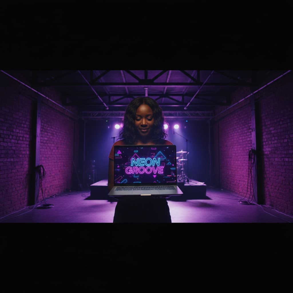
The stage was dark and the venue was quiet — a Tuesday afternoon, three hours before doors opened. Naomi Clarke sat at the small production desk behind the bar of a 400-capacity music space in Birmingham's Digbeth quarter, with a laptop open and a problem she had been putting off for two months.
The venue had launched a YouTube channel. The idea was straightforward: document live sets from the artists they booked, run a behind-the-scenes series on venue operations, and build an interview series with local musicians. The content was ready. What wasn't ready — what had been placeholding in the channel settings since the account was created — was the visual identity. No banner. No proper profile picture. No end-card templates for the video series.
The freelance graphic designer the venue occasionally hired had quoted £180 per asset. For the banner, the profile picture, and four end-card variants, that was over £700. The venue's discretionary marketing budget for the quarter was £400 total.
Independent venues building an online presence face a specific visual credibility problem: the channel has to look like it belongs before it has an audience. A blank or placeholder banner signals that the channel hasn't committed to the platform — which discourages the kind of subscriber who would otherwise click follow.
The result. Naomi produced a complete YouTube channel visual identity — banner at the platform's full 2560 × 1440px specification, profile picture variants for each content series, and four end-card graphic templates — in a single afternoon using Playyy's AI Image Generator, AI Image Editor, and Background Remover. Total design spend: zero. The channel reached 500 subscribers in its first eight weeks.
The Visual Credibility Problem for Independent Venues
YouTube channel art is doing work that venue managers often underestimate. The banner is the first visual signal a potential subscriber sees before deciding whether the channel is worth following — before they've watched a single video. For a music venue, it communicates genre, atmosphere, and production seriousness in a single image.
The generic approach most venues default to — a photograph of a crowded show, a logo on a dark background, a Canva template — doesn't carry that signal. In a space where established music publications, record labels, and larger venues compete for the same subscriber's attention, visual quality functions as a proxy for what's inside.
Naomi had photographed enough shows at the venue to know what the space looked like at its best: the industrial steel structure catching the neon bar lighting, the exposed brick under a purple wash, the particular quality of darkness that made the stage feel like it held something worth watching. She just didn't know how to translate that into a banner without a designer.
Writing the Brief, Not the Design
Independent venues operate in a visual environment where the production budgets of major labels and large-capacity venues set the visual reference point — and independent spaces are expected to compete with the same credibility on a fraction of the resources. The gap isn't talent or taste; it's tools. When the primary cost of professional visual production shifts from hourly design fees to the clarity of a written brief, the constraint changes from budget to language.
The workflow Naomi used started not with software, but with a sentence.
She opened Playyy's AI image generator and wrote a prompt the way she would have briefed a designer: "dark industrial venue banner with neon accents, Birmingham skyline visible through high windows, distressed brick texture, moody purple and blue lighting, wide letterbox composition." Not generic concert energy. Specific to the venue's physical character — the grit of the building, the particular quality of the light they used, the industrial history of the Digbeth neighbourhood visible in the architecture.
She generated three directions from that brief. The first read too corporate. The second had the right palette but the composition was too centred for a banner format. The third was close: the right mood, the industrial texture, the neon character of the space. She refined it — adjusting the skyline element, deepening the contrast on the brick texture, shifting the colour temperature slightly warmer — using the AI Image Editor's element-level controls. The result was a banner that looked like the venue, not like a template of what a music venue banner looks like.
In our experience with venue and events marketing, the brief stage is where most AI image production either succeeds or fails. Vague descriptions produce vague outputs. Descriptions that name specific architectural textures, lighting colours, and spatial qualities produce images with the specificity that reads as intentional design rather than generated filler.
From One Image to a Full Channel Identity
The banner established the visual language. The rest followed from it.
For the profile picture, Naomi needed variants that worked across the venue's content series — the main venue channel, the live set series, the interview strand. Each needed a circular crop that read legibly at small sizes without losing the visual identity of the main banner. She used Background Remover to isolate and refine graphic elements from the banner image, then composited them into tight square formats at 800 × 800px for upload.
The four end-card templates — the graphics that appear in the final twenty seconds of each video, linking to other content — needed to carry the same palette without competing visually with whatever was happening in the video frame. Naomi generated each as a dark, minimal overlay treatment using the banner's colour values, with space reserved for the thumbnail placement zones YouTube requires. The AI editor's layer controls let her adjust the opacity and texture of each variant without rebuilding from scratch.
Total output from one afternoon: one channel banner at YouTube's 2560 × 1440px specification, three profile picture variants, and four end-card graphic templates. The kind of project that would have taken a designer two to three days across briefing, revisions, and delivery — and cost the venue £700 or more — was complete before the venue's Tuesday night doors opened.
What Changed When the Channel Looked Like It Meant It
The venue uploaded its first two videos the same week the channel art went live. Naomi had expected slow early growth — new channels without existing audiences tend to build gradually. What surprised her was the subscriber rate in the first fortnight: people were following the channel after viewing the channel page, not just after watching a video. The banner was doing the work it was supposed to do.
By week eight, the channel had 500 subscribers. Naomi is careful about attribution — the content quality and the venue's existing audience on Instagram both contributed to that number. But she is clear about what a placeholder banner would have cost: "If the channel had gone up looking like we hadn't thought about it, I think a lot of the people who followed just from the channel page wouldn't have bothered."
The £700 design quote she had received in January now runs as a comparison point when she talks to other venue managers. The more significant constraint wasn't the money — it was the six-week wait the designer had quoted. The channel had been ready to launch for two months. The visual identity was the hold. One afternoon changed the timeline.
For a broader look at how independent venues approach visual production across platforms without a design budget, see Local Venue & Event Marketing.

Luca Moretti
I help restaurants, venues, schools, workshops and small service businesses create posters, menus, invitations, event flyers and social promotions. I write for non-designers who need practical, good-looking visuals for real-world promotions.
Frequently asked questions
Yes — the skills required shift from design software proficiency to descriptive clarity. A well-written prompt that specifies mood, colour palette, texture, and composition produces output that holds up against professionally designed channel art. The AI handles the visual execution; the manager handles the creative direction. For venue channel art in particular, the brief almost writes itself: describe the physical space, the lighting character, and the genre of content. That specificity is what separates results that look designed from those that look generated.