How a Founder Built a YouTube Brand Without a Designer
 Daniel Brooks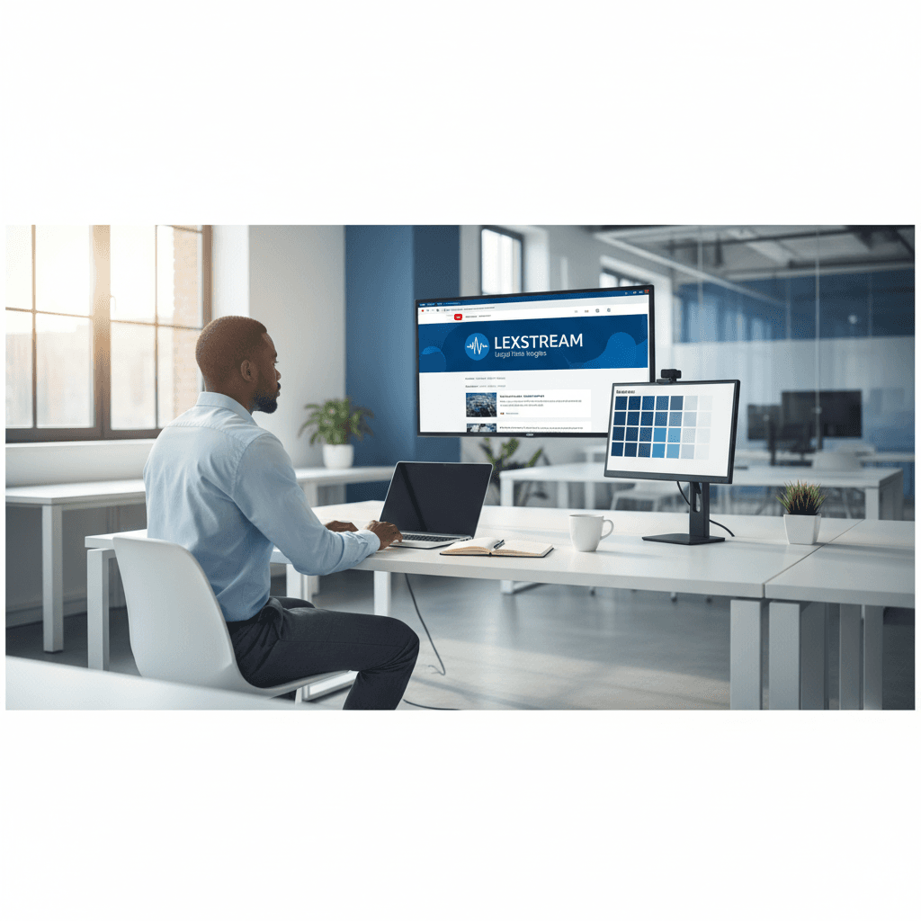
Marcus Webb had spent two weeks in Canva. He had gone through eight banner templates, adjusted colours that would never quite match the startup's actual blue, and ended up with something that looked exactly like what it was: a template that had been lightly personalised and then abandoned. He closed the tab.
Marcus's startup was six people building a legal document automation platform. He had decided that a YouTube channel was the right distribution channel for the company's ideas. The strategy was clear. The problem was everything downstream of it: every video needed a thumbnail, the channel needed a banner, and the channel needed to look like it was built by people who cared about how things looked. Marcus was one of those people. He was not, however, a designer.
The gap between knowing what your brand should look like and being able to produce it is where most founder-led content channels stall out. A brand kit that locks your exact colours and applies them to every generation closes that gap without requiring design software expertise or a designer on retainer.
The result. Marcus used Playyy's AI image generator and brand kit to establish the startup's complete YouTube visual identity in one week. He produced 22 video thumbnails consistently, reducing per-thumbnail production time from 40 minutes to 9. Three months after launch, the channel reached 1,200 subscribers — with commenters specifically citing the visual consistency as a reason the channel felt credible.
The Founder-Led Channel Problem No One Talks About
There is a version of the founder-led content strategy that gets written about constantly: the audience, the authenticity, the distribution leverage. What gets written about less is the operational reality of producing a YouTube channel when your team is six people and none of them are a designer.
For Marcus, the content itself was not the bottleneck. He knew what the startup's explainer videos needed to cover: how legal document automation works, what the real cost of manual contract review is, where AI fits into a legal team's workflow. He had the ideas, the credibility, and the willingness to be on camera. What he didn't have was a production system for the assets surrounding those videos.
According to a 2025 YouTube Creator Economy report, thumbnail click-through rate is the single most significant variable in whether a new channel breaks through its initial subscriber plateau. For a channel with no existing audience, the thumbnail is doing the same trust-building work that a product's packaging does on a crowded shelf. It has to look intentional, consistent, and specific to the brand — not like something produced in 40 minutes of frustrated iteration.
Marcus had clocked the 40 minutes per thumbnail. He'd also clocked that the results didn't look consistent. The third thumbnail had a slightly different shade of blue than the first. The fifth used a different font weight. By the seventh, he was starting from scratch each time because there was nothing systematic enough to build on.
He needed a system, not a session.
The Banner That Finally Looked Like the startup
A founder friend who ran a SaaS marketing consultancy mentioned Playyy in passing — specifically, the brand kit. The idea that you could lock in your hex values and have every subsequent generation use them exactly, not approximately, was the piece Marcus had been missing.
He started with the banner. He wrote the prompt the way he thought about the startup's visual language: clean, professional, blue and white, minimal enough to feel like a legal-tech product, confident enough to feel like a company that had made deliberate design choices. He generated four directions and eliminated three of them in under a minute — the ones that felt generic, the one that was too dark for the brand's tone. The remaining direction was right: the compositional weight was where he wanted it, the palette read as the startup's, and the overall aesthetic communicated exactly the kind of founder-led authority the channel was meant to project.
He uploaded the banner to YouTube. Then he opened Playyy's brand kit and entered the startup's exact colours — the specific blue that lived in the company's style guide, the white, the secondary grey used for text contrast. From this point forward, every image he generated would use those values without further instruction.
In our experience working with early-stage teams, this is the step that most founders skip and later regret. Generating one good image is achievable without a brand kit. Generating 22 consistent images over three months without one is not.
22 Thumbnails, One System
YouTube thumbnail consistency functions as a compound trust signal. Individual thumbnails communicate what a video is about. A consistent series communicates who the channel is — and whether it's the kind of channel that will still exist in six months. For founder-led channels, where the personal credibility of the speaker is a primary reason a viewer subscribes, the visual consistency of the thumbnail series reinforces the implied promise that the founder is serious about the work.
With the brand kit active, the thumbnail workflow became mechanical in the best sense.
Marcus generated a base composition for the thumbnail format — 1280 × 720 px, the horizontal framing that works for the startup's subject matter, the brand blue as the background anchor. He used Playyy's AI image generator to produce the visual elements relevant to each video's topic: a contract document for the overview video, a side-by-side comparison graphic for the cost analysis video, a timeline illustration for the implementation walkthrough.
The AI image editor handled the text layer: the video title, in the startup's font, positioned consistently across every thumbnail. Each thumbnail was a variant of the same system rather than a new creative decision.
The time per thumbnail dropped from 40 minutes to 9. The 40-minute version had been iterative, frustrated, and inconsistent. The 9-minute version was systematic: generate the visual element, apply the text layer, export. The brand kit handled the colour consistency without Marcus having to think about it.
By the time the startup published its 22nd video, the channel had a visual library that read as a coherent body of work. Not because each thumbnail was individually laboured over — but because the system behind them was consistent from the first.
What the Channel Became
The startup's YouTube channel reached 1,200 subscribers in three months. For a six-person legal-tech startup with no marketing budget allocated to the channel, that is a meaningful distribution outcome — particularly in a category where the buying audience is risk-averse legal and operations professionals who evaluate vendors carefully before any conversation.
What stood out in the comment data was how frequently viewers mentioned the channel's visual quality unprompted. Comments about the clarity of the thumbnails. Questions about what software produced the banner. One commenter described the channel as looking "like it was built by a real company" — which, in a category full of poorly maintained founder channels, is exactly the trust signal that converts a casual viewer into a subscriber.
Marcus attributes the subscriber growth to a combination of content quality and visual consistency, and he's probably right about the proportion. A thumbnail that clearly communicates the video's topic, in a palette that signals the brand, gets clicked. A series of those thumbnails, consistent over 22 videos, builds a channel identity that compounds.
The system is still running. New videos get thumbnails in 9 minutes. The brand kit has not changed. The channel looks the same on video 22 as it did on video one — which is, for a founder-led channel built without a designer, precisely the outcome that was supposed to be impossible.
For the broader approach to building a YouTube presence as a SaaS founder, see AI Image Generator for Startups. For the full workflow behind brand-consistent visual production across multiple formats, see YouTube Channel Branding Without a Designer.

Daniel Brooks
I work with SaaS founders, indie makers and early-stage teams on positioning, launch assets, pitch visuals and founder-led content. I write for small teams making smart decisions with limited time and resources.
Frequently asked questions
Start with a text prompt that describes your brand's visual language — colour palette, tone, and the professional context your company operates in — and generate a banner image from that brief. Lock in your exact brand colours in a brand kit before moving to thumbnails. With the brand kit active, every subsequent generation stays within your palette automatically, so you're not re-specifying colours each time. From there, thumbnail production becomes a repeatable process: swap the title text, generate, done. The visual system does the consistency work; you focus on the content.