How to Build a Brand Style Guide Everyone Can Follow
 Aiko Tanaka
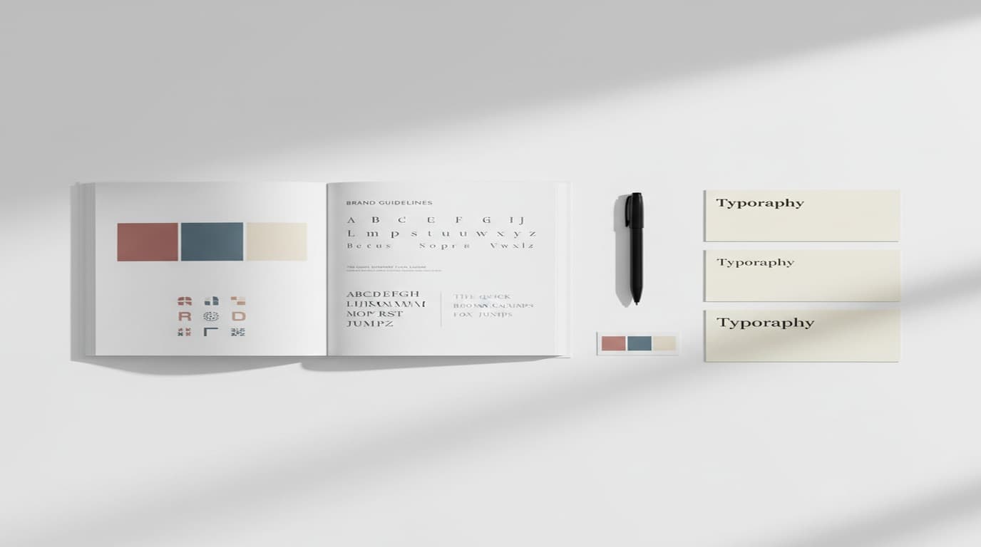
I've built brand style guides for boutique cafes, independent clothing labels, and small consultancies. The most common failure mode isn't poor design decisions — it's a guide written exclusively for people who already think like designers.
The assumption is that the guide will be read by someone who already understands how to apply visual principles. But in practice, the people who need to use the guide most — junior team members producing social content, clients handling their own communications between agency touchpoints, AI tools generating assets from described parameters — are exactly the people a designer-centric guide leaves without useful direction.
A brand style guide that only a trained designer can interpret is a guide that breaks down the moment the designer isn't in the room.
The goal of a brand style guide isn't to document everything about the brand — it's to make good visual decisions the default option for everyone who needs to produce brand assets.
Direct answer. A brand style guide everyone can follow is built around specific, actionable specifications — exact hex codes, named font weights, and visual reference images — rather than abstract descriptions. It covers logo rules, color palette, typography, photography style, and three or four real application examples, and stays short enough to navigate in under two minutes.
What Most Brand Style Guides Get Wrong
The structure of most brand style guides mirrors the output of the design process that created the brand: logo first, color second, typography third, applications last. This makes intuitive sense if you built the brand, because that's roughly the order in which the elements were designed.
It makes less sense as a usage document, because the people using the guide aren't building the brand — they're producing new assets within an existing system. They need to know how to handle the specific decision they're facing right now, not how the brand was developed.
Three specific problems I see consistently:
Visual-only references without specifications. The color section shows a beautiful palette but doesn't give hex values, CMYK breakdowns, or Pantone matches. The typography section shows a typeface name but doesn't specify which weights, at what sizes, in what hierarchy. When the person producing a new asset doesn't have the exact values, they eyedrop the closest color they can find or use the weight that's already installed. The output diverges by small but consistent margins.
Rationale without application. "The typography reflects our commitment to clarity and precision." That sentence appears in thousands of brand guides. It provides no guidance on what to do when you're setting an event flyer headline or a social caption. Application guidance — here's what the typography looks like in a square Instagram post, here's how the hierarchy works in a three-line email subject — is what makes the typography rule usable.
Written mood descriptors for image style. "Warm, natural, authentic, lifestyle." These descriptors describe a sensibility, but they don't tell someone how to execute it in a specific context. Nor do they give an AI image generation tool anything it can interpret reliably. A reference image does both.
The Structure of a Style Guide That Actually Gets Used
Here's the structure I use when building style guides for clients who need them to work for non-designers and for AI-assisted workflows:
Section 1: Brand constants (the anchor)
These are the elements that never change and that govern everything else:
- Logo: approved versions (full, icon, wordmark), clear space rule with a specific measurement, minimum size for both print and digital, prohibited uses illustrated with examples.
- Color palette: primary palette (3–4 colors maximum), secondary palette (2–3 accents), plus a neutral set. Each color documented with hex, RGB, CMYK, and Pantone. Show the palette as blocks of actual color, not just chips.
- Typography: the specific typefaces (not just the family name — the exact weights and styles), the type hierarchy for the most common contexts (web body copy, social caption, print headline), and the size relationships. If you're specifying sizes, give them in both points and pixels.
Section 2: Photography and image style (the visual tone)
This is the section most guides handle worst and that matters most for AI-assisted workflows.
Written descriptors are supplementary, not primary. The primary content here is reference images — eight to twelve images that represent exactly what "on-brand" looks like. These images should span the brand's typical content range: product imagery, environmental/lifestyle, people, texture/detail.
For each reference image, annotate what makes it correct: the color temperature, the quality of light, the compositional approach, the distance from subject. Not to explain the rule, but to help someone understand what to reproduce.
For AI image generation, these reference images are the most important input. When you load a reference image into Playyy's style system, the tool interprets the visual language — the lighting, tonal quality, and compositional approach — and applies it to new generations. A well-chosen reference image produces more consistent on-brand outputs than any amount of written prompt instruction.
Section 3: Application examples (the practical guidance)
For each format the brand regularly produces — social posts, email headers, printed materials, presentation decks — show one complete, correct example. Not a wireframe or a sketch: a finished, accurate representation of what the brand looks like in that format.
These examples do two things: they answer the most common question ("what does this look like in a [format]?") without requiring interpretation, and they establish the visual template that new assets can be built from.
Section 4: Brand kit files (the working assets)
This section is a list, not an explanation — it documents what files are in the brand kit, where they live, and what format to use each one in:
- Logo files: SVG for web/design, PDF for print, PNG with transparent background for use on colored backgrounds, PNG on white for use in documents
- Font files: the specific font files, not just names (downloadable fonts are often available in many variations; specify which ones are in use)
- Color swatch files: an ASE (Adobe Swatch Exchange) file, a Sketch palette, and a Figma library that other team members can connect to
- Reference images: a folder of the approved photography style references
For AI-assisted workflows, this section should also note which tools have the brand kit loaded and how to access it — so a team member using Playyy for social content knows exactly which saved brand kit to apply.
According to a 2025 survey by the Design Management Institute, brand teams that use structured brand kits alongside their style guides report 40% fewer revision cycles on externally produced assets than teams that rely on written guidelines alone. The primary reason: visual reference images and exact-value color specifications leave less room for interpretation than descriptive language, reducing the gap between intent and output.
Making Your Style Guide AI-Compatible
AI design tools interpret brand guides through specific input types. Understanding what these tools can and can't read determines how you structure your brand kit:
Color: hex values, not names. "Our primary blue" means nothing to a generative tool. #1A2E5C means something. Every color in your palette should be documented with its exact hex value, and ideally also loaded as a saved palette in whatever AI design tool your team uses.
Typography: font names, not descriptions. "Modern, geometric sans-serif" is a style description that will produce inconsistent results across tools and users. "GT America, Regular weight, set at 16px with 24px line-height for body copy" gives every tool and person the same instruction. Specify the exact font family and weight names as they appear in the font software.
Image style: visual references, not mood words. Load your photography references into your AI image generation tool's style library. In Playyy, style references are saved alongside your brand kit and applied automatically to new generations — so the visual quality isn't dependent on how accurately someone describes it in a text prompt.
Layout conventions: examples, not rules. A rule that says "maintain generous white space" is impossible to apply consistently without training. An example showing what "generous white space" means at the specific dimensions of your common formats gives anyone producing a new asset a concrete reference point.
The Maintenance Problem
The most reliable brand style guides I've seen share one characteristic: they're maintained as actively as they're created.
A style guide that was accurate when it was written but hasn't been updated in eighteen months is actively harmful — it gives team members false confidence that they're working correctly when they're actually using outdated assets. The photography references may no longer reflect how the brand has evolved. The font specified may have been replaced. The secondary palette may have been updated.
Two practices that help:
Version date prominently. Put the "last updated" date on the cover and in the file name. Make it visible enough that someone accessing the guide immediately knows whether they're looking at the current version.
Update the kit when you update the guide. Every time the written guide changes, audit the brand kit files to confirm they match the updated rules. A guide that says the primary color is #1A2E5C while the Figma library color is #1B2F5D (two points off, from when the color was slightly adjusted) will produce outputs that look almost right but never quite right.
The style guide you build for your brand is only as valuable as the consistency it produces in practice. Write it for the people who will actually use it — including the AI tools that will increasingly be part of how brand assets get made. Playyy's brand kit feature is one practical place to store and apply those constants — saving your palette, fonts, logo, and style references so that every new asset starts from the same visual foundation.
Complete Guide: Brand Identity: The Complete Guide (2026)

Aiko Tanaka
I work with boutique brands, cafes, creators and small businesses on visual systems, layout discipline, typography and moodboards. My focus is on fast concept exploration that still has a strong design point of view.
Frequently asked questions
The minimum useful brand style guide includes: logo usage rules (clear space, minimum size, approved color variants, prohibited uses), color palette (primary and secondary colors with exact hex/CMYK/Pantone values), typography (the specific typefaces, weights, and size relationships for headers, body text, and captions), photography style (the tonal quality, composition approach, and subject matter that represent the brand), and practical application examples showing how the elements work together in real layouts. Everything else is supplementary.


