How to Keep Your Campaign Assets On Brand
There's a version of brand strategy that stays on a slide deck, and a version that actually shapes what your campaigns look like week to week. Most teams have the deck. Fewer have the operational structure that makes it matter.
The gap shows up in a predictable way: campaigns that look slightly different from each other, ad creatives that use the right colors but the wrong font weight, social posts that each feel on-brand in isolation but don't accumulate into a recognizable visual identity. The strategy exists. The execution doesn't consistently follow it.
A brand strategy that doesn't govern your visual execution is just positioning — it doesn't compound the way a real brand does.
Direct answer. Visual brand strategy works in practice when the brand kit — actual hex codes, font files, logo files, reference images — lives inside the tools your team uses every day. Define no more than six colors and one or two font families, document how brand elements apply to each specific format (paid social, email, landing page), and add a 30-second brand check to every pre-publish workflow. The strategy document matters less than whether the kit is in the workflow.
What Visual Brand Strategy Actually Means in Practice
Visual brand strategy is the plan that connects brand positioning to specific visual decisions in every piece of marketing output. It answers: given our positioning, what should every campaign asset look like — and how do we make sure it looks that way every time?
This breaks into three components:
Brand identity — the elements themselves: color palette, typography system, logo usage rules, photography style, illustration language. These are what a typical brand guidelines document defines.
Brand kit — the operational assets: the actual hex codes, font files, logo files, and reference images in formats that design tools can use. The brand identity is the rule; the brand kit is the working version.
Execution system — the process, access, and tooling that ensures every asset produced actually references the brand kit rather than a team member's memory of it.
Most growth teams have the first. Many have the second. Very few have the third structured well enough to hold under pressure — which is exactly when brand consistency matters most, because high-pressure moments (launches, campaigns, Q4 pushes) are when teams produce the most assets the fastest.
Where Visual Brand Strategy Breaks Down
The failure modes for brand consistency in fast-moving marketing teams follow a consistent pattern:
The version problem. Brand guidelines were updated six months ago but the Figma library wasn't, or the assets on the shared drive are the old ones. Different team members are working from different versions. Outputs are subtly inconsistent in ways nobody flags until you lay them all side by side.
The access problem. Freelancers, contractors, and tools don't have access to the brand kit files. They work from what they can find — a screenshot of the website, a logo downloaded from Google Image Search — rather than the official assets.
The judgment problem. Brand guidelines document the rules but don't answer every situation a designer or marketer encounters. "Use our secondary color as an accent" doesn't tell you how much accent is appropriate on a paid social image versus a landing page hero. Without judgment calls documented alongside the rules, different people apply the same guideline differently.
The speed problem. Under time pressure, people skip the brand reference step. They pull the color they remember, use the font that's already installed, crop the image how it looks right in the moment. The brand starts to drift because checking takes time that feels unavailable.
The Brand Kit as a Strategic Asset
Repositioning your brand kit from a resource file to a strategic asset changes how it gets built and maintained.
A brand kit structured for operational use at scale has a few non-negotiable properties:
Single source of truth. Every color, font, and logo variation lives in one place. Not in six different Figma files, not distributed across a Google Drive with three versions of the same logo.
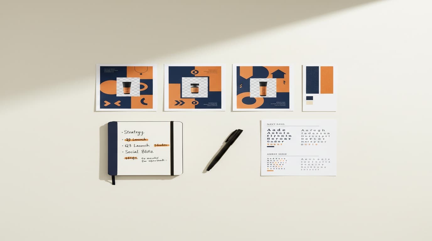
Platform-ready formats. Each asset is exported in the formats that the actual tools in your stack require — not just an Illustrator file, but also PNG dimensions for social platforms, hex codes in copyable format, fonts in the formats your web stack uses.
Application examples, not just rules. The brand kit includes example outputs — this is what our palette looks like in a Facebook ad, this is what our typography looks like on a mobile email header — so the person producing a new asset has a reference for how the elements work together, not just what they are in isolation.
AI-tool compatibility. If your team is using AI image generation tools for any part of campaign production, your brand kit needs to be structured as inputs those tools can read. Playyy's brand kit accepts your palette, fonts, logo, and a style reference image — it generates assets starting from your visual language, not from a generic default. An AI tool without brand context will produce generic outputs; one with your brand kit produces outputs that need minor adjustment rather than complete rework.
A Framework for Visual Brand Strategy Execution
Here's the execution framework I use with growth marketing teams:
Step 1: Audit what's actually being used. Before tightening anything, run a one-week audit. Collect every asset produced by every team member and tool. What colors are appearing? What font weights? What image styles? The gap between your brand guidelines and the outputs in the audit is your actual problem — not what you think it is.
Step 2: Build the brand kit for your actual tools. Based on the audit, identify which tools are producing inconsistent outputs and build a brand kit in the format those tools require. If you're using AI-assisted design tools, load the brand kit there. If you're using Figma for ad creatives, build the library in Figma. The brand kit needs to live where the work actually happens.
Step 3: Establish a visual validation step. Add a 30-second brand check to the pre-publish workflow for any marketing asset: does it use the right palette, the right font, the right visual style for its placement? This doesn't require a designer's time — it requires a checklist any team member can run.
Step 4: Document variant rules. For every campaign format your team produces regularly (paid social, email, organic social, display), document how the brand elements apply to that specific format. Not "use the brand palette" but "in Facebook ad creatives, the primary color occupies at most 40% of the background; typography is at regular weight; the logo appears at lower-left at 8% of frame width." This level of specificity takes time to create once and removes ambiguity from every subsequent asset.
Step 5: Create a creative testing protocol. When testing ad creative variations, define in advance which elements can vary (copy, image composition, CTA text) and which cannot (palette, font treatment, logo usage). Variations that deviate from brand to test performance aren't creative testing — they're brand erosion. The test variables should be tactical; the brand variables should be fixed.
Brand Consistency as a Growth Lever
The case for brand consistency in growth marketing isn't aesthetic — it's commercial.
Consistent visual brand presentation affects performance at every stage of the funnel. On social platforms, audiences who recognize a brand scroll less and engage more — reducing effective CPM over time. On landing pages, visual continuity from ad to page reduces the cognitive friction of the transition, which improves conversion rates. These effects compound: a brand that has been visually consistent for twelve months performs measurably differently from the same brand in its first month, because each impression builds on the recognition established by every prior one.
According to a 2025 Lucidpress study, consistent brand presentation across all marketing channels increases revenue by an average of 33%. More specifically relevant to growth teams: a consistent visual identity reduces effective CPM on social platforms over time, as audiences who recognize your brand scroll less and click more. It also improves landing page conversion rates — visual brand continuity from ad to landing page reduces the cognitive friction of the transition.
These effects compound. A brand that's been visually consistent for twelve months performs differently from the same brand in its first month. The impression count and recognition build a context that each individual asset benefits from. This is the compounding return on visual brand strategy that makes it a growth lever rather than just a creative preference.
The operational investment to get there is lower than most teams expect. A well-structured brand kit, implemented in the tools your team actually uses, and applied through a consistent production process is the primary requirement. The brand strategy document and the beautiful guidelines PDF are secondary.
Setting Up for Visual Consistency at Speed
If you're rebuilding an inconsistent brand kit for a growth team:
Define your non-negotiable visual constants. Maximum six colors, one or two font families, one logo usage rule. This is enough to produce consistent outputs without creating a constraint system too complex for a fast-moving team to follow.
Create style reference images. Identify four to six images that represent the visual mood your brand aims for — not your own past outputs, but reference points that capture the right photography style, color temperature, and compositional approach. These references do more to guide AI tool outputs and human judgment calls than any amount of written description.
Load the kit where the work happens. For AI-assisted design, Playyy's AI image generator lets you save your palette, typography, logo, and visual reference and apply them to generated images — so every AI-assisted output starts from your brand rather than the model's defaults.
Run a consistency audit quarterly. Pull 20 random marketing assets from the past 90 days and evaluate each against your brand kit. Not to grade the team, but to find the gaps: which tools are producing off-brand outputs, which formats are most inconsistently treated. The audit takes 30 minutes and tells you more than any amount of planning.
For teams producing campaign assets at the pace growth marketing requires, visual brand strategy isn't a design concern — it's a performance variable. The assets that compound into a recognizable brand are produced the same way as the assets that drift: quickly, by different people, under deadline pressure. The only difference is whether the brand kit is in the workflow or not.
Complete Guide: Brand Identity: The Complete Guide (2026)

Emily Carter
I help marketing teams at early-stage SaaS companies and DTC brands produce more campaign assets without losing brand consistency. My focus is on practical workflows for growth marketers — from paid social testing to creative iteration.
Frequently asked questions
Visual brand strategy is the plan that governs how your brand looks across every marketing touchpoint — from ad creatives to social posts to landing pages. It defines your color palette, typography, imagery style, and composition rules so that every asset reinforces the same brand impression. Unlike brand identity (the elements themselves), brand strategy governs when, how, and why each element is used across campaigns.


