How to Look Like a Real Brand on Shopify
Here's what happens when a Shopify store or Amazon listing doesn't have consistent branding: the product might be genuinely good, the price might be right, but the visual experience tells the visitor something different. The photos look like they came from three different photographers. The store colors don't quite match the social ad that drove the click. The email confirmation has a completely different visual character from the website.
Each of these gaps creates friction. Friction in ecommerce is exits.
The seller who fixes this doesn't need a bigger ad budget or a better product. They need the visual consistency that makes cold traffic trust what they're looking at.
In ecommerce, branding isn't about looking beautiful — it's about looking consistent. Consistency signals legitimacy, and legitimacy drives conversion.
Direct answer. Ecommerce branding for Shopify sellers means consistent product photography, a defined color palette and typography applied across the storefront, and visual continuity from ad creative to landing page. The practical starting point is standardizing product image style first, then applying the same visual constants to email, social ads, and promotional banners.
What Ecommerce Branding Actually Means
I'll skip the theory and go straight to what this means for a Shopify or Amazon seller:
Ecommerce branding is the consistent set of visual decisions applied to every touchpoint a customer encounters — product images, storefront design, email, social ads, packaging — that makes them feel like they're dealing with one coherent brand rather than an ad connected to a hastily assembled store.
The specific touchpoints that matter most in ecommerce:
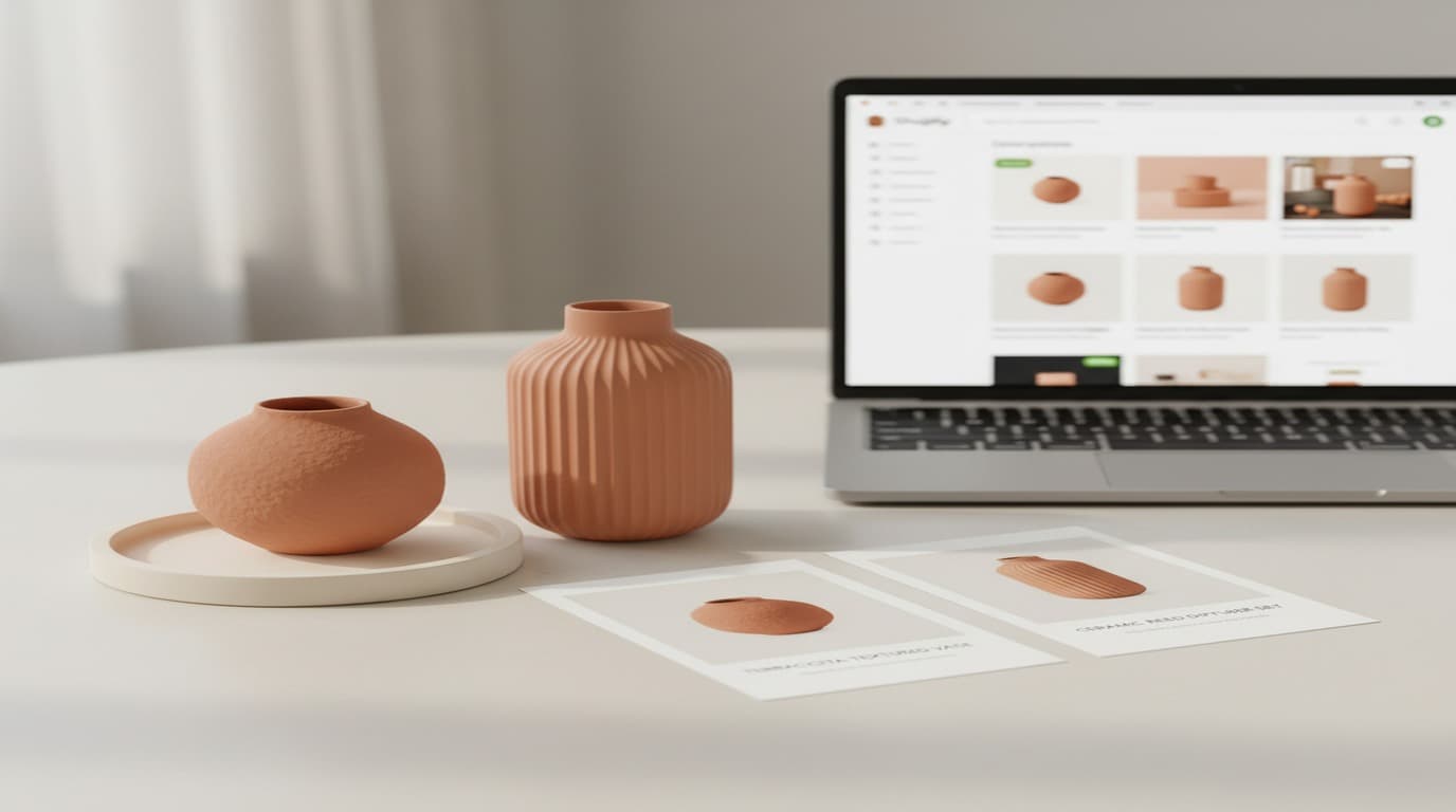
Product photography. The primary visual decision in ecommerce. Your main images (white background for Amazon, clean for Shopify) and your lifestyle images need to share a consistent photographic style — the same light quality, the same distance and framing approach, the same color temperature. A product catalog where every image looks like it came from a different photographer signals to the buyer that this isn't a real brand.
Store design. Your color palette, typography, and the visual hierarchy of your homepage and product pages. Buyers make snap judgments about store credibility within seconds of landing. A store that looks visually cohesive and considered reads as established; one that mixes colors, fonts, and photo styles reads as amateur.
Social and ad creative. The ads that drove the click need to feel continuous with the landing page. When a buyer clicks a beautiful Facebook ad and lands on a page that looks different, the mismatch creates doubt. Visual continuity from ad to store is one of the highest-leverage interventions for improving post-click conversion rates.
Email. Every post-purchase email — order confirmation, shipping notification, review request — is a brand touchpoint. A confirmation email that's visually branded reinforces purchase confidence; a plain-text receipt reminds the buyer they bought from an unknown store.
The Practical Case for Ecommerce Branding
Let me give you the numbers that made the most impact on how sellers I work with think about this:
According to a 2025 BigCommerce Visual Commerce Report, products with branded lifestyle imagery have a 34% higher add-to-cart rate compared to those with white-background-only images. This isn't because lifestyle images are inherently better — it's because they communicate brand context, which builds buyer confidence.
A 2025 Shopify Merchant Study found that stores with a consistent visual identity (defined as consistent color palette, typography, and product photography style across all touchpoints) had an average repeat purchase rate 28% higher than stores with inconsistent visual presentation.
The mechanism is straightforward: consistent branding creates recognition, recognition creates trust, trust reduces the activation energy required for both first purchase and repeat purchase. For a seller running paid acquisition, the acquisition cost is the same whether the store converts at 2% or 3.5% — but the lifetime value of a customer who recognizes and trusts your brand is dramatically higher.
According to a 2025 Shopify Merchant Study, stores with a consistent visual identity — defined as a consistent color palette, typography, and product photography style across all customer touchpoints — had an average repeat purchase rate 28% higher than stores with inconsistent visual presentation. The research controlled for product category and price point, isolating brand consistency as the primary variable.
Building Ecommerce Branding Without a Design Budget
The good news: ecommerce branding doesn't require a brand agency or a full design budget. It requires a few clear decisions applied consistently. Here's the practical starting point:
Define your visual constants. Palette: three colors maximum — a dominant color for your most prominent brand elements (hero banner, email header), an accent color for CTAs and highlights, and a neutral for backgrounds and text areas. Typography: one font for headings and one for body text (or one versatile font at two weights). These constants take 30 minutes to define and save years of inconsistent decisions.
Establish a product photography style. For the main image set — white background, product centered, product occupying at least 85% of frame — consistency is technical rather than stylistic. Use the same lighting setup for every product, same distance, same file export settings. For lifestyle images, define the visual direction once: the setting (home, outdoor, specific room type), the light quality (natural light, warm vs. cool), the styling approach (minimal, lived-in, aspirational). Apply this direction to every lifestyle image you produce.
AI tools have made lifestyle product imagery far more accessible. Playyy's background removal and image expansion tools let you take supplier or studio product photos and place them in consistent, brand-appropriate lifestyle contexts without a photography session. The visual direction is defined once in your brand kit; every new product image applies it automatically.
Apply the brand kit to every generated visual. Whether you're generating social ad creatives, email headers, or promotional banners, use a tool that accepts brand kit inputs. Playyy's brand kit feature stores your palette, typography, and style reference — every AI-generated campaign asset starts from your brand's visual language, not a generic default. For a seller producing a new seasonal campaign every four to six weeks, this means consistent visual identity across every campaign without starting from scratch each time.
Platform-Specific Execution
Amazon: the main image is the decision
Amazon's algorithm and buyer behavior mean your main image is doing more work than any other asset. It determines click-through rate from search results before the buyer reads the title or price. Main image best practices:
- Pure white background (RGB 255,255,255), no shadows, no props
- Product occupies at least 85% of frame
- Minimum 1000px on longest side (2000px preferred for zoom quality)
- Consistent orientation and scale across products in the same catalog
Beyond the main image, A+ content (available to Brand Registry sellers) is where brand storytelling happens. A well-designed A+ module — your brand story, key differentiators, comparison table — consistently improves conversion by 3–10% according to Amazon's published data. The visual quality of your A+ content is a direct signal of brand investment.
Shopify: the homepage hero and product page consistency
The homepage hero is your storefront's first visual impression. It needs to communicate your brand's visual identity immediately — your palette, your photography style, your value proposition — in the three-second window before a visitor decides whether to scroll. Seasonal campaign visuals that don't match the brand identity you've built erode this first impression every time you update them.
Product pages need consistent image formatting: same image dimensions across all products, same number of images per product (ideally six to eight), same ordering logic (main image, lifestyle, feature close-ups). Buyers who browse multiple products in a session expect visual consistency; inconsistency reads as disorganization.
For banner images, seasonal promotions, and email headers, Playyy's image tools generate campaign-quality visuals within your defined brand style — so a Black Friday banner and a Valentine's Day promotion both look like they come from the same brand, even though they're produced weeks apart with different visual themes.
The Product Image → Sales Relationship
The direct line between product image quality and sales performance is one of the clearest in ecommerce. Here's what to focus on, in order of impact:
1. Main image clarity and background. If your main image isn't on a clean white background, professionally lit, and clearly showing the product, fix this first. Everything else is secondary.
2. Lifestyle image consistency. Once the main images are correct, lifestyle images showing the product in use convert significantly better than additional product-only images.
3. Detail and feature close-ups. For products where material quality, construction, or specific features are selling points, close-up detail images that show what makes the product good address buyer objections before they form.
4. Brand touchpoint consistency. Once your product images are solid, extend the same visual quality to your email, social ads, and storefront design. Each touchpoint that matches the product image quality reinforces brand credibility.
For sellers working with an existing archive of product photos that need improvement — compression artifacts, inconsistent backgrounds, mixed lighting quality — Playyy's Visual Enhancer and Image Upscaler can restore a significant portion of that archive to campaign-quality without reshooting. I've seen sellers recover full seasonal collections this way when reshooting wasn't viable on the timeline.
The ecommerce market at every price point now has sellers who are putting real effort into visual branding. The default presentation — generic product photos, no consistent visual identity, ad creative that doesn't match the store — is no longer competitive in most categories. The sellers taking market share are the ones who've made consistent visual branding part of their standard operating procedure, not a project they'll get to someday.
Complete Guide: Brand Identity: The Complete Guide (2026)

James Walker
I help Shopify and Amazon sellers improve product images, promotional banners and ad creatives. I focus on practical visual improvements that help products look more credible and conversion-ready — no design jargon, just what works.
Frequently asked questions
Ecommerce branding is the consistent visual identity applied across your product images, storefront design, social media, packaging, and marketing materials that makes your store look and feel like a coherent brand rather than a generic listing. It includes your logo, color palette, product photography style, email design, and any branded touchpoint a customer encounters from discovery through delivery. Strong ecommerce branding builds trust with cold visitors and creates the visual consistency that drives repeat purchase.


