How Creators Build a Strong Visual Identity
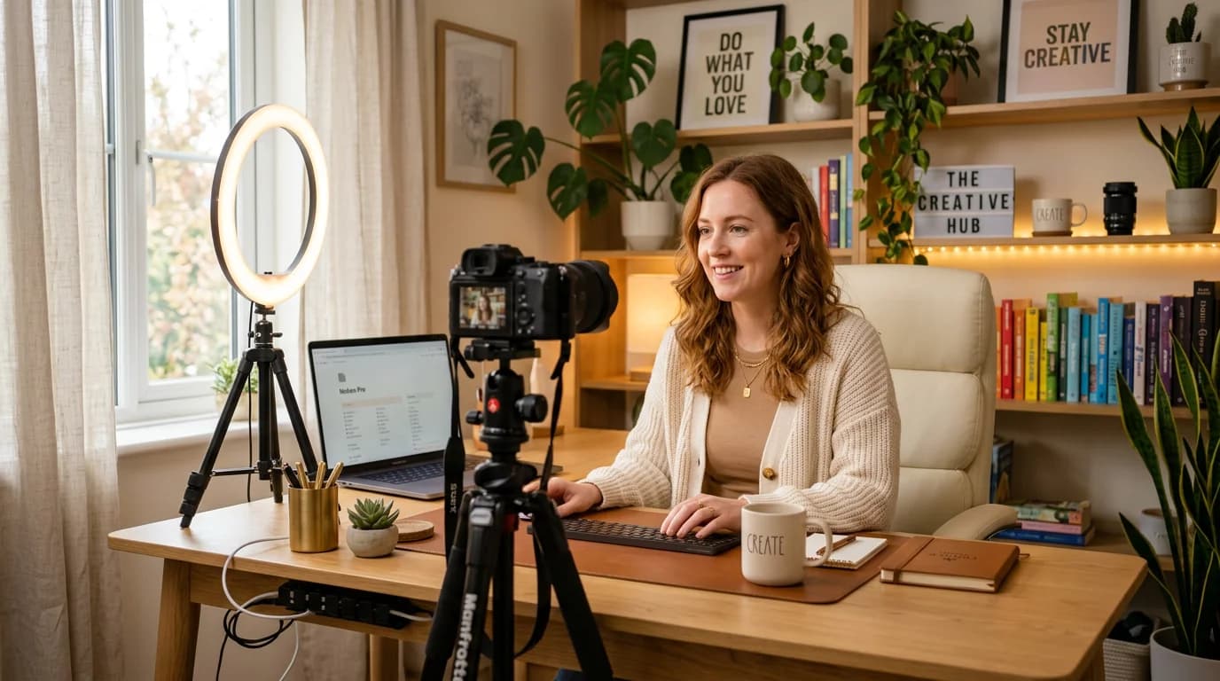
The creator with 50,000 followers whose content I can't recognize in my feed and the creator with 8,000 followers whose thumbnail I spot from across the screen — the difference between them almost always comes down to personal branding. Not their production quality. Not their content strategy. The visual identity that makes their work immediately theirs.
Personal branding for creators isn't a vanity project. It's the mechanism by which your audience builds a relationship with your content before they build a relationship with you. When someone sees your thumbnail in a YouTube recommendation and thinks "that's probably good, I've seen their stuff before" — that's your visual identity doing the work.
The goal of creator personal branding is recognition before reading. When your visual identity is working, your audience knows it's you before they've processed the title.
Direct answer. Strong creator personal branding comes down to four consistent elements applied everywhere: a fixed color palette, a locked-in typography treatment, a unified imagery style, and consistent profile visuals. When these four components are applied from a single brand kit rather than rebuilt each time, your audience learns to recognize your content before reading the title.
What Personal Branding Actually Consists Of
Let's get specific, because "personal branding" is one of those terms that people use to mean everything from your logo to your values to your wardrobe.
For creators, the practical definition is: the consistent visual and tonal identity applied to everything you publish. It has four tangible components:
Color palette. Two to four colors that appear consistently across every piece of content you create — thumbnails, posts, Stories, launch pages, products. Not your favorite colors in general, but the specific hex values you apply in every design context. When your audience sees that specific combination of colors, they think of you.
Typography. The font choices and text treatment that appear in your branded content — your overlay text style, your title treatment, your caption aesthetic. You don't need multiple fonts; one well-applied font used consistently is more recognizable than four fonts used interchangeably.
Imagery style. The visual treatment and tonal quality that unifies your photos and AI-generated images — the warmth or coolness of the light, the compositional distance, the amount of background in frame, whether you favor lifestyle context or clean studio-style isolation.
Profile identity. Your profile photo, your channel banner, your bio page visuals — the first impression of your presence on each platform. These aren't separate design projects; they're the brand constants applied to the platform-specific formats.
The sum of these four components, applied consistently, is what creates the recognition effect.
Why Most Creators Struggle With Consistency
The real obstacle to creator personal branding isn't lack of design skill — it's the fragmentation of production across contexts, platforms, and time.
A creator posting across YouTube, Instagram, and TikTok while also running a newsletter and periodically launching products is producing visual content in seven or eight distinct format contexts. Each context has different dimensions, different viewer expectations, and different production moments — often weeks apart, often in different moods, sometimes with collaborators or VAs involved.
Every time you start a design from scratch, small decisions compound: you grab a slightly different shade of your brand color because it looks right in this context, you use a font weight you haven't used before because the layout needs it, you frame the thumbnail differently because this video has a different energy. Each decision is defensible in isolation. Together, over 50 pieces of content, they produce a feed that looks like it belongs to three or four different creators.
The fix isn't discipline — it's infrastructure. Specifically, a brand kit that every piece of content gets produced from, rather than rebuilt around.
Building Your Creator Brand Kit
A brand kit is the working set of assets that every piece of content references. For creators, it needs to be light enough to actually use in a fast production workflow, which means:
Palette: three colors maximum. A dominant color (appears in 60–70% of your branded visual space), an accent (appears in 20–30% as a highlight or contrast element), and a neutral (backgrounds, text areas, breathing room). Name each color with its hex value and save it somewhere you access every time you design — your design tool's saved palette, a color bookmark, somewhere frictionless.
Fonts: two at most. One for headers, titles, and callouts. One for body text or supporting captions. If you only use your content in digital formats, many creators manage with a single font at two weights (regular and bold). Lock in the specific font name and weight — not "a clean sans-serif" but "DM Sans, Bold for headlines, Regular for body." Load the actual file into every tool you use.
Style reference: two to three images. Not your own content — reference images that capture the visual mood you're aiming for. The warmth of the light, the type of environment, the visual density. These references guide AI image generation more effectively than any text prompt, and they give you a standard to check new content against: does this feel like my references, or has it drifted?
Logo or mark (optional). If you have one, document its approved usage — where it appears, at what minimum size, on what backgrounds. If you don't have one yet, don't block your brand kit setup on it; a profile photo and a consistent color/typography treatment are sufficient.
Applying Your Brand Kit Across Platforms
Once your brand kit exists, every piece of content production becomes a matter of applying it to a format rather than designing a new identity. This is the shift that makes consistency achievable at creator volume.
YouTube thumbnails. Your brand color should occupy a prominent area — whether as a background zone, a text block, or a consistent overlay treatment. Use your brand font for the thumbnail text. The compositional style (how much of the frame is your face, what kind of background, what energy level in your expression) should be consistent enough that your thumbnails are recognizable in a grid view at 200×113px.
Instagram and TikTok. Feed posts should use your palette as the foundational color relationship — either as the image's dominant colors or as the design layer (text boxes, overlays, framing elements) applied to the image. For AI-generated content, Playyy's brand kit applies your palette and style reference automatically to generated images, so you don't need to adjust every output manually.
Stories and short-form. The platform convention is more energetic and less polished, but your brand constants should still appear: your palette accent in a sticker, your font in any text overlay, your consistent visual energy. Stories that are completely off-brand from your feed create a jarring experience for followers who move between your content types.
Launch pages and product visuals. When you launch something — a course, a product, a community — the visual identity should be an extension of your creator brand, not a separate design project. Your launch hero image, your sales page header, your email announcement should all use the same brand constants as your regular content. The launch is a moment when new people encounter your brand for the first time, and it should match what your existing audience already knows.
Using AI Tools for Personal Brand Production
The practical change that AI design tools have made for creator personal branding is throughput. Producing a launch kit — hero image, square post, vertical Story, email header — used to require either hiring a designer or spending a day in Canva. Now it can be done in under two hours by a creator with no design background, without sacrificing visual quality.
The key is that AI tools produce on-brand outputs only when the brand kit is in the workflow. An AI image generator without your brand context will produce generic, serviceable content that looks like it could belong to any creator. The same tool with your palette, your style references, and your visual direction loaded produces content that looks like yours.
This is what Playyy's brand kit feature addresses specifically: you save your visual constants once, and every AI-generated image starts from those constants rather than from zero. For a creator who produces content in sprint bursts — a weekend of thumbnail prep, a launch week of visuals — this means consistent output without the visual drift that comes from making brand decisions fresh each time.
For launch specifically: Playyy's Image Expander takes your hero image and adapts it to every format you need — the 1200×627px social share, the 1080×1080px feed post, the 1080×1920px Story — without rebuilding the composition. One visual direction, every format, in minutes.
According to a 2025 Creator Economy Report by Patreon and NeoReach, creators with visually consistent channels had 2.3× higher subscriber retention over 12 months than creators with inconsistent visual identities, after controlling for content quality and posting frequency. Consistency in color palette and typography was identified as the strongest single predictor of audience recognition and return-visit behavior.
The Recognition Compound
The long-term payoff of consistent personal branding is the recognition compound. Each piece of content you publish is both a standalone creative and a building block in a visual identity your audience is learning to recognize.
According to a 2025 Creator Economy Report by Patreon and NeoReach, creators with visually consistent channels had 2.3× higher subscriber retention over 12 months than creators with inconsistent visual identities, after controlling for content quality and posting frequency. The visual identity predicts what someone's experience will be before they click — and that prediction, when consistently confirmed, builds the kind of audience trust that conversion depends on.
Your personal brand is the asset that keeps working while you're not publishing. A strong visual identity means someone who encountered your content six weeks ago and sees your thumbnail in a recommendation today connects the two immediately — that's recognition that took no active work on your part to produce.
Build the brand kit once. Apply it everywhere. Let the consistency compound.
Complete Guide: Brand Identity: The Complete Guide (2026)

Minji Park
I help indie creators, online educators and small product teams prepare launch visuals and social campaigns. My goal is to make launches feel polished and trustworthy — even when you are working without a designer.
Frequently asked questions
Personal branding for creators is the deliberate, consistent visual and tonal identity you apply to everything you publish — content, launches, profiles, and products. It's what makes your YouTube thumbnail look like it came from the same place as your Instagram post and your email newsletter. Strong personal branding means your audience recognizes your content before reading your name, and new visitors immediately understand who you are and what you're about.


