Why Most Vision Boards Fail and How to Build One That Works
A vision board is one of those tools that's easy to dismiss as motivational decoration and easy to misuse as exactly that. The boards that work — that people actually return to, that shape decisions over time — share a specific quality: visual coherence. Not a lot of images, not images of desired outcomes, but images that all feel like they came from the same world.
This complete guide covers everything about vision boards: what they are and what they're actually for, the complete process for making one that works, 15 aesthetic directions to explore, how businesses use vision boards as strategic briefing tools, and how AI generation tools solve the specific gap where sourcing falls short.
A vision board externalizes a direction. It converts something abstract — a goal, an aesthetic, a brand — into a visual reference concrete enough to think against. When the board is working correctly, you look at it and immediately understand the direction. When it's not working, you look at it and it could mean anything.
Direct answer. Most vision boards fail because they collect aspirational subjects rather than building a consistent visual language. A board that works has one clear aesthetic direction, 10–15 images that all feel like they came from the same world, and enough visual coherence that someone else could understand the direction without an explanation. The process is: define the theme first, collect generously, curate ruthlessly, arrange by visual logic — not by goal category.
What Is a Vision Board?
A vision board is a curated collection of images, colors, and visual references organized to communicate a specific direction. The word "vision" points to the aspirational function — it represents a future state or direction — and "board" points to the physical or digital canvas where that vision is made concrete.
Vision boards have existed in various forms since the early twentieth century, but the current form was popularized in the early 2000s through personal development literature. The practice moved through fashion and design industries (where similar tools called mood boards, reference boards, and inspiration boards serve the same function in professional contexts), and has since expanded into business strategy, brand development, and creative project planning.
The fundamental purpose of a vision board is the same in every context: to convert an abstract direction into a visual reference that can be returned to for guidance. A brand vision board, a personal goal board, and a campaign direction board all work on the same principle — they make it possible to check a decision against a visual standard rather than relying on memory of an abstract intention.
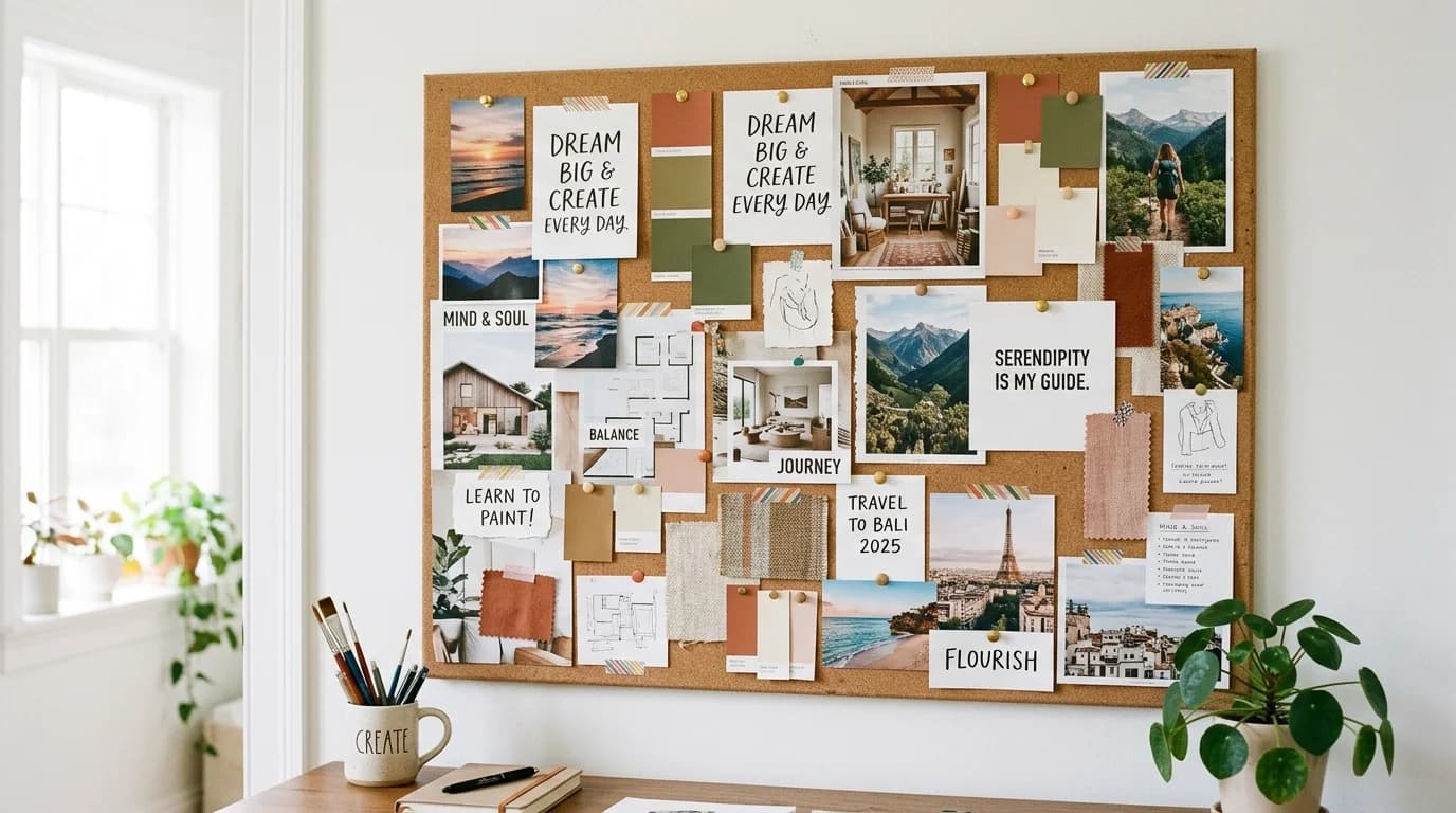
The quality of a vision board is determined by its visual coherence: do all the images feel like they come from the same world? A high-coherence board produces a clear, immediate sense of direction when you look at it. A low-coherence board produces a pleasant-enough collage that tells you many things at once and therefore tells you nothing actionable.
How to Make a Vision Board That Works
The complete process breaks into four distinct phases: defining the theme, collecting generously, curating ruthlessly, and arranging with intention.
Phase 1: Define the Theme Before You Collect
The most common vision board mistake is starting with a platform — opening Pinterest and searching broadly — before defining what the board needs to communicate. This produces boards that are aesthetically pleasant but directionless, because the collection follows what's available rather than what's needed.
Define the theme as a specific visual direction: not "I want to feel inspired" but "warm, textured, natural materials, diffused golden light, unhurried pace." The more specific the definition, the more useful the collection phase becomes, and the easier the curation phase is.
Complete How-To: How to Make a Vision Board That Actually Works
Phase 2: Collect Generously, Then Edit Ruthlessly
Collect 20–30 candidate images before evaluating any of them. The first-pass collection should be quantity-focused: gather everything that might belong, make no decisions about what stays. The evaluation comes after, with all the candidates visible simultaneously.
The best sources for vision board images vary by aesthetic:
- General lifestyle and aspirational content: Pinterest, Instagram saved collections
- Fashion and editorial: Vogue, Harper's Bazaar, editorial photography archives
- Interior and architecture: Architectural Digest, Dezeen, Dwell
- Brand and design reference: Behance, It's Nice That, Brand New
- Specific aesthetics that are underrepresented in stock: AI generation (for the 15–20% gap)
Phase 3: Curate to Visual Coherence
The curation standard for a working vision board is strict: keep only images that share the same tonal values, color temperature, and compositional character. If you have to explain why an image belongs — "it's here because of the feeling, even though it looks different" — it probably doesn't belong.
A board that makes it through strict curation will typically have 10–15 images from a starting collection of 20–30. The reduction in quantity is usually a significant improvement in quality.
Phase 4: Arrange with Visual Logic
Physical or digital arrangement should group by visual relationship: similar tones together, similar compositions near each other, colors that relate positioned in proximity. The goal is to make the board itself read as a coherent visual document rather than a grid of individually selected images.
For digital boards, working at a fixed canvas size (1920×1080 or 2400×1600 typically) and maintaining consistent spacing produces a more professional result than free-floating arrangement.
According to a 2024 Journal of Experimental Psychology study on visual goal-setting, participants who created specific, visually coherent reference images for a goal showed 32% higher goal-adherence at 90 days compared to those who described the goal verbally. The visual specificity of the reference (not just its existence) correlated most strongly with the effect.
15 Vision Board Aesthetic Directions
The most effective vision boards are organized by visual aesthetic rather than goal category. Here are fifteen directions with specific image and palette guidance for each.
Soft Minimalist uses off-white, warm ivory, mist gray, and barely-there blush. Defining textures are linen, smooth plaster, and unglazed ceramic. Collect empty rooms with directional light, hands holding simple objects, matte-finish surfaces with significant negative space.
Cottagecore uses sage green, dusty rose, warm cream, and honey. Collect gardens with overgrown edges, wildflowers, farmhouse kitchens, handwritten notes. Refer to the sage green color palette guide for palette specifics.
Dark Academia uses deep burgundy, forest green, warm black, and aged gold. Collect library reading rooms, architectural stone, worn leather-bound books, candlelit desk setups, spiral staircases. The defining quality is a weight and seriousness that can appear in any subject.
Coastal Grandmother uses warm sand, driftwood gray, sea glass green, and natural linen. Collect covered porches, linen curtains, well-read books, simple meals, aged silver. Search "Greek island house editorial" rather than "coastal grandmother" for higher-quality sourcing.
Moody Hygge uses burnt amber, charcoal, warm stone, and candlelight yellow. Everything should be shot in autumn or winter conditions. Collect lit candles against darkness, heavy textiles, fire, steaming cups, single warm light sources.
Dopamine Dressing uses multiple saturated hues simultaneously — electric yellow, cobalt, Kelly green, hot coral. The palette only works when colors coexist; isolated bright colors don't produce the effect.
Japandi uses warm white, natural ash wood, and matte black with minimal accent. Collect handmade objects with intentional imperfection, brushed ash surfaces, Japanese tea ceremony objects, light through rice paper. Restraint is the defining quality.
Quiet Luxury uses camel, ivory, warm taupe, and stone. Collect simple clothes in expensive fabrics, fine jewelry worn casually, interiors with quality materials and minimal decoration. Quality is communicated through material, not ornamentation.
Earthy Boho uses terracotta, dusty mauve, warm sand, and olive. Collect macramé, hand-thrown pottery, dried botanicals, Mediterranean outdoor living spaces.
Desert Modernism uses warm sand, adobe terracotta, sage, and bleached bone. Search "Palm Springs architecture" and "New Mexico interior editorial" for the best sourcing.
Y2K Nostalgia uses metallic silver, baby blue, hot pink, and holographic rainbow. Source from archives (Getty, magazine archives from 1998–2004) rather than contemporary recreations.
Art Deco Revival uses black, gold, ivory, and deep teal. Collect 1920s–1930s architecture details, fan motifs, geometric tile, gilded metals, vintage cosmetic packaging.
Botanical Maximalism uses every green from sage to deep jungle, with terracotta and rattan. Collect greenhouse interiors, large tropical leaf close-ups, plant-filled studios, botanical illustration.
Editorial Archive uses true black, pure white, and high-contrast gray. Best for brand boards where visual discipline and contrast are the primary signals.
Eclectic Maximalism uses jewel tones, earthy pigments, and natural whites in combination. Collect layered interiors, global textiles, markets with abundant goods.
Full Aesthetic Guide: 15 Vision Board Ideas by Visual Aesthetic
Vision Boards for Business and Brand Work
Design teams briefed with visual reference documents — rather than written descriptions alone — report significantly fewer revision rounds on first deliverables. A 2024 IDEO survey found the time saved in production exceeded the time spent building the board by a factor of three to five for most creative projects. Visual specificity communicates direction faster and more accurately than adjectives like "premium" or "approachable" ever can.
In professional contexts, vision boards function as briefing tools rather than motivation tools. Their job is to communicate a visual direction clearly enough that designers, photographers, and agencies can work from them without additional explanation.
A business vision board for brand direction should contain: color palette references (actual swatches, not approximate descriptions), photography style references (showing the light quality, compositional approach, and subject-background relationship you're working toward), typography tone specimens (showing the kind of type that matches the communication style, even if it's not the actual typeface), and competitive context (showing where your brand sits relative to direct competitors visually).
The quality standard for a business vision board is higher than for a personal one. Every image must communicate something precise — about color, light, composition, or material quality — that a designer who wasn't in the room can read from the image alone.
According to a 2024 IDEO survey, design teams briefed with visual reference documents reported 40% fewer revision rounds on first visual deliverables compared to teams briefed with written descriptions alone. The time saved in production exceeded the time spent building the board by a factor of three to five.
Business Application: How to Build a Vision Board for Your Business
Digital Vision Board Tools
Several tools serve the digital vision board workflow well, each with different strengths:
Figma provides precise control over layout, spacing, and annotation. Best for professional brand direction boards where the output will be shared with design teams. The grid and spacing controls allow more precise visual organization than free-form tools.
Canva has a large image library and template system that makes getting started faster than from scratch. Best for lifestyle and personal direction boards. Less precise layout control than Figma.
Milanote is specifically designed for visual reference organization, with card-based layout and note-linking. Best for research-phase collection before final organization.
Pinterest boards are the best collection tool, not the best organization tool. Use Pinterest for gathering candidates, then transfer the final selection to a canvas tool for arrangement.
Playyy combines vision board creation with AI image generation — when sourcing can't produce the specific image you need for a direction, Playyy's AI image generator creates images from detailed visual descriptions (surface material, light quality, compositional approach, color temperature). The workflow: build 80% from sourced images, use AI generation for the remaining 15–20% that sourcing can't reach with sufficient precision.
The practical advantage of AI generation in vision board work isn't replacing sourcing — it's filling the specific gap where you have a clear visual idea but can't find the right image executed at the quality and specificity you need. "Japandi interior, single handmade ceramic vessel on natural ash shelf, diffused natural light from left, no people, warm white background" produces a usable result. "Minimalist interior" doesn't.
The Difference Between a Vision Board and a Mood Board
These terms are often used interchangeably but serve different functions in design and brand work:
A vision board is exploratory and personal. It represents a direction you're working toward through visual language. It can include images that don't quite fit yet, reference points that are aspirational, and content that requires explanation. It's the working document.
A mood board is edited and audience-facing. It communicates a specific, decided visual direction to a collaborator, client, or production team. Every image must communicate clearly without explanation. It's the deliverable.
Vision boards are typically created during the exploration phase of brand or project development; mood boards come later, when the direction has been decided and needs to be communicated. The vision board is the process; the mood board is the output of that process.
For brand and creative project work, building a strong vision board before creating the mood board produces better mood boards — because the exploration phase has clarified which images actually communicate the direction versus which ones just appealed aesthetically during collection.
Filling Image Gaps with AI Generation
After careful sourcing, most vision boards have two to four specific gaps — images that you can describe clearly but can't find executed at the right quality in your available sources. This is where AI generation serves a concrete practical purpose.
The cases where AI generation adds the most value in vision board work:
Highly specific material or light conditions. "Warm afternoon light falling across rough-textured plaster wall with deep shadow definition, no foreground objects" is easily described but rarely represented in stock photography exactly as needed.
Scale or proportion variations. Standard stock photography is shot in standard formats for standard purposes. If you need a specific composition — close-up texture filling the full frame, or a very specific spatial relationship between subject and background — stock may not have it.
Aesthetic combinations that aren't well-indexed. Some aesthetic combinations (Japandi interior with terracotta accent, desert modernism with vintage textile) exist as an aesthetic sensibility but aren't widely searched or well-indexed in stock libraries.
Avoiding recognizable images. For brand vision boards specifically, using widely-known stock images creates associations with the thousands of other brands that have used the same images. AI-generated images are original.
The workflow that produces the best results: build most of the board from real photography, then use Playyy's AI image generator to fill the specific gaps the sourced collection reveals. Describe what you need with specific visual parameters — not mood words but actual visual attributes: surface, light direction, color temperature, compositional approach, what's absent.
This produces a board where every image serves a specific purpose in the visual logic, and the AI-generated images are indistinguishable from the sourced ones in function and quality.
Start building your vision board with Playyy — AI image generation, full design editor, and brand kit tools available on the free tier.

Aiko Tanaka
I work with boutique brands, cafes, creators and small businesses on visual systems, layout discipline, typography and moodboards. My focus is on fast concept exploration that still has a strong design point of view.
Frequently asked questions
A vision board externalizes a direction — for a goal, brand, project, or year — by making it visually concrete rather than abstractly described. The function is to give you a reference point you can return to when decisions need to be made. When the board has strong visual coherence, it communicates the direction clearly enough that other people (designers, photographers, collaborators) can work from it without further explanation.


