How to Make a Vision Board That Actually Works
 Aiko Tanaka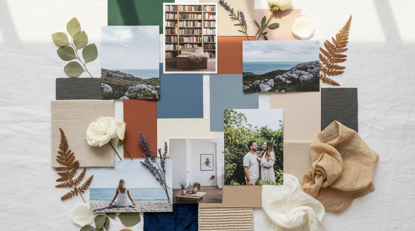
There's a version of a vision board that works — and a version that becomes a collage of aspirational images you never look at again. The difference isn't the quality of the images. It's whether the board has a visual logic that makes it feel like a single, coherent thing rather than a mood collage assembled in an afternoon.
Visual coherence isn't a vague aesthetic preference. In brand identity work it's a precise thing: every element on the board should feel like it could have come from the same world. Same light quality, same emotional temperature, same implied relationship to space and time. When that alignment is present, your eye moves across the board without snagging. You understand the direction immediately. When it's absent, you feel a low-level discomfort even if you can't name it — a sense that the board is saying several things at once, none of them clearly.
Visual coherence comes from shared tonal values (how light or dark the images are), consistent color temperature (warm, cool, or neutral — pick one and commit), compositional character (airy and spacious versus dense and textural), and subject type (people, places, objects, or abstract texture — one should dominate). It doesn't require every image to look identical. A board can have contrast and variety. But the contrast should feel deliberate, not accidental.
Learning how to make a vision board properly means developing an eye for this — and then learning the methods that support it.
Direct answer. To make a vision board that actually works, write one direction sentence first, collect 25–35 reference images, edit ruthlessly down to 12–18 that share a consistent tonal range and color temperature, extract a four-to-six color palette, and arrange them with a clear visual anchor and intentional spacing. Coherence — not quantity — is what makes a board useful.
What a Vision Board Is Actually For
A vision board is a visual articulation of a direction — for a goal, a brand, a creative project, or a year ahead. Its function is to make something abstract feel concrete enough to act on, and to give you a reference point you can return to when decisions need to be made.
For brand projects, a vision board is the precursor to a moodboard: it's exploratory and personal, whereas a moodboard is edited for a specific audience or output. For personal goals, it's a way of committing a feeling to a surface so you can see whether your choices align with it.
The board fails when the images don't agree with each other — when warm, earthy tones sit next to high-contrast editorial photography, or when a minimalist layout gets interrupted by a cluttered lifestyle image. Your eye can't settle, and the direction remains vague.
Physical vs Digital Vision Boards: Which Is Right for You
Both formats work. The question is what kind of thinker you are and what the board is for.
Physical boards have a tactile quality that's genuinely useful for personal goals and long-range life vision. The act of cutting, arranging, and fixing images to a surface is slower and more deliberate — which means you're less likely to throw everything at the board at once. There's a natural editing pressure. You also live with it physically: on a wall, on a desk. It's present in your peripheral vision in a way a digital file rarely is.
Physical boards work best when: the goal is personal (a year's direction, a lifestyle shift, a creative identity you're developing), you work better with your hands, or you want something you'll see daily without actively opening a file.
Digital vision boards offer flexibility that physical boards can't match. You can swap images, adjust scale, test color relationships, and export to share with a client or collaborator. You can work at a precision — exact pixel spacing, extracted hex codes — that a physical board doesn't allow. And if you need a specific image that doesn't exist yet, tools like Playyy's AI image generator let you generate it from a text description rather than hunting through stock libraries.
Digital boards work best when: the goal is a project or brand (where the board will eventually inform deliverables), you need to share or present the board, or you're iterating — testing different directions before committing.
For most creative and brand work, consider making a rough physical board first to find the direction intuitively, then building a refined digital version that clarifies and sharpens what the physical board found. The two aren't competing — they're different phases of the same process.
Vision Board Ideas by Goal Type
The images that belong on a vision board depend entirely on what the board is for. Here's how to approach five common goal types.
Career and professional direction. Focus on the environment and energy of the work you want, not the title or outcome. Images of workspaces, materials, tools, the quality of light in a particular kind of office or studio. If you want to move toward independent design work, find images of studios that feel right — not necessarily famous ones, but ones with the atmosphere you're after. Include images of people at work, but pay attention to how they're depicted: focused, collaborative, in motion? The energy in the image matters more than the subject.
Brand identity. For a brand board, your images should capture the world the brand lives in, not the brand itself. If you're building an identity for a slow-living food brand, look for images of morning light through linen, ceramics on unfinished wood surfaces, hands holding imperfect produce. The board establishes the visual territory before any logo or typography decisions are made. Include textures — linen, concrete, matte paper, rough stone — because texture is often what carries a brand's tactile character.
Personal lifestyle. These boards tend toward interiors, landscapes, and everyday objects that represent how you want to feel in daily life. The risk here is collecting aspirational images that don't actually reflect your real taste — images you think you should want rather than images that genuinely resonate. To test this: save an image and look at it again 48 hours later. Does it still pull at you, or has it faded? The ones that still pull at you are the real references.
Creative projects. For a film, book, photography series, or illustration project, the vision board establishes the visual world of the work. Think about light quality first (the board for a melancholy winter film will have entirely different light from a board for a sun-drenched summer project), then color, then texture and material. Include images from unexpected sources — architecture, food, landscape — that capture the feeling of the work even if the subject is unrelated.
Health and wellness. The mistake with wellness boards is collecting images of outcomes (bodies, results) rather than environments and practices. A board that's about how you want to live is more useful than one about how you want to look. Find images of movement that feels joyful rather than laborious, of food that looks nourishing rather than medicinal, of rest environments that feel genuinely restorative. The visual language should feel attainable, not aspirational to the point of alienation.
How to Build a Digital Vision Board Step by Step
Here's the process for digital vision boards — whether for a personal project or a client brand.
Step 1: Write one direction sentence. Before touching any images, write a single sentence that captures the visual direction you're after. "Quiet luxury — neutral tones, natural materials, unhurried spaces." "Raw outdoor brand — texture-forward, morning light, bodies in motion." This sentence is your filter for everything that follows.
Step 2: Gather references. Collect 25–35 images before you arrange anything. Use Pinterest boards, editorial photography sites (Dezeen, Wallpaper*, Kinfolk archives), and architecture/interior blogs. For images you can't find — a specific lighting condition, a texture at a particular scale, a product shot in a precise setting — Playyy's AI image generator lets you generate a reference image from a text description. This is particularly useful when you have an exact image in your mind but can't locate it in existing photography.
Step 3: Edit to 12–18 images. This is the hardest step and the most important. For each image, ask: does this match the direction sentence you wrote? Does it share tonal, compositional, and color characteristics with the others? Cut everything that doesn't clearly pass. If you're hesitant about an image — "it's almost right, but slightly off" — Playyy's style transfer tool can shift the color grading or visual treatment of an image to better match the rest of your board.
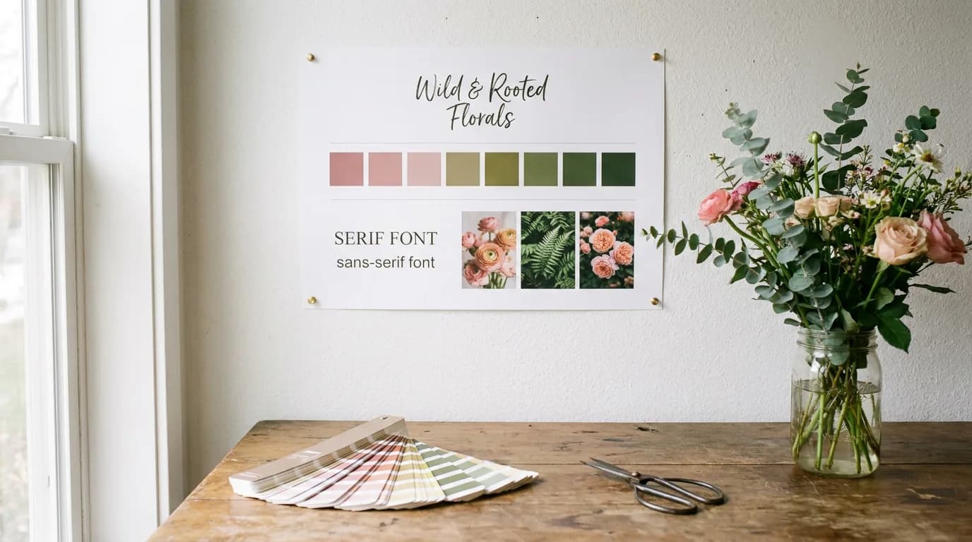
Step 4: Extract the palette. Open your selected images and identify 4–6 colors that recur across them. These are your palette. Write down the hex codes. Add a small swatch row to your canvas — this makes the implicit palette explicit and quickly reveals any images that don't truly belong.
Step 5: Arrange on canvas. Work at 1920×1080px minimum, or at the intended output format if you know it. Start with one anchor image at roughly 30–40% of the total area. Build outward from that anchor, grouping images by tonal similarity. Maintain consistent spacing between images — typically work with either very tight (almost touching) or generous (clear breathing room) spacing, and commit to one approach across the board. Avoid the urge to fill every corner.
Step 6: Add one typographic element. A single word, a short phrase, or a type specimen in a font that matches the aesthetic. This anchors the board conceptually without overwhelming the visual composition. Keep it secondary to the imagery.
Step 7: Do the three-second test. Send the board to someone unfamiliar with the project and ask them to describe the mood in one or two words after three seconds. If their description aligns with your direction sentence, the board is working. If it doesn't, more editing — not more images — is the answer.
Color Theory for Vision Boards
Color is where most vision boards either find their coherence or lose it. Understanding a few basic principles makes the difference.
Temperature first. Every image has a color temperature — warm (yellows, oranges, warm reds, golden tones), cool (blues, blue-grays, cool greens), or neutral (desaturated tones that lean neither warm nor cool). A vision board with consistent color temperature reads as unified at a glance. A board that mixes warm and cool images without intention looks disorganized. Decide upfront: is this a warm board, a cool board, or a neutral one?
Saturation level. High saturation (vivid, intense colors) communicates energy, confidence, and modernity. Low saturation (muted, desaturated, or dusty tones) communicates calm, sophistication, and restraint. Most boards work best with a consistent saturation level — either lean muted or lean vivid. Mixing both is possible, but only works if the contrast is clearly intentional (one vivid accent in an otherwise muted board, for instance).
The emotional psychology of color on vision boards. Colors carry associations that your eye reads before your brain processes them consciously. Warm tones (terracotta, cream, amber) tend toward comfort, groundedness, and approachability. Cool tones (slate, sage, dusty blue) read as calm, precise, and considered. Deep, saturated darks (navy, forest green, near-black) communicate weight and authority. Light, airy tones (off-white, pale sage, soft blush) read as open and unhurried. None of these is better than another — but they're worth being conscious of as you select images, because the emotional register of your board's palette is doing a significant amount of work.
Building a cohesive palette from images. Rather than choosing colors first and then finding images to match, let the palette emerge from images that already feel right to you. Gather your selected images, then use an eyedropper to pull representative colors from each. You'll typically find 2–3 colors that recur across multiple images — these are your primary palette. The remaining colors are accents. If you find more than 6–7 distinct colors in your selected images, you likely have too many images with conflicting color stories, and the editing process needs to go further.
The 3 Most Common Vision Board Mistakes
Across personal projects and brand work, the same three problems come up repeatedly.
1. Too many conflicting themes. This is the most common mistake: a board that's trying to express three or four different directions at once because the maker hasn't committed to a clear brief. The result is a board that feels scattered and ultimately useless as a reference tool. The fix isn't better images — it's a clearer direction sentence before you start gathering. If your board currently has conflicting themes, break it into two or three separate, coherent boards and see which one actually excites you. That's the board you should develop.
2. Aspirational but mismatched images. Using images that represent what you think you should want, or what would impress someone looking at the board, rather than images that genuinely capture the direction you're after. These images are technically good — high quality, beautiful — but they don't agree with each other or with the rest of the board. They were chosen for the wrong reason. The test: would you include this image if no one else were going to see this board? If the answer is no, cut it.
3. Treating it as a collage, not a design. A collage fills space. A design communicates a specific thing with intention. The most common symptom is too many images at similar sizes, competing equally for attention, with no visual hierarchy. Every board needs a dominant image that anchors it, secondary images that support the dominant's direction, and negative space that lets individual images be seen. If everything is the same size and given equal visual weight, nothing reads clearly. More discipline in arrangement — not more images — is the solution.
Vision Boards for Brands and Creative Projects
Designers and founders who skip the vision board phase before a project brief often end up spending more time in revision. The vision board is where you discover the visual direction before you've committed to any specific executions — before a logo is drawn, before a color system is locked, before a photographer is briefed.
For brand projects, use the vision board to answer one question: what world does this brand live in? Not what the brand's logo looks like, not what the website grid will be — the world. The light quality. The materials. The people and how they move through space. A vision board that answers that question clearly gives every subsequent design decision a reference point. Does this typeface choice feel like the board? Does this layout? Does this photography direction?
For creative projects — a film, a book, a photography series, an exhibition — the board establishes the visual and emotional grammar of the work. It's particularly useful for collaborations, where different contributors need to be working from a shared sense of what the work is reaching for. A well-made board communicates more precisely than a written brief ever can, because it shows rather than describes.
The practical process for brand vision boards: typically build two or three competing boards at the research phase — different potential directions for the brand — and then use those boards as the basis for a conversation with the client. The board they respond to most viscerally usually contains more useful information than any verbal brief.
If you're building a brand vision board and need reference imagery that doesn't exist in stock libraries — a specific texture, a particular light quality, a product shown in a precise context — generating it with Playyy's AI image generator is faster and more accurate than trying to adapt an existing image that's almost right.
Step 1: Define One Theme Before You Search for Anything
The most common mistake is opening Pinterest and typing a broad search before knowing what you're looking for. You'll collect 100 images that point in 15 different directions, and the board will feel like a mood survey.
Start with one sentence. Not a goal ("I want to feel calm"), but a visual direction: "Quiet luxury — neutral tones, natural materials, unhurried spaces." Or: "Outdoor brand — raw texture, morning light, movement without chaos."
That sentence becomes your filter. Every image either passes it or it doesn't.
Step 2: Collect Generously, Then Edit Ruthlessly
Gather 25–35 images before you arrange anything. This is the research phase — cast wide. Use Pinterest, editorial photography sites, architecture blogs, and product imagery. If you can't find an image that captures a specific feeling, Playyy's AI image generator can generate reference images from a text description — useful when you have a precise aesthetic in mind but can't find an existing photograph that matches it.
Then edit down to 12–18 images maximum. The editing is where most people stop too early. You're looking for images that share:
- A tonal range: Are they all warm-toned? Cool? High-contrast? Muted?
- A compositional quality: Spacious and airy, or dense and textural?
- A subject type: People, objects, spaces, or abstract texture — pick a dominant type
If an image is beautiful but doesn't agree with the others, cut it. It belongs on a different board.
Step 3: Anchor the Board with a Color Palette
Before you arrange images, extract 4–6 colors that appear across your selected images. These become your board's palette — and later, potentially your brand's or project's palette.
Colour harmony — hues sharing a temperature or value relationship — is what separates a board that looks curated from one that looks collected. A coherent palette reads as intentional at a glance, before anyone examines the individual images, because the eye registers overall colour relationships faster than it parses content.
Add a small color swatch row to one edge of your board. It makes the implicit palette explicit and helps you identify any images that don't quite belong.
Step 4: Arrange with Intention — Not Just Filling Space
Resist the urge to fill every corner. White space (or negative space on a physical board) is not wasted space — it's what allows individual images to be seen rather than competing for attention.
A few principles that consistently work:
- Anchor with one large image: One image at roughly 30–40% of the board's area gives the eye a starting point
- Group by tone or subject: Similar images placed near each other create visual clusters that feel purposeful
- Create movement: Place a detail image near a wider shot of the same mood to lead the eye from close to far
- Add one typographic element: A word, a phrase, or a type specimen in a font that fits the aesthetic. Keep it secondary — the imagery should dominate
Step 5: Build the Digital Version
For a digital vision board, work at 1920×1080px minimum. This gives you enough canvas to see how images relate to each other at actual visual weight.
The process mirrors the physical version: arrange your selected images as layers, use consistent spacing between elements, and resist adding drop shadows or decorative borders — these age quickly and distract from the imagery itself.
If a reference image is close but not quite right — the lighting, the texture, the setting — Playyy's style transfer tool can modify it to better fit your palette or composition. It's particularly useful for adjusting the color temperature of an image that's almost right but slightly too warm or too cool.
How to Tell If Your Vision Board Is Working
A functional vision board passes what's often called the "three-second test": someone unfamiliar with your project looks at it for three seconds and can tell you the mood in one or two words. Not what the goal is — the feeling. Calm. Bold. Playful. Precise.
If they can't, the board needs more editing, not more images. More is not more here.
A well-made vision board is genuinely useful for months. It gives you a visual checkpoint for every decision — does this choice feel like the board, or does it feel like something else? Start with a clear theme, edit rigorously, and keep the palette tight. If you're building one for a brand project, Playyy can generate reference imagery to fill gaps in your moodboard before you commit to a direction.
Complete Guide: Vision Board: The Complete Guide (2026)

Aiko Tanaka
I work with boutique brands, cafes, creators and small businesses on visual systems, layout discipline, typography and moodboards. My focus is on fast concept exploration that still has a strong design point of view.
Frequently asked questions
Start by defining one clear theme or goal. Collect 25–35 images that feel right — don't edit yet. Then curate down to 12–18 that share a visual language (similar tones, mood, or composition style). Arrange them with intention: group by color or feeling, leave breathing room, and add 1–2 text elements if needed.