What Is a Brand Board? Examples and a Template
 Aiko Tanaka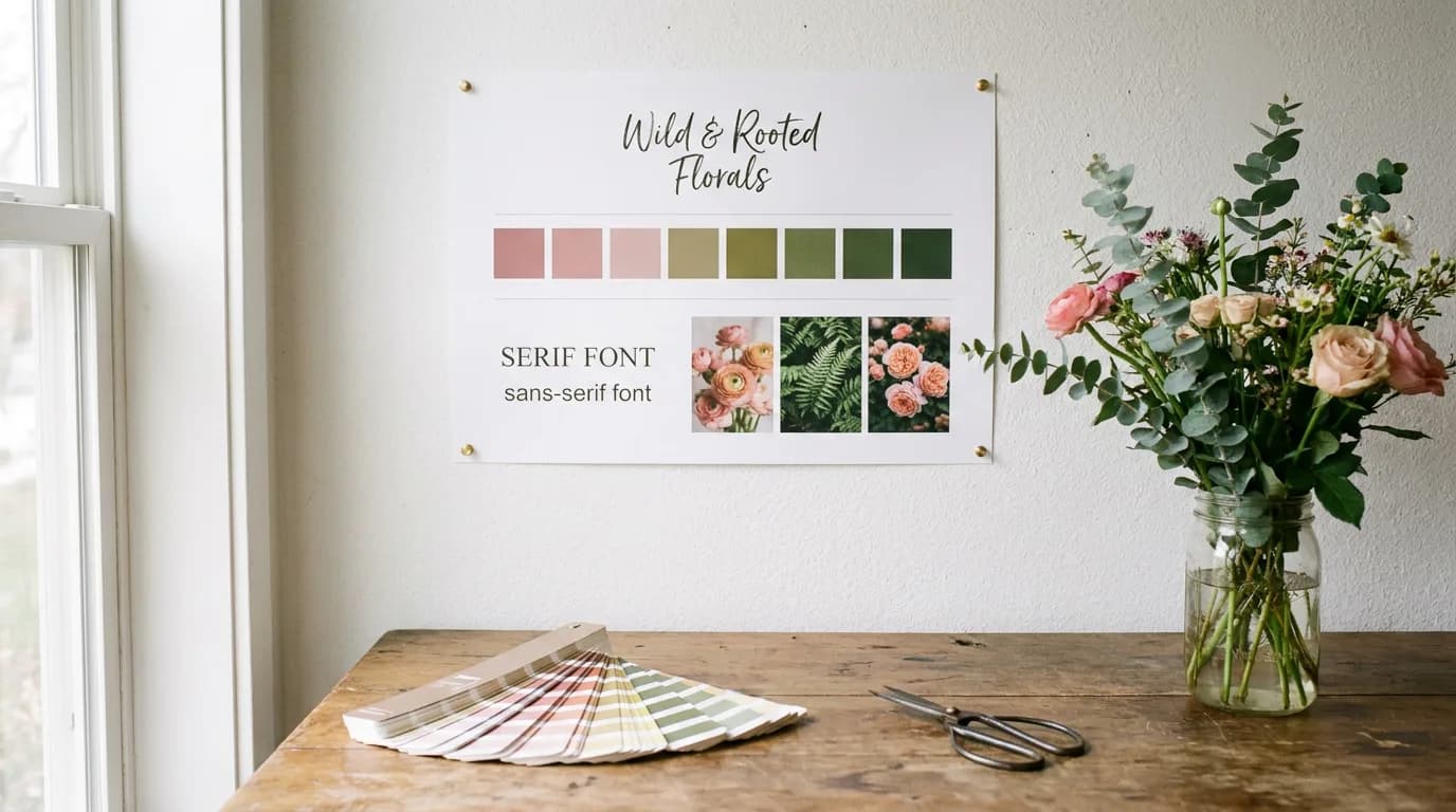
Designers usually hand a brand board to a client right after the logo is approved, and it often outlives every other deliverable in the project. It's the single page that ends up pinned above desks, attached to emails to printers and opened every time someone makes a social post. A good brand board shows the whole identity at a glance: the logo in its versions, the colors with exact codes, the fonts and the look of the imagery, arranged so anyone can match it in seconds.
Direct answer. A brand board is a one-page visual summary of a brand's identity. It shows the primary logo and its alternates, the color palette with exact codes, the fonts, and sample imagery or textures in one layout, so anyone creating content can match the brand at a glance.
What Is a Brand Board?
A brand board, sometimes called a branding board or brand identity board, is a one-page snapshot of how a brand looks. It isn't meant to explain or justify anything. It simply shows the pieces side by side so the relationships between them are obvious: which color goes with which font, how the logo sits on a dark background, what kind of photo belongs next to it.
That makes it different from the longer brand documents. A brand book is the multi-page reference that covers the story, values, voice and every usage rule. A brand kit is the folder of working files: logo exports, font files and color codes ready to use. The brand board sits between them as the visual overview, small enough to glance at and complete enough to design from.
It also differs from a mood board. A mood board gathers inspiration before the identity is designed. A brand board records the identity once the decisions are made.
Anatomy of a Brand Board: What to Include
Most brand boards share the same eight parts. Treat this as a checklist when you build or review one.
- Primary logo. The full logo in its main colors, placed largest and usually top left or center. It's the version used most often.
- Alternate logos. A stacked or horizontal layout, a version with a tagline, and one-color versions for light and dark backgrounds.
- Submark or icon. The compact mark for social avatars, stickers, favicons and watermarks, often a monogram or simple symbol.
- Color palette. Three to six swatches with HEX, RGB and CMYK codes, sized to show proportion: the main color gets the largest block, accents get small ones.
- Typography. Two or three fonts shown as specimens, each labeled with its role: headline, subheading or accent, and body text.
- Imagery. Three to five photos that show the photography style: light or moody, close-up or wide, people or products.
- Patterns and textures. Optional, but useful for brands that rely on backgrounds, packaging or prints.
- Personality words. Three to five adjectives that describe how the brand should feel, such as "warm, handmade, unhurried."
The color codes are what make a brand board usable rather than decorative. J Alexandria Creative's brand board checklist recommends including CMYK, RGB and HEX values for every color, and adding Pantone values for product-based brands, then putting everything on a single page so it's easy to share with team members and vendors.

A brand board also sets limits. Hoot Design Company's brand board anatomy explains that the palette on the board is meant to be the complete list: those colors plus white, unless tints or shades are specified. Showing the palette as the whole set keeps people from adding a "close enough" blue later.
Brand Board Examples by Business Type
The eight parts stay the same, but each business gives them different weight. These brand board examples describe how the layout changes with the business.
Florist or wedding stationer
The wordmark is usually a delicate serif or script, so the board needs a bold submark for small sizes. The palette runs from muted pinks to deep greens, imagery takes a large share of the page, and a botanical pattern fills the bottom row. Personality words lean romantic and seasonal.
Coffee roaster
Packaging drives this board. The logo shows up as a round stamp for bag labels, the palette pairs earthy browns with one bright accent for roast levels, and the imagery block shows bags, beans and cups rather than people. A kraft paper texture often sits behind the swatches.
Fitness coach
The person is the brand. A bold sans-serif wordmark, a high-contrast palette of two or three colors and action photos of training sessions take most of the space. The board often includes a sample social post layout, since that's where clients see the brand most.
Skincare brand
Clean and spacious. Soft neutrals, a refined serif for headlines, texture swatches of creams and serums, and product photos on plain backgrounds. The logo appears on a bottle mockup so the board shows how it reads on packaging.
SaaS startup
Screens dominate. Beyond the logo and app icon, the palette includes interface colors for buttons and status states, the type section shows the product font at several sizes, and the imagery block holds a dashboard screenshot and a couple of illustrations.
Children's clothing label
Playful and bright. A rounded wordmark, a hand-drawn submark, a palette of five or six saturated colors and a repeating pattern made from the brand's motif. Imagery shows kids in the clothes and flat-lay product shots.

A Brand Board Template You Can Copy
A brand board template works best as a simple grid. On a landscape canvas, split the page into three columns and three rows, then assign the blocks like this:
| Position | Block | What goes in it |
|---|---|---|
| Top left | Primary logo | Full logo, largest element on the page |
| Top center | Alternate logos | Stacked or horizontal layout, one-color versions |
| Top right | Submark | Icon or monogram, shown on light and dark backgrounds |
| Middle row | Color palette | 3-6 swatches sized by proportion, with HEX, RGB, CMYK |
| Bottom left | Typography | 2-3 font specimens labeled headline, accent, body |
| Bottom center | Imagery | 3-5 photos that show the photography style |
| Bottom right | Pattern and words | Texture or pattern, plus 3-5 personality words |
Leave generous white space between blocks and keep labels small and consistent. If a block feels crowded, the brand probably has too many options in that category, which is worth fixing in the identity rather than squeezing onto the page.
How to Make a Brand Board
1. Gather the real assets. Use the logo files, colors and fonts the brand already uses, not new favorites. If the website and the Instagram feed disagree, decide which one is right first.
2. Write down exact codes. Pull HEX values from the logo or website, then convert to RGB and CMYK. Name each color by role: primary, secondary, accent, background.
3. Choose the imagery. Pick three to five photos that represent the style you want more of, not just your best-performing posts.
4. Lay it out on the grid. Start with the logo, then the palette, then type and imagery. Check that the board reads clearly at a glance from across a room.
5. Export and share. Save a PNG for quick sharing and a PDF for printers and vendors, and keep the board next to the working files.
Playyy shortens the first three steps. Paste your website URL into Playyy's brand kit generator and it pulls your logos, brand colors, headline and body fonts and reusable assets into a brand kit, along with written guidelines on personality, color usage, typography, logo usage and imagery. From there, ask Playyy's agent for a one-page brand board using that kit and choose an editable design, so every logo, swatch and text label stays a separate layer you can move, resize or swap. Imagery can be generated with GPT Image 2.5 or Nano Banana Pro in the brand's style, so the photo block shows the look you're aiming for. Export the finished board as a PNG or PDF.
Keep Your Brand Board Close
A brand board works because it's fast: one page, eight parts, exact codes. Build it from the identity the brand actually uses, weight it toward what the business produces most, and put it where people make things. When the business outgrows a single page, expand the board into a full brand book with the story and rules behind each choice. To start from the logo, colors and fonts already on your site, open the brand kit generator and turn the kit into your first brand board.
Keep Reading
- What Is Brand Identity, and What Does It Include? — the identity decisions a brand board puts on one page.
- 7 Types of Logos, and the Versions Each One Needs — the logo versions to show on your board.
- Brand Style Guide Examples and a Template to Copy — the rules that sit behind the board.
- Why Brand Consistency Matters for Local Businesses — how a shared reference keeps every channel on-brand.

Aiko Tanaka
I work with boutique brands, cafes, creators and small businesses on visual systems, layout discipline, typography and moodboards. My focus is on fast concept exploration that still has a strong design point of view.
Frequently asked questions
Eight parts cover almost every brand: the primary logo, alternate logo layouts, a submark or icon, the color palette with HEX, RGB and CMYK codes, two or three fonts with their roles, sample imagery that shows the photo style, any patterns or textures, and a few words that describe the brand's personality. Everything fits on one page.