What Is a Monogram, and Which Initial Goes First?
 Aiko Tanaka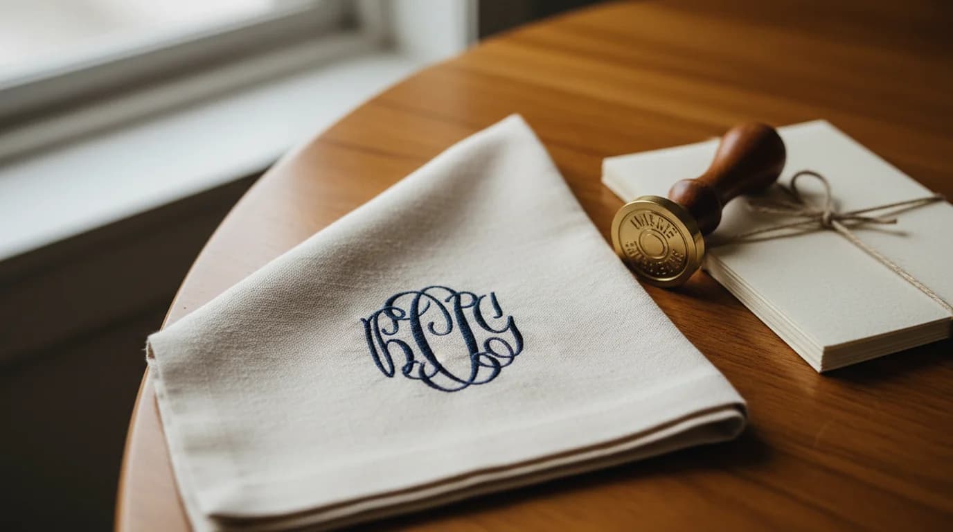
Monograms turn up on wedding invitations, hotel linens, engraved silver, luggage tags, notecards, and the side of a handbag — and on a first look at a classic one, something seems wrong. Three letters, and they do not spell the name. The middle one is bigger than the other two and belongs to the surname, which most people expect to come last. That arrangement is deliberate, it is centuries old, and it is the single thing most worth understanding before making one.
Quick answer. A monogram is a single mark made from a person's or brand's initials, drawn so the letters form one unit rather than sitting side by side as separate characters. In the classic three-letter arrangement the surname initial goes in the centre and is drawn larger than the other two, with the first name initial to its left and the middle name initial to its right.
What Makes a Monogram a Monogram
The distinction that matters is not how many letters there are — it is whether they behave as one thing.
Set J, R, and W in a row and you have initials: three characters that happen to be adjacent. Draw them so the stems overlap, the strokes interlace, or a single flourish carries through all three, and you have a monogram. The letters stop being readable individually and start being a shape. That is why a monogram survives at sizes where three separate letters would fall apart, and why it can be embossed, engraved, or stitched as a unit.
The classic monogram is also cipher-adjacent without being a cipher. A cipher is the arrangement where two or more letters are simply overlapped or intertwined at the same size, with no letter given prominence. A monogram in the traditional sense makes one letter dominant.
Both belong to the same family as a lettermark — a logo built from initials, like IBM or HBO — and the difference is treatment rather than category. A lettermark is usually typeset. A monogram is drawn as an arrangement. If you are deciding between them for a business rather than for a napkin, the fuller map of logo types is the better place to start.
Which Initial Goes in the Middle
Here is the rule that answers the question almost everyone actually arrives with.
Leontine Linens, which has produced custom monogrammed linens for decades, states the convention plainly: the most classic monogram style features three letters "with the surname initial centered and enlarged." The order is therefore first name, surname, middle name.
So Emily Rose Parker is E P R. Not E R P. The P is both centred and drawn larger, and the E and R are matched in size to each other.
The logic is that a monogram marks belonging. The family name is the thing being asserted, so it gets the dominant position, and the two given names flank it as supporting letters. Reading order never entered into it, because a monogram is not meant to be read left to right — it is meant to be recognised as a whole, the way a crest is.
One qualification keeps this from being a trap. When all three letters are set at the same size, usually in a squared-off block style, the arrangement conventionally reverts to plain name order: first, middle, last. The sizing is the signal. An oversized centre letter means the surname is in the middle; three equal letters mean the letters read as a name.
That single detail resolves the "these look out of order" reaction, and it is the thing to settle before drawing anything, because it changes which letter needs the most room.
Two Letters, and When There Is No Middle Name
Not everyone has three initials to work with, and the rules are simpler here.
Two initials of equal size placed side by side is a standard and entirely correct monogram — typically a first and last name initial. The same pair can also be drawn as a cipher, with the two letters overlapped and intertwined one atop the other. Ciphers read as more decorative and less formal-heraldic than an enlarged-centre monogram, which is why they suit jewellery, seals, and brand marks better than they suit bed linen.
For a person with no middle name, use the two-letter form rather than padding the arrangement. For a hyphenated surname, the usual approach is to treat the hyphenated name as one surname and use the first letter of the first part, because a four-letter monogram starts to lose the compactness that makes the format work.
Married and Couple Monograms
Weddings are where monogram questions get asked most, and where two conventions coexist without one being wrong.
The traditional couple arrangement is the wife's first name initial, the married surname in the centre, and the wife's maiden name initial — a monogram of one person, carrying her name history. The modern arrangement keeps the married surname in the centre and replaces the third letter with the husband's first name initial, so the mark represents the couple rather than one spouse.
Couples who kept separate surnames generally use a two-letter cipher of the two surname initials, at equal size, since neither name can occupy the dominant centre position without making a claim the couple did not make.
For wedding invitations specifically, the practical constraint is that the monogram usually appears at two very different sizes — large on a cover or seal, small on a place card — so whichever arrangement you choose has to survive both.
What the Letters Have to Survive
A monogram is almost never used only on a screen, and that is what separates it from most logo work.
Embroidery reduces a design to thread paths, so hairline strokes and tight interlocks either fill in or break. Engraving and wax seals remove colour entirely, leaving only the outline. Vinyl cutting machines like Cricut and Silhouette need closed, non-overlapping paths, so a monogram whose letters cross each other has to be drawn as a single merged shape rather than as three letters stacked in layers.
That is the practical reason monograms are drawn heavier than the typefaces they resemble. A thin script monogram that looks elegant at 2,000 pixels becomes a smudge at 12 millimetres of thread.
Two export formats cover the real uses. SVG for anything that cuts, engraves, or scales — a cutting machine reads paths, not pixels, so a vector file is the only one that will not jag at a new size. Transparent PNG for print and digital placement, where the mark has to sit on paper stock or a coloured background without a white box around it.
A free monogram maker handles that last part directly: two or three initials in, a frame tried before you commit to it, and an SVG that cuts clean or a transparent PNG for print. The arrangement decision — which letter is centred, and at what size — is still yours to make, and it is the one this article exists to settle.
If the name is short enough to spell out in full, a wordmark logo maker is often the better tool, because a readable name outperforms initials for anyone who does not already know the brand.
Deep Dive: 7 Types of Logos, and the Versions Each One Needs
Deep Dive: What Logo Size Do You Actually Need?

Aiko Tanaka
I work with boutique brands, cafes, creators and small businesses on visual systems, layout discipline, typography and moodboards. My focus is on fast concept exploration that still has a strong design point of view.
Frequently asked questions
For Emily Rose Parker, the classic three-letter monogram is E P R — first initial, surname initial enlarged in the centre, middle initial last. The Chanel double-C and the Louis Vuitton LV are monograms too: initials drawn as one interlocking unit rather than set side by side. The common thread is that the letters form a single mark, not a row of characters.