How to Make a Collage for Social Media in 2026
I work with lifestyle and wellness brands who post four to seven times a week across Instagram, TikTok, LinkedIn, and email — and the single biggest production bottleneck is never the photo. It is the collage. The cropping, the cutouts, the layout, the resize for every platform, the brand-kit pass to make it all match. For years that meant three tools open at once: a generator, a background remover, and Canva for the layout. With Playyy's new AI Image Editor, the whole sequence collapses into one editable canvas. This is the playbook I now use with every client.
To make a collage for social media: pick a primary platform and canvas size (1080x1350 for Instagram feed), generate or upload three to six on-brand photos, remove backgrounds on any subject-led tiles, drop the images onto a grid with consistent gutters, apply one color palette and one image treatment across every tile, then resize and reflow the same layers for Stories (9:16), LinkedIn (1200x627), and email (600px wide). One source, four exports, one brand.
Why Collages Still Outperform Single-Image Posts
Single-image posts have their place, but collages do something single images cannot — they tell a sequence. A three-tile collage of a morning skincare routine reads as a story. The same three photos posted individually reads as three disconnected moments. For lifestyle, wellness, and education brands, the sequence is the message.
Citation Capsule: A 2024 Later analysis of more than 1.2 million Instagram posts found that carousels generated the highest median engagement rate at 1.26%, compared with 0.70% for single images and 1.08% for Reels. Collage covers on carousels gave brands a second compounding gain — a stronger opening tile led to higher swipe-through. (Later, 2024)
For my client work, the question is rarely "image or collage?" It is "which format does this content deserve?" Product launches, before-and-after transformations, recipe step-throughs, and curriculum overviews all live in collages. Single moods, single quotes, and single hero shots stay as single images.
What Made Collages Painful Before the AI Image Editor
Until this year, building a social-media collage meant tab-juggling four tools:
- A text-to-image generator for the missing photo
- A background remover for the subject cutouts
- Canva or Figma for the layout grid
- A separate magic-resize step for every platform
Every tool boundary cost two to five minutes — uploading, downloading, re-uploading, re-aligning. A four-tile collage for three platforms easily ran forty-five minutes from start to export. Worse, every export-import cycle lost a little quality, and small alignment drift compounded into visible inconsistency across the final assets.
The New AI Image Editor Closes the Loop
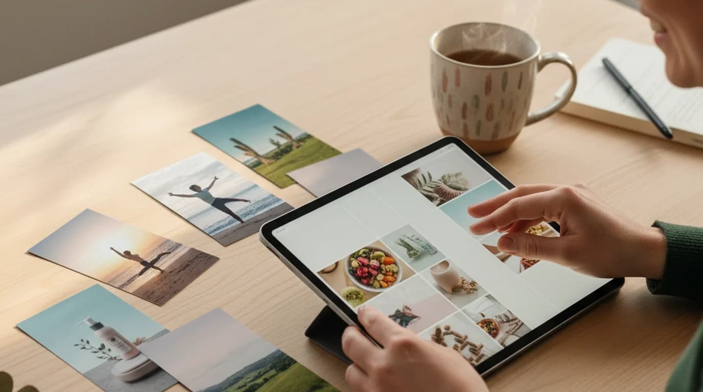
Playyy's AI Image Editor is the upgrade that finally puts every step on one canvas. It takes every generated image straight onto a fully editable surface — recolor, swap, move, replace, outpaint with image expand, inpaint with inpaint replace, split layers, restyle, and edit text. The four-tool sequence above now happens inside a single workspace.
For me, the practical shift is this: I generate three new tiles with the AI Image Generator, drop them onto the canvas alongside two client-provided source photos, cut out the subjects with the Background Remover, arrange the grid, and resize for four platforms — without ever exporting between tools. The same campaign that used to take forty-five minutes now takes twelve to fifteen.
Deep Dive: Canva Alternatives: AI-Native Tools for 2026 Visual Production
Build collages for every platform in one canvas
Generate, cut out, arrange, and resize for Instagram, TikTok, and LinkedIn without bouncing between Canva tabs.
Open the AI Image EditorHow to Make a Social Media Collage: 5-Step Playbook
This is the exact sequence I run for client carousel covers and product-launch grids. Total time on Playyy's canvas: about twelve to fifteen minutes for a four-tile collage adapted to four platforms.
Step 1. Set the primary canvas
Decide which platform is the priority. For lifestyle and wellness clients, that is almost always Instagram feed at 1080x1350 (4:5 portrait). For B2B and education clients, it is LinkedIn at 1200x627. Build the collage on the priority canvas first — the others get reflowed from this master.
Step 2. Source the tiles
I aim for three to six tiles per collage. The mix is usually two to four client-provided photos plus one to two AI-generated images filling gaps the client did not shoot. I use the AI Image Generator with a brand-style prompt (color palette, lighting direction, subject) to keep generated tiles visually consistent with the photographed ones.
Step 3. Cut out and clean
Every tile that features a subject (product, person, hero object) runs through the background remover. Tiles that are environmental — flatlay, texture, landscape — stay full-frame. Cutouts let me place subjects against a unified collage background, which is what gives the final grid its visual cohesion.
Step 4. Arrange the grid
Three reliable grids cover 80% of social use cases: the two-by-two square grid for product ranges, the three-row horizontal stack for step-by-step sequences, and the asymmetric "hero plus thumbnails" layout for launch announcements. Lock gutters at eight to sixteen pixels (twelve is my default). Align tiles to a grid — no freehand placement — and the collage will read as designed rather than improvised.
Step 5. Apply brand pass and resize
This is where the new canvas earns its keep. With every layer still editable, I apply the brand-kit color palette to backgrounds and text, restyle all source images to one treatment, then resize the canvas for each platform — Stories at 1080x1920, LinkedIn at 1200x627, email banner at 600 pixels wide — and reflow the same layers into each new aspect ratio. No re-export, no quality loss, no alignment drift.
Adapting One Collage for Every Platform
The most expensive mistake I made in my first year as a social media manager was building a separate collage from scratch for each platform. The fix is to design once on the largest canvas, then reflow the same layers.
Here are the six formats I deliver for every campaign and how the layout adapts:
- Instagram feed (1080x1350, 4:5 portrait). The master canvas. Four to six tiles. This is where the collage carries the most visual information and where the strongest engagement returns live.
- Instagram feed square (1080x1080). A center crop of the master. Trim the top and bottom tiles, keep the middle two intact. Works for grid feeds where every post needs the same aspect.
- Stories and Reels cover (1080x1920, 9:16). Vertical reflow. Stack two to three of the strongest tiles top-to-bottom, leave 250 pixels of safe area at the top and bottom for UI overlays.
- LinkedIn link preview (1200x627). Horizontal reflow. Two to three tiles arranged left-to-right with text overlay space on the right third.
- TikTok cover (1080x1920, 9:16). Same vertical canvas as Stories, but plan for the TikTok username and caption strip in the bottom 350 pixels — keep critical visuals above that band.
- Email banner (600 pixels wide). Horizontal strip, usually two tiles plus a headline area. Email clients downsample aggressively, so up your contrast and pull text size 20% larger than you would for social.
Deep Dive: Social Media Image Sizes for 2026: The Complete Reference
When I work with lifestyle and wellness brands who post the same campaign across all six surfaces, the time savings from reflowing one master collage instead of building six separates is the difference between a two-hour and a twenty-minute deliverable.
Brand Consistency: The Three Locks
A collage falls apart visually the moment one tile reads as off-brand. Three locks keep the grid coherent:
Color lock. Three to five hex codes from the brand kit, applied to every background, every text element, and every overlay. No off-palette colors anywhere in the collage. For lifestyle and wellness brands, I usually work with one warm neutral, one accent, and one deep contrast color — three is enough.
Typography lock. One display font for headers, one body font for supporting copy. That is the entire type system for the collage. Adding a third font is the single fastest way to make a collage look amateurish. If the brand kit specifies more, use only two per collage and rotate across the carousel.
Image treatment lock. This is the one most teams skip and where the biggest gains live. Every source image — generated or photographed — gets the same warmth, contrast, and saturation. The AI Image Editor's restyle feature applies the same treatment across multiple tiles in one pass. A collage with five tiles that share an image treatment reads as one campaign; the same five tiles with mixed treatments reads as a Pinterest board.
Citation Capsule: A 2023 Sprout Social Index reported that 68% of consumers say a consistent brand presentation across social channels increased their revenue by 10% or more — and 74% of users now expect that consistency across every touchpoint. Image-treatment consistency across a collage is a measurable trust signal, not a design preference. (Sprout Social, 2023)
Deep Dive: Social Media Branding: The Visual System That Holds Across Platforms
Common Collage Mistakes I Still See
After three years of building collages for clients across about forty brands, these are the four mistakes that come up most often:
Inconsistent gutters. Twelve pixels between two tiles and four between the next two reads as sloppy. Lock gutters at one value across the collage. Use the canvas snapping guides — do not eyeball it.
Subject crowding at the edges. Faces, products, and headlines too close to the canvas edge get cropped on small screens or under platform UI overlays. Keep the most important content within an 80% safe area, especially for Stories and TikTok formats.
Mixed cutout quality. Three clean AI cutouts plus one sloppy manual cutout makes the whole collage look like the sloppy one. Use the same background remover across every subject tile, and zoom to 200% to check edges before final placement.
Too many photos. Above nine tiles, individual images become unreadable on a phone screen. If the campaign needs more than nine images, split into a carousel of multiple collages — three slides of three-tile grids beats one slide of nine-tile soup.
A Word on AI-Generated Tiles
About 30 to 40% of the tiles in my client collages are now AI-generated. The use cases that consistently work: filling gaps in a photo shoot the brand could not afford to extend, generating lifestyle context shots that match a flatlay product photo, and producing seasonal variations (autumn palette, winter palette) of an existing photo set without a re-shoot.
The tiles that still belong to real photography: the brand's hero products, founder portraits, and any image where authenticity is the message. I work with lifestyle and wellness brands who care deeply about not deceiving their audience — AI-generated tiles get used for context and atmosphere, not for the hero product itself.
Deep Dive: AI Photoshoots for Creators: Studio-Quality Photos Without a Photographer
The Workflow in Practice
For a recent product-launch campaign with a wellness brand, this was the actual deliverable:
- One master collage built on the 1080x1350 Instagram canvas — four tiles (two product photos, one AI-generated lifestyle context shot, one ingredient flatlay).
- Six platform exports: feed 4:5, feed square, Stories 9:16, LinkedIn 1200x627, TikTok cover 9:16, email banner 600px.
- Total production time end-to-end: 18 minutes on the editable canvas.
The equivalent in my old workflow (Midjourney plus Remove.bg plus Canva plus six manual resizes) was about 95 minutes. The savings compound across a week of posts — what used to be a four-hour Monday morning is now under forty-five minutes.
For the Background Remover deep dive on getting clean cutouts before placement, see our guide to AI background removal.
Summary
A social-media collage that works across Instagram, TikTok, LinkedIn, and email is no longer four tools, five exports, and an hour of alignment drift. With one editable AI canvas, the entire sequence — generate, cut out, arrange, brand-lock, resize — happens in a single workspace, with every layer still editable to the end.
If you build social content for more than one platform a week, the collage workflow on a unified canvas is the single highest-impact upgrade you can make to your production process this year.
Start building collages on Playyy's AI Image Editor — generate the missing tiles, cut out the subjects, arrange the grid, and reflow for every platform in one canvas.

Sophie Whitmore
I help lifestyle, wellness and education brands keep visual content consistent across Instagram, TikTok, LinkedIn and email campaigns. I specialise in content calendar planning and multi-platform visual production for small teams.
Frequently asked questions
Start with three to six on-brand source photos at the highest resolution you have. Drop them onto a 1080x1350 canvas (the 4:5 portrait size that fills the most feed real estate), align them on a two-column or three-row grid, and keep gutters at eight to sixteen pixels for a clean modern look. I work with lifestyle and wellness brands who repurpose the same six images into a four-pane grid, a Reel cover, and a Story panel — one collage source, three Instagram surfaces. Cut out distracting backgrounds with an AI background remover before placement so each tile reads cleanly.


