
Turn Low-Quality Images Into Marketing Assets
From watermarked or blurry source image to clean, channel-ready marketing visual — no Photoshop required.
Explore workflowRescue a dark photo or tone down a blown-out one — brightness, contrast, highlights, shadows, and saturation in one panel
A workflow built around your real creative needs — from first direction to final asset.
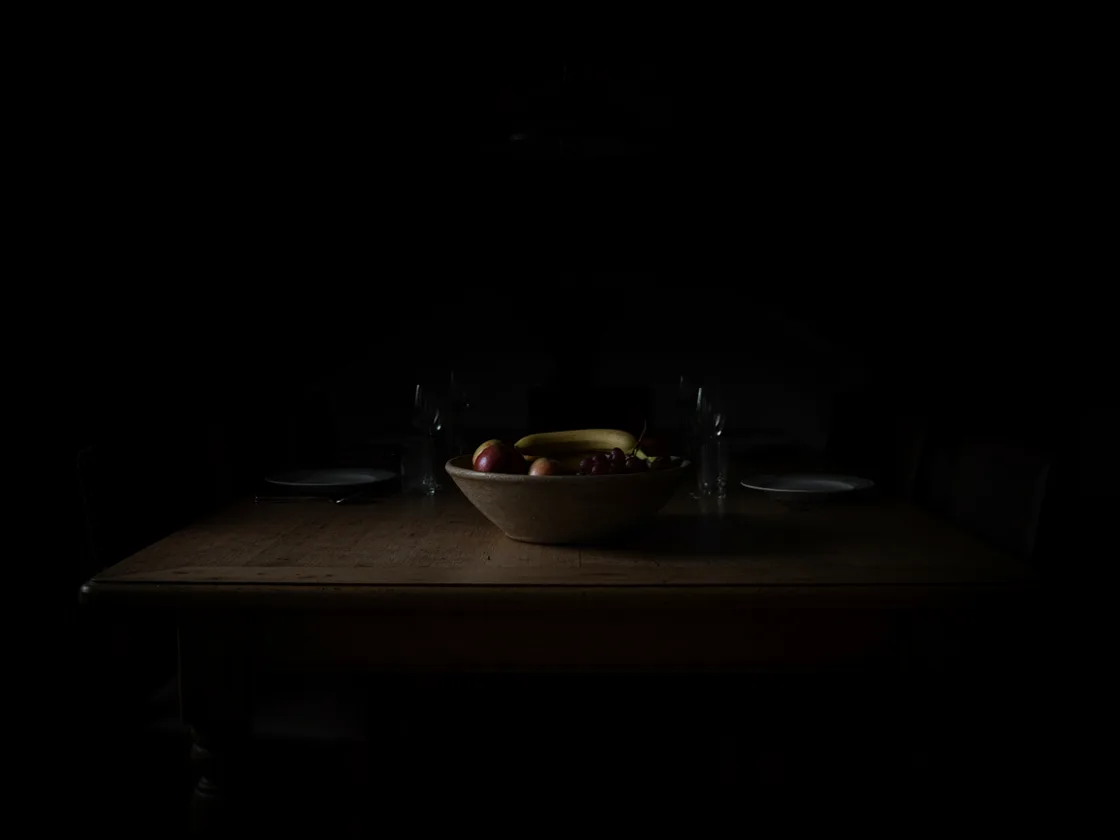
An underexposed shot has detail hiding in the shadows rather than missing from them. Lifting brightness and the shadows slider together recovers it — the wood grain on a dark table, the label on a product shot taken in a dim room. Push too far and you surface noise along with the detail, so the preview updates live to show you where that line is.
Try for free
Too bright is the harder direction. Where highlights are genuinely blown to pure white there's nothing left to recover, but most overexposed photos are merely close to it — pulling the highlights and whites sliders back returns the texture on a white surface or a pale garment. Recovering the highlights first, then adding contrast, tends to work better than reaching straight for the brightness slider.
Try for free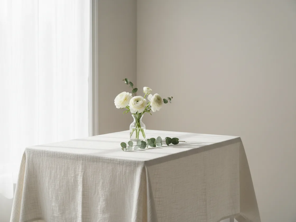
Brightness and contrast are the blunt instruments; highlights, shadows, whites, and blacks let you move one end of the tonal range without dragging the other with it. Color correction sits in the same panel — temperature and tint fix a color cast from indoor lighting, and vibrance and saturation set how intense what's left reads. Having all eleven together with a live preview means balancing them against each other instead of applying one, exporting, and finding it needed another.
Try for freeLift the midtones and open up the shadows independently, so you can rescue dark areas without flattening the parts of the photo that were already correct.
Recover a blown-out highlight or set the black point without touching the midtones — the controls that separate a real correction from a brightness slider.
Widen or narrow the gap between the light and dark parts of the frame. A brightened photo often looks flat until contrast is brought back.
Every change previews on the full image as you drag, so you can see the point where lifting shadows starts surfacing noise instead of detail.
Adjustments stack as settings rather than being baked in one at a time. Dial any of them back at any point without starting over from the original file.
Neutralize the orange cast of indoor lighting or the green of fluorescents, then use vibrance and saturation to set how intense the remaining color is.
Tools that offer a single brightness slider make dark photos grey rather than bright, because lifting every tone equally raises the black point along with everything else. Having shadows, blacks, highlights, and whites as their own controls is what gets you a photo that looks properly lit instead of washed out — you lift the dark end and leave the black point where it was.
Brightness is a correction and a filter is a style, and the order matters. Grading an underexposed photo bakes the underexposure into the result, which is why a vintage filter over a dark shot comes out muddy. Fixing the lighting first and grading second is the sequence that works, and both panels live in the same editor so there's no export in between.
Upload the photo and try the lighting controls before signing in. Download requires an account and exports a PNG without a watermark, with the longest edge capped at 4,000 pixels.
From watermarked or blurry source image to clean, channel-ready marketing visual — no Photoshop required.
Explore workflow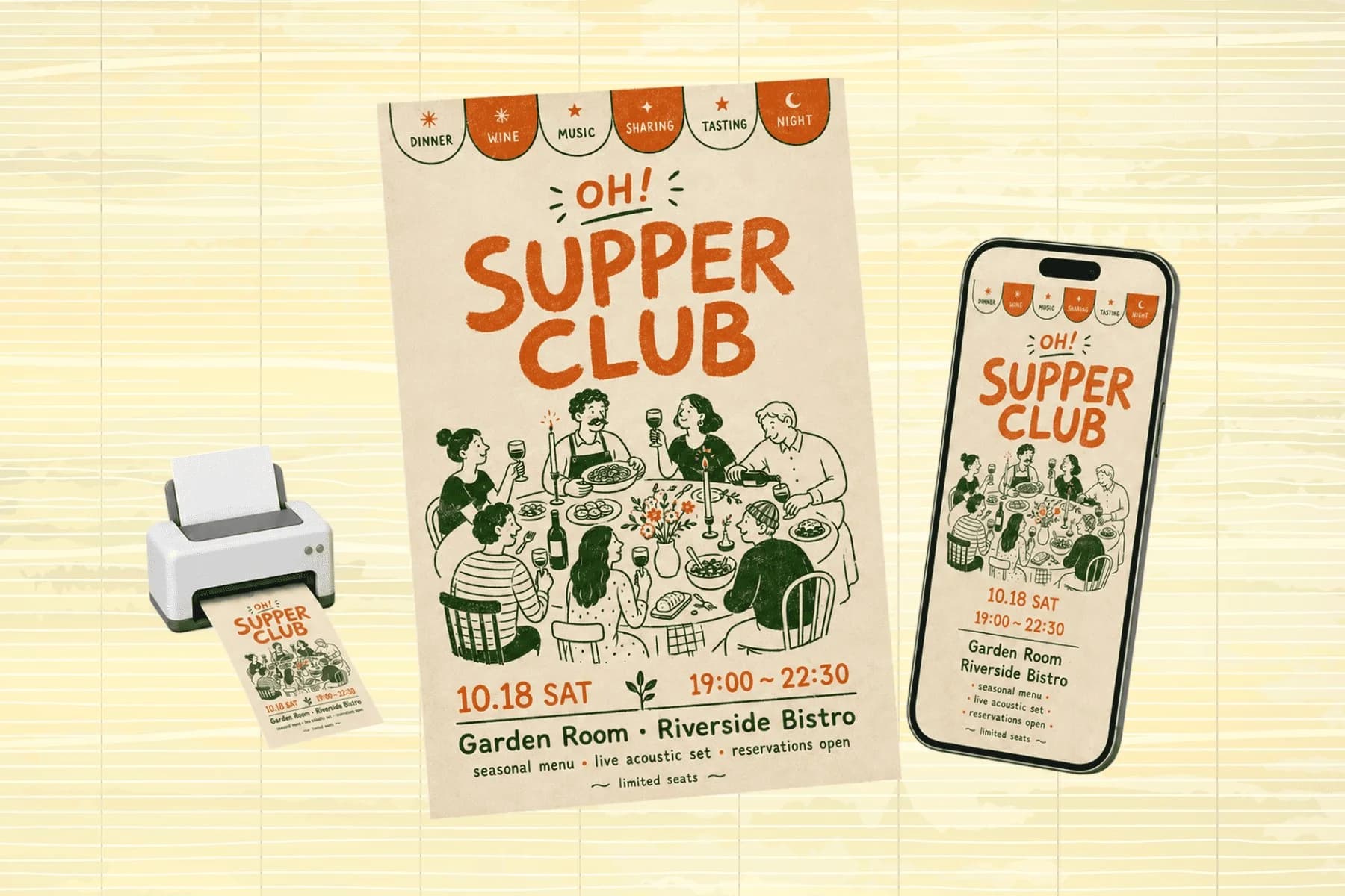
One hero visual, every platform format — YouTube, LinkedIn, Instagram — without manual resizing.
Explore workflowUpload the image and drag the brightness control while watching the live preview. For a photo that's globally too dark, lift brightness, then open the shadows, then pull the blacks back down to restore contrast — using the three together beats pushing brightness alone.
Raising brightness alone lifts the blacks as well as the midtones, which is what causes the washed-out grey look. Lift brightness and shadows, then bring the blacks slider back down to restore the black point. That keeps the photo bright and still punchy.
Partly. Where highlights are blown to pure white, no information remains and nothing can be recovered there. If they are merely close to white — a bright garment, a white surface — pulling the highlights and whites sliders down usually brings the texture back.
Brightness moves the whole image, midtones included. Highlights only affects the brightest part of the tonal range. Use highlights to recover a blown-out sky or a white surface without making the rest of the photo darker.
Lifting shadows can make existing noise more visible. Adjusted images download as PNG with a longest edge of up to 4,000 pixels, so larger originals are reduced on export.
Before. A filter is a stylistic layer over whatever it is given, so grading an underexposed photo locks the underexposure in. Correct the lighting first, then apply the filter.
Yes. Temperature shifts the image along the warm-to-cool axis and tint along green-to-magenta, which between them neutralize most indoor and fluorescent casts. Both sit in the same panel as the brightness controls.
Yes. Vibrance and saturation both sit in the same panel as the brightness controls. Saturation moves every color equally; vibrance lifts the muted colors while leaving the already-intense ones alone, which is usually the safer of the two on anything with skin tones in it.
See how teams are using Playyy to ship better visuals, faster.

200 blurry and watermarked legacy images, two days, one campaign deadline — how Elena Torres recovered her entire visual archive with AI.
 James Walker
Six retainer clients, one tab. How one brand consultant uses Playyy's AI Image Editor to remove people from photos and ship launch visuals.
 Daniel Brooks
New menu, no design budget, three formats — complete in one afternoon with an AI image creator.
 Luca Moretti
Keep every image on brand, control the final look, and turn campaign ideas into polished assets without waiting on another design cycle.














