25 Poster Ideas Sorted by What the Poster Is For
 Luca Moretti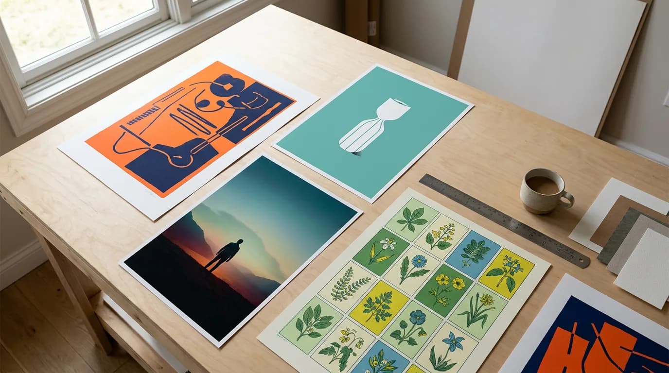
The best poster ideas start with a question most idea galleries skip: what does this poster have to do, and where will it hang? A gig poster taped to a café window, a launch poster in a shop, a conference poster in a crowded hall and a print above the sofa each get a few seconds of attention under very different conditions. So instead of a mood board of pretty layouts, the 25 poster ideas below are grouped by purpose, and each one comes with the design move that makes it work at real size.
Direct answer. Good poster ideas come from the poster's job. Event posters need the date readable from across the street; product posters need one hero object; movie-style posters need a title treatment and a single dramatic image; research posters need the result to dominate; home posters need a concept that still holds up after a month on the wall.
Event Poster Ideas That Get People to Show Up
Event posters compete with everything else on a noticeboard, so the date and place matter as much as the artwork. A useful rule from years of making posters for venues and schools: if the day and time can't be read from two steps back, the poster has failed regardless of how good it looks.
1. The giant date
Set the date as the biggest element on the page, larger than the event name. Works well for recurring nights ("Every Thursday") where regulars only need the reminder.
2. One object, cropped off the edge
A trumpet bell, a tennis ball, a slice of cake, printed huge and bleeding off the page. Cropping makes the poster feel bigger than its frame and stops people mid-stride.
3. The illustrated map
For markets, fun runs and open studio days, draw the route or the stall layout as the artwork. The poster becomes useful information, which is why people photograph it.
4. Two-color screenprint look
Limit the palette to two inks, such as orange and navy, with halftone texture. It reads as a gig or festival poster immediately and stays legible on cheap paper.
5. Lineup as typography
For concerts and talks, stack the names in descending sizes, headliner first. The type is the design, and nobody has to hunt for who is on the bill.

Event posters often travel with a smaller handout. If you need the version people take home, the steps in how to make a flyer cover the extra details a flyer can carry.
Product Launch and Sale Poster Ideas
A product poster sells one thing. The common mistake is listing every feature; the poster then reads like a spec sheet from across the store.
6. Hero product on a flat color field
Place the product dead center on a single saturated background pulled from its packaging. Minimal, expensive-looking, and it photographs well for social.
7. The oversized number
"40% off" or "New: 3 flavors" set enormous, with the product small beneath it. Sale posters live or die on that number being readable through a window.
8. Before and after split
Divide the page vertically: the problem on the left, the result on the right. Good for services, cleaning products and anything with a visible outcome.
9. Ingredient explosion
Show the product with its ingredients or components flying out around it. Food, cosmetics and tech hardware all suit this layout.
10. Countdown series
Print three posters for the same launch: "3 days", "2 days", "Tomorrow". Swap them in the same frame so regulars notice the change.
In Playyy's AI poster generator, the launch poster and its sale variant can come from the same design: choose Editable design, and the headline, price and date stay as separate text layers above the artwork, so changing "Coming soon" to "Out now" is a text edit rather than a new poster. With a brand kit set, the logo, colors and fonts are applied from the first draft.
Movie Poster Ideas (and Movie-Style Posters for Anything)
Movie poster ideas are useful well beyond film. A school play, a podcast season or a company offsite all get more attention dressed as a one-sheet.
11. The lone figure against something huge
A small silhouette in front of a planet, a wave or a city. Scale contrast creates drama with one image and leaves room for the title.
12. Floating heads
The ensemble-cast layout: faces stacked above a small scene. Familiar enough to read as a movie instantly, which makes it a good parody format for team events.
13. Title as the image
The title letters hold the scene inside them, or are cut from the key image. Works when the title is short.
14. Minimal symbol poster
One object that stands for the whole story, such as a key, a red balloon or a broken watch, on a plain background. The thriller and indie favorite.
15. Retro painted one-sheet
Seventies or eighties painted style with a credits block at the bottom. Ideal for themed parties and movie nights.
A real theatrical one-sheet is 27 x 40 inches, and the movie poster size page has the pixel dimensions for print. Movie-style posters lean heavily on title treatment, which is where text effects such as outline, neon and glitch earn their place. Use your own original title, characters and scene for the artwork rather than imitating an existing film's key art.

Research and Academic Poster Ideas
Research posters are read up close by people standing in an aisle, often while the author waits nearby. The design goal is the opposite of a gig poster: inviting someone to stop for three minutes rather than three seconds.
16. Result-first layout
Put the main finding as a sentence in the largest type below the title, and the figure that proves it in the center. Methods shrink to a side column.
17. The single big chart
One chart takes up a third of the poster with plain-language labels. Viewers understand the work from the chart before they read anything.
18. QR code to the full paper
A QR code in the corner links to the paper, the dataset or a short video walkthrough, which lets the poster stay short.
19. Visual abstract strip
Three or four icons across the top showing the study in sequence: problem, method, result, implication.
20. Color-coded sections
Give background, methods, results and conclusions their own tint so the reading order is obvious from a distance.
Type size is where academic posters usually go wrong. Macalester College's research poster guide recommends titles of 110-160pt and paragraph text of 32-36pt, noting that people will likely read a poster from five feet away or more. Text set at a document's usual 11pt size is unreadable at that distance, which is why most dense conference posters end up skimmed instead of read. The common conference format is 36 x 48 inches, covered on the research poster size page.
Motivational and Home Poster Ideas
Posters for a home, a classroom or an office have a different test: they need to stay interesting after the hundredth look.
21. One-line quote in big type
A short line, five or six words, set large on a plain background. Longer quotes turn into wallpaper.
22. Personal map poster
The neighborhood, a favorite trail or the city where two people met, drawn in a minimal line style.
23. Botanical or specimen grid
Nine illustrations in a neat grid: leaves, shells, mushrooms or coffee beans. Calm, decorative and suited to kitchens and studies.
24. Classroom rules as icons
For schools, pair each rule with a simple icon so younger kids can read the poster before they read words.
25. Travel poster for a place you love
The vintage railway-poster style applied to your own town, a lake or a holiday spot, with flat colors and a bold place name.
For framed home prints, size matters as much as the idea. The standard poster sizes guide explains which frames each size fits.
What Makes Any of These Poster Ideas Work
Across all five groups, the same three decisions separate posters that get read from posters that get ignored.
First, size comes before design. A layout composed for 11 x 17 rarely scales up cleanly to 24 x 36, because the ratio of headline to empty space changes as the viewer steps back. In Playyy, picking the size first means the AI composes for that shape: an 18 x 24 launch poster and a 36 x 48 research poster come out with different hierarchies from the same kind of prompt.
Second, one focal point. Every idea above has a single element that wins the page, whether a date, an object, a figure or a chart. Two competing focal points is the most common reason a poster looks busy.
Third, editable text. Dates move, venues change and typos happen. Keeping the type separate from the artwork means a correction takes seconds instead of a redesign, which matters most for event and sale posters that get reprinted. If you already have a poster whose layout you like, design remake rebuilds that layout around your own image and copy.
Pick the Purpose, Then the Idea
Start with what the poster has to do and where it hangs, choose one idea from that group, and commit to a single focal point at the right size. When you're ready to build one, the Playyy AI poster generator covers sizes from 11x17 to 36x48, keeps every line of text editable, and exports a print PDF with crop marks and bleed.
Keep Reading
- How to Make a Flyer in 7 Steps — the handout companion to an event poster, from size to print.
- Event Poster and Flyer Design — how venues and organizers produce matching posters and flyers for one event.
- Standard Poster Sizes for Print and Events — which poster size fits which wall, frame and viewing distance.
- 20 Business Card Ideas and Examples — small-format print ideas for the same brand that made the poster.

Luca Moretti
I help restaurants, venues, schools, workshops and small service businesses create posters, menus, invitations, event flyers and social promotions. I write for non-designers who need practical, good-looking visuals for real-world promotions.
Frequently asked questions
A good poster does one job and can be read from where people actually stand. That means one dominant image or shape, a headline short enough to take in at a glance, and supporting details placed where the eye lands last. If a passer-by can name the event, product or message after three seconds, the poster is doing its work.