Tattoo Styles Explained, and How Each One Ages
 Claire Dubois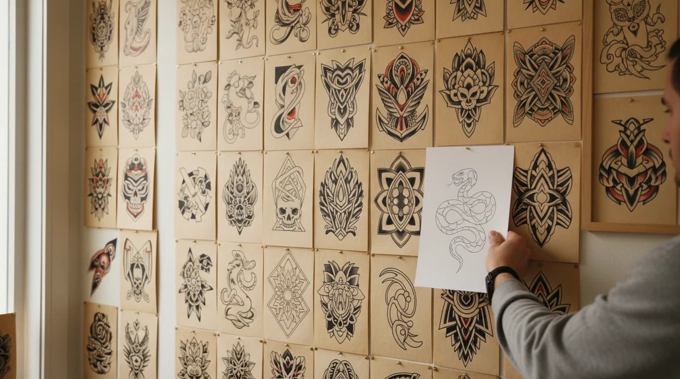
Style is the first thing a tattoo artist asks about and the hardest thing to name if you have only ever browsed. The words get used loosely — fine line and minimalist describe different things, blackwork and traditional overlap in places, and half the terms in circulation are techniques rather than styles. Underneath the vocabulary, the styles separate along three technical choices: how thick the lines are, how much solid ink fills the shapes, and how much contrast the design holds. Those same three choices decide what the tattoo will look like in twenty years, which makes ageing the most practical way to tell the styles apart.
Quick answer. Tattoo styles are defined by line weight, ink density and contrast rather than by subject matter. Bold-outline styles such as American traditional and blackwork hold their shape longest because heavy lines and flat saturated fills survive decades of pigment spread. Fine line, single-needle and soft-shaded realism show change earliest, because a hairline stroke has the least ink to lose before it thins.
The Main Tattoo Styles
American Traditional
Heavy black outlines of uniform weight, a narrow palette of flat colours — red, yellow, green, black — minimal shading, and a fixed vocabulary of subjects: swallows, roses, daggers, anchors, panthers. It is the oldest continuously practised Western style and the one most tattooers train on first.
Everything about it was designed around the medium's limits, which is why it remains the benchmark for durability. Bold lines keep their identity as they spread; flat colour has nothing subtle to lose.
Neo Traditional
The traditional framework redrawn with more range. The bold outline stays, but line weight varies within a single piece, the palette opens up to full colour blending, and shading becomes dimensional rather than flat. Subjects turn illustrative — portraits of animals, ornate florals, art nouveau framing.
It keeps most of traditional's durability because the outline is still doing structural work, while allowing detail that flat traditional cannot hold.
Fine Line
Thin, delicate linework, often done with a single needle or a very tight grouping, usually in black or grey and usually without a heavy outline. It suits botanicals, small script, delicate figures, and the discreet placements — inner arm, ribs, behind the ear — that have driven most of its growth.
It is the least forgiving style over time, and it is worth choosing with that in mind rather than being surprised by it later.
Blackwork
Solid black, no colour, with the design carried by the contrast between inked and bare skin. It covers a wide range: bold graphic shapes, ornamental patterning, tribal-influenced work, and dotwork, where tone is built from stippled dots rather than shading.
Large solid fills age about as well as anything can, because there is no fine internal detail to blur. The risk is at the edges — a shape with a complicated silhouette softens where a simple one does not.
Geometric
Precise shapes, repeated patterns, symmetry, mandalas, and linework built on measured construction rather than free drawing. Often overlaps with blackwork and dotwork.
Geometric work is the style most punished by imprecision, because the eye reads a broken symmetry instantly. It also has to be drawn for the body part it will sit on — a flat grid wrapped around a forearm stops being a grid.
Minimalist
Small, spare designs reduced to the fewest marks that still carry the idea: a single line figure, a small symbol, a short word. Minimalist overlaps heavily with fine line but is not the same thing — minimalism is about how much is drawn, fine line is about how thin the stroke is. A minimalist design can be executed in a bold line and gain years of legibility by it.
Script and Lettering
Words, names, dates and quotes, drawn rather than typeset. The style range runs from traditional bold script through calligraphic and gothic to fine-line handwriting.
Lettering is the most commonly regretted category, and the reasons are technical as often as sentimental: letterforms that were too thin, set too tight, or placed where the skin stretches. Initials drawn as a single interlocking mark rather than separate letters age better than a row of thin characters — the same reasoning behind how a monogram is constructed.
Botanical and Illustrative
Flowers, branches, insects, and drawn-from-life subjects rendered as an illustrator would. Floral work is the largest single subject category in contemporary tattooing and spans every style here — a rose can be traditional, neo traditional, fine line, or blackwork, and the style choice matters more than the subject.
Realism
Photographic rendering in black and grey or full colour, built from shading with soft outlines or none at all. Portraits, animals, landscapes.
Realism demands the most technical skill and carries the most risk over time, because the effect depends on smooth tonal transitions that pigment migration gradually flattens. Black-and-grey realism generally outlasts colour realism, and the sizing and placement decisions it depends on are covered in choosing tattoo placement and size.
Why Line Weight Decides How a Tattoo Ages
The reason bold styles last is not that their ink is different. It is where the ink lives.
Research published in the Journal of Experimental Medicine found that tattoo pigment in the dermis is held almost entirely inside macrophages — immune cells that engulf the particles after the needle creates the wound. Those cells do not live forever. When one dies it releases its pigment into the surrounding tissue, where nearby and newly arrived macrophages take it up again, in what the researchers describe as successive cycles of capture, release and recapture.
The study set out to explain why tattoos persist and why they resist laser removal, and it did not measure line spread. But the mechanism accounts for what tattooers have described for as long as there have been old tattoos to look at: pigment is handed between cells rather than fixed in place, and each handoff allows a little lateral drift. Over decades the edge of a line softens outward by a small amount.
That small amount is proportionally enormous for a hairline and trivial for a heavy outline. A stroke laid down at three millimetres that spreads to three and a half still reads as the same line. A stroke laid down at half a millimetre that spreads by the same absolute amount has doubled, and two such strokes drawn close together become one. This is also why designs with generous negative space outlive dense ones at identical line weights — the gaps have room to shrink.
None of which makes fine line a mistake. It makes it a style with a maintenance cost, and the sensible response is to design for it: more space between elements than looks necessary, placement away from the hands, feet and other high-friction areas, and an expectation of touch-ups.
Matching a Style to Size and Placement
Style, size and placement are one decision, not three, and getting them out of order is the most common way a good design becomes a disappointing tattoo.
Scale sets the floor on detail. A design with elements that must stay visually distinct needs enough physical room for each of them to be drawn at a weight that survives. Shrinking a neo traditional piece to the size of a coin does not produce a small neo traditional piece — it produces a dark blur, because the shading and line variation that define the style have nowhere to go.
Placement sets the ceiling on delicacy. Hands, fingers, feet and the outer forearm take the most friction and the most sun, and fine work in those spots changes fastest. Flat, low-movement areas — the outer upper arm, the back, the thigh — are the most forgiving and the reason large traditional and blackwork pieces live there.
And body geometry decides whether a flat drawing survives contact with a curved surface. Geometric and ornamental work in particular has to be drawn for the limb it wraps.
Turning a Style Into Something an Artist Can Work From
Most consultations start with a folder of screenshots, which is a weak brief. Reference images show a subject and a finished result, but they do not say which style choices you want carried over — and an artist looking at six saved photos in four different styles has to guess.
What works better is a single piece of line art that already commits: this subject, this style, at roughly this scale, for this placement. It does not have to be good drawing. It has to be unambiguous, so that the conversation is about improving one clear idea instead of reconstructing an idea from fragments.
A free AI tattoo generator covers that gap — describe the piece, name the style from fine line, traditional, geometric or lettering, and get clean line art back as a vector your artist can scale to any placement. The artist still draws the tattoo. What changes is that they start from a stated intent rather than a mood board.
Once a design exists, the remaining decisions — final size, exact placement, what to bring to the appointment — have their own set of rules.
Deep Dive: How to Choose Tattoo Placement and Size

Claire Dubois
I advise fashion, beauty, lifestyle and hospitality brands on campaign direction, brand storytelling and visual consistency. I care deeply about how brands use AI tools while preserving taste, restraint and a coherent art direction.
Frequently asked questions
The styles in widest use are American traditional, neo traditional, fine line, blackwork, geometric, minimalist, script and lettering, illustrative and botanical, realism, and Japanese irezumi. They differ by three technical choices — line weight, how much solid ink fills the shapes, and how much contrast the design carries — which is also what determines how each one holds up over time.