An Autumn Campaign Built on One Burgundy Colour Story
 Aiko Tanaka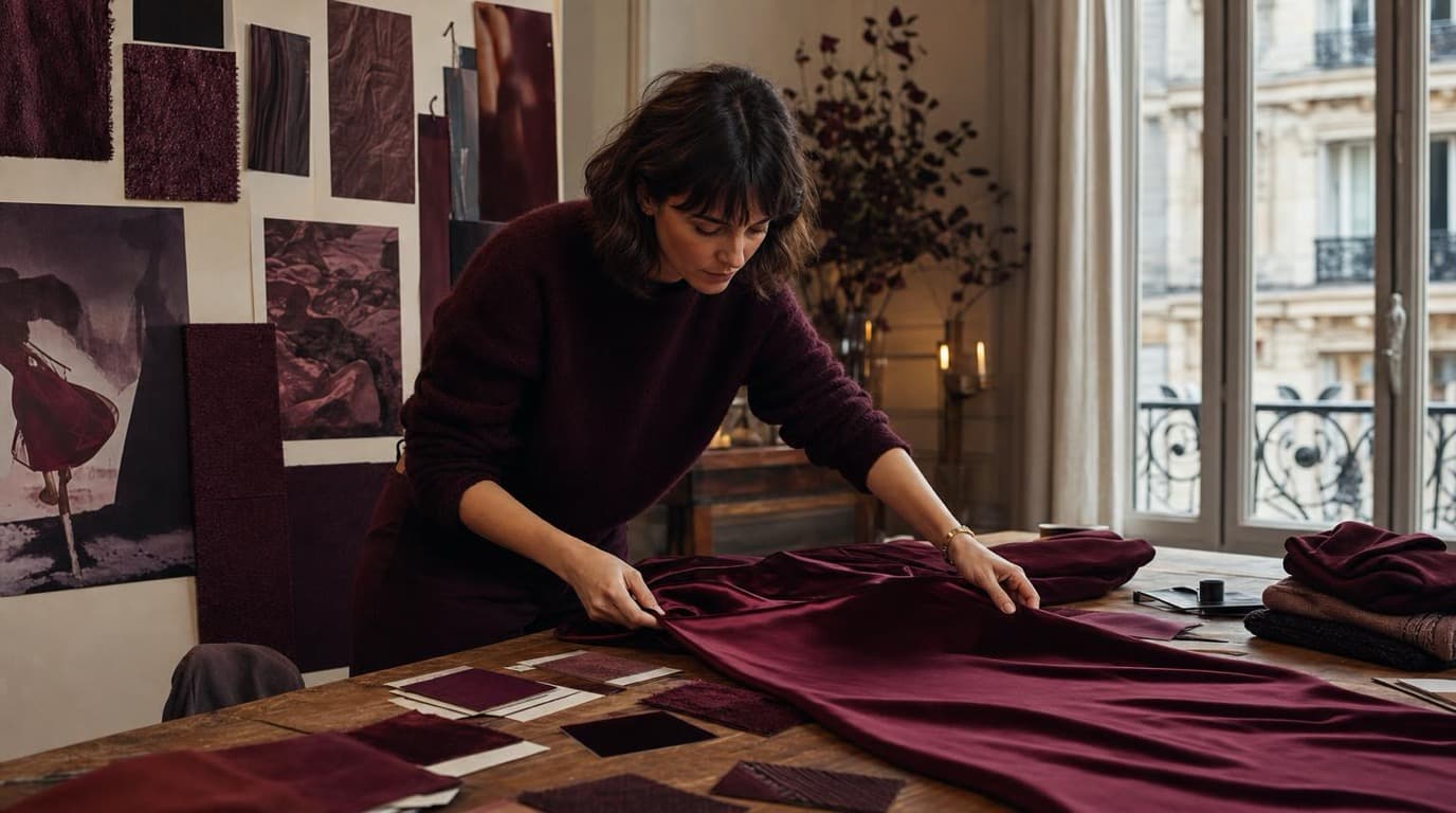
The quotes arrived on a Wednesday afternoon in late August. Camille Laurent had sent the brief to three photographers — a studio in the 10th, a freelancer who had shot the spring lookbook, and a production house that came recommended by a friend at a larger label. The brief was direct: thirty-plus images for the autumn campaign, all built around burgundy, the colour she had staked the season on. Product flat lays, lifestyle stills, fabric texture details. The quotes came back within 48 hours. The lowest was €6,800. The highest was €11,200.
Camille closed the emails and looked at the season's content plan pinned to the wall of her studio apartment in the 11th, where she has run the label since founding it in 2021. It's an Instagram-first women's clothing label — small production runs, carefully chosen fabrics, a customer base that found the brand through the grid and stays because of it. For a brand at that scale, €8,000 in photography is not an impossible number. It is simply a number that determines whether the autumn campaign happens at all.
She had six days before the campaign assets needed to be ready for scheduling.
The Colour That Had to Hold
Burgundy was not an aesthetic choice for that season so much as a structural one. The label's autumn collection was built around the colour — a deep wine that appeared in the main garments, the lining details, and the campaign's proposed visual palette. For the campaign to work, the colour had to hold across every surface it touched: the Instagram grid, which would carry it across nine posts in sequence; the Stories, where it would appear as texture and atmosphere; the email campaign, which would open the season; and the website lookbook, where customers would encounter it at larger scale.
The risk with AI generation, in Camille's read, was not whether images could be produced. It was whether thirty-four images could be produced that looked like they came from the same world — the same light, the same depth of colour, the same temperature in the shadows.
She built the workflow in two stages.
Generating the Base Library
The first stage was prompt-led generation through Playyy's AI Image Generator. Camille worked with three core prompt structures: a flat lay prompt for product imagery, a lifestyle prompt for atmospheric stills, and a texture prompt for close detail work.
The flat lay prompt that produced the most usable images was close to: product flat lay on burgundy silk, soft natural light, editorial mood, dupioni texture, no props, overhead angle. The lifestyle prompt leaned into atmosphere rather than product — draped burgundy wool, late afternoon window light, Parisian interior, no model, editorial stillness. The texture prompt was the most abstract: close-up of burgundy fabric fold, soft sidelight, fine weave detail, editorial.
Each prompt produced a working set. Not every generated image was usable — Camille estimated she kept roughly one in three — but the generation process was fast enough that iterating to a usable set was a matter of hours rather than days. By the end of the second day she had a raw library of around sixty images to work from.
Holding the Colour Across the Set
The second stage was where the campaign cohered. Sixty images generated across three prompt structures, even anchored to the same burgundy base, carry different tonal signatures. The flat lay images ran slightly cooler. The texture details were darker. The lifestyle stills had a warmth that the flat lays lacked.
Camille resolved this with Style Transfer. She selected a single reference image — one flat lay that had come out with exactly the colour temperature she wanted, a burgundy that sat between wine and plum in the midtones, with shadows that read as deep rather than muddy — and ran every other image in the library through it.
The effect was not uniform application of a filter. Style transfer reads the tonal character of the reference and adjusts the target image toward it while leaving the composition intact. What emerged from the pass was a library where the burgundy registered at the same depth across flat lays, lifestyle stills, and texture details — images that had been generated from different prompts now felt like they had been lit in the same room.
From the sixty-image raw library, Camille selected thirty-four for the final campaign set. The selection was editorial rather than remedial: she was choosing the best images, not recovering from inconsistency.
Finishing in the AI Editor
The final stage was fine-grained adjustment. A handful of the selected images needed small corrections — a fold in a fabric that read as too stiff, a shadow on a flat lay that was slightly too heavy for the lifestyle section of the campaign, a texture detail where the grain direction felt inconsistent with the others.
Camille made these adjustments in Playyy's AI Image Editor. The fold correction was a matter of selecting the relevant region and inpainting a softer drape. The shadow adjustment was a local darkening pass. None of the corrections required rebuilding the underlying image — the editable canvas let her address individual elements without disturbing the rest of the composition.
In practice, most images needed no correction at all. The editor came into use for seven or eight images in the final set, and in each case the intervention was under three minutes.
The Campaign
The autumn campaign went live on the first Monday of September. Thirty-four assets, produced over six days, distributed across four surfaces: the Instagram grid carried the campaign across a nine-post sequence that opened with a flat lay and moved through lifestyle stills and texture details; Stories ran the detail images in a tighter format; the email opened with a hero still and closed with a fabric texture; the website lookbook presented the full set in sequence.
The burgundy colour story held. Customers who moved from Stories to the grid to the email encountered the same colour — not approximately the same colour, calibrated by a post-production colour grader across three different file formats, but the same colour, because the same tonal reference had been applied to every image in the set before they were distributed.
The photoshoot quotes totalled between €6,800 and €11,200. The campaign cost a software subscription and six days of Camille's own time.
"I needed thirty-four images that looked like they came from the same shoot. That was the only constraint that mattered." — Camille Laurent, founder
For the spring cycle, Camille has already written the prompt library. The reference colour this time is an olive that sits at the edge of sage. The structure of the workflow will be the same.

Aiko Tanaka
I work with boutique brands, cafes, creators and small businesses on visual systems, layout discipline, typography and moodboards. My focus is on fast concept exploration that still has a strong design point of view.
Frequently asked questions
Yes — with the right workflow. Generating images from a tightly written prompt establishes a base palette, but the tool that holds colour consistency across 30+ assets is style transfer. By running every generated image through a shared style reference — a single image that carries the burgundy tonal signature, the shadow depth, the light temperature — you force all outputs into the same colour envelope. The result reads as a unified campaign rather than a collection of individually generated pieces.