How to Make a Mood Board for a Design Project
 Aiko Tanaka
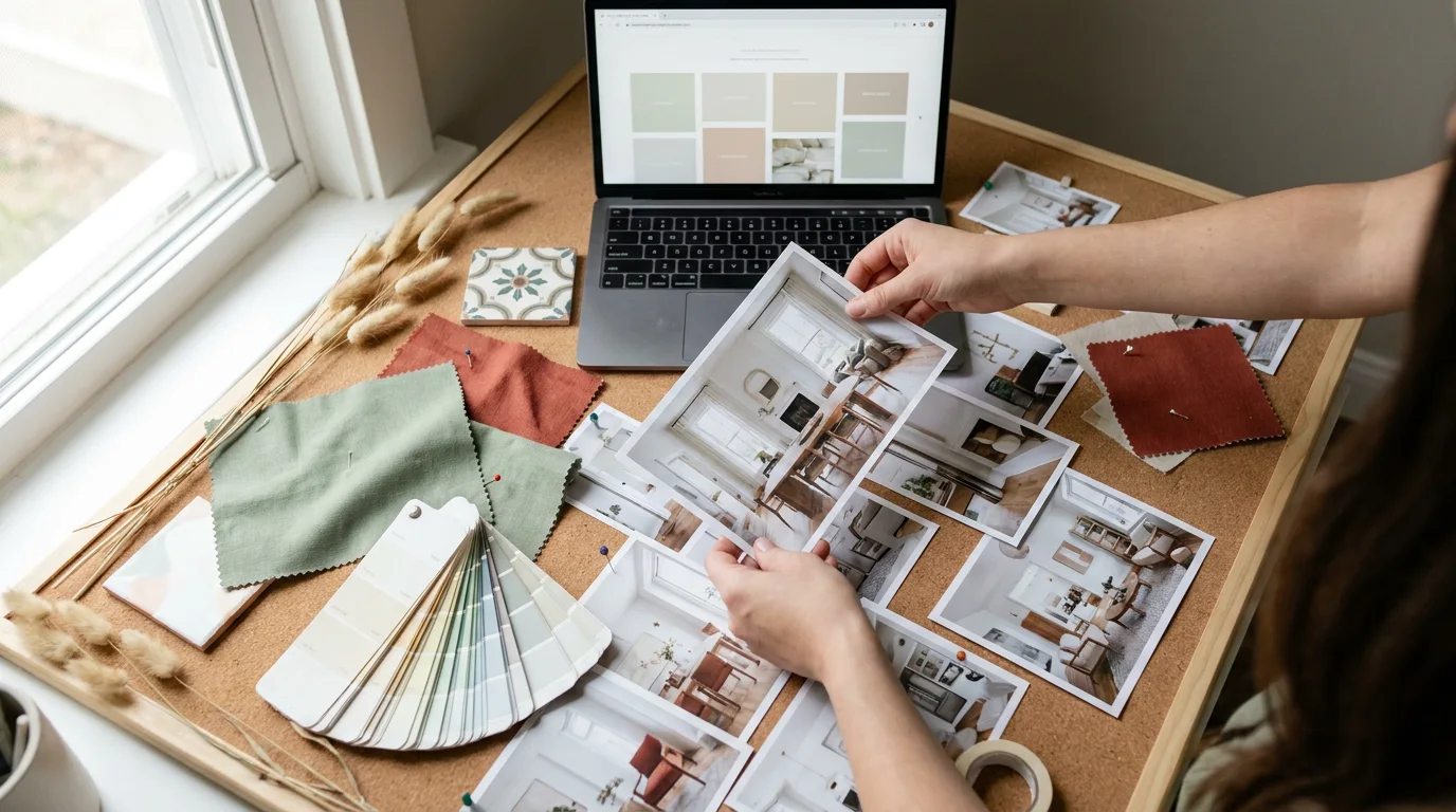
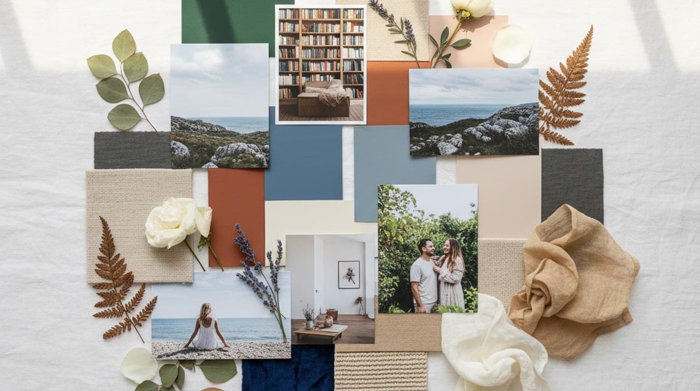
A mood board is a single page of images, colors, textures, type and words that shows how a project should look and feel before anyone designs it. Designers make one at the start of a brand refresh, a product launch, a photo shoot, a website or an event, so the client and team agree on a direction in one meeting instead of five rounds of revisions. Here is how to make a mood board step by step, what to put on it, a mood board template you can copy and a finished example.
Quick answer. To make a mood board, write a one-line brief, collect 30 to 60 references, cut them down to the 6 to 12 strongest, pull a five- or six-color palette from those images, add one heading and one body typeface, write three to five mood words, then arrange everything on one landscape page with the strongest image largest and export it as a PNG or PDF.
What a mood board is, and how it differs from other boards
The Interaction Design Foundation describes mood boards as visual collections of colors, textures and imagery that designers use to set a visual direction, share ideas with stakeholders and keep a cohesive design language. A mood board is a direction-setting tool: it comes before the design and gets replaced by real work once the direction is approved.
Three boards get mixed up often:
| Board | Question it answers | When you make it | What's on it |
|---|---|---|---|
| Mood board | How should this project look and feel? | Start of a specific project | Reference images, palette, type, mood words |
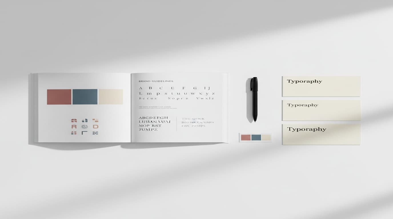
| Brand board | What are this brand's fixed visual assets? | After the identity is decided | Logo versions, exact brand colors, fonts, patterns |
| Vision board | What do I want my life to look like? | Personal goal setting | Photos and words for personal goals |
A brand board records decisions that are already made: the actual logo, the exact color codes, the fonts in use. A mood board explores and proposes, so its images are references, not finished assets. A vision board is a personal goal-setting tool, a different job entirely. For the rest of this article, "mood board" means the design kind: for a brand, a campaign, a product, an interior, a shoot or an event.
What to put on a mood board
A strong mood board has seven ingredients, each with one job:
- A hero image. The single picture that captures the feeling best. It gets the biggest tile.
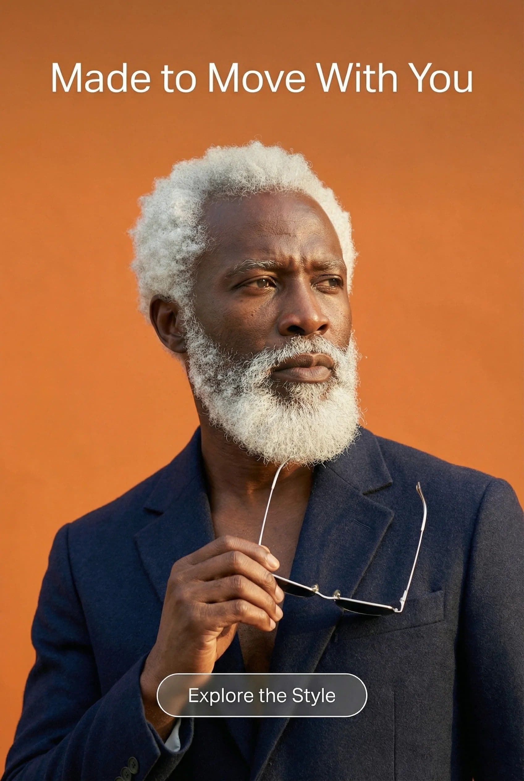
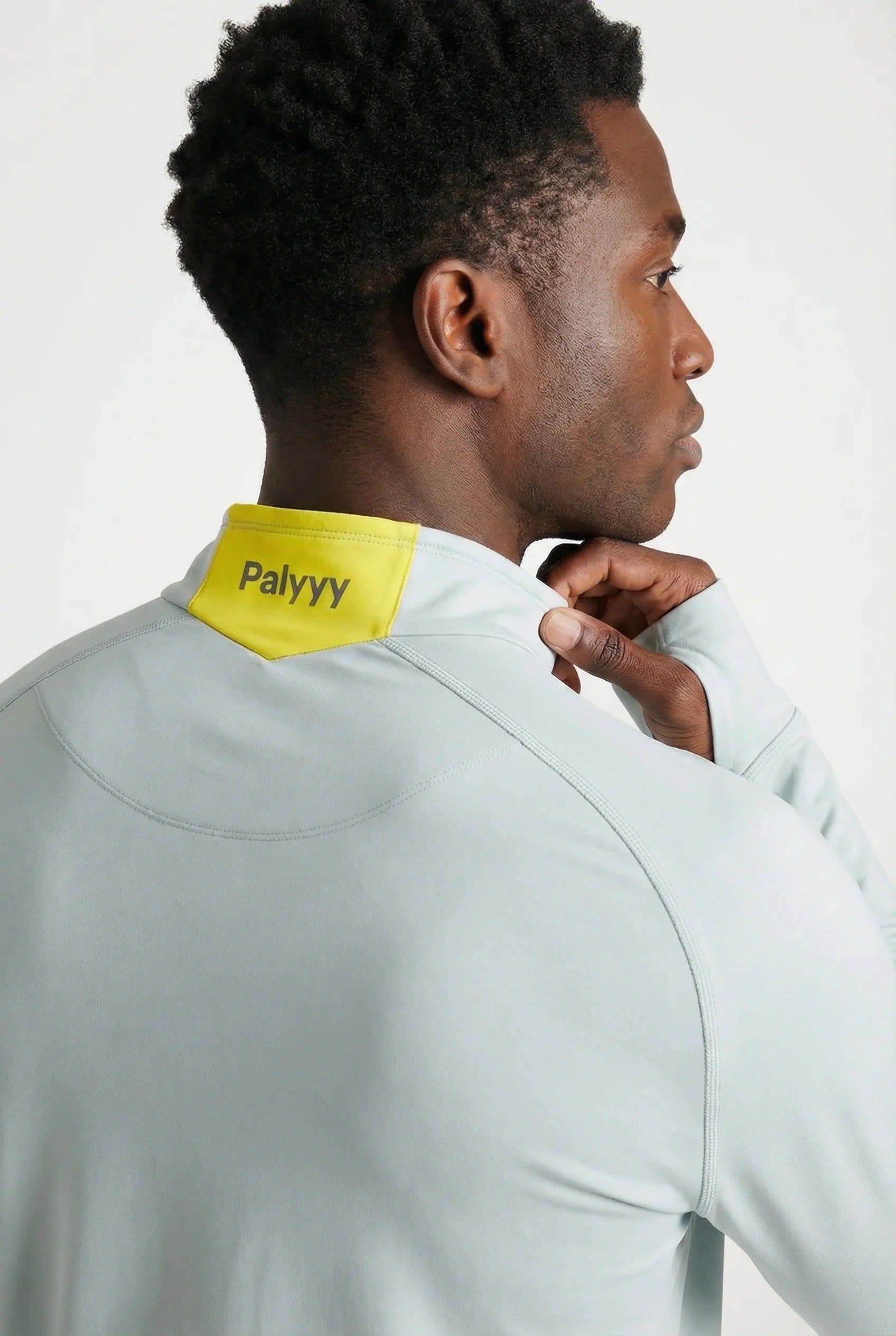
- Supporting images. Two to four photos that add texture, people, setting or detail, all with a similar light and color temperature.
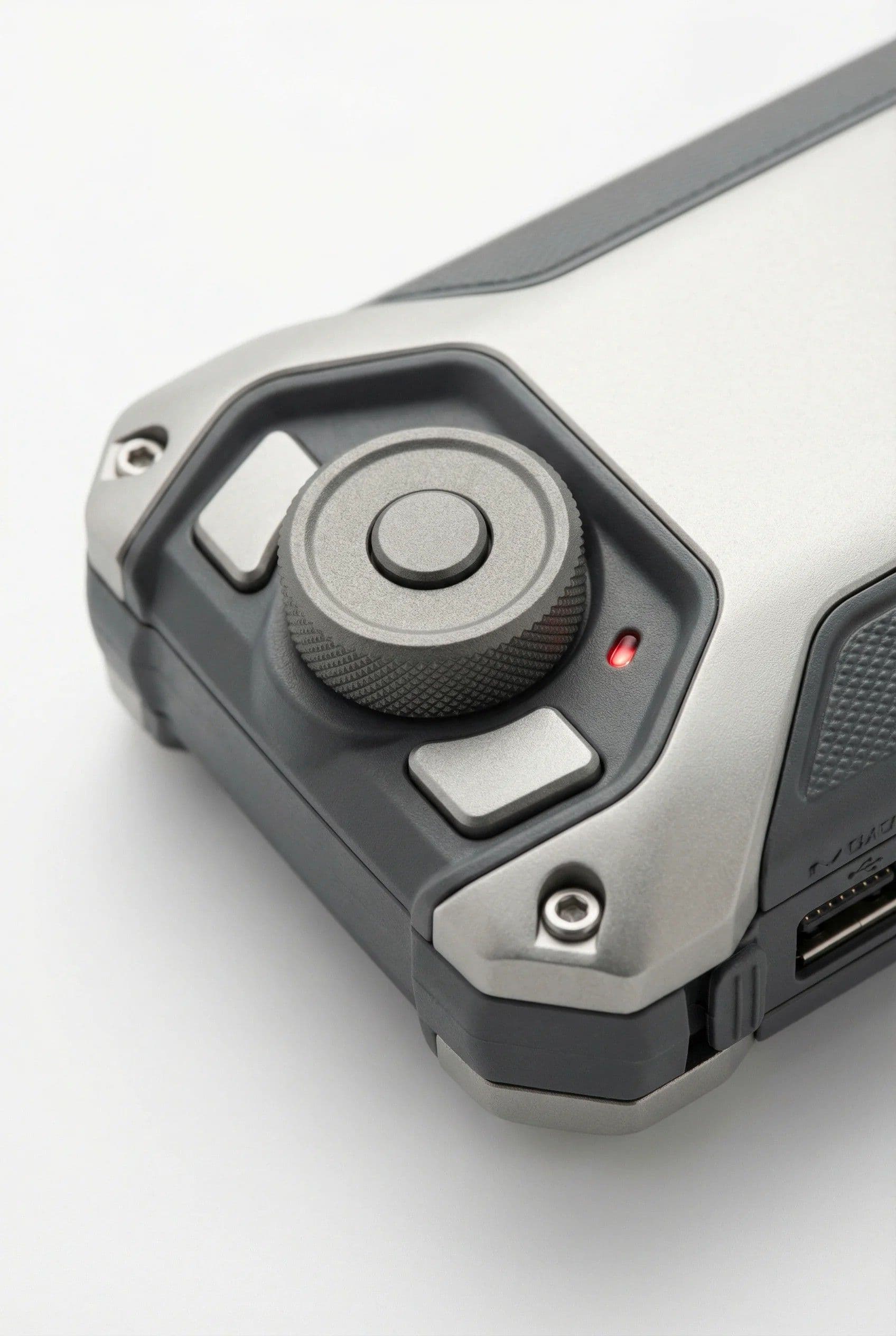
- Texture or material. Fabric, paper, stone, glaze, packaging stock: whatever the finished work will be made of or printed on.
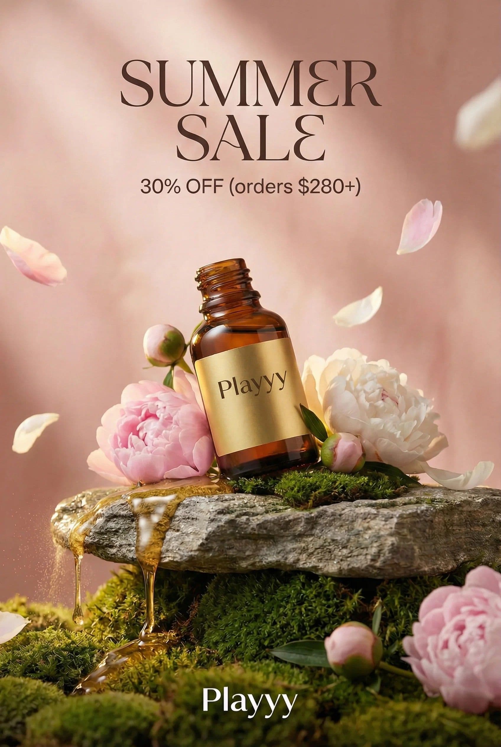
- A context shot. Where the work will live: a shelf, a storefront, a phone screen, a venue.
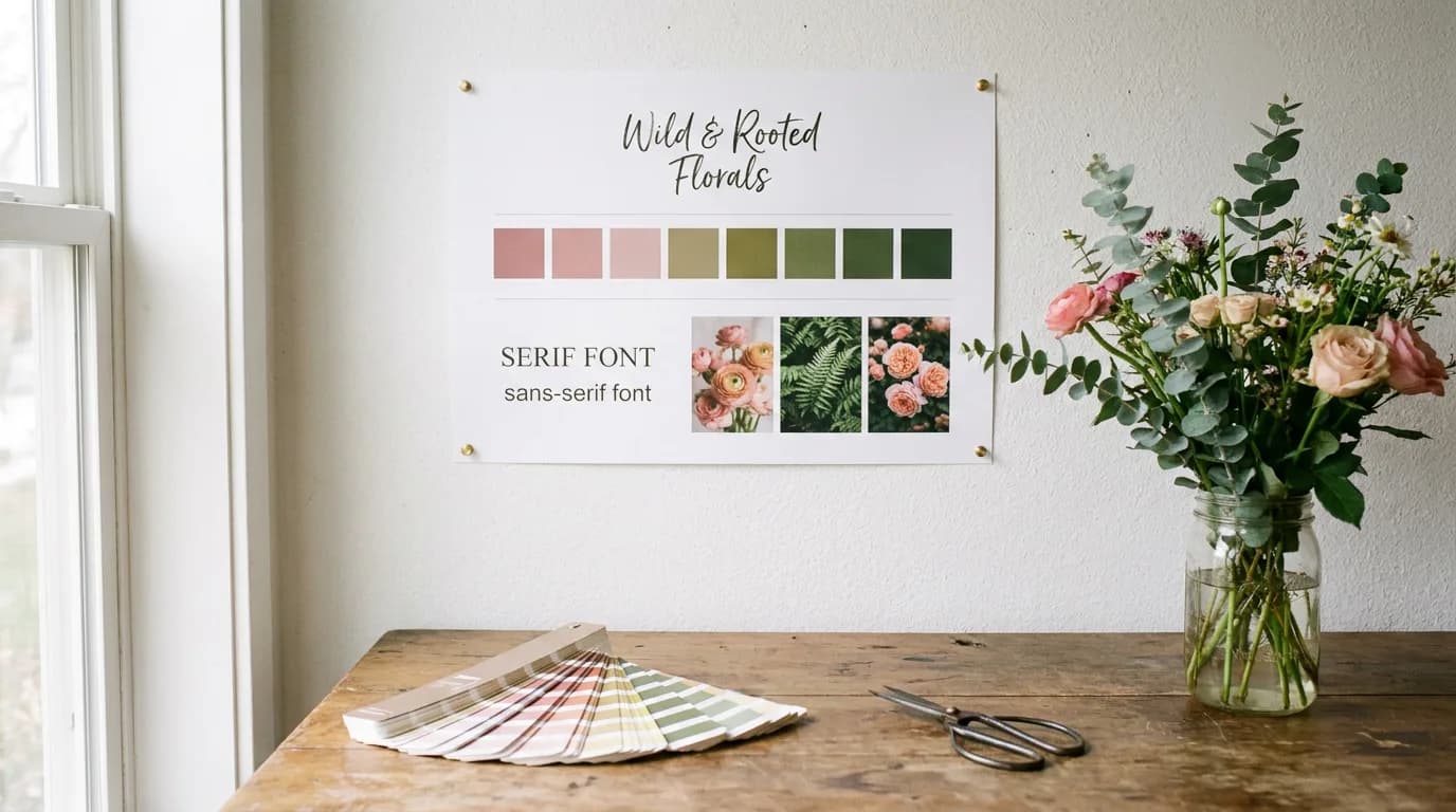
- A color palette. Five or six swatches with HEX codes, sampled from the images themselves.
- Typography. One heading typeface and one body typeface, shown at real size with a sample line of copy.
- Words. Three to five mood words ("calm, coastal, handmade"), one sentence of direction, and a short "avoid" line.
The words do more work than they look like. Two people can read the same photo differently; "calm" versus "sleepy" settles it. The "avoid" line is equally useful because it rules out directions the client was thinking but didn't say, such as glossy finishes or neon accents.
How to make a mood board in 7 steps
1. Write a one-line brief
Before collecting anything, write who the project is for, what it is and how it should feel: "A spring launch for a small ceramics studio that should feel calm, coastal and handmade." Every image you add later has to support that sentence.
2. Collect widely
Gather 30 to 60 references from your own photos, Pinterest, Are.na, magazines, stock libraries and photos of materials. Collect fast and judge later. Save each item with a note on what you like about it: the light, the color, the texture, the composition. Often you like one quality of an image, and that note keeps the reason.
3. Cut to the strongest 6 to 12
Lay everything out and remove anything that pulls in a different direction, even favorites. A mood board is persuasive only when every image agrees with the others. In our experience, the board gets approved faster after this cut than with more options left in, because the client sees one clear direction.
4. Pull the palette from the images
Sample colors directly from your chosen images with an eyedropper so the palette matches the mood. Pick one dominant neutral, one or two main colors and one accent. Write the HEX code under every swatch so a developer or printer can use it later.
5. Choose type
Pick one heading face and one body face that match the mood words. Show them at real size with a sample line of real copy. A serif with soft curves reads warm and handmade; a geometric sans reads modern and precise.
6. Write the words
Add three to five mood words, one sentence of direction and an "avoid" line. Keep the words concrete enough to settle disagreements later.
7. Arrange, label and export
Arrange the board on one landscape page, with the hero image largest and placed top left where the eye lands first. Leave even space between tiles so the board feels calm and readable. Add the project name and date, then export a PNG for chat and a PDF for presentations.
A mood board template you can copy
A mood board template works best as a simple three-column grid on a 1920 × 1080 pixel landscape canvas, the same size as a presentation slide, so the board drops straight into a pitch deck or a video call.

Fill the zones in this order:
- Top row: the hero image takes the left third, supporting images fill the middle, and the right column stacks a texture tile above a context shot.
- Bottom row: the color palette sits under the hero, typography in the middle, and words and notes on the right.
- Margins: keep the same gap between every tile, about 20 pixels on a 1920-pixel canvas.
The same mood board template works in portrait (1080 × 1350) for sharing on Instagram or in a client's phone, as long as the hero stays on top and the palette stays together.
Mood board example: a spring launch for a ceramics studio
Here is the template filled in for a fictional ceramics brand, Saltmarsh Pottery, planning a spring collection launch. The brief: "Calm, coastal, handmade, for people who like slow mornings."

What makes this board work:
- One light. Every image has soft, warm side light, so the board reads as one world even though the subjects range from a mug to a marsh.
- The palette comes from the pictures. Oat from the linen, terracotta from the glaze, sage from the glaze drip, blush from the sky, brown from the kiln-fired clay.
- The marsh is the context shot. It's a landscape rather than a product photo, yet it explains the brand name and the color story in one picture.
- The avoid line is specific. "Glossy finishes, bright primaries, studio-white backdrops" tells the photographer what not to bring to the shoot.
All the photos on this example were generated with AI for illustration. On a real project, the board would mix your own photos, licensed references and generated images to fill gaps.
Digital vs physical mood boards
Both formats work; the choice depends on the project and who needs to see the board.
| Digital mood board | Physical mood board | |
|---|---|---|
| Best for | Brands, campaigns, websites, remote teams | Interiors, fashion, products, packaging |
| Strength | Easy to share, edit, version and present | You can touch the fabric, see true paint colors |
| Weakness | Screen colors differ from print | Hard to share and update |
| Output | PNG or PDF, slide in a deck | Foam board or cork board, photographed |
Interior designers and fashion teams often make both: a physical sample board for materials, which screens can't reproduce, and a digital version for the client presentation. If the work ends up printed, check the palette against a printed sample before approving it, since a HEX color on screen and a CMYK print rarely match exactly.
What to leave off a mood board
- Finished designs by someone else. A competitor's ad or logo invites copying rather than designing.
- Images that disagree. One cool blue photo on a warm board makes the client ask which direction is real.
- Too many images. Past a dozen, the direction blurs. Make a second board instead.
- Text-heavy screenshots. Words on images compete with your mood words.
- Low-resolution files. Blurry tiles make the whole board look unfinished in a presentation.
How to make a mood board in Playyy
Playyy is an AI design agent with a free-form canvas, which makes it a practical place to build a mood board: drop in your references, arrange them in the grid, and generate the images you couldn't find. When a board needs a specific shot, such as "wet clay with a sage glaze drip, soft side light", the AI image generator makes it with GPT Image 2.5 or Nano Banana Pro in the same light as the rest of the board, at 16:9, 4:3, 1:1 or another ratio that fits the tile.
For brand projects, the palette can come from the brand itself. Paste the client's website into the brand kit generator and Playyy reads their colors, fonts and logo, so swatches and type samples on the board match what they already use, and anything new you propose stands out clearly. Every tile stays a separate, editable layer, so you can swap one image after feedback, recolor a photo to match the palette, or remove a background before exporting the board as a PNG or PDF.
Conclusion
A good mood board is small and decisive: one brief, 6 to 12 images that agree, a palette sampled from those images, two typefaces and a few concrete words. Use the template grid to keep it to one page, make a second board rather than crowding the first, and present it before any design work starts. Once the direction is approved, the mood board becomes the reference every later design is checked against.

Aiko Tanaka
I work with boutique brands, cafes, creators and small businesses on visual systems, layout discipline, typography and moodboards. My focus is on fast concept exploration that still has a strong design point of view.
Frequently asked questions
Put one hero image that sets the mood, two to four supporting images with matching light, a texture or material sample, a context shot of where the work will live, a five- or six-color palette with HEX codes, one heading and one body typeface, and three to five mood words with a short note on what to avoid.