12 Menu Design Ideas, From Cafes to Weddings
 Luca Moretti
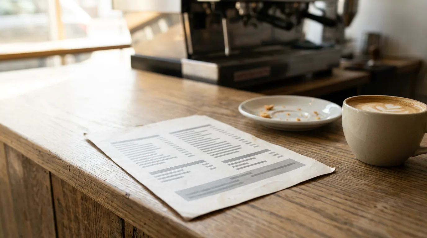
A menu does three jobs at once. It tells guests what's available, it sets the tone of the place before the food arrives, and it nudges people toward the dishes that keep the business healthy. The menu design ideas below are grouped by venue, because a cafe menu read in a queue, a cocktail list read by candlelight and a wedding menu read at a set table have very different problems to solve. Each idea comes with the layout, type, color and description choices that make it work, followed by the menu psychology worth using and a short process for making your own.
Quick answer. The best menu design ideas start from where the menu is read. Cafe and bakery menus work as short cards or boards with a few clear sections. Bar menus list ingredients. Wedding menus drop prices and center the courses. Food trucks use big numbered combos. Fine dining keeps each dish to a line. Every menu benefits from clear sections, readable type and quiet prices.
Cafe Menu Design Ideas
1. The one-card coffee menu
A single card with three sections, such as espresso, brew bar and "not coffee", covers most cafes. Use one bold sans serif for the shop name and section headings, a lighter weight for drink names, and a small gray line under each drink for the description. Put the milk alternatives and extra shot as a single footnote line instead of repeating them under every drink. A cream or kraft background in two colors (one dark, one warm accent) reads well under bright counter lighting and prints cheaply.
2. The wall board above the counter
The board above the till is read from several steps away, so the type has to be larger and the list shorter than on a hand-held card. Keep the board to the drinks people order without thinking, and move seasonal drinks to a small A-frame or a tent card on the counter. Good cafe menu design here comes down to contrast: light text on a dark board or dark text on a pale one, never mid-tone on mid-tone.
Bakery Menu Ideas
3. The "baked today" bakery menu
A bakery menu changes daily, so design the fixed part (croissants, breads, cakes) as the permanent menu and give the changing bake its own tinted box. That box becomes the one place staff update each morning. A soft pastel background, a high-contrast serif for the bakery name and a humanist sans for items give the warmth people expect from a bakery without hurting legibility.
4. The order sheet for cakes and bread
Celebration cakes and whole loaves need sizes, prices and notice periods, which suit a compact grid more than a list. List the flavors on one line, the sizes and prices on the next, and the notice period at the end, so the reader gets everything needed to place an order in one look.

Bar and Drink Menu Template Ideas
5. The cocktail list that names ingredients
Guests choose cocktails by base spirit and flavor, so list the ingredients in lowercase under each drink name and skip adjectives like "refreshing" or "delicious". A dark navy or charcoal background with a warm metallic accent color works in low bar light, as long as the body text stays large and light enough to read by a table candle. One thin border around the page holds the whole list together.
6. The drink menu template with glass and bottle columns
Wine and beer lists need two prices per line. A drink menu template with the name on the left and two right-aligned price columns, one for the glass and one for the bottle, lets guests compare quickly without a table grid. Add a short zero-proof section at the end with the same styling as the cocktails, so non-drinkers get a real list rather than a footnote.
Wedding and Event Menu Ideas
7. The wedding menu template with centered courses
A wedding menu template drops prices and becomes a keepsake, so it follows the stationery: same script for the couple's names, same accent color as the invitations. Center everything, label each course in small spaced capitals, and put the dish name in a classic serif with a one-line description in italics. If guests pre-selected their main, show both options with a simple "or" between them, and add a key for vegetarian and gluten-free marks at the foot of the card.
8. The event menu card for buffets and parties
Buffets and catered parties need labels more than a full menu. A small folded card per dish, with the name, a one-line description and dietary marks, does more than one large board, because guests read it while they serve themselves. Use the same fonts and colors as the event signage so the tables look planned.

Food Truck and Quick Service Menu Ideas
9. The food truck board with numbered combos
A food truck menu is read from the pavement in a few seconds, often while the reader is deciding whether to join the queue. Four to six items, each with a large number, a bold name, a short description and a big price, are easier to order from than a long list ("two number twos, please"). Put a dashed-border combo upsell under the list and the payment options at the bottom. Bright yellow or white on black is the classic choice because it carries across a street.
10. The quick service price board
Counter-service menus are usually landscape boards split into columns by category: mains, sides, drinks. Give the combo or meal deal its own panel with the add-on price ("make it a meal +3.50") rather than repeating combo prices under every item. If the board is a screen, keep the layout fixed and change only prices and photos, so regulars can find their order in the same spot every time.
Fine Dining and Seasonal Menu Ideas
11. The tasting menu, one line per course
Fine dining menus say less. A tasting menu works as a centered list of courses with the main ingredient as the title and two or three components below, separated by middle dots. A single price for the whole menu and the wine pairing goes at the foot. Plenty of cream space, a high-contrast serif and no images signal care better than ornament does.
12. The farm-to-table menu that changes with the season
Seasonal restaurants print often, so design a fixed frame (logo, section headings, footer) and treat the dish list as the only part that changes. Earthy colors such as sage, terracotta and warm beige on textured paper suit the style. Naming the farm or the region in the description gives guests a reason to choose a dish, and it's more honest than a string of adjectives.

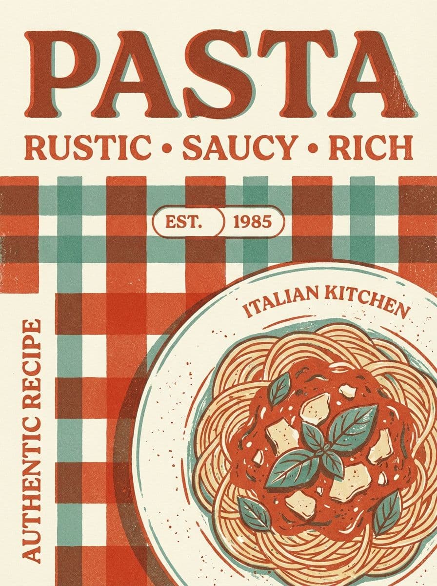
The sample menus in this article use fictional venues. Laying them out showed one pattern again and again: the menus that read best had the fewest type styles. Each one uses two fonts and two or three colors, and the extra emphasis comes from size, spacing and a single highlight box.
Menu Psychology That Holds Up
Menu engineering is full of rules passed from consultant to consultant. A few are backed by research, a few are design common sense, and one of the best known doesn't survive testing.
Anchor each section with a high-priced dish. Listing a premium dish first in a section gives guests a reference point, so the dishes below it read as reasonable. This is ordinary price anchoring, and it works best when the anchor is a dish people genuinely order sometimes, such as a whole fish or a dish for two.
Highlight one dish per page, not five. A box, a small label or extra space around one high-margin dish draws the eye. When every section has a box, none of them stand out.
Keep prices quiet. A study from Cornell's Center for Hospitality Research, "$ or Dollars: Effects of Menu-price Formats on Restaurant Checks" by Yang, Kimes and Sessarego (2009), found that diners given menus with numerals only spent significantly more than diners whose menus showed a dollar sign. The authors note the result may apply only to lunch at the restaurant they tested. Placing the price straight after the description, in the same size as the text, also stops guests from scanning a price column to find the cheapest dish.
The golden triangle is weaker than its reputation. The old advice says diners look at the center of a menu, then the top right, then the top left. Eye-tracking research by Sybil Yang of San Francisco State University, published in the International Journal of Hospitality Management, found diners read menus sequentially, like a book, with no evidence of a sweet spot. The one zone that got the least attention was the bottom corners, where the test menu held restaurant information and salads. Diners also picked a main first and built the meal around it.
So instead of hiding dishes in a "sweet spot", order the sections the way people eat, put mains where they're easy to find, and keep fine print in the lower corners.
Write descriptions that name things. "Fennel, blood orange, salsa verde" tells a guest what will be on the plate. "A delightful journey of flavors" tells them nothing. Origin, cooking method and two or three components are enough.

How to Make a Menu in Six Steps
Whether the menu is a cafe card or a wedding place setting, how to make a menu comes down to the same six steps.
- List and cut the items. Write every dish and drink with its price, then remove the ones that rarely sell or that slow the kitchen down.
- Group them into sections in the order people eat or drink: starters, mains, sides, desserts; or espresso, brew bar, tea.
- Pick the format and size. A single card in letter or A4 size, a folded tabloid sheet, a tall drinks card, a wall board or a screen. Decide this before the layout, because it sets how much text fits.
- Choose two fonts and two or three colors that match the room, the signage and the logo.
- Write short descriptions with ingredients, origin and method, then place the price straight after each one.
- Proof and test. Check allergens, spelling and prices, then print one copy and read it where guests will read it: at the counter, under the bar lights or across the street.
Making a Menu With AI
Playyy is an AI design agent that creates menus, posters, flyers and other print designs on an editable canvas. Describe the venue, paste the item list with prices, and name a style ("a one-page cafe menu in cream and forest green, three sections, prices without dollar signs"), and the AI menu generator returns a laid-out menu with the text in editable layers. Change a price, swap a dish or ask the agent to "add a zero-proof section in the same style", and the layout updates around it.
To match the rest of the shop, the brand kit reads your website's colors, fonts and logo and applies them to every design. The same brief can then produce the window poster, the flyer and the social post for a new seasonal menu, which is how the small business marketing kit keeps a cafe or restaurant's print and online pieces consistent. For the window and the street, these poster ideas cover the formats that pair well with a new menu.
Read the AI draft against the kitchen's real list before printing. Prices, allergens and dish names are the parts guests notice when they're wrong.
Conclusion
Good menu design ideas come from the place the menu will be read: a short card for a cafe queue, an ingredient list for a bar, centered courses for a wedding, big numbers for a food truck and a single line per course for fine dining. Keep two fonts, clear sections in eating order and quiet prices, and use research-backed tactics like anchoring rather than the golden triangle. To turn your item list into an editable, print-ready layout in minutes, start with Playyy's AI menu generator.

Luca Moretti
I help restaurants, venues, schools, workshops and small service businesses create posters, menus, invitations, event flyers and social promotions. I write for non-designers who need practical, good-looking visuals for real-world promotions.
Frequently asked questions
The golden triangle is an old menu-engineering idea that diners look at the middle of a menu first, then the top right, then the top left, so the most profitable dishes should sit there. Eye-tracking research by Sybil Yang, published in the International Journal of Hospitality Management in 2012, found diners mostly read menus in order, like a book, with no single sweet spot. Section order and clear headings matter more.